
Usability Heuristics Lecture /slide deck produced
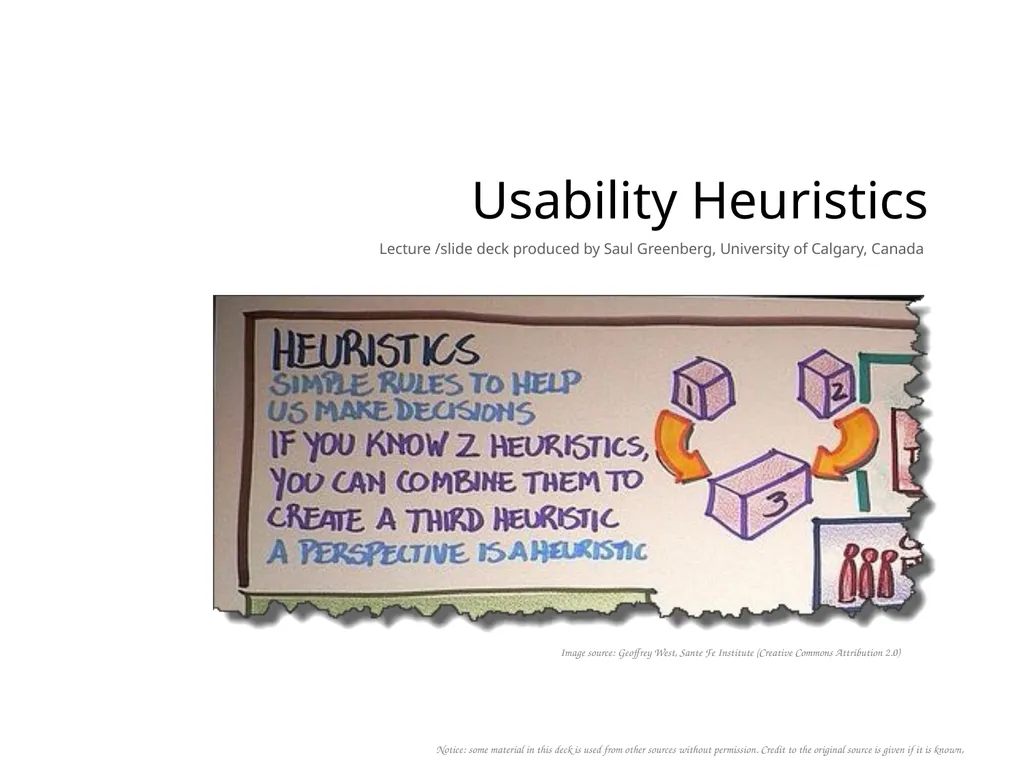
Description: Usability Heuristics Lecture slide deck produced by Saul Greenberg, University of Calgary, Canada Notice: some material in this deck is used from other sources without permission. Credit to the original source is given if it is known,
Related Topics
Download Presentation
"Usability Heuristics Lecture /slide deck produced" is the property of its rightful owner. Permission is granted to download and print the materials on this website for personal, non-commercial use only, and to display it on your personal computer provided you do not modify the materials and that you retain all copyright notices contained in the materials. By downloading content from our website, you accept the terms of this agreement.
Presentation Transcript
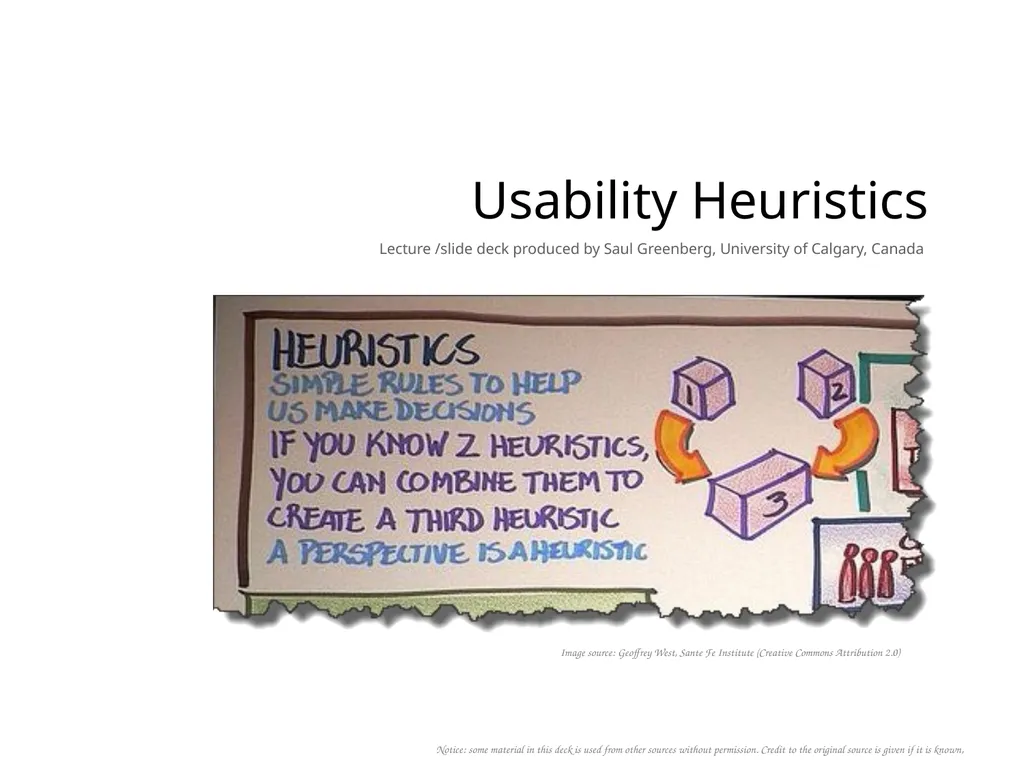
slide1. Usability Heuristics Lecture /slide deck produced by Saul Greenberg, University of Calgary, Canada Notice: some material in this deck is used from other sources without permission. Credit to the original source is given if it is known, Image source: Geoffrey West, Sante Fe Institute (Creative Commons Attribution 2.0)<br>
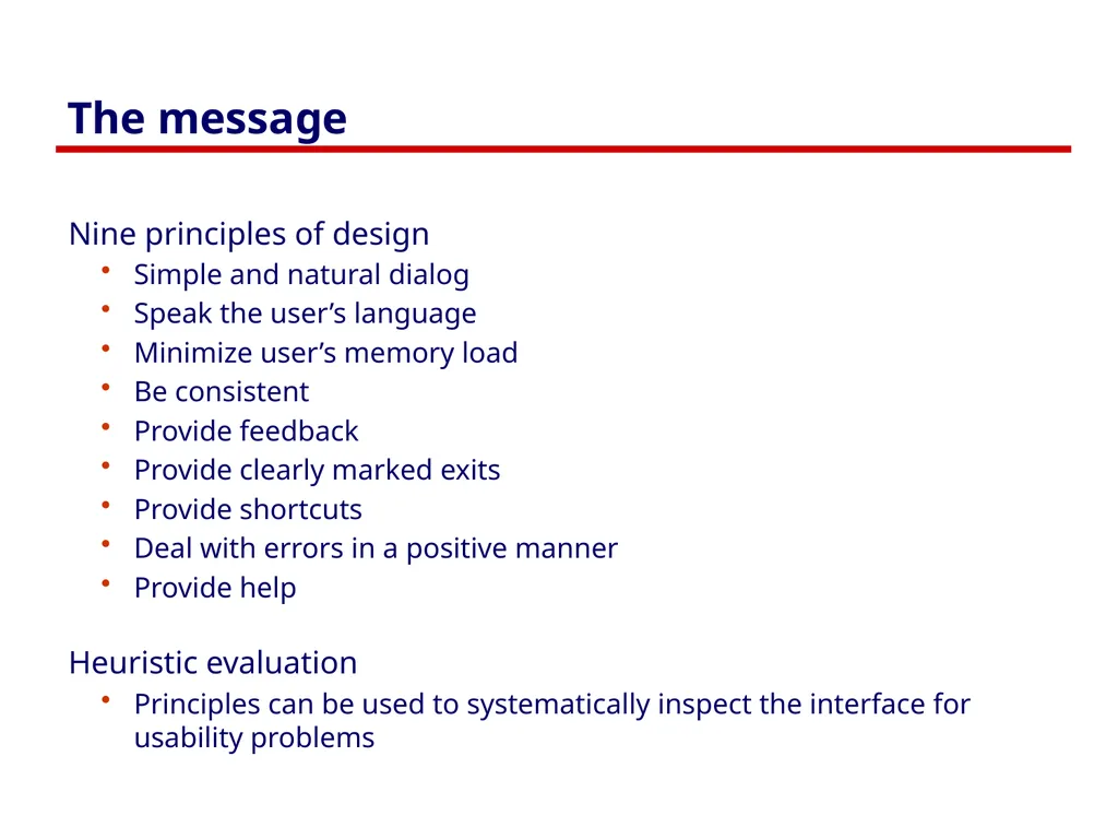
slide2. The message Nine principles of design
Simple and natural dialog
Speak the user’s language
Minimize user’s memory load
Be consistent
Provide feedback
Provide clearly marked exits
Provide shortcuts
Deal with errors in a positive manner
Provide help
Heuristic evaluation
Principles can be used to systematically inspect the interface for usability problems<br>
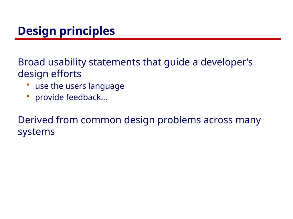
slide3. Design principles Broad usability statements that guide a developer’s design efforts
use the users language
provide feedback…
Derived from common design problems across many systems<br>
slide4. Heuristic evaluation Systematic inspection of interface for compliance to guidelines<br>
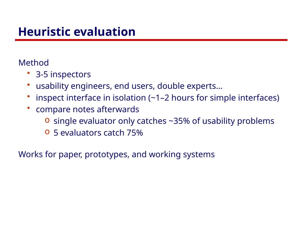
slide5. Heuristic evaluation Method
3-5 inspectors
usability engineers, end users, double experts…
inspect interface in isolation (~1–2 hours for simple interfaces)
compare notes afterwards
single evaluator only catches ~35% of usability problems
5 evaluators catch 75%
Works for paper, prototypes, and working systems<br>
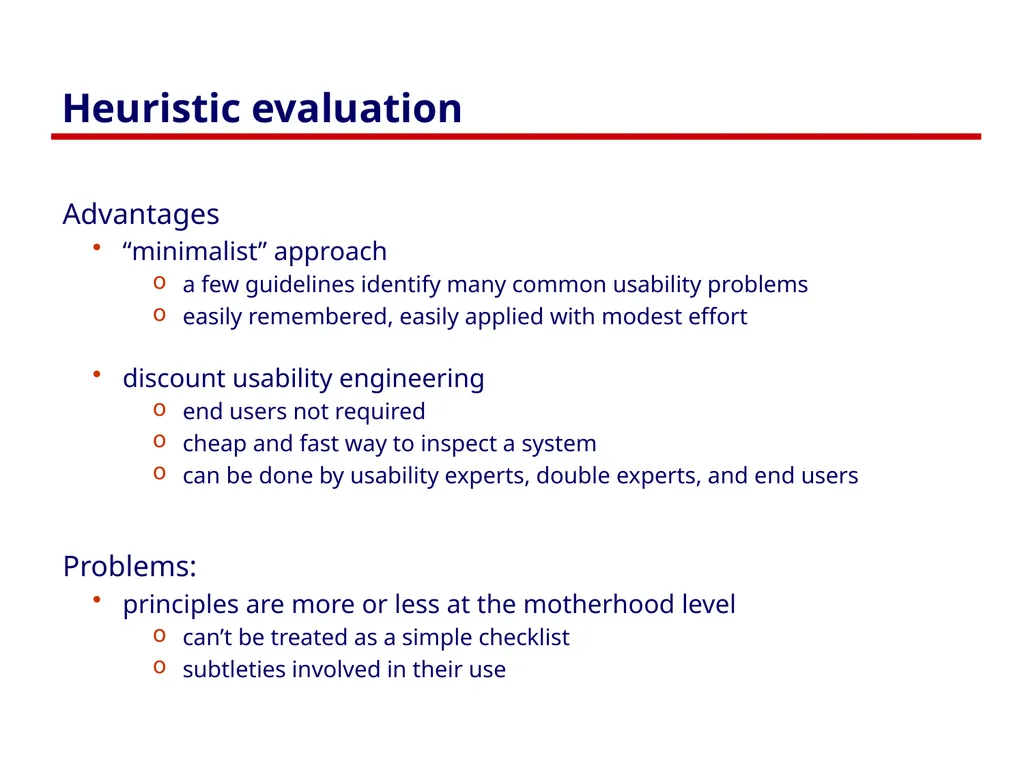
slide6. Heuristic evaluation Advantages
“minimalist” approach
a few guidelines identify many common usability problems
easily remembered, easily applied with modest effort
discount usability engineering
end users not required
cheap and fast way to inspect a system
can be done by usability experts, double experts, and end users
Problems:
principles are more or less at the motherhood level
can’t be treated as a simple checklist
subtleties involved in their use<br>
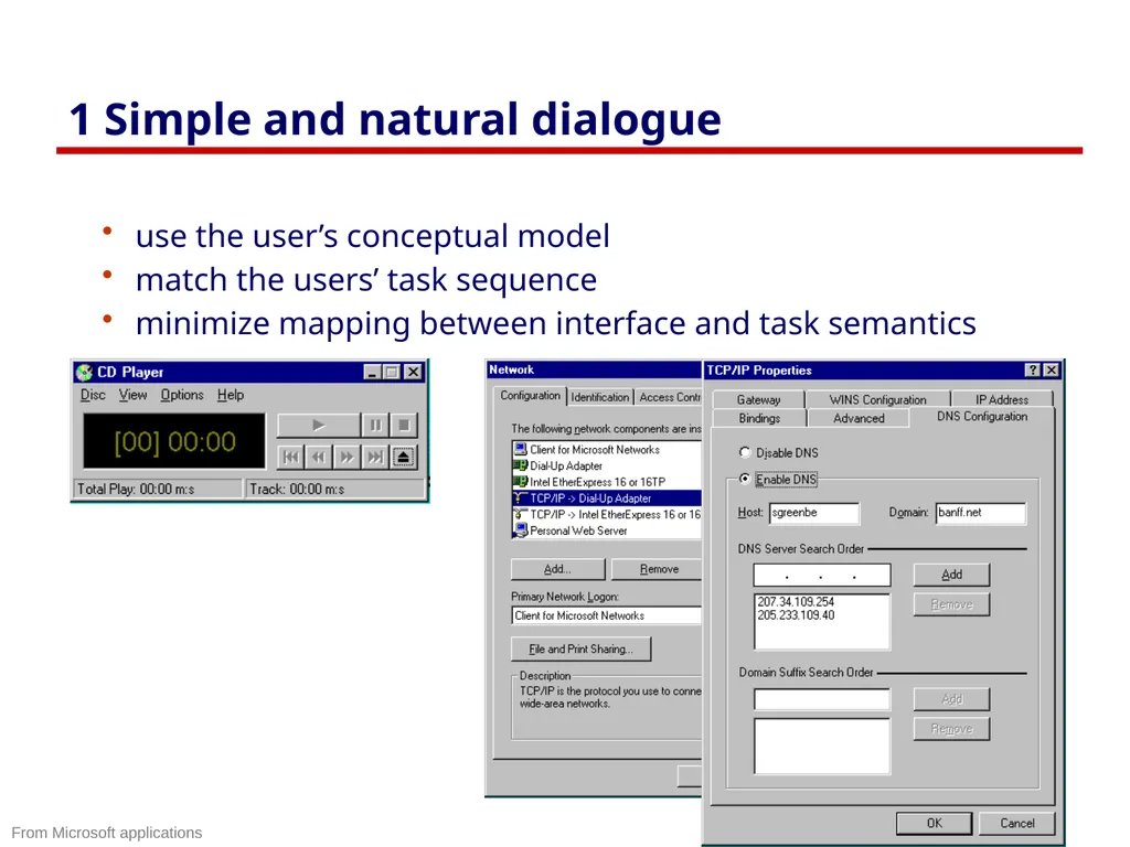
slide7. 1 Simple and natural dialogue use the user’s conceptual model
match the users’ task sequence
minimize mapping between interface and task semantics From Microsoft applications<br>
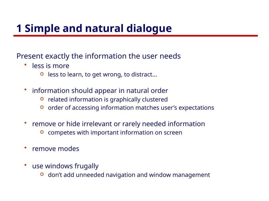
slide8. 1 Simple and natural dialogue Present exactly the information the user needs
less is more
less to learn, to get wrong, to distract...
information should appear in natural order
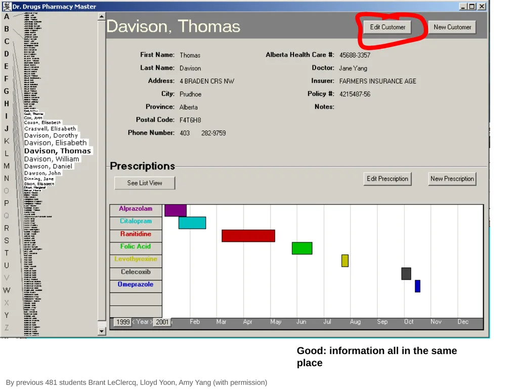
related information is graphically clustered
order of accessing information matches user’s expectations
remove or hide irrelevant or rarely needed information
competes with important information on screen
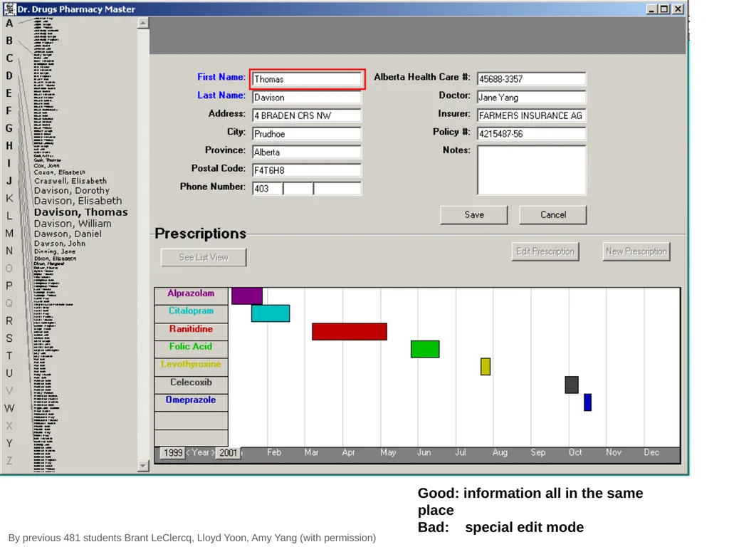
remove modes
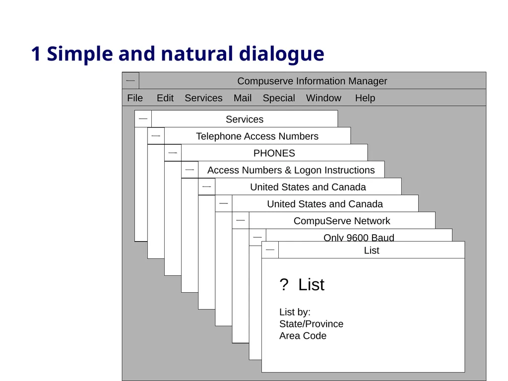
use windows frugally
don’t add unneeded navigation and window management<br>
slide9. 1 Simple and natural dialogue<br>
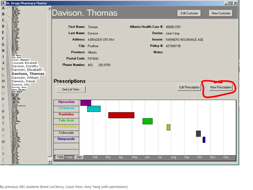
slide10. By previous 481 students Brant LeClercq, Lloyd Yoon, Amy Yang (with permission) Good: information all in the same place<br>
slide11. By previous 481 students Brant LeClercq, Lloyd Yoon, Amy Yang (with permission) Good: information all in the same place Bad: special edit mode<br>
slide12. By previous 481 students Brant LeClercq, Lloyd Yoon, Amy Yang (with permission)<br>
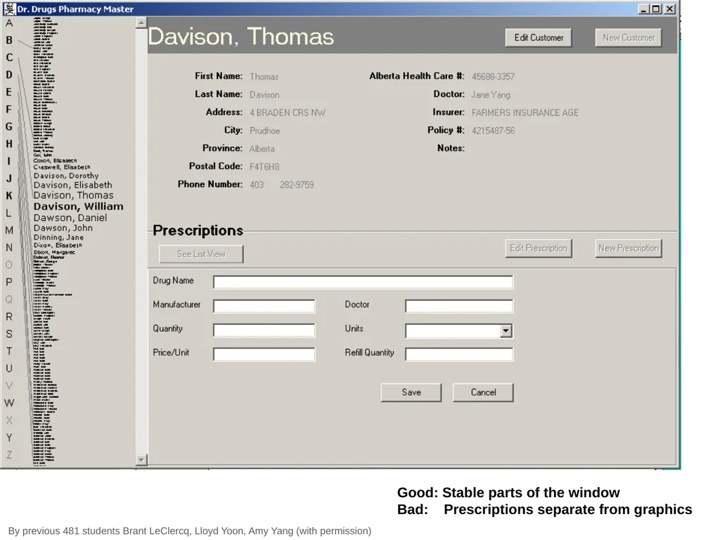
slide13. Good: Stable parts of the window Bad: Prescriptions separate from graphics By previous 481 students Brant LeClercq, Lloyd Yoon, Amy Yang (with permission)<br>
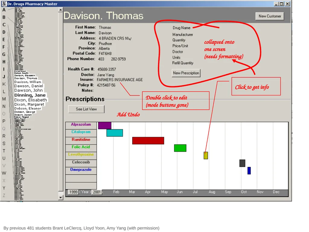
slide14. By previous 481 students Brant LeClercq, Lloyd Yoon, Amy Yang (with permission) collapsed onto one screen (needs formatting) Double click to edit (mode buttons gone) Click to get info Add Undo<br>
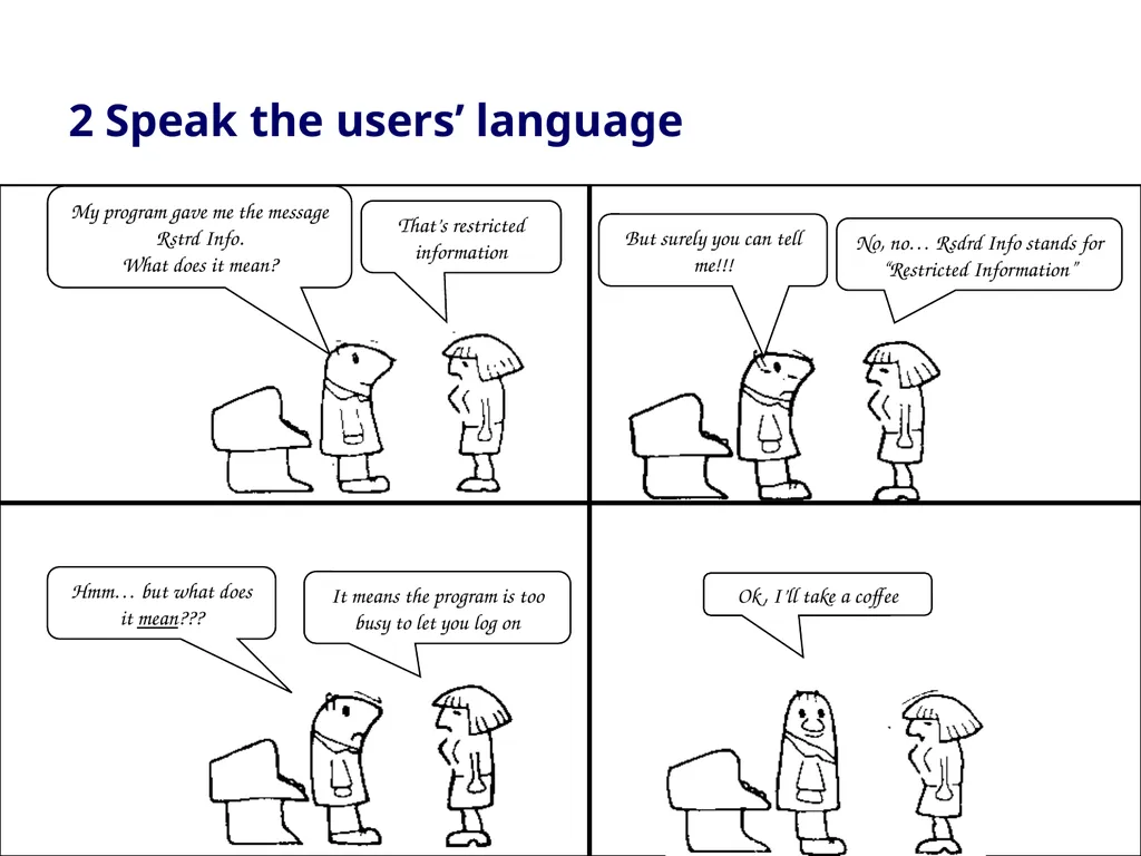
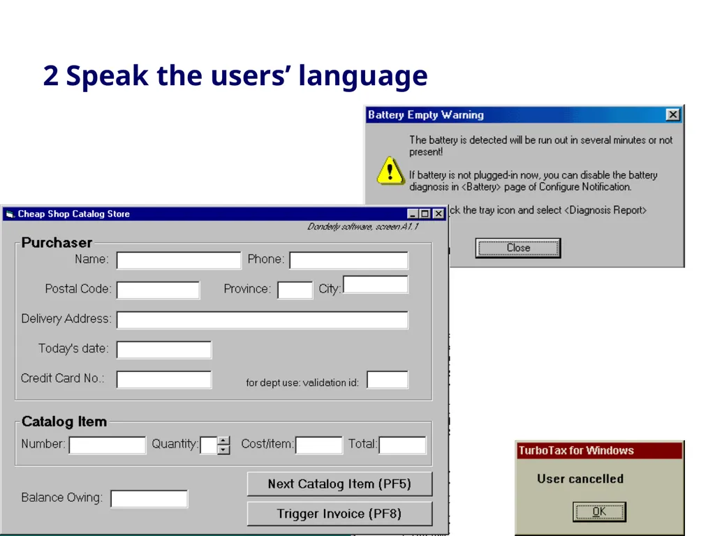
slide15. 2 Speak the users’ language<br>
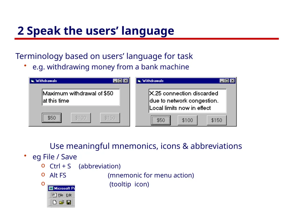
slide16. 2 Speak the users’ language Terminology based on users’ language for task
e.g. withdrawing money from a bank machine
Use meaningful mnemonics, icons & abbreviations
eg File / Save
Ctrl + S (abbreviation)
Alt FS (mnemonic for menu action)
(tooltip icon)<br>
slide17. 2 Speak the users’ language<br>
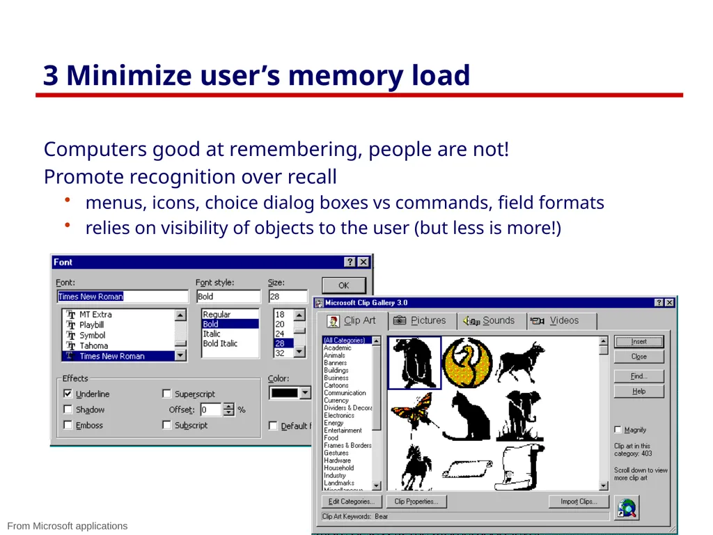
slide18. 3 Minimize user’s memory load Computers good at remembering, people are not!
Promote recognition over recall
menus, icons, choice dialog boxes vs commands, field formats
relies on visibility of objects to the user (but less is more!) From Microsoft applications<br>
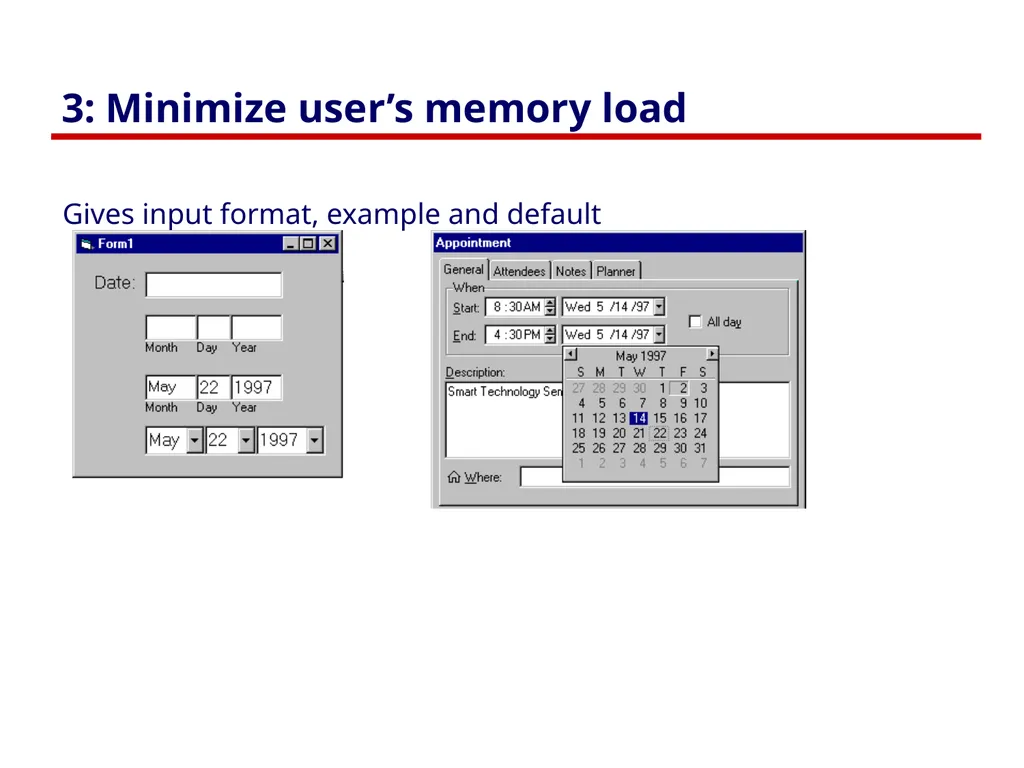
slide19. 3: Minimize user’s memory load Gives input format, example and default<br>
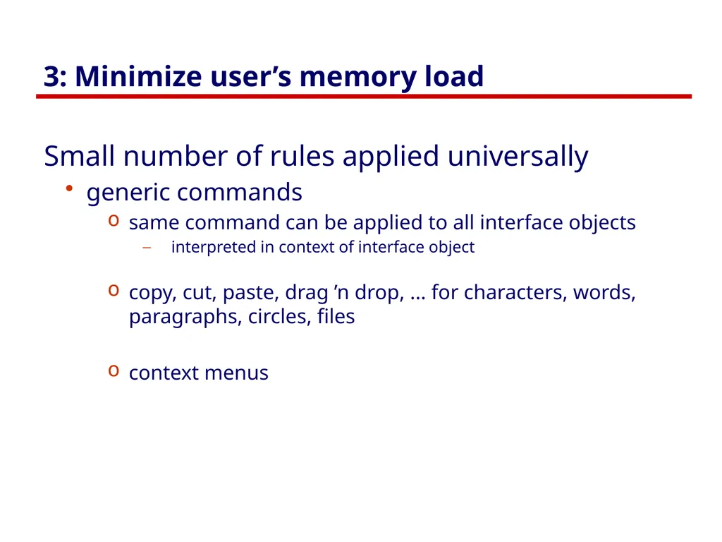
slide20. 3: Minimize user’s memory load Small number of rules applied universally
generic commands
same command can be applied to all interface objects
interpreted in context of interface object
copy, cut, paste, drag ’n drop, ... for characters, words, paragraphs, circles, files
context menus<br>
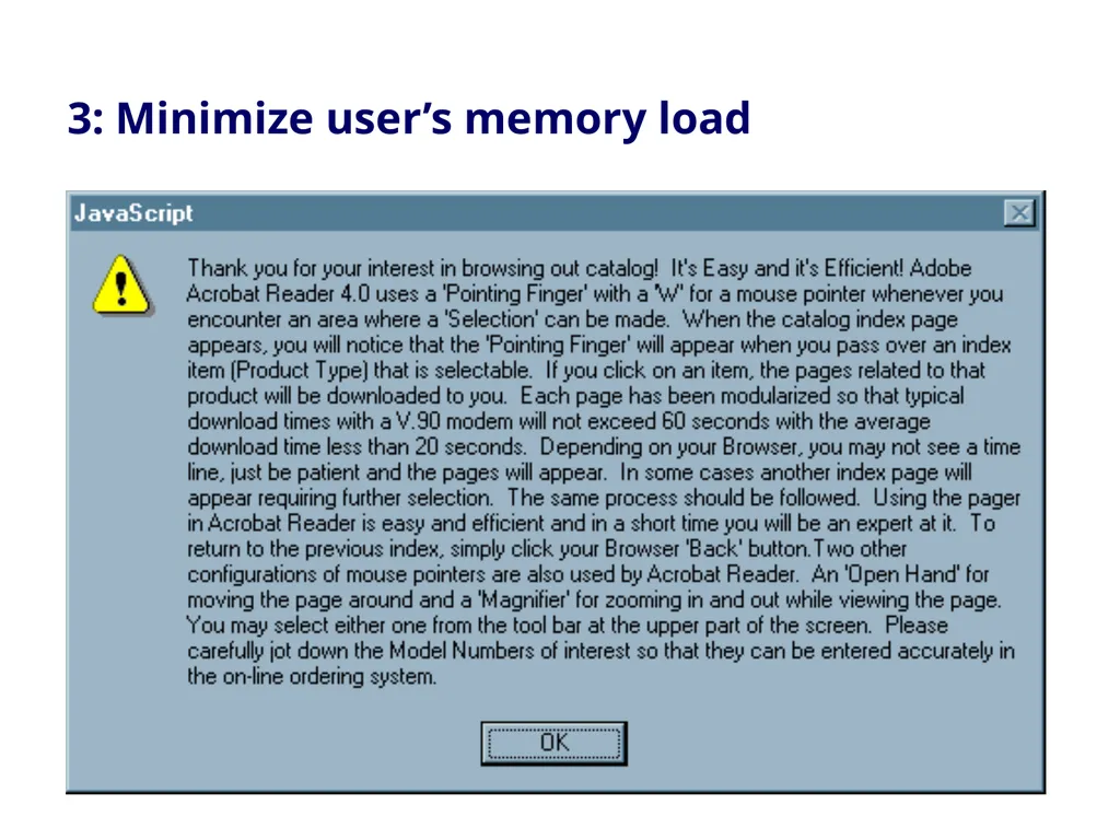
slide21. 3: Minimize user’s memory load<br>
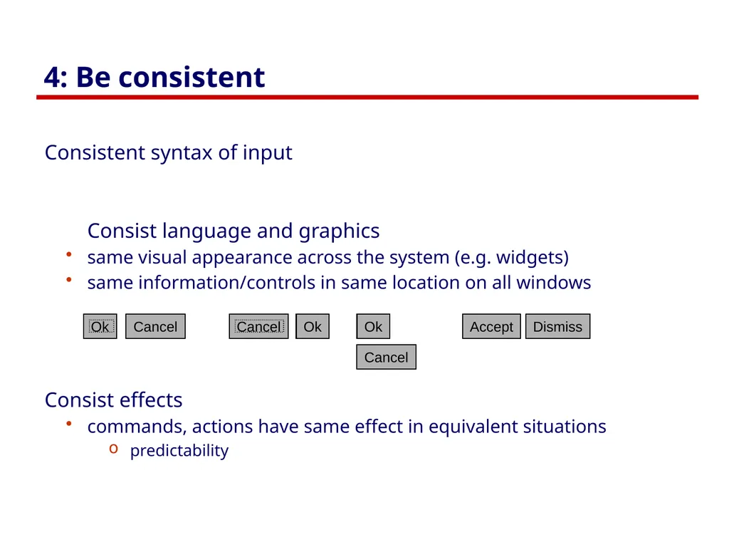
slide22. 4: Be consistent Consistent syntax of input
Consist language and graphics
same visual appearance across the system (e.g. widgets)
same information/controls in same location on all windows
Consist effects
commands, actions have same effect in equivalent situations
predictability<br>
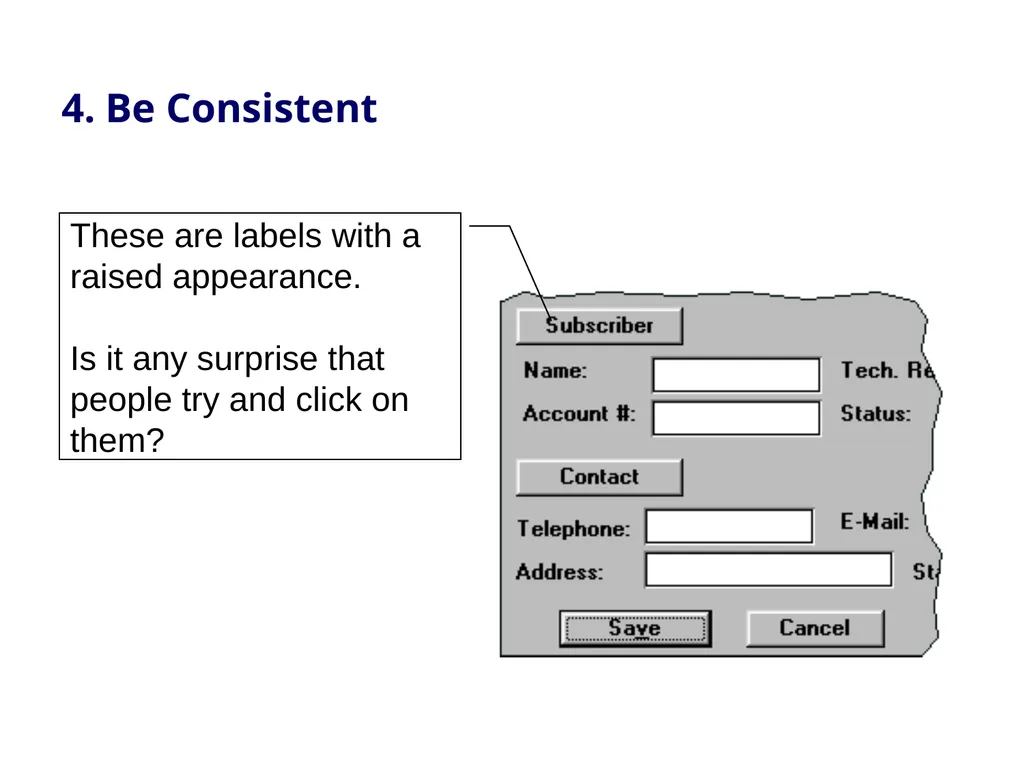
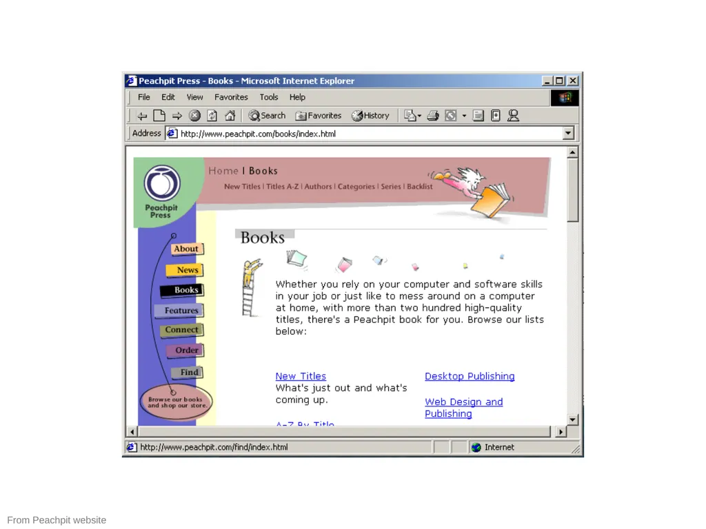
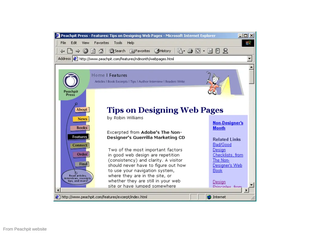
slide23. 4. Be Consistent These are labels with a raised appearance.
Is it any surprise that people try and click on them?<br>
slide24. From Peachpit website<br>
slide25. From Peachpit website<br>
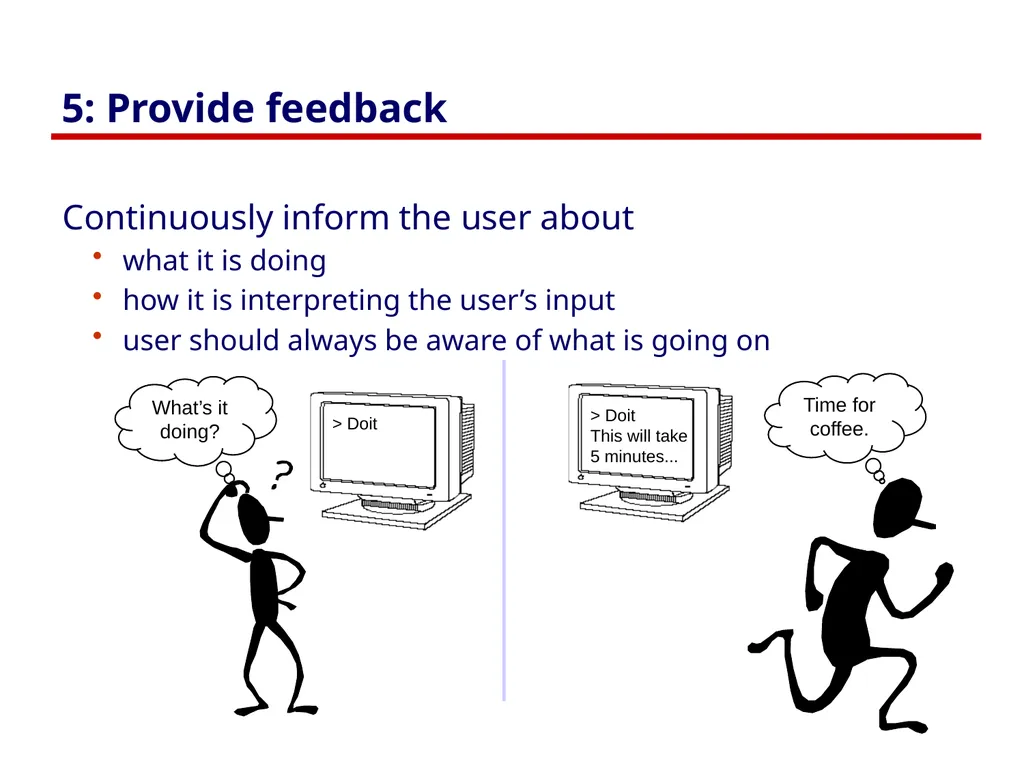
slide26. 5: Provide feedback Continuously inform the user about
what it is doing
how it is interpreting the user’s input
user should always be aware of what is going on What’s it doing? Time for coffee.<br>
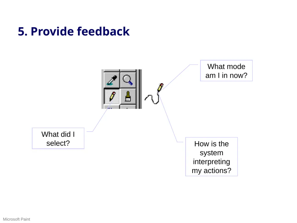
slide27. 5. Provide feedback What did I select? What mode am I in now? How is the system interpreting my actions? Microsoft Paint<br>
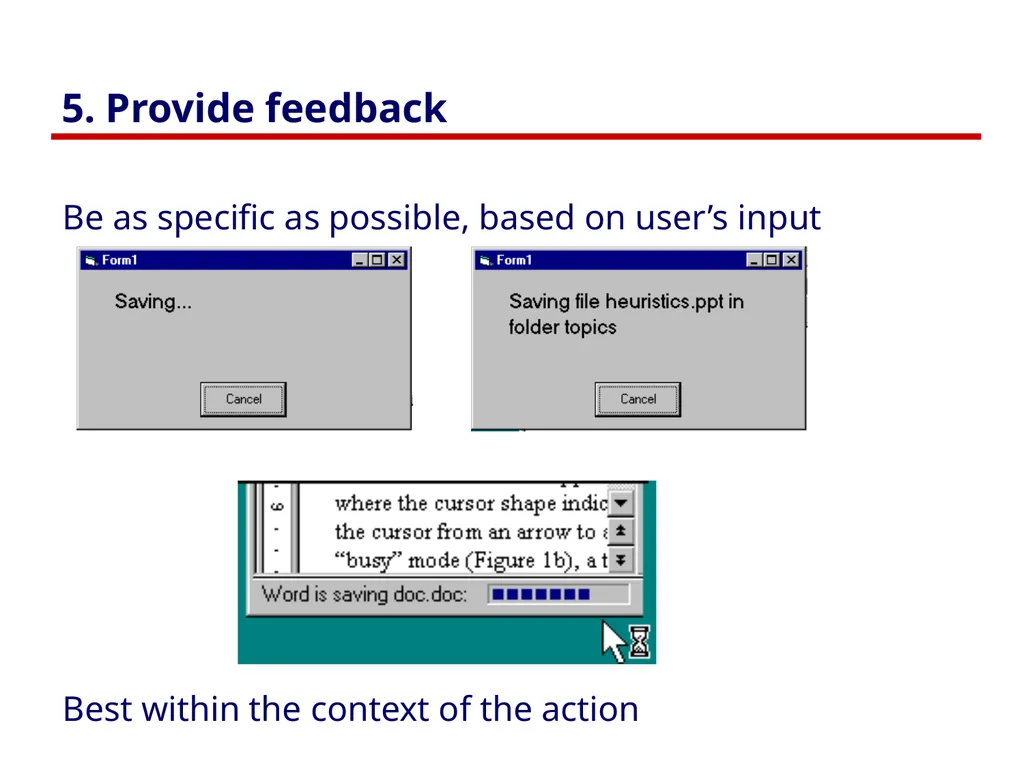
slide28. 5. Provide feedback Be as specific as possible, based on user’s input Best within the context of the action<br>
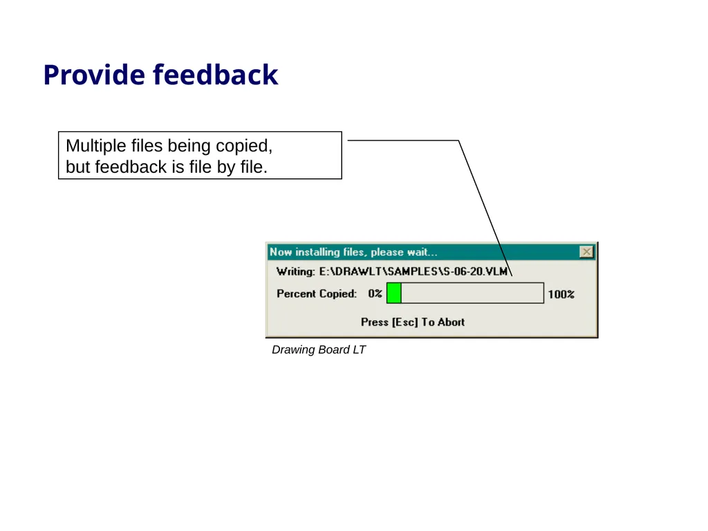
slide29. Provide feedback Drawing Board LT Multiple files being copied, but feedback is file by file.<br>
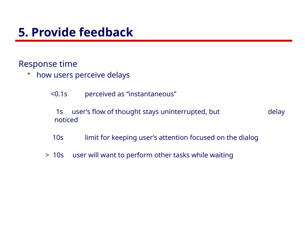
slide30. 5. Provide feedback Response time
how users perceive delays
<0.1s perceived as “instantaneous”
1s user’s flow of thought stays uninterrupted, but delay noticed
10s limit for keeping user’s attention focused on the dialog
> 10s user will want to perform other tasks while waiting<br>
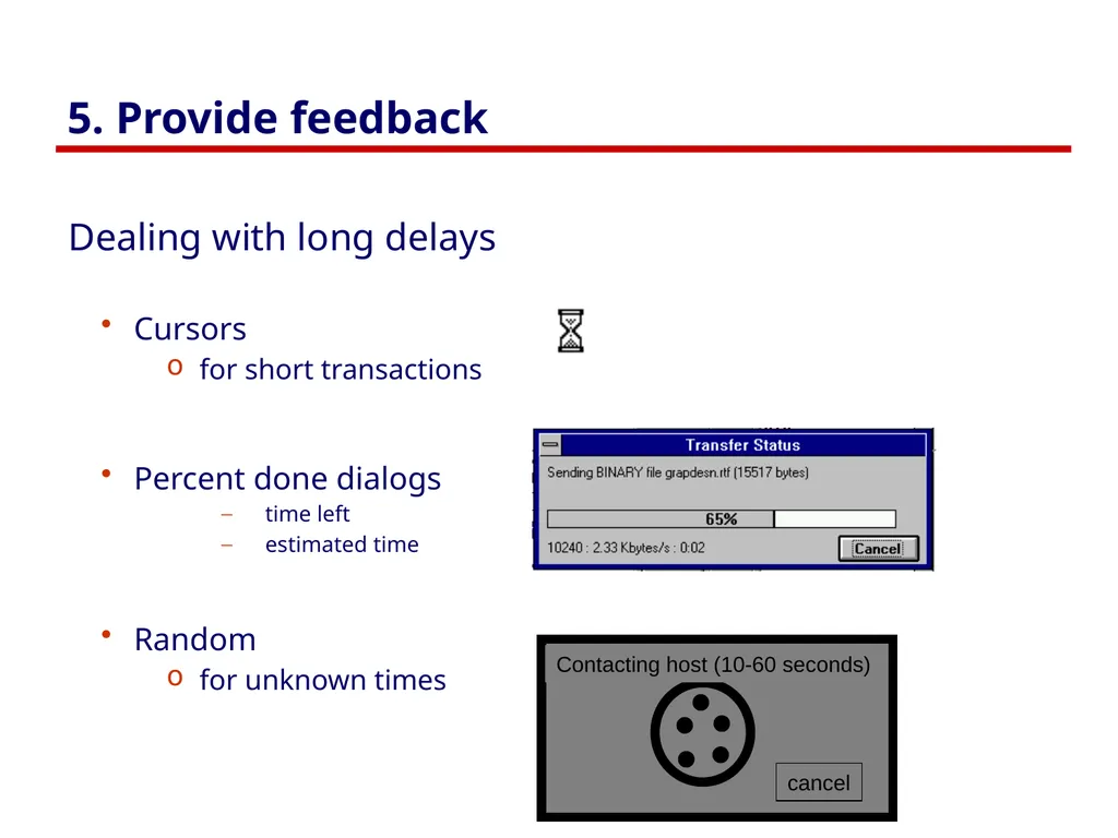
slide31. 5. Provide feedback Dealing with long delays
Cursors
for short transactions
Percent done dialogs
time left
estimated time
Random
for unknown times<br>
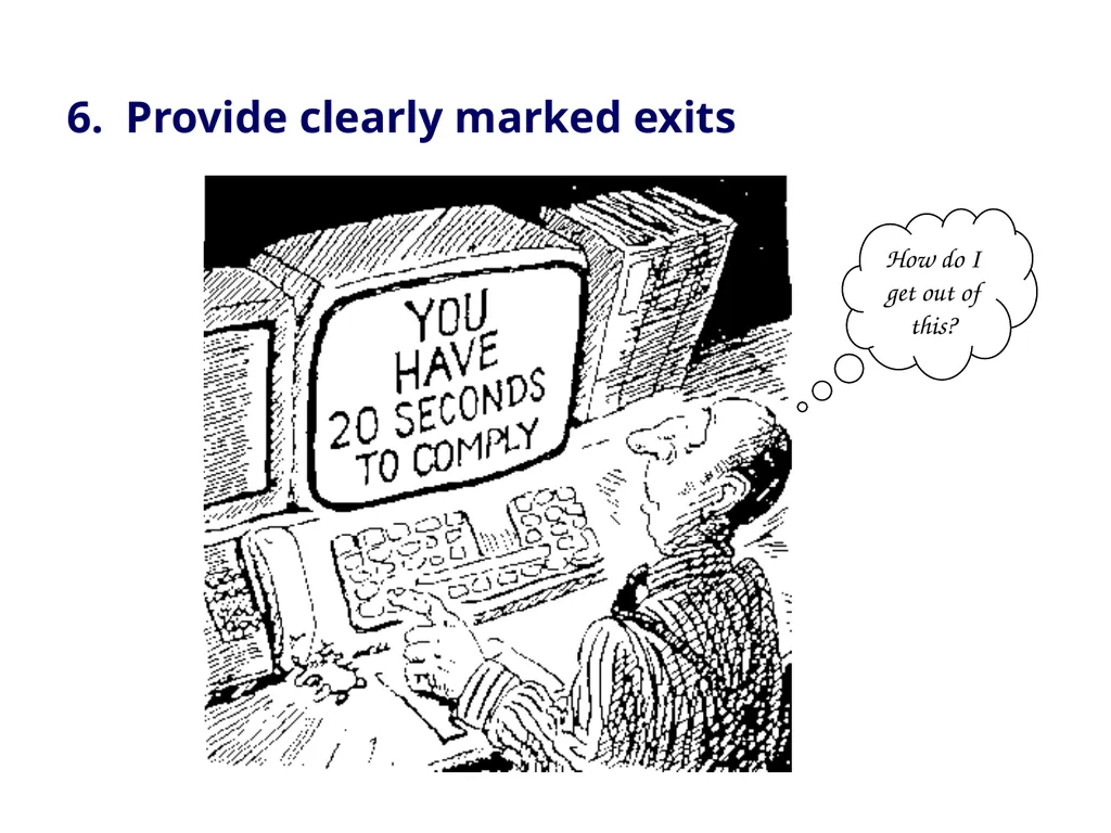
slide32. How do I get out of this? 6. Provide clearly marked exits<br>
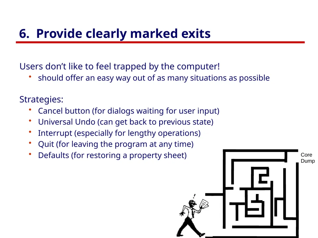
slide33. 6. Provide clearly marked exits Users don’t like to feel trapped by the computer!
should offer an easy way out of as many situations as possible
Strategies:
Cancel button (for dialogs waiting for user input)
Universal Undo (can get back to previous state)
Interrupt (especially for lengthy operations)
Quit (for leaving the program at any time)
Defaults (for restoring a property sheet)<br>
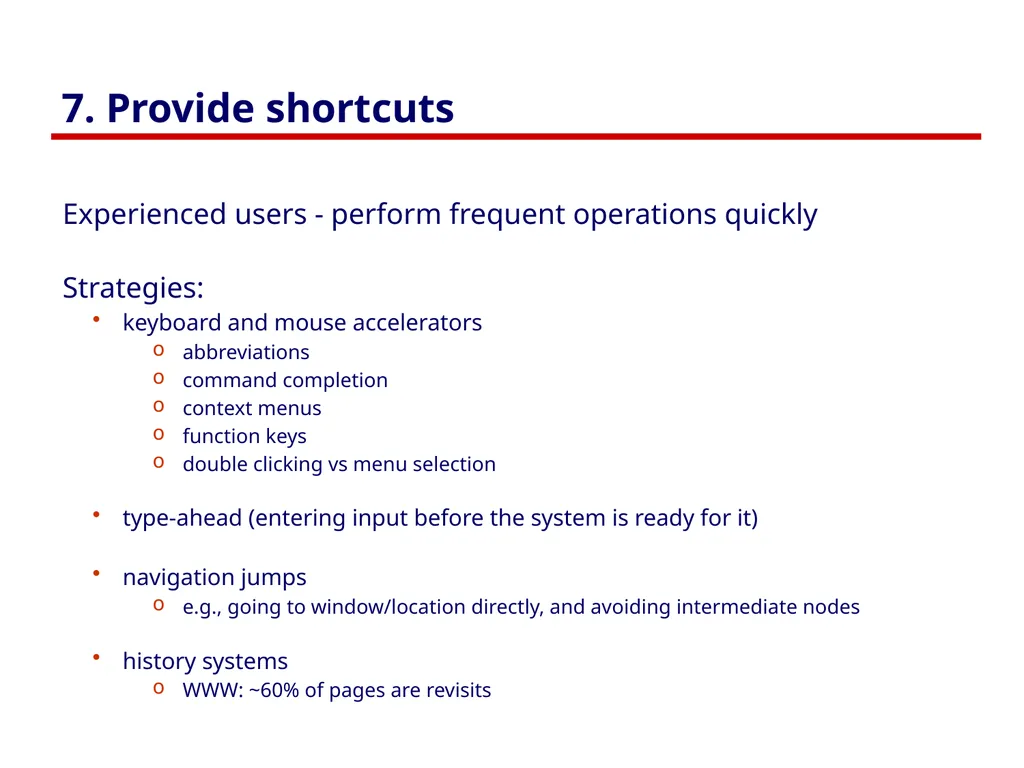
slide34. 7. Provide shortcuts Experienced users - perform frequent operations quickly
Strategies:
keyboard and mouse accelerators
abbreviations
command completion
context menus
function keys
double clicking vs menu selection
type-ahead (entering input before the system is ready for it)
navigation jumps
e.g., going to window/location directly, and avoiding intermediate nodes
history systems
WWW: ~60% of pages are revisits<br>
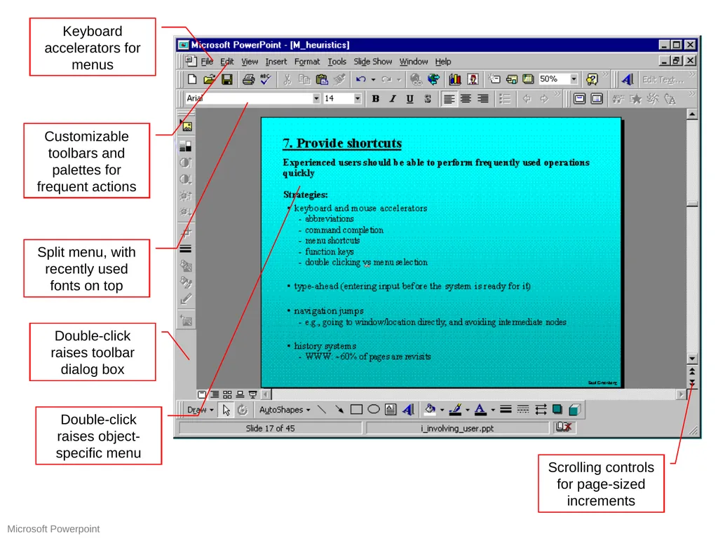
slide35. Keyboard accelerators for menus Customizable toolbars and palettes for frequent actions Split menu, with recently used fonts on top Scrolling controls for page-sized increments Double-click raises object-specific menu Double-click raises toolbar dialog box Microsoft Powerpoint<br>
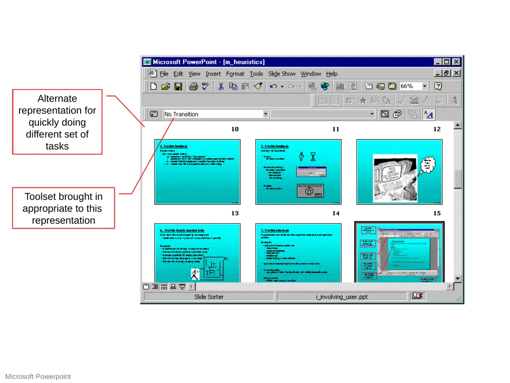
slide36. Alternate representation for quickly doing different set of tasks Toolset brought in appropriate to this representation Microsoft Powerpoint<br>
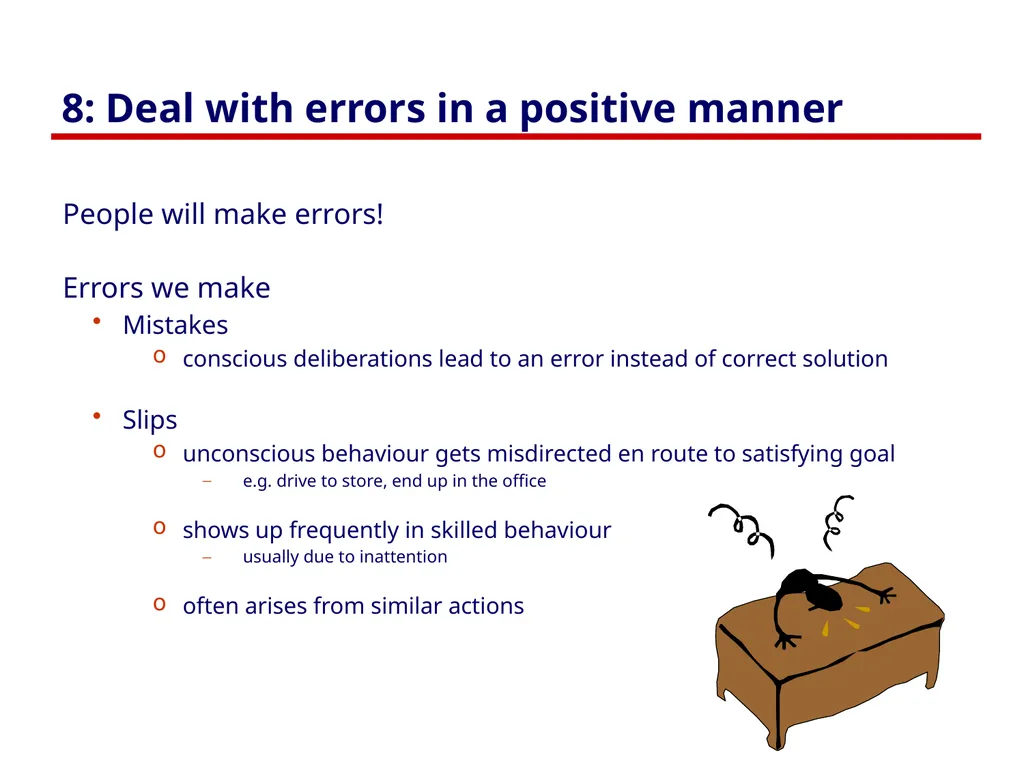
slide37. 8: Deal with errors in a positive manner People will make errors!
Errors we make
Mistakes
conscious deliberations lead to an error instead of correct solution
Slips
unconscious behaviour gets misdirected en route to satisfying goal
e.g. drive to store, end up in the office
shows up frequently in skilled behaviour
usually due to inattention
often arises from similar actions<br>
slide38. Designing for slips General rules
prevent slips before they occur
detect and correct slips when they do occur
user correction through feedback and undo<br>
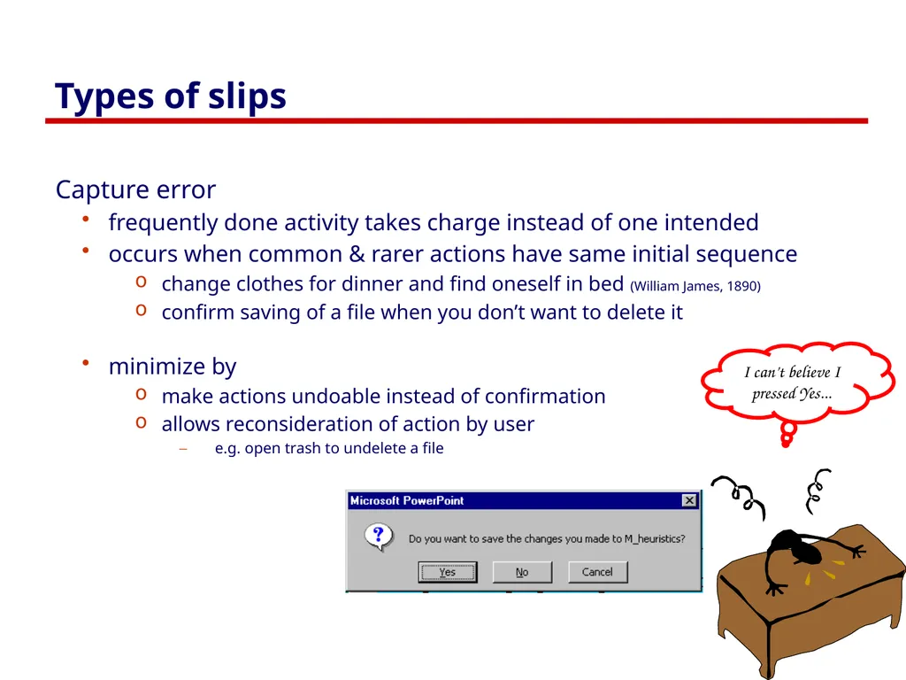
slide39. Types of slips Capture error
frequently done activity takes charge instead of one intended
occurs when common & rarer actions have same initial sequence
change clothes for dinner and find oneself in bed (William James, 1890)
confirm saving of a file when you don’t want to delete it
minimize by
make actions undoable instead of confirmation
allows reconsideration of action by user
e.g. open trash to undelete a file I can’t believe I pressed Yes...<br>
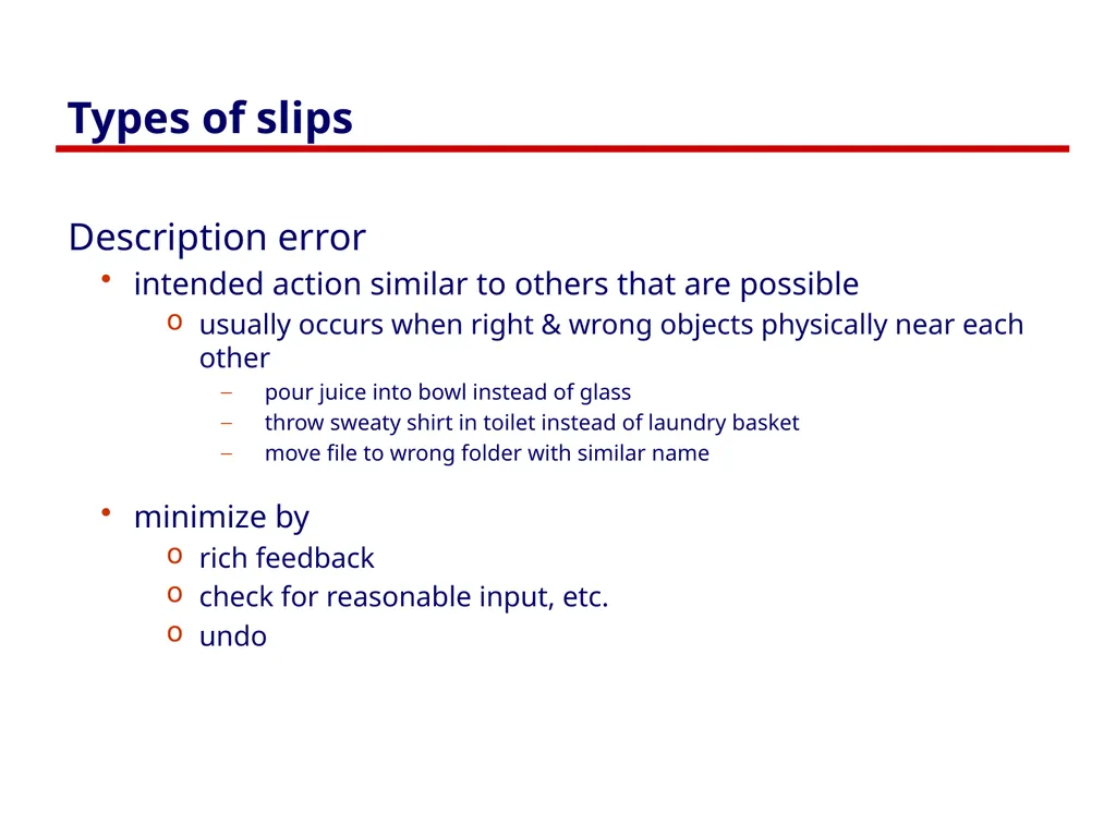
slide40. Types of slips Description error
intended action similar to others that are possible
usually occurs when right & wrong objects physically near each other
pour juice into bowl instead of glass
throw sweaty shirt in toilet instead of laundry basket
move file to wrong folder with similar name
minimize by
rich feedback
check for reasonable input, etc.
undo<br>
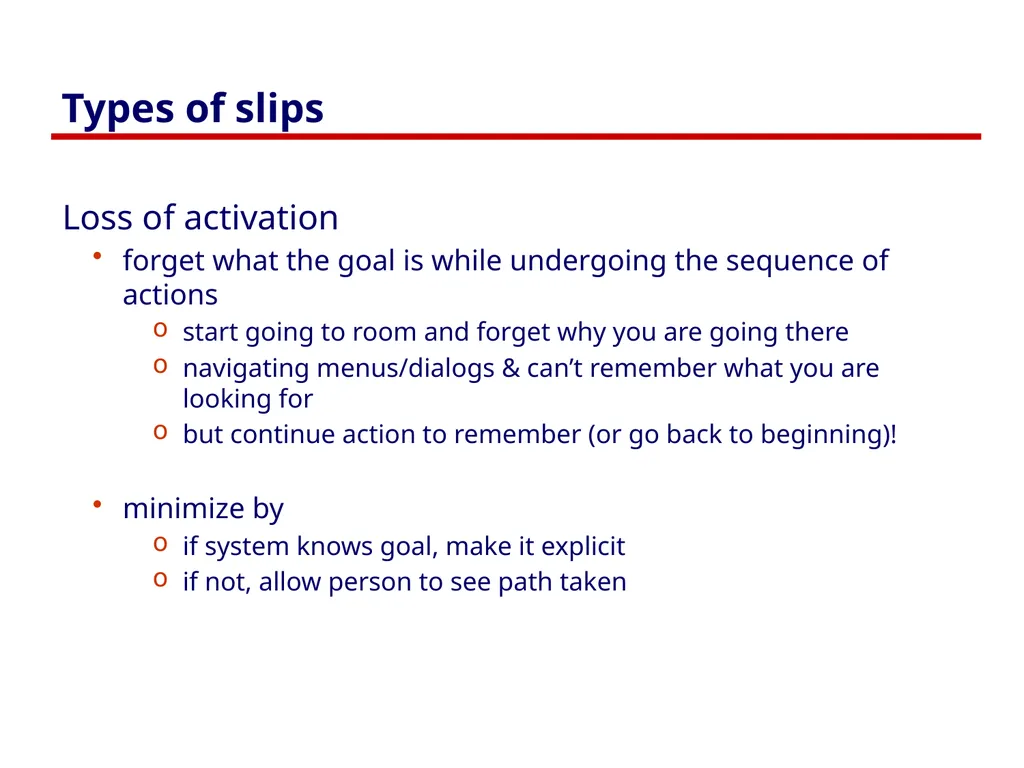
slide41. Types of slips Loss of activation
forget what the goal is while undergoing the sequence of actions
start going to room and forget why you are going there
navigating menus/dialogs & can’t remember what you are looking for
but continue action to remember (or go back to beginning)!
minimize by
if system knows goal, make it explicit
if not, allow person to see path taken<br>
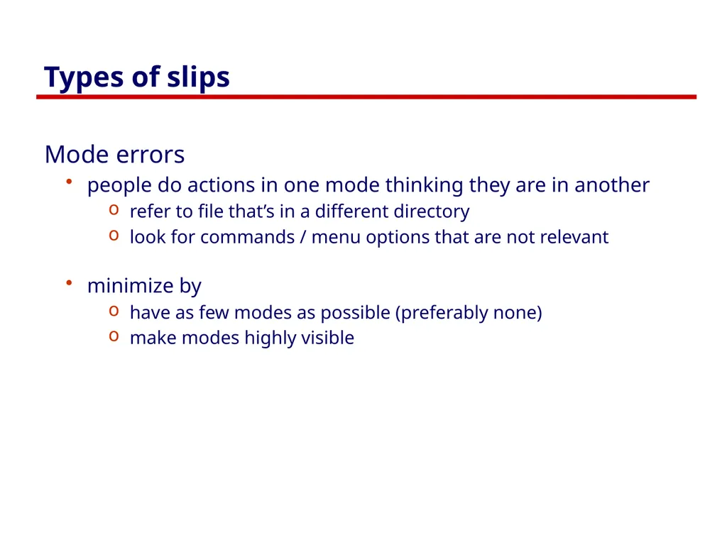
slide42. Types of slips Mode errors
people do actions in one mode thinking they are in another
refer to file that’s in a different directory
look for commands / menu options that are not relevant
minimize by
have as few modes as possible (preferably none)
make modes highly visible<br>
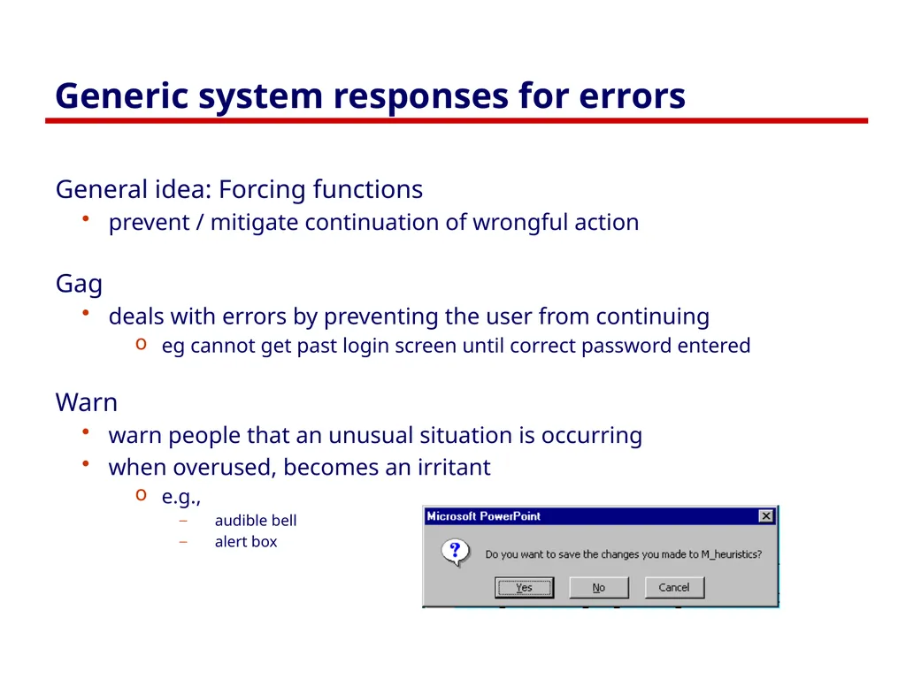
slide43. Generic system responses for errors General idea: Forcing functions
prevent / mitigate continuation of wrongful action
Gag
deals with errors by preventing the user from continuing
eg cannot get past login screen until correct password entered
Warn
warn people that an unusual situation is occurring
when overused, becomes an irritant
e.g.,
audible bell
alert box<br>
slide44. Generic system responses for errors Do nothing
illegal action just doesn’t do anything
user must infer what happened
enter letter into a numeric-only field (key clicks ignored)
put a file icon on top of another file icon (returns it to original position)
Self-correct
system guesses legal action and does it instead
but leads to a problem of trust
spelling corrector<br>
slide45. Generic system responses for errors Lets talk about it
system initiates dialog with user to come up with solution to the problem
compile error brings up offending line in source code
Teach me
system asks user what the action was supposed to have meant
action then becomes a legal one<br>
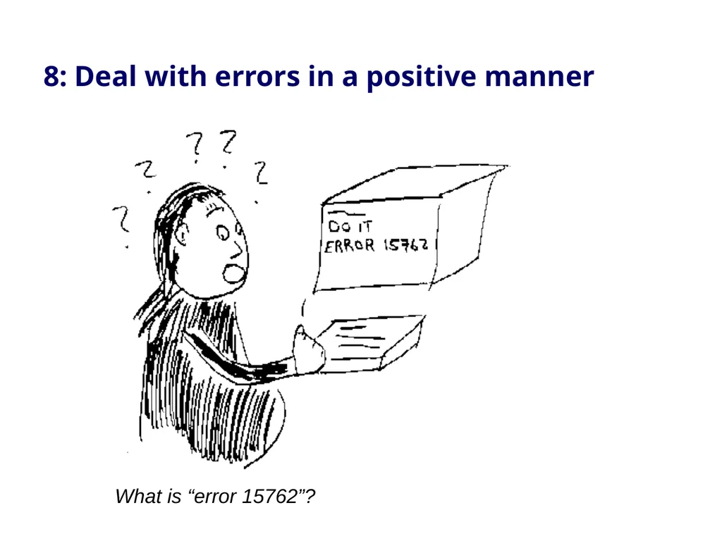
slide46. What is “error 15762”? 8: Deal with errors in a positive manner<br>
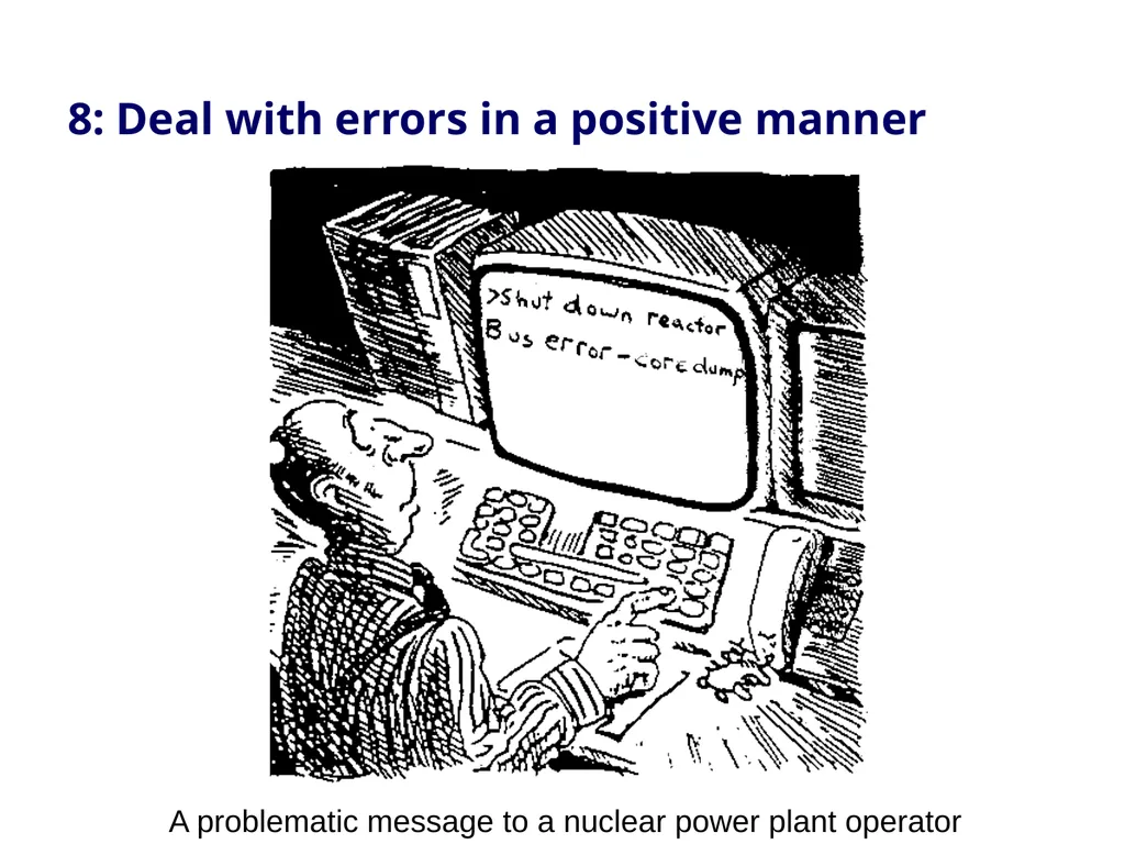
slide47. A problematic message to a nuclear power plant operator 8: Deal with errors in a positive manner<br>
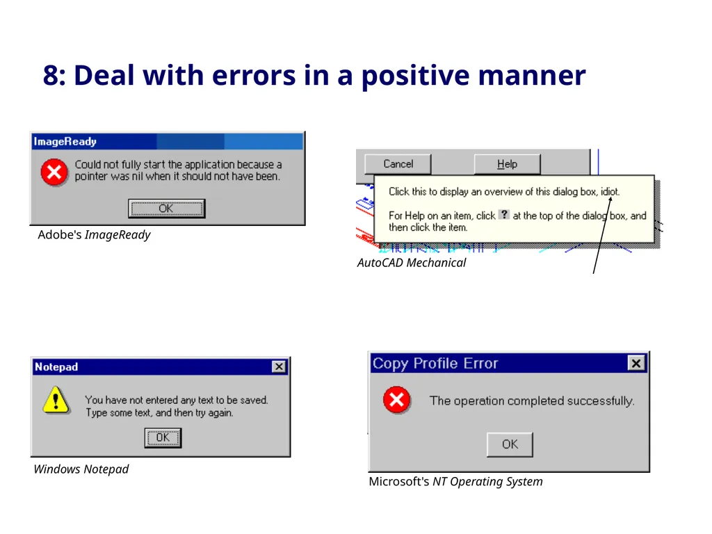
slide48. 8: Deal with errors in a positive manner Adobe's ImageReady AutoCAD Mechanical Windows Notepad Microsoft's NT Operating System<br>
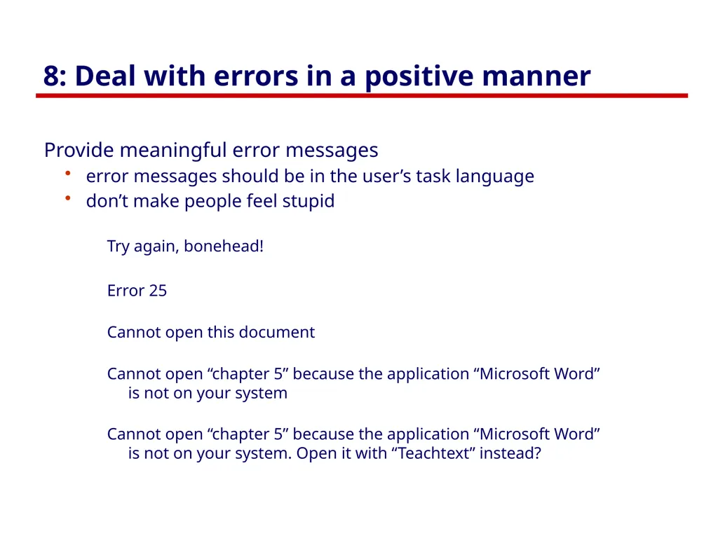
slide49. 8: Deal with errors in a positive manner Provide meaningful error messages
error messages should be in the user’s task language
don’t make people feel stupid
Try again, bonehead!
Error 25
Cannot open this document
Cannot open “chapter 5” because the application “Microsoft Word” is not on your system
Cannot open “chapter 5” because the application “Microsoft Word” is not on your system. Open it with “Teachtext” instead?<br>
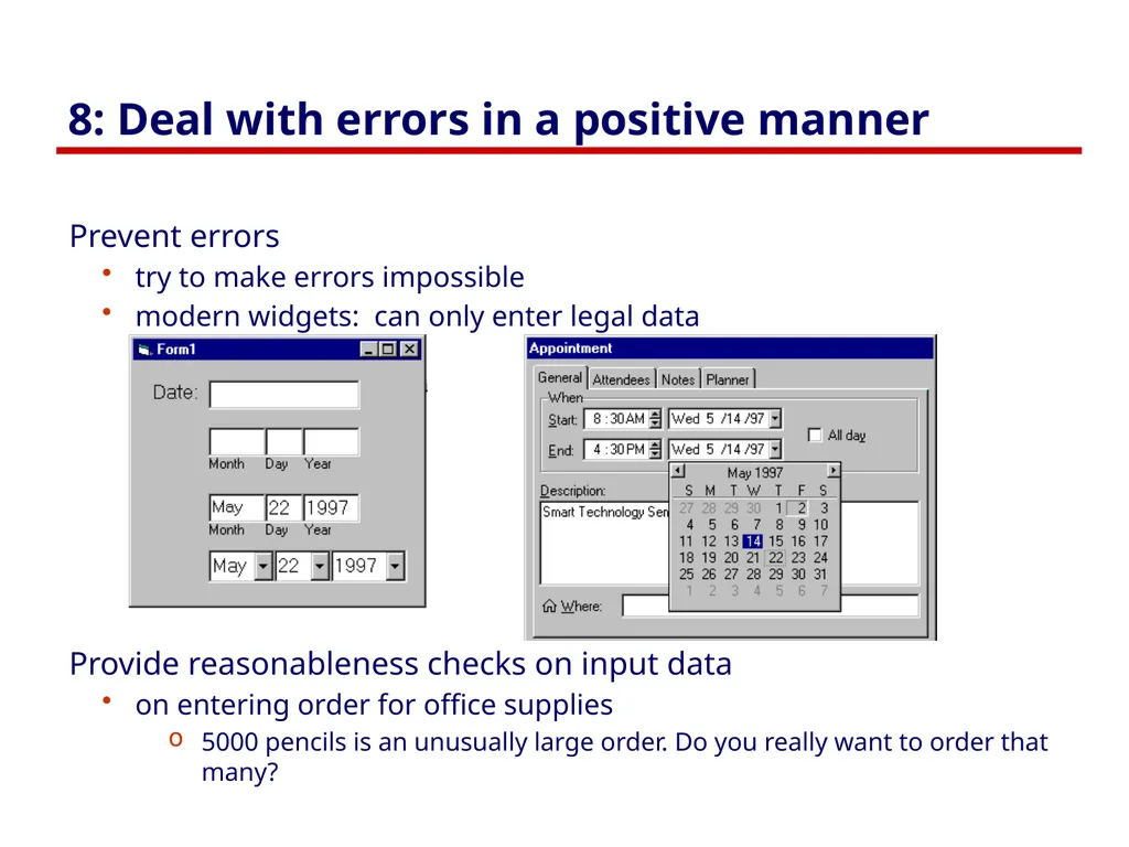
slide50. 8: Deal with errors in a positive manner Prevent errors
try to make errors impossible
modern widgets: can only enter legal data
Provide reasonableness checks on input data
on entering order for office supplies
5000 pencils is an unusually large order. Do you really want to order that many?<br>
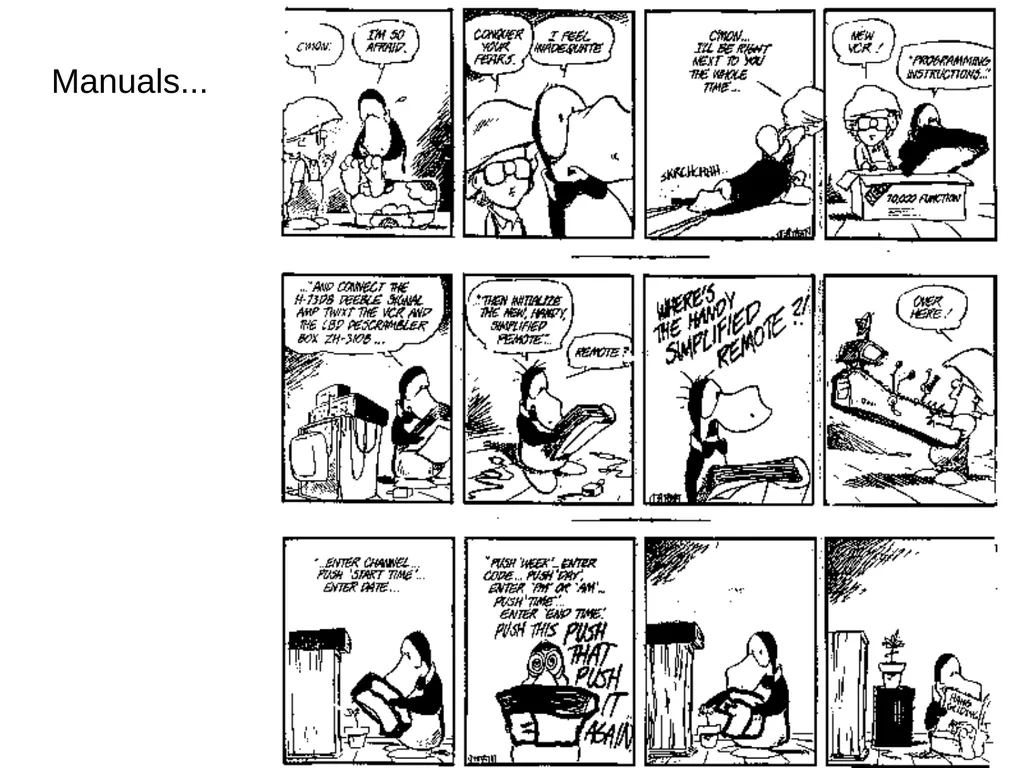
slide51. Manuals...<br>
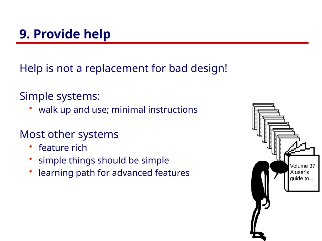
slide52. 9. Provide help Help is not a replacement for bad design!
Simple systems:
walk up and use; minimal instructions
Most other systems
feature rich
simple things should be simple
learning path for advanced features<br>
slide53. Documentation and how it is used Many users do not read manuals
prefer to spend their time pursuing their task
Usually used when users are in some kind of panic
paper manuals unavailable in many businesses!
e.g. single copy locked away in system administrator’s office
online documentation better
good search/lookup tools
online help specific to current context
Sometimes used for quick reference
syntax of actions, possibilities...
list of shortcuts ...<br>
slide54. Types of help Tutorial and/or getting started manuals
short guides that people are likely to read when first obtaining their systems
encourages exploration and getting to know the system
tries to get conceptual material across and essential syntax
on-line “tours”, exercises, and demos
demonstrates very basic principles through working examples<br>
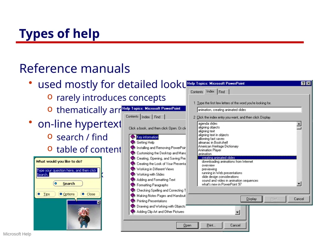
slide55. Types of help Reference manuals
used mostly for detailed lookup by experts
rarely introduces concepts
thematically arranged
on-line hypertext
search / find
table of contents
index
cross-index Microsoft Help<br>
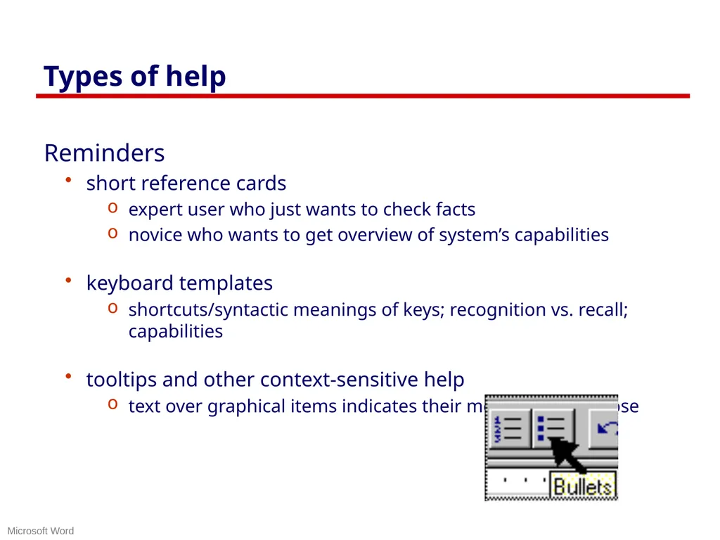
slide56. Types of help Reminders
short reference cards
expert user who just wants to check facts
novice who wants to get overview of system’s capabilities
keyboard templates
shortcuts/syntactic meanings of keys; recognition vs. recall; capabilities
tooltips and other context-sensitive help
text over graphical items indicates their meaning or purpose Microsoft Word<br>
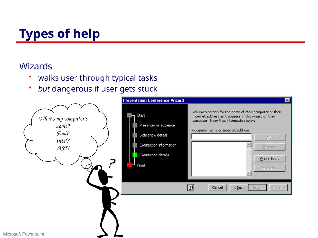
slide57. Types of help Wizards
walks user through typical tasks
but dangerous if user gets stuck What’s my computer’s name? Fred? Intel? AST? Microsoft Powerpoint<br>
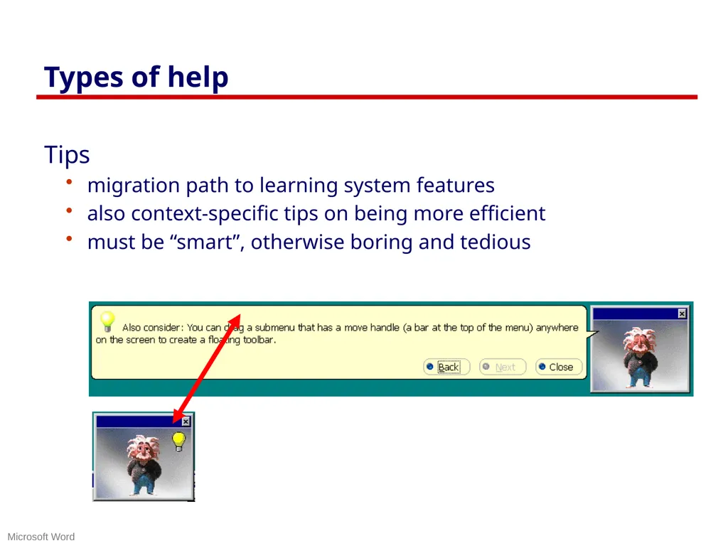
slide58. Types of help Tips
migration path to learning system features
also context-specific tips on being more efficient
must be “smart”, otherwise boring and tedious Microsoft Word<br>
slide59. Other Guidelines: Style guides Guidelines published by producers of graphical user interfaces (GUIs)
examples:
Open Software Foundation MOTIF
Open Look
MS Windows
Apple
Describes the “look and feel” of the GUI
e.g. Open Look
grouping items in the same menu:
Use white space between long groups of controls on menus or in short groups when screen real estate is not an issue
Good, but hard too follow
GUI and widget specific
vast number of guidelines
may miss fundamental design principles<br>
slide60. Example Motif Style Guide, Release 1.1 Message Dialogs Description
MessageDialogs should be used to convey a message to the user. They must not interrupt the user’s interaction with the application. They should include a message, and one of the following button arrangements.
OK
OK Help
OK Cancel
OK Cancel Help
Yes No
Yes No Help
Yes No Cancel
Yes No Cancel Help
Cancel
Cancel Help
Retry Cancel
Retry Cancel Help
Related Information
For more information, see the reference pages for DialogBox, ErrorDialog, InformationDialog, QuestionDialog, WorkingDialog, and WarningDialog Information Dialog Description
An InformationDialog should be used to convey information the the user. It must not interrupt the user’s interaction with the application. It should include an information symbol, a message, and one of the following button arrangements.
OK
OK Help
Illustration
Related Information
For more information, see the reference page for DialogBox<br>
slide61. Other Guidelines: Widget-level “guides” Toolkit “hard-wires” guidelines
repertoire of widgets
look & feel of particular widgets
grouping behaviour of widgets
Outside of “normal” programmer’s control
easier to use defaults then to re-invent the wheel!
Some toolkits
look & feel is programmer-settable or platform-dependent
Advantages:
easy to be consistent
widgets developed by experts (graphical designers, etc.)
Disadvantages
can be hacked around
interfaces “assembled” by non-interface designers can still be terrible<br>
slide62. Evaluating Heuristic evaluation Problems found by a single inspector
Problems found by multiple inspectors
Individuals vs. teams
Self guided or scenarios?<br>
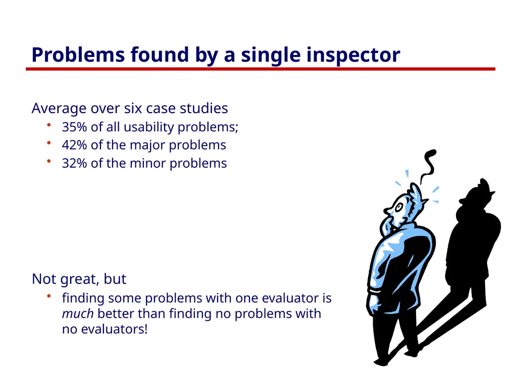
slide63. Problems found by a single inspector Average over six case studies
35% of all usability problems;
42% of the major problems
32% of the minor problems
Not great, but
finding some problems with one evaluator is much better than finding no problems with no evaluators!<br>
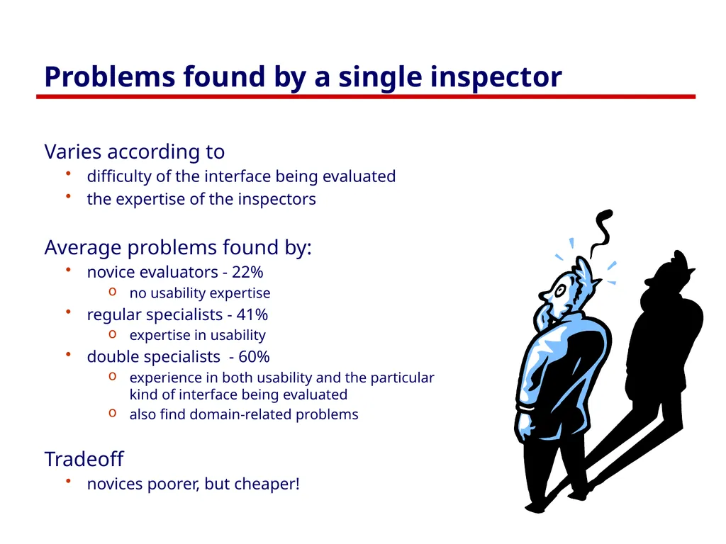
slide64. Problems found by a single inspector Varies according to
difficulty of the interface being evaluated
the expertise of the inspectors
Average problems found by:
novice evaluators - 22%
no usability expertise
regular specialists - 41%
expertise in usability
double specialists - 60%
experience in both usability and the particular kind of interface being evaluated
also find domain-related problems
Tradeoff
novices poorer, but cheaper!<br>
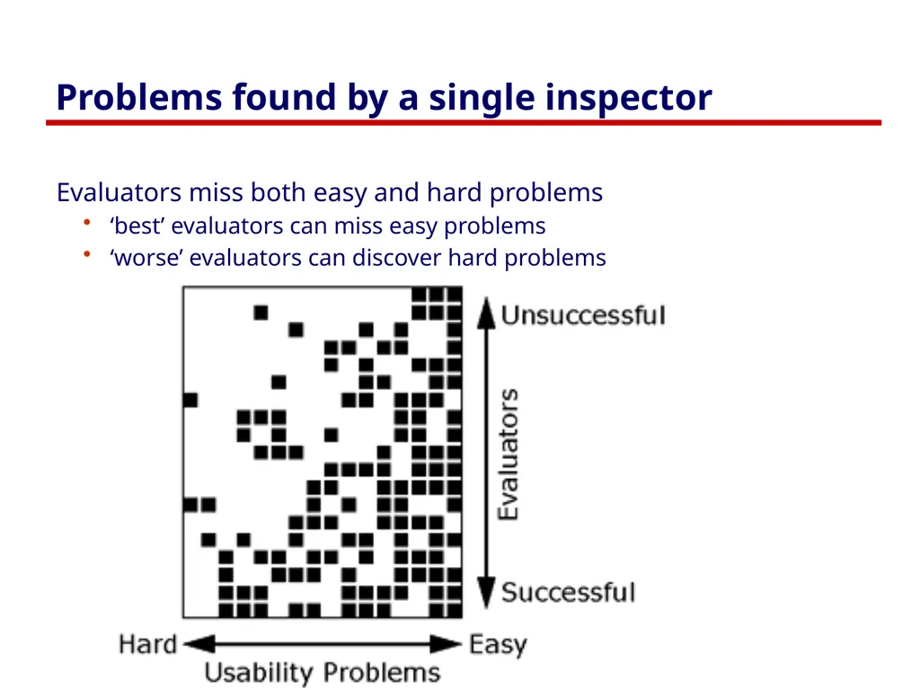
slide65. Problems found by a single inspector Evaluators miss both easy and hard problems
‘best’ evaluators can miss easy problems
‘worse’ evaluators can discover hard problems<br>
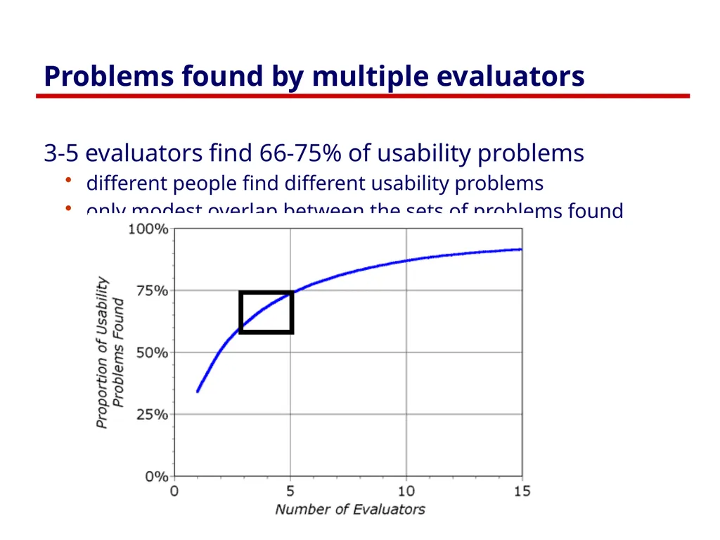
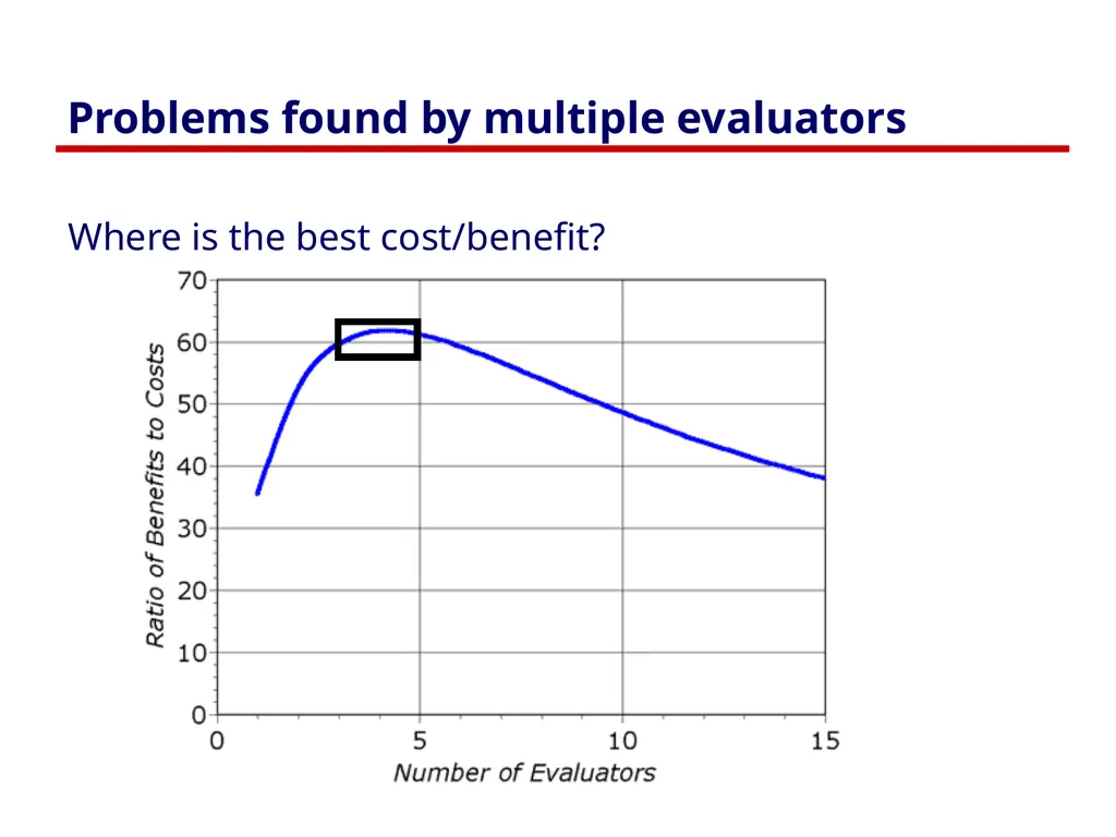
slide66. Problems found by multiple evaluators 3-5 evaluators find 66-75% of usability problems
different people find different usability problems
only modest overlap between the sets of problems found<br>
slide67. Problems found by multiple evaluators Where is the best cost/benefit?<br>
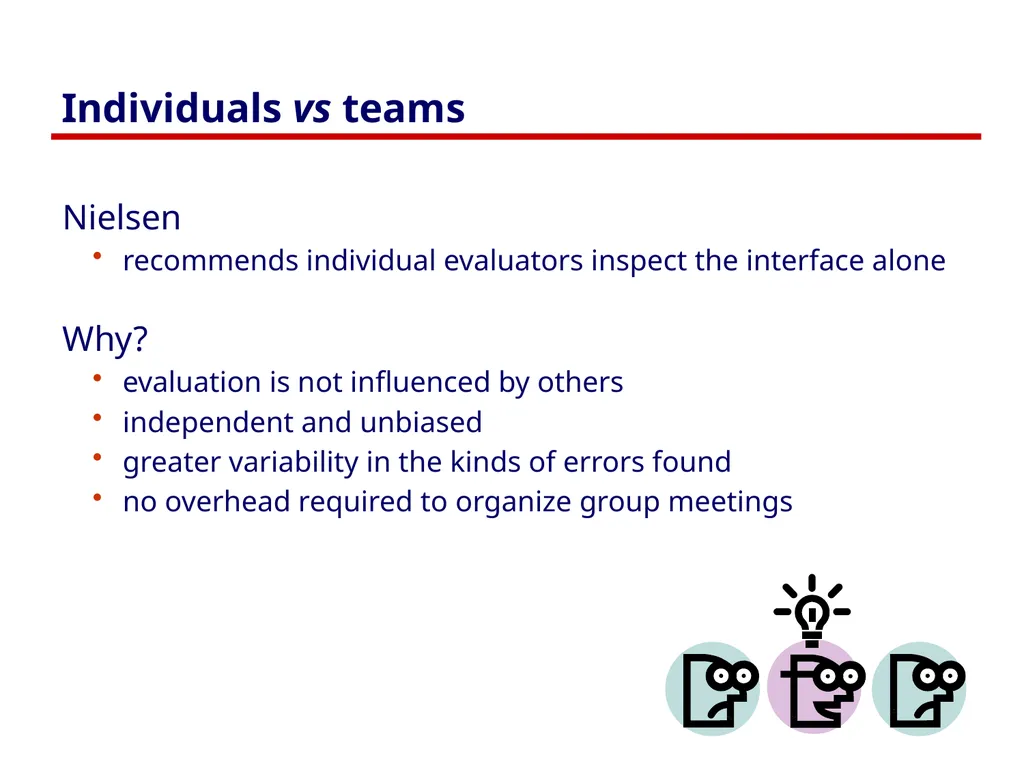
slide68. Individuals vs teams Nielsen
recommends individual evaluators inspect the interface alone
Why?
evaluation is not influenced by others
independent and unbiased
greater variability in the kinds of errors found
no overhead required to organize group meetings<br>
slide69. Self Guided vs Scenario Exploration Self-guided
open-ended exploration
Not necessarily task-directed
good for exploring diverse aspects of the interface, and to follow potential pitfalls
Scenarios
step through the interface using representative end user tasks
ensures problems identified in relevant portions of the interface
ensures that specific features of interest are evaluated
but limits the scope of the evaluation - problems can be missed<br>
slide70. You know now Nine principles of design
Simple and natural dialog
Speak the user’s language
Minimize user’s memory load
Be consistent
Provide feedback
Provide clearly marked exits
Provide shortcuts
Deal with errors in a positive manner
Provide help
Heuristic evaluation
Principles can be used to systematically inspect the interface for usability problems<br>
slide71. Primary Sources This slide deck is partly based on concepts as taught by:
Chapter 5: Usability heuristics. In Nielsen. J. Usability engineering, 1993, Academic Press.
Nielsen, J. (1994) Chapter 2: Heuristic evaluation. In J. Nielsen and R. Mack (eds) Usability Inspection Methods, p25-62, Wiley and Son
Nielsen J. and Molich, R. Improving a Human-Computer Dialogue, March 1990, Communications of the ACM 33(3), ACM Press.<br>
slide72. Permissions You are free:
to Share — to copy, distribute and transmit the work
to Remix — to adapt the work
Under the following conditions:
Attribution — You must attribute the work in the manner specified by the author (but not in any way that suggests that they endorse you or your use of the work) by citing:
“Lecture materials by Saul Greenberg, University of Calgary, AB, Canada. http://saul.cpsc.ucalgary.ca/saul/pmwiki.php/HCIResources/HCILectures”
Noncommercial — You may not use this work for commercial purposes, except to assist one’s own teaching and training within commercial organizations.
Share Alike — If you alter, transform, or build upon this work, you may distribute the resulting work only under the same or similar license to this one.
With the understanding that:
Not all material have transferable rights — materials from other sources which are included here are cited
Waiver — Any of the above conditions can be waived if you get permission from the copyright holder.
Public Domain — Where the work or any of its elements is in the public domain under applicable law, that status is in no way affected by the license.
Other Rights — In no way are any of the following rights affected by the license:
Your fair dealing or fair use rights, or other applicable copyright exceptions and limitations;
The author's moral rights;
Rights other persons may have either in the work itself or in how the work is used, such as publicity or privacy rights.
Notice — For any reuse or distribution, you must make clear to others the license terms of this work. The best way to do this is with a link to this web page.<br>
slide2. The message Nine principles of design
Simple and natural dialog
Speak the user’s language
Minimize user’s memory load
Be consistent
Provide feedback
Provide clearly marked exits
Provide shortcuts
Deal with errors in a positive manner
Provide help
Heuristic evaluation
Principles can be used to systematically inspect the interface for usability problems<br>
slide3. Design principles Broad usability statements that guide a developer’s design efforts
use the users language
provide feedback…
Derived from common design problems across many systems<br>
slide4. Heuristic evaluation Systematic inspection of interface for compliance to guidelines<br>
slide5. Heuristic evaluation Method
3-5 inspectors
usability engineers, end users, double experts…
inspect interface in isolation (~1–2 hours for simple interfaces)
compare notes afterwards
single evaluator only catches ~35% of usability problems
5 evaluators catch 75%
Works for paper, prototypes, and working systems<br>
slide6. Heuristic evaluation Advantages
“minimalist” approach
a few guidelines identify many common usability problems
easily remembered, easily applied with modest effort
discount usability engineering
end users not required
cheap and fast way to inspect a system
can be done by usability experts, double experts, and end users
Problems:
principles are more or less at the motherhood level
can’t be treated as a simple checklist
subtleties involved in their use<br>
slide7. 1 Simple and natural dialogue use the user’s conceptual model
match the users’ task sequence
minimize mapping between interface and task semantics From Microsoft applications<br>
slide8. 1 Simple and natural dialogue Present exactly the information the user needs
less is more
less to learn, to get wrong, to distract...
information should appear in natural order
related information is graphically clustered
order of accessing information matches user’s expectations
remove or hide irrelevant or rarely needed information
competes with important information on screen
remove modes
use windows frugally
don’t add unneeded navigation and window management<br>
slide9. 1 Simple and natural dialogue<br>
slide10. By previous 481 students Brant LeClercq, Lloyd Yoon, Amy Yang (with permission) Good: information all in the same place<br>
slide11. By previous 481 students Brant LeClercq, Lloyd Yoon, Amy Yang (with permission) Good: information all in the same place Bad: special edit mode<br>
slide12. By previous 481 students Brant LeClercq, Lloyd Yoon, Amy Yang (with permission)<br>
slide13. Good: Stable parts of the window Bad: Prescriptions separate from graphics By previous 481 students Brant LeClercq, Lloyd Yoon, Amy Yang (with permission)<br>
slide14. By previous 481 students Brant LeClercq, Lloyd Yoon, Amy Yang (with permission) collapsed onto one screen (needs formatting) Double click to edit (mode buttons gone) Click to get info Add Undo<br>
slide15. 2 Speak the users’ language<br>
slide16. 2 Speak the users’ language Terminology based on users’ language for task
e.g. withdrawing money from a bank machine
Use meaningful mnemonics, icons & abbreviations
eg File / Save
Ctrl + S (abbreviation)
Alt FS (mnemonic for menu action)
(tooltip icon)<br>
slide17. 2 Speak the users’ language<br>
slide18. 3 Minimize user’s memory load Computers good at remembering, people are not!
Promote recognition over recall
menus, icons, choice dialog boxes vs commands, field formats
relies on visibility of objects to the user (but less is more!) From Microsoft applications<br>
slide19. 3: Minimize user’s memory load Gives input format, example and default<br>
slide20. 3: Minimize user’s memory load Small number of rules applied universally
generic commands
same command can be applied to all interface objects
interpreted in context of interface object
copy, cut, paste, drag ’n drop, ... for characters, words, paragraphs, circles, files
context menus<br>
slide21. 3: Minimize user’s memory load<br>
slide22. 4: Be consistent Consistent syntax of input
Consist language and graphics
same visual appearance across the system (e.g. widgets)
same information/controls in same location on all windows
Consist effects
commands, actions have same effect in equivalent situations
predictability<br>
slide23. 4. Be Consistent These are labels with a raised appearance.
Is it any surprise that people try and click on them?<br>
slide24. From Peachpit website<br>
slide25. From Peachpit website<br>
slide26. 5: Provide feedback Continuously inform the user about
what it is doing
how it is interpreting the user’s input
user should always be aware of what is going on What’s it doing? Time for coffee.<br>
slide27. 5. Provide feedback What did I select? What mode am I in now? How is the system interpreting my actions? Microsoft Paint<br>
slide28. 5. Provide feedback Be as specific as possible, based on user’s input Best within the context of the action<br>
slide29. Provide feedback Drawing Board LT Multiple files being copied, but feedback is file by file.<br>
slide30. 5. Provide feedback Response time
how users perceive delays
<0.1s perceived as “instantaneous”
1s user’s flow of thought stays uninterrupted, but delay noticed
10s limit for keeping user’s attention focused on the dialog
> 10s user will want to perform other tasks while waiting<br>
slide31. 5. Provide feedback Dealing with long delays
Cursors
for short transactions
Percent done dialogs
time left
estimated time
Random
for unknown times<br>
slide32. How do I get out of this? 6. Provide clearly marked exits<br>
slide33. 6. Provide clearly marked exits Users don’t like to feel trapped by the computer!
should offer an easy way out of as many situations as possible
Strategies:
Cancel button (for dialogs waiting for user input)
Universal Undo (can get back to previous state)
Interrupt (especially for lengthy operations)
Quit (for leaving the program at any time)
Defaults (for restoring a property sheet)<br>
slide34. 7. Provide shortcuts Experienced users - perform frequent operations quickly
Strategies:
keyboard and mouse accelerators
abbreviations
command completion
context menus
function keys
double clicking vs menu selection
type-ahead (entering input before the system is ready for it)
navigation jumps
e.g., going to window/location directly, and avoiding intermediate nodes
history systems
WWW: ~60% of pages are revisits<br>
slide35. Keyboard accelerators for menus Customizable toolbars and palettes for frequent actions Split menu, with recently used fonts on top Scrolling controls for page-sized increments Double-click raises object-specific menu Double-click raises toolbar dialog box Microsoft Powerpoint<br>
slide36. Alternate representation for quickly doing different set of tasks Toolset brought in appropriate to this representation Microsoft Powerpoint<br>
slide37. 8: Deal with errors in a positive manner People will make errors!
Errors we make
Mistakes
conscious deliberations lead to an error instead of correct solution
Slips
unconscious behaviour gets misdirected en route to satisfying goal
e.g. drive to store, end up in the office
shows up frequently in skilled behaviour
usually due to inattention
often arises from similar actions<br>
slide38. Designing for slips General rules
prevent slips before they occur
detect and correct slips when they do occur
user correction through feedback and undo<br>
slide39. Types of slips Capture error
frequently done activity takes charge instead of one intended
occurs when common & rarer actions have same initial sequence
change clothes for dinner and find oneself in bed (William James, 1890)
confirm saving of a file when you don’t want to delete it
minimize by
make actions undoable instead of confirmation
allows reconsideration of action by user
e.g. open trash to undelete a file I can’t believe I pressed Yes...<br>
slide40. Types of slips Description error
intended action similar to others that are possible
usually occurs when right & wrong objects physically near each other
pour juice into bowl instead of glass
throw sweaty shirt in toilet instead of laundry basket
move file to wrong folder with similar name
minimize by
rich feedback
check for reasonable input, etc.
undo<br>
slide41. Types of slips Loss of activation
forget what the goal is while undergoing the sequence of actions
start going to room and forget why you are going there
navigating menus/dialogs & can’t remember what you are looking for
but continue action to remember (or go back to beginning)!
minimize by
if system knows goal, make it explicit
if not, allow person to see path taken<br>
slide42. Types of slips Mode errors
people do actions in one mode thinking they are in another
refer to file that’s in a different directory
look for commands / menu options that are not relevant
minimize by
have as few modes as possible (preferably none)
make modes highly visible<br>
slide43. Generic system responses for errors General idea: Forcing functions
prevent / mitigate continuation of wrongful action
Gag
deals with errors by preventing the user from continuing
eg cannot get past login screen until correct password entered
Warn
warn people that an unusual situation is occurring
when overused, becomes an irritant
e.g.,
audible bell
alert box<br>
slide44. Generic system responses for errors Do nothing
illegal action just doesn’t do anything
user must infer what happened
enter letter into a numeric-only field (key clicks ignored)
put a file icon on top of another file icon (returns it to original position)
Self-correct
system guesses legal action and does it instead
but leads to a problem of trust
spelling corrector<br>
slide45. Generic system responses for errors Lets talk about it
system initiates dialog with user to come up with solution to the problem
compile error brings up offending line in source code
Teach me
system asks user what the action was supposed to have meant
action then becomes a legal one<br>
slide46. What is “error 15762”? 8: Deal with errors in a positive manner<br>
slide47. A problematic message to a nuclear power plant operator 8: Deal with errors in a positive manner<br>
slide48. 8: Deal with errors in a positive manner Adobe's ImageReady AutoCAD Mechanical Windows Notepad Microsoft's NT Operating System<br>
slide49. 8: Deal with errors in a positive manner Provide meaningful error messages
error messages should be in the user’s task language
don’t make people feel stupid
Try again, bonehead!
Error 25
Cannot open this document
Cannot open “chapter 5” because the application “Microsoft Word” is not on your system
Cannot open “chapter 5” because the application “Microsoft Word” is not on your system. Open it with “Teachtext” instead?<br>
slide50. 8: Deal with errors in a positive manner Prevent errors
try to make errors impossible
modern widgets: can only enter legal data
Provide reasonableness checks on input data
on entering order for office supplies
5000 pencils is an unusually large order. Do you really want to order that many?<br>
slide51. Manuals...<br>
slide52. 9. Provide help Help is not a replacement for bad design!
Simple systems:
walk up and use; minimal instructions
Most other systems
feature rich
simple things should be simple
learning path for advanced features<br>
slide53. Documentation and how it is used Many users do not read manuals
prefer to spend their time pursuing their task
Usually used when users are in some kind of panic
paper manuals unavailable in many businesses!
e.g. single copy locked away in system administrator’s office
online documentation better
good search/lookup tools
online help specific to current context
Sometimes used for quick reference
syntax of actions, possibilities...
list of shortcuts ...<br>
slide54. Types of help Tutorial and/or getting started manuals
short guides that people are likely to read when first obtaining their systems
encourages exploration and getting to know the system
tries to get conceptual material across and essential syntax
on-line “tours”, exercises, and demos
demonstrates very basic principles through working examples<br>
slide55. Types of help Reference manuals
used mostly for detailed lookup by experts
rarely introduces concepts
thematically arranged
on-line hypertext
search / find
table of contents
index
cross-index Microsoft Help<br>
slide56. Types of help Reminders
short reference cards
expert user who just wants to check facts
novice who wants to get overview of system’s capabilities
keyboard templates
shortcuts/syntactic meanings of keys; recognition vs. recall; capabilities
tooltips and other context-sensitive help
text over graphical items indicates their meaning or purpose Microsoft Word<br>
slide57. Types of help Wizards
walks user through typical tasks
but dangerous if user gets stuck What’s my computer’s name? Fred? Intel? AST? Microsoft Powerpoint<br>
slide58. Types of help Tips
migration path to learning system features
also context-specific tips on being more efficient
must be “smart”, otherwise boring and tedious Microsoft Word<br>
slide59. Other Guidelines: Style guides Guidelines published by producers of graphical user interfaces (GUIs)
examples:
Open Software Foundation MOTIF
Open Look
MS Windows
Apple
Describes the “look and feel” of the GUI
e.g. Open Look
grouping items in the same menu:
Use white space between long groups of controls on menus or in short groups when screen real estate is not an issue
Good, but hard too follow
GUI and widget specific
vast number of guidelines
may miss fundamental design principles<br>
slide60. Example Motif Style Guide, Release 1.1 Message Dialogs Description
MessageDialogs should be used to convey a message to the user. They must not interrupt the user’s interaction with the application. They should include a message, and one of the following button arrangements.
OK
OK Help
OK Cancel
OK Cancel Help
Yes No
Yes No Help
Yes No Cancel
Yes No Cancel Help
Cancel
Cancel Help
Retry Cancel
Retry Cancel Help
Related Information
For more information, see the reference pages for DialogBox, ErrorDialog, InformationDialog, QuestionDialog, WorkingDialog, and WarningDialog Information Dialog Description
An InformationDialog should be used to convey information the the user. It must not interrupt the user’s interaction with the application. It should include an information symbol, a message, and one of the following button arrangements.
OK
OK Help
Illustration
Related Information
For more information, see the reference page for DialogBox<br>
slide61. Other Guidelines: Widget-level “guides” Toolkit “hard-wires” guidelines
repertoire of widgets
look & feel of particular widgets
grouping behaviour of widgets
Outside of “normal” programmer’s control
easier to use defaults then to re-invent the wheel!
Some toolkits
look & feel is programmer-settable or platform-dependent
Advantages:
easy to be consistent
widgets developed by experts (graphical designers, etc.)
Disadvantages
can be hacked around
interfaces “assembled” by non-interface designers can still be terrible<br>
slide62. Evaluating Heuristic evaluation Problems found by a single inspector
Problems found by multiple inspectors
Individuals vs. teams
Self guided or scenarios?<br>
slide63. Problems found by a single inspector Average over six case studies
35% of all usability problems;
42% of the major problems
32% of the minor problems
Not great, but
finding some problems with one evaluator is much better than finding no problems with no evaluators!<br>
slide64. Problems found by a single inspector Varies according to
difficulty of the interface being evaluated
the expertise of the inspectors
Average problems found by:
novice evaluators - 22%
no usability expertise
regular specialists - 41%
expertise in usability
double specialists - 60%
experience in both usability and the particular kind of interface being evaluated
also find domain-related problems
Tradeoff
novices poorer, but cheaper!<br>
slide65. Problems found by a single inspector Evaluators miss both easy and hard problems
‘best’ evaluators can miss easy problems
‘worse’ evaluators can discover hard problems<br>
slide66. Problems found by multiple evaluators 3-5 evaluators find 66-75% of usability problems
different people find different usability problems
only modest overlap between the sets of problems found<br>
slide67. Problems found by multiple evaluators Where is the best cost/benefit?<br>
slide68. Individuals vs teams Nielsen
recommends individual evaluators inspect the interface alone
Why?
evaluation is not influenced by others
independent and unbiased
greater variability in the kinds of errors found
no overhead required to organize group meetings<br>
slide69. Self Guided vs Scenario Exploration Self-guided
open-ended exploration
Not necessarily task-directed
good for exploring diverse aspects of the interface, and to follow potential pitfalls
Scenarios
step through the interface using representative end user tasks
ensures problems identified in relevant portions of the interface
ensures that specific features of interest are evaluated
but limits the scope of the evaluation - problems can be missed<br>
slide70. You know now Nine principles of design
Simple and natural dialog
Speak the user’s language
Minimize user’s memory load
Be consistent
Provide feedback
Provide clearly marked exits
Provide shortcuts
Deal with errors in a positive manner
Provide help
Heuristic evaluation
Principles can be used to systematically inspect the interface for usability problems<br>
slide71. Primary Sources This slide deck is partly based on concepts as taught by:
Chapter 5: Usability heuristics. In Nielsen. J. Usability engineering, 1993, Academic Press.
Nielsen, J. (1994) Chapter 2: Heuristic evaluation. In J. Nielsen and R. Mack (eds) Usability Inspection Methods, p25-62, Wiley and Son
Nielsen J. and Molich, R. Improving a Human-Computer Dialogue, March 1990, Communications of the ACM 33(3), ACM Press.<br>
slide72. Permissions You are free:
to Share — to copy, distribute and transmit the work
to Remix — to adapt the work
Under the following conditions:
Attribution — You must attribute the work in the manner specified by the author (but not in any way that suggests that they endorse you or your use of the work) by citing:
“Lecture materials by Saul Greenberg, University of Calgary, AB, Canada. http://saul.cpsc.ucalgary.ca/saul/pmwiki.php/HCIResources/HCILectures”
Noncommercial — You may not use this work for commercial purposes, except to assist one’s own teaching and training within commercial organizations.
Share Alike — If you alter, transform, or build upon this work, you may distribute the resulting work only under the same or similar license to this one.
With the understanding that:
Not all material have transferable rights — materials from other sources which are included here are cited
Waiver — Any of the above conditions can be waived if you get permission from the copyright holder.
Public Domain — Where the work or any of its elements is in the public domain under applicable law, that status is in no way affected by the license.
Other Rights — In no way are any of the following rights affected by the license:
Your fair dealing or fair use rights, or other applicable copyright exceptions and limitations;
The author's moral rights;
Rights other persons may have either in the work itself or in how the work is used, such as publicity or privacy rights.
Notice — For any reuse or distribution, you must make clear to others the license terms of this work. The best way to do this is with a link to this web page.<br>