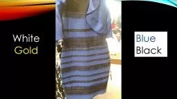
Gold Blue Black Unit 3 Introduction into critical and contextual awareness in Art amp Design 11 Critically compare a range of critical perspectives that influence the analysis of art and design ID: 616079
Download Presentation The PPT/PDF document "White" is the property of its rightful owner. Permission is granted to download and print the materials on this web site for personal, non-commercial use only, and to display it on your personal computer provided you do not modify the materials and that you retain all copyright notices contained in the materials. By downloading content from our website, you accept the terms of this agreement.
Slide1
White
Gold
Blue
BlackSlide2
Unit 3
Introduction into critical and contextual awareness in Art & Design
1.1 Critically compare a range of critical perspectives that influence the analysis of art and design. Slide3
Name of the artist
Birth date of the artist
Research to interpret the artwork to
contextualise
Name of the art work
Death date of the artist (if applicable)
Year the art work was created
Description of materials used in the art work
Detailed description of how the chosen piece supports you own ideas and project work
Description of how the art work was created (techniques, processes and skills)
Brief biography of the life of the artist
Concluding reflective comments about your findings
Detailed biography of the artist
Your own understanding of what the art work represents
Where the artist studied
Other examples of the artist’s work
Quote a source to
contextualise
work / ideas
Relevant information taken from Wikipedia
AnalysisSlide4
PerspectiveSlide5
Perspective
What does it mean?See, hear or become aware of something by using our sensesThe way in which something is regarded, understood or interpretedSlide6
DISCUSSION on perception
If a lion could speak we would still be unable to understand it.(Ludwig Wittgenstein)
Humans share both a perceptual and a conceptual apparatus. We also behave in broadly similar ways, i.e. we share what anthropologists call 'universals' and Wittgenstein calls 'forms of life'. Because we share all these things, we have language in common.
A lion doesn't share any of this with us. We have no idea what the world looks like, both literally and in a broader sense, to a lion. None. Slide7
QUALIA
1. a quality or property as perceived or experienced by a personSlide8
Perspective
What colour is this?
What shade is this?Slide9Slide10
SUBJECTIVE
1. based on or influenced by personal feelings, tastes, or opinions."his views are highly subjective“
Synonyms
personal
, personalized, individual, internal, emotional, instinctive, intuitive, impressionistic;
More biased
, prejudiced, bigoted, idiosyncratic,
irrational, gut reaction Slide11
assumption
Thing that is accepted as true or as certain to happen, without proof.“We assume that was we are seeing is correct”
Synonyms
supposition, presupposition, presumption, premise, belief, expectation, conjecture, speculation, surmise, guess, theory, hypothesis, postulation, conclusion, deduction, inference, thought, suspicion, notion, impression, fancy;
guessworkSlide12
ASSUMPTIONSlide13
Namibia’s HimbA TribeSlide14Slide15Slide16
EXPLANATORY GAP
Inability to explain something to someone who is unable to experience it.ExamplesExplaining the colour red to a blind personExplaining an emotion to artificial intelligence
Ted Lowe on BBC’s 2 snooker championships infamously unhelpful quote “For those watching in black and white the pink is next to the green ball”.Slide17Slide18
“More
than 541 million years ago, during the Precambrian Eon, life existed in a quiet gloom. Most creatures were blind, so colour was of little use”.(NHM, 2016)Slide19Slide20
XSlide21Slide22
Subjective
The Colour Queen: Her Super Vision allows her to see up to 100X more colour than an average person.Her rare genetotype provides a fourth cone in her eye.
Her “Super Vision” status takes her beyond previously known artistic
colour
and value use
.
As if by magic, her process is so powerful it creates disbelief for the viewers
.Slide23Slide24
Objective
Objective1. (of a person or their judgement) not influenced by personal feelings or opinions in considering and representing facts."historians try to be objective and impartial"
synonyms:
Impartial, unbiased, unprejudiced, non-partisan, non-discriminatory, neutral, uninvolved, even-handed, equitable, fair, fair-minded, just, open-minded, dispassionate, detached, impersonal, unemotional, clinicalSlide25
Objective
While tetrachromacy is so rare that it makes headlines every time a new case emerges, it might come as a surprise that women with four cone types in their retinas are actually more common than we think. Researchers estimate that they represent as much as 12% of the female population. (Delniv, 2015).
because perceiving
color
is a personal experience, they would have no way of knowing they see far beyond what we consider the limits of human vision
. (Greenwood, 2012)
"Most of the things that we see as coloured are manufactured by people who are trying to make colours that work for
trichromats," he said. "It could be that our whole world is tuned to the world of the trichromat.“ In other words, the colours we use are so limited that the fourth cone cell never gets a work out. (MacDonald, 2016)Enhanced sensitivity is not always a blessing, though. “The grocery store is a nightmare,” she says. “It’s like a trash pile of colour coming in at every angle.” That enhanced sensitivity might explain why she finds solace in plain white surfaces. “People find that extraordinary that white is my favourite colour, but it makes sense because it is so peaceful and restful for my eyes. There is still a lot of colour in it, but it’s not hurting me.”Slide26
QUESTIONWhat can we do to be less subjective and more objective? What can we do to be more informed so we don’t have to assume things? Slide27
Question
“In
1963, Lawrence Herbert, Pantone's founder, created an innovative system for identifying, matching and communicating
colors
to solve the problems associated with producing accurate
color
matches in the graphic arts community. His insight that the spectrum is seen and interpreted differently by each individual led to the innovation of the PANTONE® MATCHING SYSTEM®, a book of standardized color in fan format”. (Pantone.com, 2017)How can we use colour subjectively so that we ensure that we are using the same colour and that my duck egg is not your arctic blue?Slide28
What does Antico see when she looks at this viral photo of the dress? "
This dress is a colored or darker version of gray," she writes on her Facebook page. "It has hints of lilac, blues, grays, pinks... not bright but subtle... it is definitely not appearing dark as in black or dark blue on my monitor. In the gold area or lace there is some gold yellow but also
grayish
gold brown and lighter gold beiges."