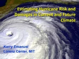
/
Hurricane Sandy: A Progress Report and a Look Into the Future of the P/C Insurance Industry Hurricane Sandy: A Progress Report and a Look Into the Future of the P/C Insurance Industry

Hurricane Sandy: A Progress Report and a Look Into the Future of the P/C Insurance Industry - PowerPoint Presentation

briana-ranney
briana-ranney . @briana-ranney
Follow
352 views
Uploaded On 2018-10-12

Hurricane Sandy: A Progress Report and a Look Into the Future of the P/C Insurance Industry - PPT Presentation

Independent Insurance Agents and Brokers of Suffolk amp TriCounty Melville NY March 14 2013 Download at wwwiiiorgpresentations Robert P Hartwig PhD CPCU President amp Economist ID: 688199

2012 insurance 9pm 2011 insurance 2012 2011 9pm institute information losses source sources average financial states insured 2013 2010

Share:

Link:

Embed:

Download Presentation from below link

Download Presentation The PPT/PDF document "Hurricane Sandy: A Progress Report and a..." is the property of its rightful owner. Permission is granted to download and print the materials on this web site for personal, non-commercial use only, and to display it on your personal computer provided you do not modify the materials and that you retain all copyright notices contained in the materials. By downloading content from our website, you accept the terms of this agreement.


Presentation Transcript

Slide1

Hurricane Sandy: A Progress Report and a Look Into the Future of the P/C Insurance Industry

Independent Insurance Agents and Brokers of Suffolk & Tri-CountyMelville, NYMarch 14, 2013Download at www.iii.org/presentations

Robert P. Hartwig, Ph.D., CPCU, President & Economist

Insurance Information Institute  110 William Street  New York, NY 10038

Tel: 212.346.5520  Cell: 917.453.1885  bobh@iii.org  www.iii.orgSlide2

Meterological

Hat Trick: Poor Islip Can’t Catch a Break…2

…From the

Twittersphere

Long Islander’s understand that Mother Nature has not been kind to themSlide3

3

P/C Insurance Industry Financial Overview

Profit Recovery

in 2012 After High CAT Losses; Ultimate Impact of Sandy Still Unclear

12/01/09 - 9pm

3Slide4

P/C Net Income After Taxes1991–2012:Q3 ($ Millions)

2005 ROE*= 9.6%

2006 ROE = 12.7%

2007 ROE = 10.9%

2008 ROE =

0.1%

2009

ROE

=

5.0%

2010

ROE

=

6

.6%

2011 ROAS

1 = 3.5%2012:Q3 ROAS1 = 6.3%

P-C Industry 2012:Q3 profits were up 222% from 2011:Q3, due primarily to lower catastrophe losses

* ROE figures are GAAP;

1

Return on avg. surplus. Excluding Mortgage & Financial Guaranty insurers yields a

6.6% ROAS through 2012:Q3, 4.6%

ROAS for

2011, 7.6%

for 2010 and 7.4% for 2009.

Sources: A.M. Best, ISO, Insurance Information InstituteSlide5

A 100 Combined Ratio Isn’t What ItOnce Was: Investment Impact on ROEs

Combined Ratio / ROE

*

2008

-

2012

figures

are return on average surplus and exclude

mortgage and financial guaranty

insurers. 2012:Q3 combined ratio including M&FG insurers is 100.9, ROAS = 6.3%; 2011 combined ratio including M&FG insurers is 108.2, ROAS = 3.5%.

Source: Insurance Information Institute from A.M. Best and ISO data.

Combined Ratios Must Be Lower in Today’s Depressed

Investment Environment to Generate Risk Appropriate ROEs

A combined ratio of about 100

generates an ROE of ~6.6% in 2012, ~7.5

% ROE in 2009/10,

10% in 2005 and 16% in 1979

Year Ago2011:Q3 = 108.1, 3.1% ROESlide6

Profitability Peaks & Troughs in the P/C Insurance Industry, 1975 – 2012:Q3*

*Profitability = P/C insurer

ROEs.

2011 figure is an estimate based on

ROAS data

. Note: Data for

2008-2012

exclude mortgage and financial guaranty insurers

.

2012:Q3 ROA

S = 6.2% including M&FG.

Source: Insurance Information Institute; NAIC, ISO, A.M. Best.

1977:19.0%

1987:17.3%

1997:11.6%

2006:12.7%

1984: 1.8%

1992: 4.5%

2001: -1.2%

10 Years

10 Years

9 Years

2011:4.6%*

History suggests next ROE peak will be in 2016-2017

ROE

1975: 2.4%

2012:Q3: 6.6%Slide7

12/01/09 - 9pm

eSlide – P6466 – The Financial Crisis and the Future of the P/C

7

ROE vs. Equity Cost of Capital:

U.S. P/C Insurance:1991-2012*

* Return on average surplus in

2008-2012

excluding mortgage and financial guaranty insurers

. 2012 figures are III estimates.

Source: The Geneva Association, Insurance Information Institute

-13.2 pts

+1.7 pts

+2.3 pts

-9.0 pts

-6.4 pts

-3.2 pts

The P/C Insurance Industry Fell Well

Short of Its Cost of Capital

Every Year Since 2008

US P/C Insurers Missed Their Cost of Capital by an Average 6.7 Points from 1991 to 2002, but on Target or Better 2003-07, Fell Short in

2008-2012

The

Cost of Capital

is the Rate of Return Insurers Need to Attract and Retain Capital to the Business

(Percent)

-

2.4

pts

-7.3 pts

-6.9 ptsSlide8

8

Personal Lines Profitability Analysis

Significant Variability Over Time and Across StatesSlide9

9

*Latest available.

Sources

:

NAIC.

Return on Net Worth: Homeowners Insurance,

10-Year Average

(2002-2011*)

Hawaii was the most profitable state for home insurers from

2002-2011

due to the absence of hurricanes during this period

(Percent)

Top 25 States

Sandy will pull down NY’s profitability numbersSlide10

10

*Latest available.Sources: NAIC

Hurricanes Katrina and Rita made Louisiana and Mississippi the least profitable states for home insurers from

2002-2011

Bottom 25 States

(Percent)

Return on Net Worth: Homeowners Insurance,

10-Year Average

(2002-2011*)Slide11

11

Return on Net Worth: All P-C Lines vs. Homeowners, 1990-2011*

*Latest available.

**Excluding

Hurricane Andrew (1992); Including 1992

produces

an average

homeowners RNW of

0.5%.

Sources:

NAIC; Insurance Information Institute.

(Percent)

Average RNW:

1990-2011*

All P-C Lines:

7.8% Homeowners

: 3.2%**Homeowners Insurance Is Considerably More Volatile than the Market Overall Due to Coastal Exposure and Interior Wind/Hail Events

Impact of Hurricane IreneKatrina, Rita, Wilma

Texas “Mold” CrisisSlide12

12

*Latest available.

Sources

:

NAIC.

Hawaii

was the most profitable state for auto insurers from

2002-2011

Return on Net Worth: Pvt. Passenger Auto,

10-Year Average

(2002-2011*)

Top 25 States

(Percent)Slide13

13

Return on Net Worth: Pvt. Passenger Auto,

10-Year Average

(2002-2011*)

*Latest

available

.

Sources: NAIC

Michigan

was the least profitable state for auto insurers from

2002-2011

(Percent)

Bottom 25 StatesSlide14

14

Profitability and Growth in New York P/C Insurance Markets

Analysis by Line and Nearby State ComparisonsSlide15

15

RNW All Lines: NY vs. U.S., 2002-2011

Sources: NAIC.

(Percent)

Average 2002-2011

US: 7.7%

NY: 5.9%Slide16

16

RNW Homeowners: NY vs. U.S.,2002-2011

Sources: NAIC.

(Percent)

Average 2002-2011

US: 5.4%

NY: 17.8%

NY profitability in 2012 will take a nosedive due to SandySlide17

17

RNW PP Auto: NY vs. U.S., 2002-2011

Sources: NAIC.

Average 2002-2011

US: 7.7%

NY: 9.1%Slide18

18

RNW Comm. Auto: NY vs. U.S.,2002-2011

Sources: NAIC.

(Percent)

Average 2002-2011

US: 9.8%

NY: 8.4%Slide19

19

RNW Comm. Multi-Peril: NY vs. U.S.,2002-2011

Sources: NAIC.

(Percent)

Average 2002-2011

US: 9.1%

NY: 11.6%Slide20

20

RNW Workers Comp: NY vs. U.S.,2002-2011

Sources: NAIC.

(Percent)

Average 2002-2011

US: 6.7%

NY: 5.0%Slide21

All Lines: 10-Year Average RNW NY & Nearby States

Source: NAIC, Insurance Information Institute

2002-2011

New York All Lines profitability is below the US and regional averageSlide22

Homeowners: 10-Year Average RNW NY & Nearby States

Source: NAIC, Insurance Information Institute

2002-2011

New York Homeowners profitability is above the US and regional

average (Sandy will cause figure to drop)Slide23

23

Top Ten Most Expensive And Least Expensive States For Homeowners Insurance, 2010 (1)

Rank

Most

expensive

states

Average expenditure

Rank

Least

expensive states

Average

expenditure

1

Texas (2)

$1,560

1

Idaho

$500

2

Louisiana (3)

1,546

2

Oregon

535

3

Florida (4)

1,544

3

Utah

558

4

Oklahoma

1,246

4

Wisconsin

563

5

Mississippi

1,217

5

Washington

595

6

Rhode Island

1,092

6

Ohio

614

7

Kansas

1,066

7

Delaware

636

8

District Of Columbia

1,065

8

Arizona

666

9

Connecticut

1,052

9

Maine

676

10

Alabama

1,050

10

South Dakota

678

Based on the HO-3 homeowner package policy for owner-occupied dwellings, 1 to 4 family units. Provides “all risks” coverage (except those specifically excluded in the policy) on buildings and broad named-peril coverage on personal property, and is the most common package written.

The Texas Department of Insurance developed home insurance policy forms that are similar but not identical to the standard forms. Note: Average premium=Premiums/exposure per house years. A house year is equal to 365 days of insured coverage for a single dwelling. The NAIC does not rank State Average Expenditures and does not endorse any conclusions drawn from this data.

Policies written by Citizens Property Insurance (Louisiana), are not included.

Policies written by Citizens Property Insurance (Florida), are not included.

Note: Average premium=Premiums/exposure per house years. A house year is equal to 365 days of insured coverage for a single dwelling. The NAIC does not rank state average expenditures and does not endorse any conclusions drawn from this data.

Source: © 2012 National Association of Insurance Commissioners (NAIC). Reprinted with permission. Further reprint or distribution strictly prohibited without written permission of NAIC.

New York ranked as the 11th most expensive state for homeowners insurance in 2010, with an average expenditure of $1,044.Slide24

12/01/09 - 9pm

eSlide – P6466 – The Financial Crisis and the Future of the P/C24

Average Premiums for Homeowners Insurance in New York State, 2000-2010 (1)

(1) Based

on the HO-3 homeowner package policy for owner-occupied dwellings, 1 to 4 family units. Provides “all risks” coverage (except

those specifically excluded in the policy) on buildings and broad named-peril coverage on personal property, and is the most common

package written.

Note

: Average premium=Premiums/exposure per house years. A house year is equal to 365 days of insured coverage for a single

dwelling. The NAIC does not rank state average expenditures and does not endorse any conclusions drawn from this data.

Source

: NAIC.Slide25

PP Auto: 10-Year Average RNW NY & Nearby States

Source: NAIC, Insurance Information Institute

2002-2011

New York PP Auto profitability is above the US average and below the regional averageSlide26

26

Top Ten Most Expensive And Least Expensive States For Automobile Insurance, 2010 (1)

Rank

Most

expensive

states

Average expenditure

Rank

Least

expensive states

Average

expenditure

1

New Jersey

$1,157.30

1

South Dakota

$525.16

2

District of Columbia

1,133.87

2

North Dakota

528.81

3

Louisiana

1,121.46

3

Iowa

546.59

4

New York

1,078.88

4

Idaho

547.78

5

Florida

1,036.76

5

Maine

582.29

6

Delaware

1,030.98

6

Nebraska

592.69

7

Rhode Island

984.95

7

North Carolina

599.90

8

Connecticut

965.22

8

Wisconsin

613.37

9

Maryland

947.70

9

Ohio

619.46

10

Michigan

934.60

10

Wyoming

621.08

Based on average automobile insurance expenditures.

Source: © 2012 National Association of Insurance Commissioners.

New York

ranked 4th in 2010, with an average expenditure for auto insurance of $1,078.88Slide27

Comm. Auto: 10-Year Average RNW NY & Nearby States

Source: NAIC, Insurance Information Institute

2002-2011

New York Commercial Auto profitability is below the US and regional averageSlide28

Comm. M-P: 10-Year Average RNW NY & Nearby States

Source: NAIC, Insurance Information Institute

2002-2011

New York Commercial Multi-Peril profitability is above the US average and below the regional averageSlide29

Workers Comp: 10-Year Average RNW

NY & Nearby States

Source: NAIC, Insurance Information Institute

2002-2011

New York Workers Comp profitability is below the US average and regional averageSlide30

30

All Lines DWP Growth: NY vs. U.S., 2002-2011

Source: SNL Financial.

(Percent)

Average 2002-2011

US: 3.6%

NY: 3.7%Slide31

31

Personal Lines DWP Growth: NY vs. U.S., 2002-2011

Source: SNL Financial.

(Percent)

Average 2002-2011

US: 3.7%

NY: 2.7%Slide32

32

Homeowner’s MP DWP Growth: NY vs. U.S., 2002-2011

Source: SNL Financial.

(Percent)

Average 2002-2011

US: 7.1%

NY: 6.2%Slide33

33

Private Passenger Auto DWP Growth: NY vs. U.S., 2002-2011

Source: SNL Financial.

(Percent)

Average 2002-2011

US: 2.5%

NY: 1.5%Slide34

34

Comm. Lines DWP Growth: NY vs. U.S., 2002-2011

Source: SNL Financial.

(Percent)

Average 2002-2011

US: 3.9%

NY: 4.8%Slide35

Hurricane Sandy Summary

35

Sandy Will Become One of the Most Expensive Events in Insurance History

12/01/09 - 9pm

35Slide36

12/01/09 - 9pm

eSlide – P6466 – The Financial Crisis and the Future of the P/C

36

2012 Catastrophe Summary

Catastrophe Communications: US & Global

U.S. Focus

: ~$37-$42B = 2

nd

Most Costliest Year Ever for

Insured

Catastrophe Loss (Behind 2005)

Economic Losses = $101BCrop = Additional ~$16B ($7B-$8B privately insured) NFIP Flood = Additional $9B+

Flood losses/NFIP/FEMA has been the #1 communications “issue” in the wake of Sandy

Global Focus

:

$65B in Insured

LossesWell Below $105B in 2011 but Above 10-Yr. Avg. of $50BCats abroad did not drive media cycle in 2012, save ongoing Fukishima issues; Climate change Market Consequences: Primary & ReinsuranceImpacts on price, availabilitySlide37

12/01/09 - 9pm

37Top 12 Most Costly Hurricanesin U.S. History

(Insured Losses,

2012

Dollars, $ Billions

)

*Estimate as of 12/09/12 based on estimates of catastrophe modeling firms and reported losses as of 1/12/13. Estimates range up to $25B.

Sources

: PCS; Insurance Information Institute inflation

adjustments to 2012 dollars using the CPI.

Hurricane Sandy could become the 3

rd

costliest

hurricane

in US insurance history

Hurricane Irene became the 12th most expensive hurricane in US history in 201110 of the 12 most costly hurricanes in insurance history occurred over the past 9 years (2004—2012)Slide38

Hurricane Sandy: Claim Payments to Policyholders, by State

Insurers Will Pay at Least $18.75 Billion to 1.52 Million Policyholders Across 15 States and DC in the Wake of Hurricane Sandy

38

At $9.6B and $6.6B, respectively, NY and NJ suffered, by far, the largest losses from Hurricane Sandy

TOTAL = $18.75 BILLION

($ Thousands)

Sources: Catastrophe loss data is for Catastrophe Serial No. 90 (Oct. 28 – 31, 2012) from PCS as of Jan. 18, 2013; Insurance Information Institute . Slide39

Hurricane Sandy resulted in an estimated 1.52 million privately insured claims resulting in an estimated $18.75 to $25 billion in insured losses. Hurricane Katrina produced 1.74 million claims and $48.7B in losses (in 2012 $)

Hurricane Sandy: Number of Claims

by Type*

*PCS claim count estimate s as of 1/18/13. Loss estimate

represents PCS total ($18.75B) and upper end of range estimates by risk modelers RMS,

Eqecat

and AIR. All figures e

xclude losses paid by the NFIP.

Source

:

PCS; AIR,

Eqecat

, AIR Worldwide; Insurance Information Institute.

12/01/09 - 9pm

39

Sandy is a high HO frequency, (relatively low) severity event (avg. severity <50% Katrina)

Total Claims = 1.52 Million*Slide40

Although Commercial Lines accounted for only 13% of total claims, they account for 48% of all claim dollars paid. In most hurricanes, Commercial Lines accounts for about 1/3 of insured losses.

Hurricane Sandy: Insured Loss by

Claim Type* ($ Millions)

*PCS insured loss estimates as of 1/18/13.

Catastrophe modeler estimates range up to $25 billion. All figures e

xclude losses paid by the NFIP.

Source

:

PCS; Insurance Information Institute.

12/01/09 - 9pm

40

Total Claim Value = $18.75 Billion*Slide41

Hurricane Sandy: Value of Homeowners Claims Paid, by State* ($ Millions)

*Preliminary as of 1/18/13.

Source

:

PCS.

12/01/09 - 9pm

41

Hurricane Sandy

Estimated 1,067,000 homeowners claims**

$7.0 billion in insured losses.

Average loss per claim is $6,558

Claims in NJ estimated at $2.5 billion (36%) and $2.7 billion in NY (38%)Slide42

Hurricane Sandy

Estimated 250,500 vehicle claims

$2.729 billion in insured losses.

Average loss per claim is $10,894

60% of the claims occurred in NY state.

Hurricane Sandy: Number of Auto Claims by State*

*Preliminary as of 1/18/13.

Source

:

PCS.

12/01/09 - 9pm

42Slide43

Hurricane Sandy

Estimated 250,500 vehicle claims

$2.729 billion in insured losses.

Average loss per claim is $10,894

About 50% of the claim dollars will be paid in NY, 32% in NJ.

Hurricane Sandy: Value of Auto Claims Paid, by State* ($ Millions)

*Preliminary as of 1/18/13.

Source

:

PCS.

12/01/09 - 9pm

43Slide44

Hurricane Sandy: Loss Distribution by Commercial/Personal Lines and Reinsurance vs. Primary Insurer

*Fitch Ratings assigns a range of 60-65% commercial and 35-40% personal lines.,

Hurricane Sandy Update

, January 8, 2013.

**Source

:

Insurance Information Institute rough estimate based on company reports as of January 13, 2013. Actual number will vary.

12/01/09 - 9pm

44

Personal vs. Commercial Lines*

Primary vs. Reinsurer Share**

~60-65% of Sandy losses appear to be commercial lines, and 35-40% personal, the opposite of the norm for hurricane losses

Reinsurers’ share of Sandy losses appears to be in the 30% range, though this is highly preliminarySlide45

Hurricane Sandy: Average Claim Payment by Type of Claim

Commercial (Business) Claims Were Nearly Seven Times More Expensive than Homeowners Claims; Vehicle Claims Were Unusually Expensive Due to Extensive Flooding

45

Commercial (i.e., business claims) are more expensive because the value of property is often higher as well as the impact of insured business interruption losses

*Includes rental and condo policies (excludes NFIP flood). **As of Feb. 20, 2013.

Sources: Catastrophe loss data is for Catastrophe Serial No. 90 (Oct. 28 – 31, 2012) from PCS as of Jan. 18, 2013; Insurance Information Institute .

The average insured flood loss was 6.5 times larger than the average non-flood insured loss (mostly wind)Slide46

Hurricane Sandy: Flood Issues

46

Most of the Uninsured Direct Losses Are Due to Flooding

12/01/09 - 9pm

46Slide47

Source:

Wharton Center for Risk Management and Decision Processes, Issue Brief, Nov. 2012; Insurance Information Institute.

Residential NFIP Flood Take-Up Rates in NJ (2010) & Sandy Storm Surge

47

Flood coverage penetration rates were extremely low in many very vulnerable areas in NJ, with take-up rates far below 50% in many areasSlide48

Source:

Wharton Center for Risk Management and Decision Processes, Issue Brief, Nov. 2012; Insurance Information Institute.

Residential NFIP Flood Take-Up Rates in NY, CT (2010) & Sandy Storm Surge

48

Flood coverage penetration rates were extremely low in many very vulnerable areas of NY and CT, with take-up rates far below 50% in many areasSlide49

Hurricane Sandy: National Flood Insurance Program Payment, by State*

The NFIP Will Ultimately Likely Pay Close to $7 Billion to 100,000 Policyholders Across 9 States and DC in the Wake of Hurricane Sandy

49

At $2.437B and $2.152B, respectively, NY and NJ sustained, by far, the largest NFIP flood losses from Hurricane Sandy

TOTAL = $4.797 BILLION

($ Millions)

*As of February 20, 2013.

Sources: NFIP; Insurance Information Institute . Slide50

12/01/09 - 9pm

eSlide – P6466 – The Financial Crisis and the Future of the P/C

50

Flood Loss Paid by the National Flood Insurance Program, 1980-2012E

*Estimate as of 11/25/12.

Sources: Department of Homeland Security, Federal Emergency Management Agency, NFIP;

Insurance Information

Institute.

Billions (Original Values)

Hurricanes Katrina and Rita accounted for the majority of 2005’s record $17.4B payout

Hurricane Ike

12/01/09 - 9pm

50

Hurricane Sandy and other events could result in $7.5 billion in payouts from the NFIP in 2012, second only to 2005 and potentially exhausting the NFIP’s borrowing authoritySlide51

12/01/09 - 9pm

eSlide – P6466 – The Financial Crisis and the Future of the P/C

51

Federal Aid Requests for States With Greatest

Sandy Impact & Federal Aid Proposals (as of 1/6/13)

*As of Jan. 2, 2013.

Source:

New York

Times, Dec. 6, 2012; Insurance

Information

Institute research.

Billions

States Requested Enormous Sums in Sandy Aid in the Middle of the “Fiscal Cliff” Debate, Causing Delays

$33.0

$7.4

$29.5

$42.0

$9.0$6.0

$36.9

$7.9

12/01/09 - 9pm

51

$33B to repair subways, hospitals and other facilities; $9B to upgrade infrastructure against future storms

$3.2

$60.4

$39.5B to repair schools roads, bridges, businesses, homes and other facilities; $7.4B to for mitigation and prevention against future storms

$3.2B to bury power lines, upgrade transmission systems, build sewage treatment plants and other mitigation projects

$60.2

$9.7

$51.0

House passed on Jan. 5

$60.0*

House passed on Jan. 15Slide52

52

Federal Disaster Declarations Patterns: 1953-2012

12/01/09 - 9pm

52

Despite 11 Sandy Declarations, Fewer Disasters Were Declared in 2012 than the Record Number of Declarations in 2010 and 2011Slide53

Number of Federal Disaster Declarations, 1953-2013*

*Through

Jan. 31

, 2013.

Source: Federal Emergency Management

Administration;

http://www.fema.gov/disasters

;

Insurance Information Institute.

The Number of Federal Disaster Declarations Is

Rising and Set New Records in 2010

and

2011. Hurricane Sandy Produced

13

Declarations in 2012/13.

The number of federal disaster declarations

set a new record in 2011, with 99, shattering 2010’s record 81 declarations.

There have been 2,084 federal disaster declarations since 1953. The average number of declarations per year is 35 from

1953-2011,

though that few haven’t been recorded since 1995.

47

federal disasters were declared in 2012

12/01/09 - 9pm

53Slide54

54

Federal Disasters Declarations by State, 1953 – 2013: Highest 25 States*

Over the

past 60 years, Texas has had the highest

number of Federal Disaster Declarations

12/01/09 - 9pm

*Through

Jan. 31, 2012

. Includes Puerto Rico and the District of Columbia.

Source

:

FEMA:

http://www.fema.gov/news/disaster_totals_annual.fema

; Insurance Information Institute.

NY has the 4

th highest number of disaster declarations since 1953Slide55

55

Federal Disasters Declarations by State, 1953 – 2012: Lowest 25 States*

Over the past

60 years, Wyoming and Rhode Island had the fewest

number of Federal Disaster Declarations

12/01/09 - 9pm

*Through

Jan. 31, 2013

. Includes Puerto Rico and the District of Columbia.

Source

:

FEMA:

http://www.fema.gov/news/disaster_totals_annual.fema

; Insurance Information Institute.

Slide56

Severe Weather Reports in NY, 2012

56

Source: NOAA Storm Prediction Center;

http://www.spc.noaa.gov/climo/online/monthly/2011_annual_summary.html

#

; Ins. Information Institute.

There

were 547

severe weather reports

in NY 2012

Tornadoes (Red): 8 Large Hail (Green): 131 High Wind (Blue): 408Slide57

12/01/09 - 9pm

eSlide – P6466 – The Financial Crisis and the Future of the P/C

57

Discussion of Long Island/Coastal New York Issues

Sandy is the Latest in a String of Major Nat Cat Events Leading to an Evolution of Thought on Property Risks

Experience of Sandy Will Be Incorporated into Cat Models

Risk of Northeast Hurricane Was Known to (Re)Insurers

No Evidence to Date of Rapid NYPIUA Growth

NYPIUA had ~11,000 claims (only about 300 still open)

Market Shows No Signs of Dysfunction

Flood Remains Greatest Risk

Biggert-Waters reforms will raise cost of flood insurance

Remapping will expand flood zonesState Land Acquisition, Beach Replenishment, Rezoning, Code Strengthening Will Help Over Time

Cost of Coastal Living Will Rise in NY, Insurance is Only One ReasonSlide58

Hurricane Sandy: Regulatory & Legislative Consequences

58

Sandy Very Quickly Became a Highly Politicized Issue

12/01/09 - 9pm

58Slide59

59

U.S. Insured Catastrophe Loss Update

2012 Catastrophe Losses Were Close to “Average” Until Sandy Hit

2011 Was the 5

th

Most

Expensive

Year

on Record

12/01/09 - 9pm

59Slide60

As of January 1, 2013

Number of Events

Fatalities

Estimated Overall Losses (US $m)

Estimated Insured Losses (US $m)

Tropical Cyclone

4

143

52,240

26,360

Severe

Thunderstorm

115

118

27,688

14,914

Drought

2

0

20,000

16,000

Wildfire

38

13

1,112

595

Winter Storm

2

7

81

38

Flood

19

3

13

0

††

TOTALS

184

284

$101,134

$57,907

Natural Disaster Losses in the United States: 2012

60

Source: MR

NatCat

SERVICE

- Includes Federal Crop Insurance Losses.

† † - Excludes federal flood.Slide61

Significant Natural Catastrophes, 2012

(Events with $1 billion economic loss and/or 50 fatalities)

Date

Event

Estimated Economic

Losses (US $m)

Estimated Insured Losses (US $m)

June – Sept 2012

Central US Drought

20,000

16,000

March 2 - 3

Thunderstorms

5,000

2,500

April 2 – 4

Thunderstorms

1,550

775

April 13- 15

Thunderstorms

1,800

910

April 28 – 29

Thunderstorms

4,500

2,500

May 25 – 30

Thunderstorms

3,400

1,700

June 6 – 7

Thunderstorms

1,400

1,000

June 11 – 13

Thunderstorms

1,900

950

June 28 – July 2

Thunderstorms

4,000

2,000

August 26 - 30

Hurricane Isaac

2,000

1,220

October 28 - 30

Hurricane Sandy

50,000

25,000

††

61

61

Source: MR

NatCat

SERVICE

- Includes Federal Crop Insurance Losses.;

† † - Excludes NFIP losses.Slide62

Number

Geophysical

(earthquake, tsunami,

volcanic activity)

Climatological

(temperature extremes,

drought, wildfire)

Meteorological (storm)

Hydrological

(flood, mass movement)

Natural Disasters in the United States, 1980 – 2012

Number of Events (Annual Totals 1980 – 2012)

Source: MR

NatCat

SERVICE

62

41

19121

3

There were

184

natural disaster events

in the US in 2012Slide63

Losses Due to Natural Disasters in the US, 1980–2012

(Overall & Insured Losses)63

Overall losses (in

2012

values)

Insured losses (in

2012

values)

Source: MR

NatCat

SERVICE

(2012

Dollars, $ Billions

)

(Overall and

Insured Losses)

2012 was the 2

nd or 3rd most expensive year on record for insured catastrophe losses in the US.

Approximately 57% of the overall cost of catastrophes in the US was covered by insurance in 2012

2012 Losses

Overall

: $101.1B

Insured: $57.9BSlide64

U.S. Thunderstorm Loss Trends,

1980 – 201264

Source: Property Claims Service, MR

NatCat

SERVICE

Average thunderstorm losses are up

7

fold since the early

1980s. The 5- year running average loss is up sharply.

Hurricanes get all the headlines, but thunderstorms are consistent producers of large scale loss.

2008-2012

are the most expensive years on record.

Thunderstorm losses

in 2012

totaled

$14.9 billion, the 2

nd highest on recordSlide65

12/01/09 - 9pm

65Top 16 Most Costly Disastersin U.S. History

(Insured Losses,

2012

Dollars, $ Billions

)

Hurricane Sandy could become the 4

th

or 5

th

costliest

event in US insurance history

Hurricane Irene became the 12

th

most expense hurricane in US history in 2011

Includes Tuscaloosa, AL, tornado

Includes Joplin, MO, tornado12 of the 16 Most Expensive Events in US History Have Occurred Over the Past Decade

*Estimate as of 12/09/12 based on estimates of catastrophe modeling firms and reported losses as of 1/12/13. Estimates range up to $25B.

Sources

: PCS; Insurance Information Institute inflation

adjustments to 2012 dollars using the CPI.Slide66

12/01/09 - 9pm

eSlide – P6466 – The Financial Crisis and the Future of the P/C

66

US Insured Catastrophe Losses

*As of 1/2/13. Includes $20B gross loss estimate for Hurricane Sandy.

Note: 2001 figure includes $20.3B for 9/11 losses reported through 12/31/01 ($25.9B 2011 dollars). Includes only business and personal property claims, business interruption and auto claims. Non-prop/BI losses = $12.2B ($15.6B in 2011 dollars.)

Sources: Property Claims Service/ISO; Insurance Information Institute.

US CAT Losses in 2012 Will Likely Become the 2

nd

or 3

rd

Highest in US History on An Inflation-Adjusted Basis (

Pvt

Insured).

2011

Losses Were

the 5th

Highest 2012 CAT losses were down nearly 50% from 2011 until Sandy struck in late October

Record Tornado Losses Caused 2011 CAT Losses to Surge

($ Billions,

2012

Dollars)

12/01/09 - 9pm

66Slide67

12/01/09 - 9pm

67Top 16 Most Costly World Insurance Losses, 1970-2012*

(Insured Losses,

2012

Dollars, $ Billions)

*Figures do not include federally insured flood losses.

**Estimate based on PCS value of $18.75B as of 1/18/13 and assumption of upward development based on catastrophe modeler estimates ranging as high as $25B.

Sources

: Swiss Re

sigma 1/2011

;

Munich Re; Insurance Information Institute research.

5

of the top

14

most expensive catastrophes in world history have occurred

within the past 3 yearsHurricane Sandy could become the 6th costliest event in global insurance history

2012 insured CAT Losses totaled $60B; Economic losses totaled $140B, according to Swiss ReSlide68

12/01/09 - 9pm

68

U.S. Insured Catastrophe Losses by Cause of Loss, 2011 ($ Millions)

.

Source: ISO’s Property Claim Services

Unit, Munich Re; Insurance Information Institute.

Hurricanes & Tropical Storms,

$5,510

Wildfires, $855

Thunderstorms (Incl. Tornadoes , $25,813

Winter Storms,

$2,017

Geological Events,

$50, (0.1%)

Flood , $535, (1.5%)

Other, $1,000

2011’s insured loss distribution was unusual with tornado and thunderstorm accounting for the vast majority of loss

Thunderstorm/ Tornado losses were 2.5 times above the 30-year averageSlide69

12/01/09 - 9pm

69

Inflation Adjusted U.S. Catastrophe Losses by Cause of Loss, 1990–2011

1

Catastrophes are defined as events causing direct insured losses to property of $25 million or more in 2009 dollars.

Excludes snow.

Does not include NFIP flood losses

Includes

wildland

fires

Includes civil disorders, water damage, utility disruptions and non-property losses such as those covered by workers compensation.

Source: ISO’s Property Claim Services Unit.

Hurricanes & Tropical Storms, $

161.3

Fires (4),

$6.0Tornadoes (2), $130.2

Winter Storms, $28.2Terrorism, $24.4Geological Events, $18.2

Wind/Hail/Flood (3), $

14.8

Other (5),

$1.4

Wind losses are by far cause the most catastrophe losses, even if hurricanes/TS are excluded.

Tornado share of CAT losses is rising

Insured cat losses from 1992-2011 totaled $384.3B, an average of $19.2B per year or $1.6B per monthSlide70

Homeowners Insurance Catastrophe-Related Claim Frequency and Severity, 1997—2012*

*All policy forms combined, countrywide.

Source

:

Insurance Research Council,

Trends in Homeowners Insurance Claims,

Sept. 2012 from ISO Fast Track data.

70

Avg. catastrophe claim cost rose approximately 200% from 1997-2011

Cat claim frequency in 2011 was at historic highs and more than double the rate in 1997Slide71

12/01/09 - 9pm

71Combined Ratio Points Associated with Catastrophe Losses: 1960 – 2012*

Notes

: Private carrier losses only. Excludes loss adjustment expenses and reinsurance reinstatement premiums. Figures are adjusted for losses ultimately paid by foreign insurers and reinsurers.

Source:

ISO (1960-2011); A.M. Best (2012E)

Insurance Information Institute.

The Catastrophe Loss Component of Private Insurer Losses Has Increased Sharply in Recent Decades

Avg. CAT Loss Component of the

Combined Ratio

by Decade

1960s: 1.04 1970s: 0.85 1980s: 1.31 1990s: 3.39 2000s: 3.52 2010s:

7.20*

Combined Ratio Points

Catastrophe losses as a share of all losses reached a record high in 2012Slide72

Homeowners Insurance Combined Ratio: 1990–2014F

Homeowners

Performance Deteriorated

in

2011/12

Due to Large

Cat

Losses. Extreme Regional Variation Can Be Expected Due to Local Catastrophe Loss Activity

Sources: A.M. Best (

1990-2013F);Conning (2014F); Insurance Information Institute.

12/01/09 - 9pm

72

Hurricane Ike

Hurricane Sandy

Record tornado activitySlide73

The Strength of the Economy Will Influence P/C Insurer Growth Opportunities

73

Growth

Will Expand Insurer Exposure Base Across Most Lines

12/01/09 - 9pm

73Slide74

12/01/09 - 9pm

74US Real GDP Growth*

* Estimates/Forecasts from Blue Chip Economic Indicators.

Source: US Department of Commerce, Blue Economic Indicators

3/13;

Insurance Information Institute.

Demand for Insurance Continues To Be Impacted by Sluggish Economic Conditions, but the Benefits of Even Slow Growth Will Compound and Gradually Benefit the Economy Broadly

Real GDP Growth (%)

Recession began in Dec. 2007. Economic toll of credit crunch, housing slump, labor market contraction

was severe

The Q4:2008 decline was the steepest since the Q1:1982 drop of 6.8%

2013 is expected to see initially slow growth, then gradually accelerate throughout the year and into 2014Slide75

The Fiscal Cliff Was Just the Beginning: Budget Battles for Years to Come?

*P/C Insurance Joint Industry Forum press release (

www.iii.org/press_releases

), January 15, 2013.

Source

: Fix the Debt Coalition, January 18, 2013;

Insurance Information

Institute

12/01/09 - 9pm

75

The “Fiscal Cliff” was just the beginning

There are 10+ “Fiscal Speed Bumps” over the next 5 years, setting up a potentially extended period of fiscal uncertainty

Creates long-term uncertainty around federal spending, tax policy, entitlements

Poll: 94% of P/C insurance executives think looming budget battles

In Washington will hurt the economy.*Slide76

Federal Spending as a Share of State GDP: Vulnerability to Sequestration Varies

Sources:

Pew Center on the States (2012)

Impact of the Fiscal Cliff on the States

; Wells Fargo; Insurance

Information Institute.

12/01/09 - 9pm

76

NY has relatively little exposure to sequester cutsSlide77

77

Defense and Non-Defense Federal Spending as a Share of State GDP: Top 10 States*

Federal defense spending accounts for approximately 10%+ of GDP in 5 states

*As of 2010.

Sources

:

Pew Center on the States (2012)

Impact of the Fiscal Cliff on the States

; Wells Fargo Securities; Insurance

Information Institute.

Defense Spending

Non-Defense Spending

Federal non-defense spending accounts for 10%+ of GDP in 3 states

Sequestration Could Adversely Impact Commercial Insurance Exposures Directly at Defense Contractors and Indirectly in Impacted CommunitiesSlide78

State-by-State Leading Indicators

through 2013:Q1

Sources: Federal Reserve Bank of Philadelphia at

http://www.philadelphiafed.org/index.cfm

;Insurance Information Institute.

12/01/09 - 9pm

78

5 Fastest Growing States

South Carolina 6.97%

Michigan 4.32%

West Virginia 3.59%

Idaho 3.14%

Georgia 3.04%

5 Slowest Growing States

Wyoming -1.09%

Delaware -0.24%

North Dakota -0.19%Vermont 0.09%Minnesota 0.18%Near-term growth forecasts vary widely by stateSlide79

Consumer Sentiment Survey

(1966 = 100)

January

2010

through

February 2013

Consumer confidence has been low for years amid high unemployment, falling home prices and other factors adversely impact consumers, but improved substantially in late 2011 and in 2012

Source:

University of Michigan;

Insurance Information Institute

Optimism among consumers rose in February despite tax hike, federal budget concerns

12/01/09 - 9pm

79Slide80

12/01/09 - 9pm

80

(Millions of Units)

Auto/Light Truck Sales, 1999-2019F

Source: U.S. Department of Commerce; Blue Chip Economic Indicators

(3/13);

Insurance Information Institute.

Car/Light Truck Sales Will Continue to Recover from the 2009 Low Point, Bolstering the Auto Insurer Growth and the Manufacturing Sector.

New auto/light truck sales fell to the lowest level since the late 1960s. Forecast for

2013-14

is still far below 1999-2007 average of 17 million units, but a

robust recovery

is

well underway

.

Job growth and improved credit market conditions will boost auto sales in

2013 and beyondSlide81

12/01/09 - 9pm

81

$ Billions

Personal Auto Insurance Direct Written Premiums vs. Recently-Registered Cars

Sources: AIPSO Facts (various issues); SNL Financial; Conning Research & Consulting,

Property-Casualty Forecast and Analysis

, First Quarter 2012; Insurance Information Institute.

PP DWP, flat from 2004-2009, is rising again.

Conning forecasts growth at 3.5% in 2013 and 4.0% in 2014.

Average age of registered cars rose as fewer new cars were bought (and insured

)

In 2004-07 no growth in PP DWP despite strong new car/truck

sales

New car/truck sales grow to 14-15M/year

4%/yr growth forecast for PP DWP from recovering new car/truck

salesSlide82

12/01/09 - 9pm

eSlide – P6466 – The Financial Crisis and the Future of the P/C

82

Monthly Change* in Auto Insurance Prices,

1991–2012*

*Percentage change from same month in prior year; through

Dec. 2012;

seasonally adjusted

Note: Recessions indicated by gray shaded columns.

Sources: US Bureau of Labor Statistics; National Bureau of Economic Research (recession dates); Insurance Information Institutes.

Cyclical peaks in PP Auto tend to occur approximately every 10 years (early 1990s, early 2000s and likely the early 2010s)

“Hard” markets tend to occur during recessionary periods

Pricing peak occurred in 2010 at 5.1%, falling to 2.8% by Mar. 2012

The Dec. 2012 reading of 4.7% is up from 3.6% a year earlierSlide83

12/01/09 - 9pm

eSlide – P6466 – The Financial Crisis and the Future of the P/C83Monthly Change* in Auto Insurance Prices, January 2005 - December 2012

(Percent Change

from same month,

prior year)

* Percentage change from same month in prior year, seasonally adjusted.

Sources: US Bureau of Labor Statistics; Insurance Information Institute

Auto Insurance Price Increases

Averaged 5.1%

in 2010 over 2009, After Averaging

4.5

% in 2009 over 2008

.

Underwriting performance remained strong even when prices were flat or falling due to improvements in underlying frequency and severity trends

PPA Auto, like most p/c lines, exhibits strong cyclicality in pricing. Prices rose from 2000 to late 2005, were flat/falling in 2006 and 2007 before beginning to rise gain in 2008.

Pricing weakened materially in 2011 and early 2012 but has strengthened since thenSlide84

12/01/09 - 9pm

84(Millions of Units)

New Private Housing Starts, 1990-2019F

Source: U.S. Department of Commerce; Blue Chip Economic Indicators

(3/13);

Insurance Information

Institute.

Homeowners

Insurers

Are Starting to See Meaningful Exposure Growth for the First Time Since 2005.

Commercial Insurers with Construction Risk Exposure,

Surety, Workers Comp Also Benefit

New home starts plunged 72% from 2005-2009; A net annual decline of 1.49 million units, lowest since records began in 1959

Job growth, low inventories of existing homes, low mortgage rates and demographics are stimulating new home construction for the first time in yearsSlide85

12/01/09 - 9pm

eSlide – P6466 – The Financial Crisis and the Future of the P/C

85

Construction Employment,

Jan. 2010—February 2013

*

*Seasonally

adjusted

Sources

: US Bureau of Labor

Statistics at

http://data.bls.gov; Insurance Information Institute.

Construction employment growth accelerated in the second half of 2012. Stronger growth in this key sector is possible in 2013.

(Thousands)

Construction for the new $4B Tappan Zee Bridge will create thousands of jobsSlide86

12/01/09 - 9pm

eSlide – P6466 – The Financial Crisis and the Future of the P/C

86

Construction Employment,

Jan. 2003–Feb. 2013

Note

:

Recession

indicated by gray shaded

column.

Sources:

U.S. Bureau of Labor Statistics; Insurance Information Institute.

The “Great Recession” and housing bust destroyed 2.3 million constructions jobs

The Construction Sector Could Be a Growth Leader in 2013 and 2014 as the Housing Market and Private Investment Recover. Commercial Insurers Will Benefit.

Construction employment troughed at 5.435 million in Jan. 2011, after a loss of 2.291 million jobs, a 29.7% plunge from the April 2006 peak

12/01/09 - 9pm

86

Construction employment peaked at 7.726 million in April 2006

(Thousands)

Construction employment as of Feb. 2013 totaled 5.784 million, an increase of 349,000 jobs or 6.4% from the Jan. 2011 troughSlide87

12/01/09 - 9pm

eSlide – P6466 – The Financial Crisis and the Future of the P/C87Commercial & Industrial Loans Outstanding

at FDIC-Insured Banks,

Quarterly, 2006-2012:Q3*

Outstanding

Commercial Loan Volume Has Been Growing

for

Over Two Years and Is Now Nearly Back

to

Early Recession Levels. Bodes Very Well for the Creation of Current and Future Commercial Insurance Exposures

*Latest data as of

2/24/2013

.

Source: FDIC at

http://www2.fdic.gov/qbp/

(Loan Performance spreadsheet); Insurance Information Institute.

$TrillionsCommercial lending plunged by 21.2% ($330B) during the financial crisis and ensuing period of tight credit

Commercial lending activity is nearly back to pre-crisis levels (+24.9% or $290B)Slide88

12/01/09 - 9pm

88Value of Construction Put in Place, December 2012 vs. December 2011*

Overall Construction Activity is Up, But Growth Is Entirely in the Private Sector as State/Local Government Budget Woes Continue

Growth (%)

Private sector construction activity is up in both the residential and nonresidential segments

*seasonally

adjusted

Source: U.S. Census

Bureau,

http://www.census.gov/construction/c30/c30index.html

; Insurance Information Institute.

Private: +15.0%

Public: -5.6%

Public sector construction activity remains depressedSlide89

12/01/09 - 9pm

89Value of Private Construction Put in Place, by Segment, Dec. 2012 vs. Dec. 2011*

Private Construction Activity is Up in Most Segments, Including the Key Residential Construction Sector

Growth (%)

Led by the Residential Construction, Lodging, Office, Transportation and Power industries, Private sector construction activity is up across many segments after plunging during the “Great Recession”

*seasonally

adjusted

Source: U.S. Census

Bureau,

http://www.census.gov/construction/c30/c30index.html

; Insurance Information Institute. Slide90

12/01/09 - 9pm

90Value of Public Construction Put in Place, by Segment, Dec. 2012 vs. Dec. 2011*

Public Construction Activity is Down in Many Segments as State and Local Budgets Remain Under Stress; Improvement Possible in 2013.

Growth (%)

*seasonally

adjusted

Source: U.S. Census

Bureau,

http://www.census.gov/construction/c30/c30index.html

; Insurance Information Institute.

Public sector construction activity is down substantially in many segments, but is actually now up in some key segments

Transportation and Power projects lead public sector constructionSlide91

ISM Manufacturing Index

(Values > 50 Indicate Expansion)

January

2010

through

February 2013

The manufacturing sector expanded for 33 of the 37 months from Jan. 2010 through Jan. 2013. The question is whether this will continue.

Source:

Institute for Supply Management at

http://www.ism.ws/ismreport/mfgrob.cfm

;

Insurance Information

Institute.

Manufacturing activity expanded in 3 of the past 4 months, but only slightly. The recent trend is basically flat.

12/01/09 - 9pm

91Slide92

12/01/09 - 9pm

eSlide – P6466 – The Financial Crisis and the Future of the P/C

92

Dollar Value* of Manufacturers’ Shipments

Monthly, Jan. 1992—Dec. 2012

*seasonally

adjusted

Source: U.S. Census Bureau,

Full Report on Manufacturers’ Shipments, Inventories, and

Orders,

http://www.census.gov/manufacturing/m3/

Monthly shipments are nearly back to peak (in July 2008,

8

months into the recession). Trough in May 2009. Growth from trough to

Dec. 2012

was 36%. Manufacturing is an energy intensive activity and growth leads to gains in many commercial exposures: WC, Commercial Auto, Marine, Property and Various Liability CoveragesENERGY INTENSIVEThe value of Manufacturing Shipments in Nov. 2012 were up 36% to $484.9B from its May 2009 trough. June figure is only 0.1% below its previous record high in July 2008.

$ Millions12/01/09 - 9pm92Slide93

12/01/09 - 9pm

93Manufacturing Growth for Selected Sectors, 2012 vs. 2011*

Manufacturing Is Expanding Across a Wide Range of Sectors that Will Contribute to Growth in Insurable Exposures Including: WC, Commercial Property, Commercial Auto and Many Liability

Coverages

Growth (%)

Manufacturing of durable goods was especially strong in 2012

*Seasonally adjusted; Date are YTD comparing data through December 2012 to the same period in 2011.

Source: U.S. Census Bureau,

Full Report on Manufacturers’ Shipments, Inventories, and

Orders,

http://www.census.gov/manufacturing/m3/

Durables: +7.0%

Non-Durables: +2.2%Slide94

Recovery in Capacity Utilization is a Positive Sign for Commercial Exposures

Source: Federal Reserve Board statistical releases at

http://www.federalreserve.gov/releases/g17/Current/default.htm

.

94

Percent of Industrial Capacity

Hurricane Katrina

March 2001-November 2001 recession

“Full Capacity”

The closer the economy is to operating at “full capacity,” the greater the inflationary pressure

The US operated at

78.8%

of industrial capacity in

Dec. 2012, well above

the June 2009 low of 68.3

%

December

2007-

June 2009 Recession

March 2001

through

December 2012

12/01/09 - 9pm

94Slide95

12/01/09 - 9pm

eSlide – P6466 – The Financial Crisis and the Future of the P/C

95

Manufacturing Employment,

Jan. 2010—February 2013

*

Manufacturing employment is up by more than 500,000 or 4.5% since Jan. 2010—a surprising source of strength in the economy. Employment in the sector is close to a multi-year high.

*Seasonally

adjusted

Sources

: US Bureau of Labor

Statistics at

http://data.bls.gov

;

Insurance Information

Institute.

(Thousands)Slide96

ISM Non-Manufacturing Index

(Values > 50 Indicate Expansion)

January

2010

through

February 2013

Non-manufacturing industries have been expanding and adding jobs. The question is whether this will continue.

Source:

Institute for Supply Management at

http://www.ism.ws/ismreport/nonmfgrob.cfm

;

Insurance Information

Institute.

Optimism among non-manufacturers is stable and remains expansionary in 2013

12/01/09 - 9pm

96Slide97

12/01/09 - 9pm

eSlide – P6466 – The Financial Crisis and the Future of the P/C

97

Business Bankruptcy Filings,

1980-2012:Q3

Sources: American Bankruptcy Institute at

http://www.abiworld.org/AM/AMTemplate.cfm?Section=Home&TEMPLATE=/

CM/ContentDisplay.cfm&CONTENTID=61633

;

Insurance Information Institute

Significant Exposure Implications for All Commercial Lines as Business Bankruptcies Begin to Decline

2011

bankruptcies totaled

47,806,

down

15.1%

from 56,282 in 2010—the second consecutive year of decline. Business bankruptcies more than tripled during the financial crisis. Through Q3:2012, filings were down 15.8% vs. Q3:2011

% Change Surrounding Recessions1980-82 58.6%1980-87 88.7%

1990-91 10.3%

2000-01 13.0%

2006-09 208.9%*

12/01/09 - 9pm

97Slide98

12/01/09 - 9pm

eSlide – P6466 – The Financial Crisis and the Future of the P/C

98

Private Sector Business Starts,

1993:Q2 – 2012:Q2*

Business Starts Were Down Nearly 20% in the Recession,

Holding Back Most Types of Commercial Insurance

Exposure, But Are Recovering Slowly

* Data through

Jun. 30, 2012

are the latest available as of

Feb. 6, 2013;

Seasonally

adjusted.

Source: Bureau of Labor Statistics,

http://www.bls.gov/news.release/cewbd.t08.htm

. (Thousands)Business starts were up 2.2% to 748,000 in 2011 vs. 2010. In 2012, starts are likely to be up by about 2.7% over 2011 levels.

Business Starts2006: 872,0002007: 843,0002008: 790,0002009: 697,000

2010: 742,000 2011: 748,000*

12/01/09 - 9pm

98Slide99

NFIB Small Business Optimism Index

January 1985

through

February 2013

Source:

National Federation of Independent Business at

http://www.advisorperspectives.com/dshort/charts/indicators/Sentiment.html?NFIB-optimism-index.gif

;

Insurance Information

Institute.

12/01/09 - 9pm

99

Small business optimism is returning after taking a big hit over “Fiscal Cliff” fearsSlide100

12/01/09 - 9pm

10012 Industries for the Next 10 Years: Insurance Solutions Needed

Export-Oriented Industries

Health Sciences

Health Care

Energy (Traditional)

Alternative Energy

Petrochemical

Agriculture

Natural Resources

Technology (incl. Biotechnology)

Light Manufacturing

Insourced

Manufacturing

Many industries are poised for growth,

though insurers’ ability to capitalize on these industries varies widely

Shipping (Rail, Marine,

Trucking, Pipelines)Slide101

101

Growth Analysis by State and Business Segment

Premium Growth Rates Vary Tremendously by State

12/01/09 - 9pm

101Slide102

102

Direct Premiums Written: Total P/CPercent Change by State, 2006-2011*

Sources

:

SNL

Financial LC.; Insurance Information Institute.

Top 25 States

A limited number of states showed strong growth over the past 5 years

12/01/09 - 9pmSlide103

103

Direct Premiums Written: Total P/CPercent Change by State, 2006-2011*

Bottom 25 States

States with the poorest performing economies also produced the most negative net change in premiums of the past 5 years

Sources

:

SNL

Financial LC.; Insurance Information Institute.

12/01/09 - 9pm

NY’s change in premium growth was similar to the US averageSlide104

104

Direct Premiums Written: PP AutoPercent Change by State, 2006-2011*

Sources

:

SNL

Financial LC.; Insurance Information Institute.

Top 25 States

12/01/09 - 9pmSlide105

105

Direct Premiums Written: PP AutoPercent Change by State, 2006-2011*

Bottom 25 States

States with the poorest performing economies also produced the most negative net change in premiums of the past 5 years

Sources

:

SNL

Financial LC.; Insurance Information Institute.

12/01/09 - 9pm

NY’s change in premium growth was similar to the US averageSlide106

106

Direct Premiums Written: HomeownersPercent Change by State, 2006-2011*

Sources

:

SNL

Financial LC.; Insurance Information Institute.

Top 25 States

12/01/09 - 9pmSlide107

107

Direct Premiums Written: HomeownersPercent Change by State, 2006-2011*

Bottom 25 States

States with the poorest performing economies also produced the most negative net change in premiums of the past 5 years

Sources

:

SNL

Financial LC.; Insurance Information Institute.

12/01/09 - 9pmSlide108

108

Direct Premiums Written: Comm. LinesPercent Change by State, 2006-2011*

Sources

:

SNL

Financial LC.; Insurance Information Institute.

Top 25 States

Only

12

states showed

any commercial lines growth 2006

and

2011

12/01/09 - 9pm

NY’s decline in commercial lines premiums written was less than the US overallSlide109

109

Direct Premiums Written: Comm. LinesPercent Change by State, 2006-2011*

Bottom 25 States

States with the poorest performing economies also produced the most negative net change in premiums of the past 5 years

Sources

:

SNL

Financial LC.; Insurance Information Institute.

12/01/09 - 9pmSlide110

110

Direct Premiums Written: Workers’ CompPercent Change by State, 2006-2011*

*Excludes monopolistic fund states: ND, OH, WA,

WY as

well as WV, which transitioned to a competitive structure during this period.

Sources:

SNL

Financial LC.; Insurance Information Institute.

Top 25 States

12/01/09 - 9pm

NY was one of the few states to show any growth in WC premiums written from 2006-2011Slide111

111

Direct Premiums Written: Worker’s CompPercent Change by State, 2006-2011*

Bottom 25 States

States with the poorest performing economies also produced the most negative net change in premiums of the past 5 years

*Excludes monopolistic fund states: ND, OH, WA,

WY as

well as WV, which transitioned to a competitive structure during this period.

Sources:

SNL

Financial LC.; Insurance Information Institute.

12/01/09 - 9pmSlide112

112

Labor Market Trends

Massive Job Losses Sapped the Economy and Commercial/Personal Lines Exposure, But Trend is Improving

12/01/09 - 9pm

112Slide113

12/01/09 - 9pm

eSlide – P6466 – The Financial Crisis and the Future of the P/C

113

Unemployment and Underemployment Rates: Stubbornly High in 2012, But Falling

Unemployment stood

at 7.7%

in

Feb

.

2013—lowest in 4 years.

Unemployment peaked at 10.1% in October 2009, highest monthly rate since 1983.

Peak rate in the last 30 years: 10.8% in November - December 1982

Source: US Bureau of Labor Statistics; Insurance Information Institute.

U-6 went from 8.0% in March 2007 to 17.5% in

October 2009; Stood at

14.3%

in Feb. 2013

January 2000 through Feb. 2013, Seasonally Adjusted (%)Recession ended in November 2001

Unemployment kept rising for 19 more months

Recession began in December 2007

Stubbornly high unemployment and

underemployment constrain

overall economic

growth, but the job market is now clearly improving

12/01/09 - 9pm

113Slide114

Monthly Change in Private Employment

January

2007

through

Feb. 2013 (Thousands

)

Private Employers Added

6.31million

Jobs Since Jan. 2010 After Having Shed

4.98

Million Jobs in 2009 and

3.80 Million in 2008 (State and Local Governments Have Shed Hundreds of Thousands of Jobs)

Source: US Bureau of Labor Statistics:

http://www.bls.gov/ces/home.htm

; Insurance Information Institute

Monthly Losses in Dec. 08–Mar. 09 Were the Largest in the

Post-WW II Period246,000 private sector jobs were created in February12/01/09 - 9pm

114Jobs Created2012: 2.247 Mill2011: 2.420 Mill2010: 1.235 MillSlide115

Cumulative

Change in Private Employment: Dec. 2007—Feb. 2013

December 2007

through

February 2013 (Millions)

Source: US Bureau of Labor Statistics:

http://www.bls.gov/ces/home.htm

; Insurance Information Institute

Cumulative job losses peaked at 8.765 million in February 2010

Cumulative job losses as of

Feb.

2013 totaled 2.412 million

12/01/09 - 9pm

115

All of the jobs “lost” since President Obama took office in Jan. 2009 have been recouped

Private Employers Added

6.31million

Jobs Since Jan. 2010 After Having Shed 4.98 Million Jobs in 2009 and 3.80 Million in 2008 (State and Local Governments Have Shed Hundreds of Thousands of Jobs)Slide116

Cumulative

Change in Private Sector Employment: Jan. 2010—Feb. 2013

January 2010

through

February 2013* (Millions)

Source: US Bureau of Labor Statistics:

http://www.bls.gov/ces/home.htm

; Insurance Information Institute

Cumulative job gains through

Feb.

2013 totaled 6.31 million

12/01/09 - 9pm

116

Job gains and pay increases have added more than $600 billion to payrolls since Jan. 2010

Private Employers Added

6.31million

Jobs Since Jan. 2010 After Having Shed 4.98 Million Jobs in 2009 and 3.80 Million in 2008 (State and Local Governments Have Shed Hundreds of Thousands of Jobs)Slide117

Cumulative

Change in Government Employment: Jan. 2010—Feb. 2013

January 2010

through

Feb. 2013* (Millions)

Source: US Bureau of Labor

Statistics

http://www.bls.gov/data/#employment

;

Insurance Information Institute

Cumulative job

losses

through Feb. 2013 totaled 637,000

12/01/09 - 9pm

117

Governments at All Levels are Under Severe Fiscal Strain As Tax Receipts Plunged and Pension Obligations Soared During the Financial Crisis: Sequestration Will Add to this Toll

Government at all levels has shed more than half a million jobs since Jan. 2010 even as private employers created 6.31 million jobs, though losses may now be ending.

Temporary Census hiring distorted 2010 figuresSlide118

12/01/09 - 9pm

eSlide – P6466 – The Financial Crisis and the Future of the P/C118Net Change in Government Employment: Jan. 2010—Feb. 2013*

(Thousands)

Local government employment shrank by 473,000 from Jan. 2010 through Feb. 2013, accounting for 74% of all government job losses, negatively impacting WC exposures for those cities and counties that insure privately

*Cumulative change from prior month; Base employment date is Dec. 2009.

Source

: US Bureau of Labor

Statistics

http://www.bls.gov/data/#employment

;

Insurance Information Institute

State government employment fell by 2.6% since the end of 2009 while Federal employment is down by 1.1%Slide119

119

Unemployment Rates by State, December 2012:Highest 25 States*

*Provisional figures for December 2012, seasonally adjusted.

Sources: US Bureau of Labor Statistics; Insurance Information Institute.

In December, 22 states reported over-the-month unemployment rate decreases, 16 states and the District of Columbia had increases, and 12 states had no change.

NY’s unemployment rate is above the US averageSlide120

120

Unemployment Rates by State, December 2012:

Lowest 25 States*

*Provisional figures for December 2012, seasonally adjusted.

Sources: US Bureau of Labor Statistics; Insurance Information Institute.

In December, 22 states reported over-the-month unemployment rate decreases, 16 states and the District of Columbia had increases, and 12 states had no change.Slide121

12/01/09 - 9pm

eSlide – P6466 – The Financial Crisis and the Future of the P/C

121

Oil & Gas Extraction Employment,

Jan. 2010—February 2013

*

*Seasonally

adjusted

Sources

: US Bureau of Labor

Statistics at

http://data.bls.gov; Insurance Information Institute.

Oil and gas extraction employment is up 24.4% since Jan. 2010 as the energy sector booms. Domestic energy production is essential to any robust economic recovery in the US.

(Thousands)Slide122

12/01/09 - 9pm

122US Unemployment Rate Forecast

Rising unemployment

eroded payrolls

and workers comp’s

exposure base.

Unemployment peaked at 10% in late 2009.

* = actual; = forecasts

Sources: US Bureau of Labor Statistics;

Blue Chip Economic Indicators (3/13 edition);

Insurance Information

Institute.

2007:Q1 to

2014:Q4F

*

Unemployment forecasts

have been revised slightly downwards. Optimistic scenarios put the unemployment as low as 6.6% by Q4 of

next year.Jobless figures have been revised slightly downwards for 2013/14Slide123

12/01/09 - 9pm

eSlide – P6466 – The Financial Crisis and the Future of the P/C123US Unemployment Rate Forecasts

Unemployment will remain high even under the most optimistic of scenarios, but forecasts are being revised downwards

Sources: Blue Chip Economic

Indicators (Feb. 2013);

Insurance Information Institute

Quarterly,

2013:Q1

to

2014:Q4Slide124

12/01/09 - 9pm

eSlide – P6466 – The Financial Crisis and the Future of the P/C

124

Nonfarm Payroll (Wages and Salaries):

Quarterly, 2005–2012:Q4

Note: Recession indicated by gray shaded column. Data are seasonally adjusted annual

rates.

Sources:

http

://research.stlouisfed.org/fred2/series/WASCUR

;

National Bureau of Economic Research (recession dates); Insurance Information Institute.

Billions

Prior Peak

was 2008:Q1 at $6.60

trillion

Latest (2012:Q4) was $6.96 trillion

, a new peak--$708B above 2009 troughRecent trough (2009:Q3) was $6.25 trillion, down 5.3% from prior peak

Growth rates in

2012

Q1:12

over

Q4:11: 1.8%

Q2

over

Q1: 1.4% Q3 over Q2: 0.3% Q4 over Q3: 1.0%

Pace of payroll growth accelerated in late 2012

12/01/09 - 9pm

124Slide125

12/01/09 - 9pm

125

Payroll Base* WC NWP

Payroll vs. Workers Comp Net Written Premiums, 1990-2012E

*Private employment; Shaded areas indicate recessions.

WC

premiums for

2012 are I.I.I

.

estimate based YTD 2012

actuals

.Sources: NBER (recessions); Federal Reserve Bank of St. Louis at http://research.stlouisfed.org/fred2/series/WASCUR ; NCCI; I.I.I.

Continued

P

ayroll

G

rowth and Rate Increases Suggest WC NWP Will Grow Again in 2012; +7.9% Growth in 2011 Was the First Gain Since 20057/90-3/91

3/01-11/0112/07-6/09

$Billions $Billions

WC premium volume dropped two years before the recession began

WC net premiums written were down $14B or 29.3% to $33.8B in 2010 after peaking at $47.8B in 2005

+9% in 2012ESlide126

12/01/09 - 9pm

eSlide – P6466 – The Financial Crisis and the Future of the P/C

126

Mass Layoff Announcements,

Jan. 2002—November 2012

*

*Seasonally adjusted.

Note: Recessions indicated by gray shaded columns.

Sources: US Bureau of Labor

Statistics at

http://www.bls.gov/mls/

; National Bureau of Economic Research (recession dates); Insurance Information

Institute.

Mass layoff announcements peaked at more than 3,000 per month in Feb. 2009

There were 1,759 may layoffs announced in Nov. 2012, likely a temporary spike arising from Hurricane SandySlide127

127

2012

TORNADO

&

SEVERE STORM SUMMARY

2012 Got Off to a Worrisome Start, But Is No Repeat of 2011

12/01/09 - 9pm

127Slide128

12/01/09 - 9pm

128

*Through Dec. 31, 2012.

Source

: U.S. Department of Commerce, Storm Prediction Center, National Weather

Service at

http://www.spc.noaa.gov/climo/online/monthly/newm.html

Number of Tornadoes and Related Deaths, 1990 – 2012*

Tornadoes

claimed 553 lives in 2011, the most since 1925

936

tornadoes

were recorded in 2012, causing, 68 deaths*

2012 Tornado Losses Got Off to an Ominous Beginning, but Slowed. Yet Despite Fewer Tornadoes, Overall Insured Losses from Thunderstorms Totaled $14.9B, the 2

nd

Highest on Record.Slide129

U.S. Tornado

Count, 2005-2012* 129

There

were 1,897 tornadoes

in the US in

2011 far above average, but well below 2008’s record

2012 count was far below 2011

*Through Dec. 31, 2012.

Source

:

http://www.spc.noaa.gov/wcm/

Slide130

U.S. Tornado

Count, Departure from Inflation-Adjusted Running Total, 2011 vs. 2012* 130

*Through Nov. 30, 2012.

Source

:

http://www.spc.noaa.gov/wcm/

2011 count was far above average

2012 count is running far below averageSlide131

Location of Tornadoes in the US, 2012*

*Through Dec. 31,

2012.

Source

: NOAA Storm Prediction Center;

http://

www.spc.noaa.gov/climo/online/monthly/2012_annual_summary.html

#

131

1,119

tornadoes killed

68

people

through Dec. 31Slide132

Location of Tornadoes in the US, 2011

Source: NOAA Storm Prediction Center; http://www.spc.noaa.gov/climo/online/monthly/2011_annual_summary.html#

132

1,894

tornadoes killed

553

people

in 2011,

including at least 340 on April 26 mostly in the Tuscaloosa area, and 130 in Joplin on May 22Slide133

Location of Large Hail Reports in the US, 2012*

133

*Through

Dec. 31,

2012.

Source

: NOAA Storm Prediction Center;

http://

www.spc.noaa.gov/climo/online/monthly/2012_annual_summary.html

#

There were

7,033

“Large Hail” reports

through Dec. 31, 2012,

causing extensive damage to homes, businesses and vehiclesSlide134

Location of Large Hail Reports in the US, 2011

Source: NOAA Storm Prediction Center; http://www.spc.noaa.gov/climo/online/monthly/2011_annual_summary.html#

134

There were

9,417

“Large Hail” reports

in 2011,

causing extensive damage to homes, businesses and vehiclesSlide135

Location of Wind Damage Reports in the US, 2012*

135

*Through

Dec. 31,

2012.

Source

: NOAA Storm Prediction Center;

http://

www.spc.noaa.gov/climo/online/monthly/2012_annual_summary.html

#

Extreme density due to late June

derecho

Hurricane Sandy resulted in a large volume of wind damage reports

There were

14,351

“Wind Damage” reports through

Dec. 31, causing extensive damage to homes and, businessesSlide136

Location of Wind Damage Reports in the US, 2011

Source: NOAA Storm Prediction Center; http://www.spc.noaa.gov/climo/online/monthly/2011_annual_summary.html#

136

There were

18,685

“Wind Damage” reports through

Dec. 27,

causing extensive damage to homes and, businessesSlide137

Severe Weather Reports, 2012*

137

*Through

Dec. 31,

2012.

Source

: NOAA Storm Prediction Center;

http://

www.spc.noaa.gov/climo/online/monthly/2012_annual_summary.html

#

There

were 22,503 severe

weather reports

through Dec. 31; including 1,119 tornadoes

;

7,033 “Large Hail” reports and 14,351 high wind eventsSlide138

Severe Weather Reports, 2011

138

Source: NOAA Storm Prediction Center;

http://www.spc.noaa.gov/climo/online/monthly/2011_annual_summary.html#

There

were 29,996

severe weather reports

in 2011;

including

1,894

tornadoes;

9,417

“Large Hail” reports and

18,685

high wind eventsSlide139

Wind damage from thunderstorms and tornadoes account for the majority of insured catastrophe losses in most years, including 2012

Number of Severe Weather Reports in US, by

Type, 2012

Source: NOAA Storm Prediction Center;

http://www.spc.noaa.gov/climo/online/monthly/2011_annual_summary.html#

12/01/09 - 9pm

139Slide140

The BIG Question:

Where Is the Market Heading?

140

Catastrophes and Other Factors Are Pressuring Insurance Markets

12/01/09 - 9pm

140

New Factor: Record Low Interest Rates Are Contributing to Underwriting and Pricing PressuresSlide141

12/01/09 - 9pm

141Historical Criteria for a “Market Turn”:Low Interest Rates Add New Pressure

Criteria

Status

Comments

Sustained Period of Large Underwriting Losses

Large CAT Losses in 2011/12 Pushed Up

Combineds

CAT Losses contributing to higher underwriting losses

Apart

from CAT losses, overall p/c u

nderwriting

losses remain modest

Combined ratios (ex-CATs) still in low 100s (vs. 110+ at onset of last hard market); CR= 101.1 in H1:2012

(ex-M&FG)

Prior-year reserve releases continue to reduce u/w losses, boost ROEs, though more modestly

Material Decline in Surplus/ Capacity

Small Decline Due to 2011 Cats; Could drop in 2012

Fell 1.6% in 2011 due to CATs

Surplus

reached record as of 9/30/12 record $583.5B

Likely drop as of 12/31/12 due to Sandy impact

Modest growth in demand for insurance should begin to absorb some capacity

Tight Reinsurance Market

Somewhat

in Place

Ample capacity

Market

is generally flat except up for cat-impacted accounts

Lower prices in Europe

Renewed Underwriting & Pricing Discipline

Firming Broad,

Sustained,

esp

.

in

Property,

WC

Commercial lines pricing

is consistently and uniformly across all major lines, esp. Property & WC;

Markets remain competitive in most segments

Sources: Barclays Capital; Insurance Information Institute.Slide142

INVESTMENTS:

THE NEW REALITY

142

Investment Performance is a Key Driver of

Profitability

Depressed Yields Will Necessarily Influence Underwriting & Pricing

12/01/09 - 9pm

142Slide143

Property/Casualty Insurance Industry Investment Income: 2000–2012E1

Investment Income Fell in 2012 Due to Persistently Low Interest Rates, Putting Additional Pressure on (Re) Insurance Pricing

1

Investment gains consist primarily of

interest and

stock

dividends.

*2012F is based on annualized 9M:2012 actual figure of $35.131B.

Sources

:

ISO; Insurance

Information Institute.

($ Billions)

Investment earnings in 2012 were running 14% below their 2007 pre-crisis peakSlide144

Property/Casualty Insurance Industry Investment Gain: 1994–2012F1

Investment Gains Are Slipping in 2012 as Low Interest Rates Reduce Investment Income and Lower Realized Investment Gains;

The Financial Crisis Caused Investment Gains to Fall by 50% in 2008

1

Investment gains consist primarily of interest, stock dividends and realized capital gains and losses.

* 2005 figure includes special one-time dividend of $

3.2B; 2012F figure is III estimate based on annualized actual 9M:2012 result of $38.089B.

Sources: ISO; Insurance Information Institute.

($ Billions)

Investment

gains

in 2012 are running approximately 20% below their pre-crisis peakSlide145

12/01/09 - 9pm

eSlide – P6466 – The Financial Crisis and the Future of the P/C

145

P/C Insurer Net Realized

Capital Gains/Losses, 1990-2012:Q3

Sources: A.M. Best, ISO, Insurance Information Institute.

Insurers Posted Net Realized Capital Gains in 2010, 2011 and 2012 Following Two Years of Realized Losses During the Financial Crisis. Realized

Capital Losses Were the Primary Cause

of

2008/2009’s Large Drop in Profits and ROE

($ Billions)

Realized capital gains through 2012:9M are down 46% from $5.53B in 2011:9MSlide146

12/01/09 - 9pm

eSlide – P6466 – The Financial Crisis and the Future of the P/C

146

U.S. 10-Year Treasury Note Yields:

A Long Downward Trend, 1990–2013*

*Monthly,

through Feb. 2013.

Note: Recessions indicated by gray shaded columns.

Sources: Federal Reserve Bank at

http://www.federalreserve.gov/releases/h15/data.htm

.

National Bureau of Economic Research (recession dates); Insurance Information Institutes.

Yields on 10-Year U.S. Treasury Notes have been essentially below 5%

for a full decade

.

Since roughly 80% of P/C bond/cash investments are in 10-year or shorter durations, most P/C insurer portfolios will have low-yielding bonds for years to come.

Yields on 10-Year U.S. Treasury Notes

recently rose 55bp from its all time record lows to 1.98% in Feb. 201312/01/09 - 9pm146Slide147

12/01/09 - 9pm

147Treasury Yield Curves: Pre-Crisis (July 2007) vs. Jan. 2013

Treasury yield curve remains near its most depressed level in at least 45 years. Investment income is falling as a result. Fed is unlikely to hike rates until well into

2014 at the earliest.

The

Fed Is Actively Signaling that it Is Determined to Keep Rates Low Until Unemployment Drops Below 6.5% or Until Inflation Expectations Exceed 2.5%; Low Rates Add to Pricing Pressure for Insurers.

Source

:

Federal Reserve Board of Governors;

Insurance Information Institute.Slide148

12/01/09 - 9pm

eSlide – P6466 – The Financial Crisis and the Future of the P/C

148

Average Maturity of Bonds Held by US P/C Insurers, 2006—2011*

*Year-end figures. Latest available.

Sources

: Insurance Information Institute

calculations based on A.M. Best data.

Average Maturity (Years)

Falling Average Maturity (and Duration) of the P/C Industry’s Bond Portfolio is Contributing to a Drop in Investment Income Along With Lower Yields

The average bond maturity is down by a full year between 2007 and 2011

12/01/09 - 9pm

148Slide149

12/01/09 - 9pm

eSlide – P6466 – The Financial Crisis and the Future of the P/C

149

Average Maturity of Bonds Held by US P/C Insurers, 2006—2011*

*Year-end figures. Latest available.

Sources

: Insurance Information Institute

calculations based on A.M. Best data.

Average Maturity (Years)

Falling Average Maturity (and Duration) of the P/C Industry’s Bond Portfolio is Contributing

to the

Drop in Investment Income Along With Lower Yields

The average bond maturity is down by a full year between 2007 and 2011

12/01/09 - 9pm

149Slide150

12/01/09 - 9pm

eSlide – P6466 – The Financial Crisis and the Future of the P/C150Distribution of Bond Maturities,P/C Insurance Industry, 2006-2011

Sources: A.M. Best; Insurance Information Institute.

The main shift over these 6 years has been from bonds with 5-10 years of maturity to bonds with 1-5 years of maturity. The industry also slightly trimmed it holdings of bonds in the 10-20-year maturity category

and bonds in the longest-maturity category.Slide151

12/01/09 - 9pm

151Annual Inflation Rates, (CPI-U, %),1990–2014F

Sources: US Bureau of Labor Statistics; Blue Chip Economic Indicators,

1/13

(forecasts).

The slack in the U.S. economy suggests that

inflationary pressures should remain subdued for an extended period of times. Energy, health care and

commodity prices,

plus U.S. debt burden, remain longer-run concerns

Annual Inflation Rates (%)

Inflation peaked at 5.6% in August 2008 on high energy and commodity crisis. The recession and the collapse of the commodity bubble reduced inflationary pressures in 2009/10

Higher energy, commodity and food prices

pushed

up inflation in 2011, but not longer

term inflationary

expectations.Slide152

12/01/09 - 9pm

eSlide – P6466 – The Financial Crisis and the Future of the P/C

152

Lower Investment Earnings Place a Greater Burden on Underwriting and Pricing Discipline

*Based on 2008 Invested Assets and Earned Premiums

**US domestic reinsurance only

Source: A.M. Best; Insurance Information Institute.

Reduction in Combined Ratio Necessary to Offset 1% Decline in Investment Yield to Maintain Constant ROE, by Line*

12/01/09 - 9pm

152Slide153

1. UNDERWRITING

153

Underwriting Losses in 2011 and 2012 Are Elevated by High Catastrophe Losses

12/01/09 - 9pm

153Slide154

12/01/09 - 9pm

eSlide – P6466 – The Financial Crisis and the Future of the P/C154

P/C Insurance Industry

Combined Ratio, 2001–2012:Q3*

* Excludes Mortgage & Financial Guaranty insurers 2008--

2012.

Including M&FG, 2008=105.1, 2009=100.7, 2010=102.4,

2011=108.2; 2012:Q3=100.0.

Sources: A.M. Best, ISO

.

Best Combined Ratio Since 1949 (87.6)

As Recently as 2001, Insurers Paid Out Nearly $1.16 for Every $1 in Earned Premiums

Relatively Low CAT Losses, Reserve Releases

Heavy Use of Reinsurance Lowered Net Losses

Relatively Low CAT Losses, Reserve Releases

Avg. CAT Losses, More Reserve Releases

Higher CAT Losses, Shrinking Reserve Releases, Toll of Soft Market

Cyclical Deterioration

Lower

CAT

Losses Before SandySlide155

Underwriting Gain (Loss)1975–2012:Q3*

* Includes mortgage and financial guaranty insurers in all years.

Sources: A.M. Best, ISO; Insurance Information Institute.

Large Underwriting Losses Are

NOT

Sustainable

in Current Investment Environment

Cumulative underwriting deficit from 1975 through

2011

is $

479B

($ Billions)

Underwriting losses

through 2012:Q3

totaled

$6.7B

High cat losses in 2011 led to the highest underwriting loss since 2002Slide156

12/01/09 - 9pm

eSlide – P6466 – The Financial Crisis and the Future of the P/C156Combined Ratios by Predominant Business Segment, 2012:9 Mos. vs. 2011:9 Mos.*

*Excludes mortgage and financial guaranty insurers.

Source

:

ISO/PCI;

Insurance Information Institute

(Percent)

The combined ratios for both personal and commercial lines improved substantially through 2012:Q3, prior to Hurricane SandySlide157

12/01/09 - 9pm

157P/C Reserve Development, 1992–2013F

Reserve Releases

Remained

Strong in 2010 But

Tapered

Off in

2011. Releases Are Expected to Further Diminish in 2012 and 2103

Note: 2005 reserve development excludes a $6 billion loss portfolio transfer between American Re and Munich Re. Including this transaction, total prior year adverse development in 2005 was $7 billion. The data from 2000 and subsequent years excludes development from financial guaranty and mortgage insurance.

Sources: Barclays Capital; A.M. Best.

Prior year reserve releases totaled $8.8 billion in the first half of 2010, up from $7.1 billion in the first half of 2009Slide158

12/01/09 - 9pm

eSlide – P6466 – The Financial Crisis and the Future of the P/C

158

Number of Years with Underwriting Profits by Decade, 1920s–2010s

* 2009 combined ratio

excl. mort.

and

finl

. guaranty

insurers was 99.3, which would bring the 2000s total to 4 years with an

u/w

profit.

**Data for the 2010s includes 2010 and 2011.

Note: Data for 1920–1934 based on stock companies only.

Sources: Insurance Information Institute research from A.M. Best Data.

Number of Years with Underwriting Profits

Underwriting Profits Were Common Before the 1980s (40 of the 60 Years Before 1980 Had Combined Ratios Below 100) – But Then They Vanished. Not a Single Underwriting Profit Was Recorded in the 25 Years from 1979 Through 200312/01/09 - 9pm158Slide159

Financial Strength & Underwriting

159

Cyclical Pattern is P-C Impairment History is Directly Tied to Underwriting, Reserving & Pricing

12/01/09 - 9pm

159Slide160

P/C Insurer Impairments, 1969–2011

Source: A.M. Best Special Report “

1969-2011

Impairment Review,”

June 2012;

Insurance Information Institute.

The Number of Impairments Varies Significantly Over the P/C Insurance Cycle, With Peaks Occurring Well into Hard Markets

3 small insurers in Missouri did encounter problems in 2011 following the May tornado in Joplin. They were absorbed by a larger insurer and all claims were paid.

12/01/09 - 9pm

160Slide161

12/01/09 - 9pm

161P/C Insurer Impairment Frequency vs. Combined Ratio, 1969-2011

Source: A.M. Best; Insurance Information Institute

2011

impairment rate was

0.91%, up

from

0.67%

in

2010; the rate

is

slightly higher than the 0.82%

average since 1969

Impairment Rates Are Highly Correlated With Underwriting Performance and Reached Record Lows in

2007; Recent Increase Was Associated Primarily With Mortgage and Financial Guaranty Insurers and Not Representative of the Industry OverallSlide162

12/01/09 - 9pm

162

Reasons for US P/C Insurer Impairments, 1969–2010

Source: A.M. Best:

1969-2010 Impairment Review

, Special Report, April 2011.

Historically, Deficient Loss Reserves and Inadequate Pricing Are

By Far the Leading Cause of P-C Insurer Impairments.

Investment and Catastrophe Losses Play a Much Smaller Role

Deficient Loss Reserves/

Inadequate Pricing

Reinsurance Failure

Rapid Growth

Alleged Fraud

Catastrophe Losses

Affiliate Impairment

Investment Problems (Overstatement of Assets)Misc.Sig. Change in BusinessSlide163

12/01/09 - 9pm

163

Top 10 Lines of Business for US P/C Impaired Insurers, 2000–2010

Source: A.M. Best:

1969-2010 Impairment Review

, Special Report, April 2011.

Workers Comp and Pvt. Passenger Auto Account for Nearly Half of the Premium Volume of Impaired Insurers Over the Past Decade

Workers Comp

Financial Guaranty

Pvt. Passenger Auto

Homeowners

Commercial Multiperil

Commercial Auto Liability

Other Liability

Med Mal

Surety

TitleSlide164

12/01/09 - 9pm

eSlide – P6466 – The Financial Crisis and the Future of the P/C

164

Number of Recessions Endured by P/C Insurers, by Number of Years in Operation

Sources

: Insurance Information Institute research from

National Bureau of Economic Research data.

Number of

Recessions Since 1860

Many US Insurers Are Close to a Century Old or Older

Number of

Years in Operation

Insurers are true survivors—not just of natural catastrophes but also economic ones

12/01/09 - 9pm

164Slide165

165

Performance by

Segment

12/01/09 - 9pm

165Slide166

Private Passenger Auto Combined Ratio: 1993–2014F

Private Passenger Auto Accounts for 34% of Industry Premiums and Remains the Profit Juggernaut of the P/C Insurance Industry

12/01/09 - 9pm

166

Sources: A.M. Best (

1990-2013F);Conning (2014F); Insurance Information Institute.Slide167

Homeowners Insurance Combined Ratio: 1990–2014F

Homeowners

Performance Deteriorated

in

2011/12

Due to Large

Cat

Losses. Extreme Regional Variation Can Be Expected Due to Local Catastrophe Loss Activity

Sources: A.M. Best (

1990-2013F);Conning (2014F); Insurance Information Institute.

12/01/09 - 9pm

167

Hurricane Ike

Hurricane Sandy

Record tornado activitySlide168

168

Homeowners Multi-Peril Loss & LAE Ratio, 2011:Highest 25 States

Sources: SNL Financial; Insurance Information Institute.

TN and AL had the worst underwriting performance of all states in 2011 due to high tornado and storm lossesSlide169

169

Homeowners Multi-Peril Loss & LAE Ratio, 2011:Lowest 25 States

Sources: SNL Financial; Insurance Information Institute.

HI and FL had the best performance in 2011 due to the absence of hurricanes/tropical storms impacts in either state last yearSlide170

*2007-2013F figures exclude mortgage and financial guaranty segments.

Source: A.M. Best; Insurance Information Institute

Commercial

Lines Combined

Ratio, 1990-2013F*

Commercial lines underwriting performance in 2012 was the worst since 2002 due to heavy impact from Sandy

12/01/09 - 9pm

170Slide171

Commercial Auto Combined Ratio: 1993–2014F

Commercial Auto is Expected to

Improve as Rate Gains Outpace Any Adverse Frequency and Severity Trends

12/01/09 - 9pm

171

Sources: A.M. Best (

1990-2013F);Conning (2014F); Insurance Information Institute.Slide172

Commercial Multi-Peril Combined Ratio: 1995–2013F

Commercial Multi-Peril Underwriting Performance is

Expected

to

Improve in 2013 Assuming Normal Catastrophe Loss Activity

*2012-2013 figures are A.M. Best estimate/forecast for the

combined liability and non-liability components.

Sources: A.M. Best; Insurance Information Institute.

12/01/09 - 9pm

172Slide173

General Liability Combined Ratio: 2005–2014F

Commercial

General Liability Underwriting Performance Has Been Volatile in Recent Years

Source: Conning Research and Consulting.

12/01/09 - 9pm

173Slide174

Inland Marine Combined Ratio: 1999–2014F

Inland Marine is Expected to Remain Among the Most Profitable of All Lines

Sources: A.M.

Best (1999-2011);

Insurance Information

Institute (2012F); Conning (2013F-2014F)

12/01/09 - 9pm

174Slide175

Other & Products Liability Combined Ratio: 1991–2013F

Liability Lines Have Performed Better in the Post-Tort Reform Era (~2005), but There Has Been Some Deterioration in Recent Years

Sources: A.M. Best

;

Insurance Information

Institute.

12/01/09 - 9pm

175Slide176

Medical Malpractice Combined Ratio vs. All Lines Combined Ratio, 1991-2013F

Source: AM Best, Insurance Information Institute

Med Mal Insurers in

2012

paid

out

$

0.91

in loss and expense for every $1 they earned in premiums

In 2001, med mal insurers paid out $1.55 for every dollar earned

The dramatic improvement

over the past decade

has restored med

mal’s

viability

12/01/09 - 9pm

176Slide177

Workers Compensation Operating Environment

177

The Weak Economy and Soft Market Have Made the Workers Comp Operating Increasingly Challenging

12/01/09 - 9pm

177Slide178

Workers Compensation Combined Ratio: 1994–2014F

Workers Comp Results Should Begin to Improve in 2013.

Underwriting Results

Deteriorated

Markedly

from 2007-2012 and Were the

Worst

They Had

Been in a

Decade.

Sources: A.M.

Best (1994-2013F); Insurance Information Institute (2014F).12/01/09 - 9pm

178Slide179

Workers Compensation Medical SeverityModerate Increase in 2011

179

Accident Year

Annual Change 1991–1993:

+1.9%

Annual Change 1994–2001:

+8.9%

Annual Change 2002–2010:

+6.0%

Average Medical Cost per Lost-Time Claim

Medical

Claim Cost ($000s)

2011p: Preliminary based on data valued as of 12/31/2011

1991-2010: Based on data through 12/31/2010, developed to ultimate

Based on the states where NCCI provides ratemaking services; Excludes high deductible policies

Cumulative Change = 245%

(1991-2011p)Slide180

Indemnity

Claim Cost ($ 000s)

Annual Change 1991–1993:

-1.7%

Annual Change 1994–2001:

+7.3%Annual Change 2002–2010: +3.4%

2010p: Preliminary based on data valued as of 12/31/2011

1991–2010: Based on data through 12/31/2010, developed to ultimate

Based on the states where NCCI provides ratemaking services

Excludes high deductible policies

Accident Year

Workers Comp Indemnity Claim Costs: Modest Increase in 2011

Average indemnity costs per claim resumed its upward climb in 2011

Average Indemnity Cost per Lost-Time ClaimSlide181

Workers Compensation Premium: First Increase in Years

Net Written Premium

181

$ Billions

Calendar Year

p Preliminary

Source:

1990–2010

Private Carriers,

Best's Aggregates & Averages

;

2011p

, NCCI

1996–2011p

State Funds: AZ, CA, CO, HI, ID, KY, LA, MD, MO, MT, NM, OK, OR, RI, TX, UT Annual Statements

State Funds available for 1996 and subsequent12/01/09 - 9pmSlide182

12/01/09 - 9pm

eSlide – P6466 – The Financial Crisis and the Future of the P/C

182

Nonfarm Payroll (Wages and Salaries):

Quarterly, 2005–2011:Q4

Note: Recession indicated by gray shaded column. Data are seasonally adjusted annual

rates.

Sources:

http

://research.stlouisfed.org/fred2/series/WASCUR

;

National Bureau of Economic Research (recession dates); Insurance Information Institute.

Billions

Peak was 2008:Q1 at $6.60

trillion

Latest (

2011:Q4) was $6.71 trillion, a new peak

Recent trough (2009:Q3) was $6.25 trillion, down 5.3% from prior peak

Growth rates in 2011

Q2 over Q1: 0.6%

Q3 over Q2: 0.4

%

Q4 over Q3: 1.0%

Pace of payroll growth is accelerating

12/01/09 - 9pm

182Slide183

12/01/09 - 9pm

183

Payroll Base* WC NWP

Payroll vs. Workers Comp Net Written Premiums, 1990-2011

*Private employment; Shaded areas indicate recessions. Payroll and WC premiums for 2011 is I.I.I. estimate

Sources: NBER (recessions); Federal Reserve Bank of St. Louis at

http://research.stlouisfed.org/fred2/series/WASCUR

; NCCI; I.I.I.

Resumption of payroll growth and rate increases suggests WC NWP will grow again in 2012

7/90-3/91

3/01-11/01

12/07-6/09

$Billions $Billions

WC premium volume dropped two years before the recession began

WC net premiums written were down $14B or 29.3% to $33.8B in 2010 after peaking at $47.8B in 2005Slide184

Average Approved BureauRates/Loss Costs

184

Percent

Calendar Year

Cumulative

1990–1993

+36.3%

Cumulative 2000–2003

+17.1%

Cumulative 2004–2011

-

25.6%

Cumulative 1994–1999

-27.8%

*States approved through

7/31/12.

Note: Countrywide approved changes in advisory rates, loss costs and assigned risk rates as filed by applicable rating organization.

Source: NCCI.

History of Average WC Bureau Rate/Loss Cost Level Changes

12/01/09 - 9pm

Approve rates/loss costs are seeing their first significant increase since 2003Slide185

Current NCCI Voluntary MarketFiled Rate/Loss Cost Changes

(Excludes Law-Only Filings)

185

Ratio

IN

and NC filed in cooperation with state rating

bureau

Source: NCCI

Slide186

Impact of Discounting on Workers Compensation Premium

NCCI States—Private Carriers186

Policy Year

p Preliminary

Dividend ratios are based on calendar year statistics

NCCI benchmark level does not include an underwriting contingency provision

Based on data through 12/31/2011 for the states where NCCI provides ratemaking services

Source: NCCI.

PercentSlide187

Workers Comp Rate Changes,2008:Q4 – 2012:Q4

Source: Council of Insurance Agents and Brokers; Information Institute.

WC

rate

changes have been positive for 7 consecutive quarters, longer than any other commercial line

(Percent Change)

Note: CIAB data cited here are based on a survey. Rate changes earned by individual insurers can and do vary, potentially substantially.Slide188

2. SURPLUS/CAPITAL/CAPACITY

188

How Will Large Catastrophe Losses Impact Capacity?

12/01/09 - 9pm

188Slide189

US Policyholder Surplus:

1975–2012*

* As of

9/30/12.

Source: A.M. Best, ISO, Insurance Information Institute.

“Surplus” is a measure of underwriting capacity. It is analogous to “Owners Equity” or “Net Worth” in non-insurance organizations

($ Billions)

The Premium-to-Surplus Ratio Stood at $

0.80:$

1 as of

9/30/12,

A Near Record Low (at Least in Recent History

)*

Surplus as of

9/30/12

was

a record $583.5, up 6.0% from $550.3 of 12/31/11, but still up 33.5% ($146.4B) from the crisis trough of $437.1B at 3/31/09.

Pre-crisis peak was $521.8 as of 9/30/07. Surplus as of 9/30/12 was 11.8% above 2007 peak.Slide190

12/01/09 - 9pm

eSlide – P6466 – The Financial Crisis and the Future of the P/C

190

Policyholder Surplus,

2006:Q4–2012:Q3

Sources: ISO, A.M .Best.

($ Billions)

2007:Q3

Pre-Crisis Peak

Surplus

as of 9/30/12 was

up

$12.8B or 2.2% from the previous record high of $570.7B set as of 3/31/12.

*Includes $22.5B of paid-in capital from a holding company parent for one insurer’s investment in a non-insurance business in early 2010.

The Industry now has $1 of surplus for every $

0.80

of

NPW, close to the

strongest claims-paying status in its history.

Drop due to near-record 2011 CAT losses

The P/C Insurance Industry Both Entered and Emerged from the 2012 Hurricane Season Very Strong Financially. There is No Insurance Industry “Fiscal Cliff”Slide191

191

3. REINSURANCE MARKET CONDITIONS

Record

Global Catastrophes

Activity is Pressuring Pricing

12/01/09 - 9pm

191Slide192

12/01/09 - 9pm

eSlide – P6466 – The Financial Crisis and the Future of the P/C

192

Reinsurer Share of Recent Significant Market Losses

Source: Insurance

Information

Institute from reinsurance share percentages provided in RAA, ABIR and CEA press release, Jan. 13, 2011.

Billions of 2011 Dollars

40% Reinsurance share of total insured loss

Reinsurers Paid a High Proportion of Insured Losses Arising from Major Catastrophic Events Around the World in Recent Years

$0.4

$4.0

$22.5

$9.5

$15.0

$3.5

$37.5

$13.0

$6.0

$10.0

$7.9

$8.3

$2.2

$2.8

$5.0

73%

60%

95%

44%

12/01/09 - 9pm

192Slide193

12/01/09 - 9pm

193Regional Property Catastrophe Rate on Line Index, 1990—2013 (as of January 1)

Sources:

Guy Carpenter;

Insurance Information

Institute.

Property-Cat reinsurance pricing was up in the US as of 1/1/13 but was down in Europe/UKSlide194

4. RENEWED PRICING DISCIPLINE

194

Evidence

of a Broad and Sustained Shift in

Pricing

12/01/09 - 9pm

194Slide195

12/01/09 - 9pm

eSlide – P6466 – The Financial Crisis and the Future of the P/C195Distribution of Direct Premiums Written by Segment/Line, 2010

Sources: A.M. Best; Insurance Information Institute research.

Personal/Commercial lines split has been about 50/50 for many years; Personal

Lines

overtook Commercial Lines in 2010

Pvt. Passenger Auto is by far the largest line of insurance and is currently the most important source of industry profits

Billions of additional dollars in homeowners insurance premiums are written by state-run residual market plans

Distribution Facts

Commercial Lines

$

226.8B/49%

2010

Pvt. Pass Auto

$

165.0B/36%

Homeowners

$68.2B/15%Slide196

12/01/09 - 9pm

eSlide – P6466 – The Financial Crisis and the Future of the P/C196

Net Premium Growth: Annual Change,

1971—2012:Q3

(Percent)

1975-78

1984-87

2000-03

Shaded areas denote “hard market” periods

Sources: A.M. Best (historical and forecast), ISO, Insurance Information Institute.

Net Written Premiums Fell 0.7% in 2007 (First Decline Since 1943) by 2.0% in 2008, and 4.2% in 2009, the First 3-Year Decline Since 1930-33.

2012:Q3

growth was

+

4.2

%Slide197

12/01/09 - 9pm

eSlide – P6466 – The Financial Crisis and the Future of the P/C

197

P/C Net Premiums Written: % Change, Quarter vs. Year-Prior Quarter

Sources: ISO, Insurance Information Institute.

Sustained Growth in

Written Premiums

(vs. the same quarter, prior year) Will Continue into 2013

Premium growth in Q3 2012 was up 5.1% over Q3 2011, the strongest growth since Q4 2006Slide198

12/01/09 - 9pm

eSlide – P6466 – The Financial Crisis and the Future of the P/C198Growth in Net Written Premium by Segment, 2012:9 Mos. vs. 2011:9 Mos.*

*Excludes mortgage and financial guaranty insurers.

Source

:

ISO/PCI;

Insurance Information Institute

(Percent)Slide199

12/01/09 - 9pm

199Average Commercial Rate Change,All Lines, (1Q:2004–4Q:2012)

Note: CIAB data cited here are based on a survey. Rate changes earned by individual insurers can and do vary, potentially substantially.

Source

: Council of Insurance Agents &

Brokers; Insurance

Information Institute

KRW Effect

Pricing

as of Q4:2012 was positive for the 6

th

consecutive quarter. Gains are likely to continue through 2013.

(Percent)

Q2 2011

marked the last of 30

th

consecutive quarter of price declinesSlide200

12/01/09 - 9pm

200Change in Commercial Rate Renewals, by Account Size: 1999:Q4 to 2012:Q4

Source

: Council of Insurance Agents and Brokers;

Barclay’s Capital; Insurance

Information Institute.

Note: CIAB data cited here are based on a survey. Rate changes earned by individual insurers can and do vary, potentially substantially.

Percentage Change (%)

Trough = 2007:Q3 -13.6%

KRW

:

No

Lasting Impact

Pricing Turned Negative in Early 2004 and

Remained that way for 7 ½ years

Peak = 2001:Q4 +28.5%

Pricing turned positive in Q3:2011, the first increase in nearly 8 years; Q4:2012 renewals were up 5.0%, the largest increase since late 2003; Some insurers posted stronger numbers.Slide201

12/01/09 - 9pm

201Cumulative Qtrly. Commercial Rate Changes, by Account Size: 1999:Q4 to 2012:Q4

Source: Council of Insurance Agents and Brokers;

Barclay’s Capital; Insurance

Information Institute.

1999:Q4 = 100

Note: CIAB data cited here are based on a survey. Rate changes earned by individual insurers can and do vary, potentially substantially.

Despite 6 consecutive quarters of gains (Q4:2012 = 5.0%), pricing

today is where is was in

mid-2001

(pre-9/11

), suggesting additional rate need going forward, esp. in light of record low interest ratesSlide202

12/01/09 - 9pm

202Cumulative Qtrly. Commercial Rate Changes, by Line: 1999:Q4 to 2012:Q4

1999:Q4 = 100

Source: Council of Insurance Agents and Brokers;

Barclay’s Capital; Insurance

Information Institute.

Note: CIAB data cited here are based on a survey. Rate changes earned by individual insurers can and do vary, potentially substantially.

WC rate levels are rising and are now back to where they were in late 2008 and shortly after 9/11Slide203

12/01/09 - 9pm

203Workers Comp. Quarterly Rate Changes, by Line: 2000:Q1 to 2012:Q4

1999:Q4 = 100

Source: Council of Insurance Agents and Brokers;

Barclay’s Capital; Insurance

Information Institute.

Note: CIAB data cited here are based on a survey. Rate changes earned by individual insurers can and do vary, potentially substantially.

Most accounts are now renewing upwardsSlide204

12/01/09 - 9pm

204Change in Commercial Rate Renewals, by Line: 2012:Q4

Source: Council of Insurance Agents and Brokers; Insurance Information Institute.

Major Commercial Lines Renewed

Uniformly Upward

in

Q4:2012 for the Sixth Consecutive Quarter; Property Lines &

Workers

Comp Leading the Way; Cat Losses and Low Interest Rates Provide Momentum Going Forward

Percentage Change (%)

Workers Comp rate increases are large than any other line, followed by Property lines

Note: CIAB data cited here are based on a survey. Rate changes earned by individual insurers can and do vary, potentially substantially.Slide205

CLIPS: Change in Written Price Level:All Lines, 2010:Q2 – 2012:Q4

Source: Towers Watson; Information Institute.

Rate changes have been positive for 8 consecutive quarters, longer than any other commercial line

(Percent Change)

Note: Towers Watson data cited here are based on a survey. Rate changes earned by individual insurers can and do vary, potentially substantially.Slide206

Workers Comp Rate Changes,2008:Q4 – 2012:Q4

Source: Council of Insurance Agents and Brokers; Information Institute.

WC

rate

changes have been positive for 7 consecutive quarters, longer than any other commercial line

(Percent Change)

Note: CIAB data cited here are based on a survey. Rate changes earned by individual insurers can and do vary, potentially substantially.Slide207

Shifting Legal Liability &

Tort Environment

207

Is the Tort Pendulum

Swinging Against Insurers?

12/01/09 - 9pm

207Slide208

12/01/09 - 9pm

208Over the Last Three Decades, Total Tort Costs as a % of GDP Appear Somewhat Cyclical, 1980-2013E

($ Billions)

Sources: Towers Watson,

2011

Update on US Tort Cost Trends

, Appendix 1A

Tort

costs in dollar terms have

r

emained

h

igh

but

relatively

s

table since the mid-2000s., but are down substantially as a share of GDPDeepwater Horizon Spike in 2010

1.68% of GDP in 20132.21% of GDP in 2003 = pre-tort reform peakSlide209

12/01/09 - 9pm

eSlide – P6466 – The Financial Crisis and the Future of the P/C

209

Commercial Lines Tort Costs: Insured vs. Self-(Un)Insured Shares, 1973-2010

Billions of Dollars

Tort Costs and the Share Retained by Risks Both Grew Rapidly from the mid-1970s to mid-2000s, When Tort Costs Began to Fall But Self-Insurance Shares Continued to Rise

$9.5

$15.0

$6.0

1973: Commercial Tort Costs Totaled $6.49B, 94% was insured, 6% self-(un)insured

1985: $46.6B 74.5% insured, 25.5% self-(un)insured

1995: $83.6B 69.5% insured, 30.5% self-(un)insured

2005: $143.5B 66.4% insured, 33.6% self-(un)insured

2009: $126.5B 64.4% insured, 35.6% self-(un)insured

Sources: Towers Watson,

2011

Update on US Tort Cost Trends

,

III Calculations based on data from Appendix 4.

12/01/09 - 9pm

209Slide210

12/01/09 - 9pm

eSlide – P6466 – The Financial Crisis and the Future of the P/C

210

Commercial Lines Tort Costs: Insured vs. Self-(Un)Insured Shares, 1973-2010

Percent

The Share of Tort Costs Retained by Risks Has Been Steadily Increasing for Nearly 40 Years. This Trend Contributes Has Left Insurers With Less Control Over Pricing.

1973: 94% was insured, 6% self-(un)insured

1985:74.5% insured, 25.5% self-(un)insured

1995: 69.5% insured, 30.5% self-(un)insured

2005: 66.4% insured, 33.6% self-(un)insured

2010: $138.1B 56.6% insured, 44.4% self-(un)insured (distorted by Deepwater Horizon event with most losses retained by BP)

Sources: Towers Watson,

2011

Update on US Tort Cost Trends

,

III Calculations based on data from Appendix 4.

12/01/09 - 9pm

210Slide211

Business Leaders Ranking of Liability Systems in 2012

Best StatesDelawareNebraskaWyomingMinnesota

Kansas

Idaho

Virginia

North Dakota

Utah

Iowa

Worst States

Florida

Oklahoma

AlabamaNew MexicoMontanaIllinoisCaliforniaMississippiLouisiana

West Virginia

Source: US Chamber of Commerce

2012

State Liability Systems Ranking Study; Insurance Info. Institute.

New in 2012WyomingMinnesota

KansasIdahoDrop-offs

Indiana

Colorado

Massachusetts

South Dakota

Newly Notorious

Oklahoma

Rising Above

Arkansas

12/01/09 - 9pm

211Slide212

12/01/09 - 9pm

212The Nation’s Judicial Hellholes: 2011

Source: American Tort Reform Association; Insurance Information Institute

South Florida

West Virginia

Illinois

Madison , St. Clair and McLean counties

New York

Albany and NYC

Watch List

Eastern District of Texas

Cook County, IL

Southern NJ

Franklin County, AL

Smith County, MS

Louisiana

Dishonorable Mention

MI Supreme Court

AK Supreme Court

MO

Supreme Court

California

Philadelphia

Nevada

Clark CountySlide213

www.iii.org

Thank you for your time

and your attention!

Twitter:

twitter.com/

bob_hartwig

Download at:

www.iii.org/presentations

Insurance Information Institute Online:

12/01/09 - 9pm

213