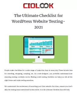
Improved User Experience without a Massive Site Overhaul Rebecca Hyams Cataloging Metadata and Systems Librarian SUNY Maritime College Why Evaluate What web designers think users want isnt always what the users really want ID: 428058
Download Presentation The PPT/PDF document "Testing and Tweaking Your Way to a Bette..." is the property of its rightful owner. Permission is granted to download and print the materials on this web site for personal, non-commercial use only, and to display it on your personal computer provided you do not modify the materials and that you retain all copyright notices contained in the materials. By downloading content from our website, you accept the terms of this agreement.
Slide1
Testing and Tweaking Your Way to a Better Library Website: Improved User Experience without a Massive Site Overhaul
Rebecca Hyams
Cataloging, Metadata, and Systems Librarian
SUNY Maritime CollegeSlide2Slide3
Why Evaluate?
What web designers think users want isn’t always what the users really want
Best way to find out what users want is to ask them
Usability testing was not done prior to launch of current site designPublic EDS Launch this FallNew campus web server will support more dynamic elementsSlide4
How did we Evaluate?
Background research on usability studies in general and case studies of library website evaluations
Three-pronged evaluation approach
Survey MonkeyGoogle AnalyticsIn-person usability testingInformal looks over-the-shoulder when helping patronsSlide5
Isn’t that Excessive?
Three different methods may seem excessive
Mostly used to inform on one another
Gives us a fuller picture than any one method canOnce the Google Analytics code is in place and the Survey was made live, they both run themselvesSlide6
Light background reading:
Jakob
Neilsen and Steve KrugTesting does not need to involve a big production or a lot of subjectsCase studies and The Journal of Web LibrarianshipMost studies were done with a large site overhaul in mind
But what if you’re
mostly
happy with your design?Slide7
Website Survey
Survey Monkey link posted on the library homepage and sent out in email
Targeted instruction sessions
May have lead to overrepresentation of Freshmen students in resultsSurvey consisted of 18 questionsSome were targeted only to certain groupsQuestions were about technology habits (frequent websites, devices, use on campus) Slide8
Survey Responses
47 responses, largely undergraduatesSlide9
When Asked About Our Site…
Results were mostly neutral-positive
No real way of knowing if the neutral response is a true neutral or the response of the apathetic
The features our patrons want are ones that will be easy to implementOur patrons aren’t as interested in the big buzzwords in the library web services (text and chat reference, social media…)Slide10
Q: The SUNY Maritime Library Website is…Slide11
Q: Which of the following features would you like to see added to the SUNY Maritime Library website?Slide12
Other Interesting Findings
The majority of respondents use tablets and smartphones to connect to the internet, just not our website
68.2% of respondents are not regular library users (self-reported)
No one wants to like/friend/follow usWhen they do come to our site, they’re looking for three main things: our catalog, our databases, and our hoursSlide13
Google AnalyticsTracking code on each page
Special code on links to external resources to track usage
Google calls these “events”
As an information portal, we want to see what people are using and how they’re getting to the informationData is anonymous Slide14
Page viewsSlide15
“Events”Slide16
“Events” per pageSlide17
Sessions per device typeSlide18
In-person Study
Five participants
1 graduate student, 3 undergraduates, 1 staff member
Number of participants recommended by usability expert Jakob NielsenNine tasks made up of standard library tasks Recorded the session using Camtasia
screen capture software and a digital voice recorderSlide19
The Room
Testing took place in our Digital Room
Quiet and private space
Questions were given to participants one at a time on index cardsThey were encouraged to think out loud, but only two participants did
Oh
hai
digital room!Slide20
Task 2:
“
You have a big assignment due first thing on Monday morning. It’s already Friday afternoon. You want to find out when the library will be open this weekend so you can maximize your time in the library to finish your work. What are the library’s hours on Saturday and Sunday?”
P1
Used
hover menus on left side of homepage
P2
Used
hover menus
and checked
many options before clicking on Hours
P3
"First I would go to Contact Us because that's what my brain says to do", when that didn't have what he was looking for,
he decided to try the FAQ
and that page just says "Coming Soon!",
Then he tried "About Us" on the hover and found the link to Hours
(About the Library is called About Us on internal pages)
P4
First
tried search box at top corner of page, thinking it would search the site
(not the catalog). After ending on the catalog he
returned to the homepage and then found the link to hours on the
lefthand
hover
P5
Started off by
looking at the way top header and way bottom footer
(when asked, he did that because many other pages have links to their hours here).
"I'm looking for an about"
and then he
found the About the Library link on the
lefthand
nested navigation
and then found hours on the menu.Slide21
Task 2:
“
You have a big assignment due first thing on Monday morning. It’s already Friday afternoon. You want to find out when the library will be open this weekend so you can maximize your time in the library to finish your work. What are the library’s hours on Saturday and Sunday?”
Most popular option:
Some use of expanding “onhover” menus
Common pitfalls:
Search box in top right of header searched only catalog
FAQ page was inviting but had no content
Fixes:
Include site search feature in standard location (replacing catalog search)
Creation of FAQ page content
Featured link to library hours on secondary pages (homepage to come)Slide22
Task 6:
“You’re taking MT250 this semester, where you will need to research the construction of a specific ship. You’re not quite sure where to begin, but you were told that there is a guide for the assignment on the library website. Find the ship construction project guide
.”
P1
He
went right to them
, using the link on the
lefthand
navigation (
unnested
version)
P2
Clicked
Subject Guides tab in middle of homepage
,
used dropdown option
but selected Marine Transportation guide, then attempted a search for the guide using the search box, but the search was "this guide" only. She then adjusted her search to all guides and found it.
P3
Subject guides tab in center box
, clicked on dropdown and looked at the choices quickly,
then used search box
and typed in MT250 and it was the only search result
P4
Went to the
Subject Guides tab on homepage center box
, went back and forth a few times between the title search and the guide list dropdown before ultimately selecting the dropdown
P5
"I think I saw something before about something a teacher could give you if they drop off an assignment." He tried the course reserves link and searched for MT250 in the reserve catalog pulling up the list of reserve books. "This is for books and not really assignments". He then browsed through the
lefthand
homepage navigation
"Maybe here under guides and tutorials?" (Nested
nav
)
. He then was on the
LibGuides
homepage but was slightly unsure if he had found the answer when he located the link to the guide. Slide23
Task 6:
“You’re taking MT250 this semester, where you will need to research the construction of a specific ship. You’re not quite sure where to begin, but you were told that there is a guide for the assignment on the library website. Find the ship construction project guide.”
Most popular option:
Subject guides tab in center of homepage
Common pitfalls:
If a participant landed on a different guide they had trouble getting the one they needed
Fixes:
Ensure all guides are listed on
LibGuides
dropdown
Improve
LibGuides
content to help with navigation between guides on similar subjectsSlide24
In-person ResultsFour out of nine tasks were successfully completed by all five participants
Catalog, hours, policies, course guides
However, some tasks were completed with much difficulty, even if the answer was ultimately found
The remaining five tasks were completed by 80% of participantsSlide25
Participant Suggestions
Clarifying language
Some language was off-putting or confusing
Design tweaksReordering or adding links Simplifying pagesParing down language and lists A search box that searches both articles and books
When that was suggested I told them about EDSSlide26
What did we learn?
By far our most popular feature is the catalog search box in the middle of the homepage
Patrons turn to the search box when they don’t know where else to find information, even if the search box is just for the catalog
Overall our page design is liked by patrons, but we can do more to improve usabilityNo major design flawsSlide27
Tweaks in Progress
Google Site Search!!! (google.com/
cse
)Tweaks needed so it doesn’t dredge up old contentOurs will search our site, blog, and our LibGuidesAs a non-profit you can edit the configuration file so there are no ads
Some CSS trickery may be needed
(Inspect element + !important override)
Default look + position:
Modified look + position:Slide28
Tweaks in Progress
Descriptions and branding images added to tab box on homepage:Slide29
Tweaks in Progress
Cut down the number of catalog choices, removing SUNY Union and
FirstSearch
links in favor of IDS SearchWith EDS (Compass) as yet another option, we had to cut back somewhereParadox of choice confused usersOld SUNY Union Catalog doesn’t link into
ILLiad
but offered false hope for requesting items
FirstSearch
interface is unappealing
IDS Search chosen over WorldCat.org because of consortium limiter (set as default)Slide30
Tweaks in Progress
Accordion lists for otherwise lengthy walls of text
Allows us to put a lot of information on a single page, but give the users the choice of viewing it
Relatively standard web convention, familiar to usersSlide31
Tweaks in Progress
Language changes
Attempt to make language more user-friendly, positive, and inviting
“Operational Procedures” “Library Policies”“BLOG”
“Library News”
“Books, DVDs, and More”
“Sextant – Catalog”
“Avoid Plagiarism”
“Citing Sources”
Emphasize the right instead of the wrong
“
eJournals
”
“Journals”
(the header was referring to both print and electronic resources)Slide32
Tweaks in Progress
Slight reorganization of navigation
Removal of pages with different URLs but identical (or nearly identical) content
Creation of logical navigation breadcrumbs Most breadcrumbs currently are just Home>>Current PageCreation of interstitial pages for Navigation (linked to menus and breadcrumbs)
If it looks like a link, it should at least go somewhere if you click itSlide33
Some Content Tweaks
Construction of an FAQ and a Scholarly Activities page (both pages were linked to but were just blank “Coming Soon!” pages)
Putting content of linked PDF files directly on page where appropriate
Putting digital archives into DSpaceGeneral Collections Page was dominated by Government DocsGov
Docs will get own page, General Collections page will have information on individual collections
Restructuring of Events and Exhibits PagesSlide34
Sneak Peaks
Current:
Proposed:Slide35
Sneak Peaks
Current:
Proposed:
No
Content!Slide36
Sneak Peaks
Current:
Proposed:
Each link opens a PDF in a new windowSlide37
Sneak Peaks
Current:
Proposed:Slide38
Big Future Changes
Dynamic PHP-based pages
Header, footer, and menu includes!!
Way more consistency with way less upkeepLive updating calendar with Google data and our own styleLive updating new acquisitions displayCreation of short video tutorialsSlide39
Questions/Comments?
rhyams@sunymaritime.edu
(I share code
!)These slides can be found at:
http://tinyurl.com/TestTweakSUNYLA