/
The Art of Poster Making The Art of Poster Making

The Art of Poster Making - PowerPoint Presentation

calandra-battersby
calandra-battersby . @calandra-battersby
Follow
401 views
Uploaded On 2016-12-14

The Art of Poster Making - PPT Presentation

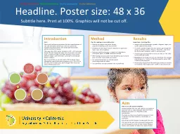
June 30 2014 REU Workshop Daria A Narmoneva Associate Professor Biomedical Engineering Used materials from George Hess Kathryn Tosney Leon Liegel httpwwwncsueduprojectposters ID: 501538

poster text results message text poster message results viewers color focus simple large methods colors people details point headings

Share:

Link:

Embed:

Download Presentation from below link

Download Presentation The PPT/PDF document "The Art of Poster Making" is the property of its rightful owner. Permission is granted to download and print the materials on this web site for personal, non-commercial use only, and to display it on your personal computer provided you do not modify the materials and that you retain all copyright notices contained in the materials. By downloading content from our website, you accept the terms of this agreement.


Presentation Transcript

Slide1

The Art of Poster Making

June 30, 2014

REU Workshop

Daria A. Narmoneva

Associate Professor, Biomedical Engineering

Used materials from:

George

Hess :: Kathryn

Tosney

:: Leon

Liegel

http://www.ncsu.edu/project/postersSlide2

An effective poster is a

visual

communications tool. ... get your main point(s) across to as many people as possible.

An effective poster operates on multiple levels ...

source of information

conversation starter

advertisement of your work

summary of your work Slide3

Planning

Before starting work on your poster, consider message, space, budget, format (single sheet or multi-panel), and deadlines.

Focus

Stay focused on your message and keep it simple. Create a mock-up and dispense with unneeded details.

Layout

Use a clearly defined visual grammar to move readers through your poster.

Headings

Use headings to orient readers and convey major points.

Graphics

Clear graphics should dominate your poster.

Text

Text should be minimized in favor of graphics, and large where used.

Colors

Colors can make a poster attractive and improve readability, but be cautious.

Editing

Edit ruthlessly to reduce the amount of text and focus on a results-oriented message.

Software

There are many packages you can use to create your poster.Slide4

Planning: Message

Know your message!

What

is the

one

thing you want your audience to learn?

Focus

on your message throughout the poster.

If it doesn't reinforce your message,

leave it out

!! Slide5

Planning: Message

If you have an interesting result, state it explicitly in the title.

The

Effect of X on Y

vs.

Substance

X Induces Y-cells

???

Make the strongest statements your data will support. Why soft-peddle exciting findings?

Rather than merely repeating the results,

state your interpretations

in the conclusion section. Slide6
Slide7

Message: Audience

There are three categories of readers in most audiences (Woolsey 1989). People in ...

your field of specialization

fields closely related to yours

unrelated fields

To satisfy them all, you should ...

Explain

the big picture and why the problem is important.

Use plain

language, avoid

jargon and

acronyms

Interpret your findings: how your work helps solve the problem you've described. Slide8

Message: Focus

& Keep It Simple

Simple messages are more memorable.

Details distract

from the main point, and can be supplied in person as needed. Slide9

What’s wrong with this poster?Slide10

Do this ... Edit ruthlessly! Simplify. Supply details in person, and only as needed.

Remove all but the most essential information about your methods.

State your results with headings, and focus on results and conclusions.

Convince viewers (potential employers) that you are a thoughtful, results-oriented researcher.

Focus: consider the alternatives Slide11

... not this Emphasize methods rather than the main message.

Identify every detail of your methods, just in case you're not in front of your poster when someone comes by.

Even in the results and conclusions, be sure to emphasize your methods over your findings.

Convince viewers (potential employers) that you are a task- and methods-oriented technician.

Focus: consider the alternatives Slide12

Your poster should have a good visual balance of figures and text, separated by white space. Balance occurs

when images and text are reflected (at least approximately) across a central horizontal, vertical, or diagonal axis.

This axis is know as the axis of symmetry.

Layout:

Balance and

White Space

Slide13

Layout:

Balance and

White Space

Slide14

Do this ... Use a graphic hierarchy that visually reflects the relative importance of elements.

... not this Use a text-heavy, publication-style format.

If it's important, make it BIG. Use type size proportional to importance.

Use 12-point font for just about everything. Actually, you could just staple up your manuscript - why not?

Show, don't tell. No need to write down every detail.

Include every detail as you would for a journal article

Use simple figures and graphs, which should dominate the poster visually.

Use complex, difficult to understand graphics, which are only a small portion of the poster.

Make all graphic elements large enough to be visible easily from one meter away.

Make sure your figures are all small enough to fit on a small portion of a journal page. Slide15

Posters are a

visual medium

.

Minimize text - use images and graphs instead.

Keep text elements to 50 words or fewer.

Use phrases rather than full sentences.

Use an active voice.

Avoid jargon (depends somewhat on

audience

).

Left-justify text; avoid centering and right-justifying text.

Sans-serif font

(e.g.,

Helvetica, Arial,

do NOT use Times New Roman!!!

) for most text - easier to read

Text should be

at least

24 point in text, 36 for headings.

Pay attention to text size in figures - it must also be large.

Title should be at least 5cm tall.

Text:

should be simple, direct, and large. Slide16

Do this ... Make text simple, direct, and large enough to read so that your message comes through loud and clear!

... not this Make text convoluted, impenetrable, and small enough that viewers will go away.

Title and major headings should be readable from 2m away.

Headings are to be small, so you can fit everything in.

Supporting material should be visible from 1m away.

Only text that lacks intrinsic content - like "Results" - should be readable from 1m away.

Details should be kept to a minimum, and still visible from 1m away.

Make text tiny, as in a published paper, so you can squeeze in all the detail.

Avoid long lines of text.

Make lines of text so long that the readers lose their place when trying to find the next line. Slide17

Use color to attract attention, organize, and emphasize - but don't overdo it.

Use a light color background and dark color letters for contrast.

Avoid dark backgrounds with light letters - very tiring to read.

Stick to a theme of

2 or 3 colors

- much more will overload and confuse viewers.

If you use multiple colors, use them in a

consistent pattern

- otherwise viewers will spend their time wondering what the pattern is rather than reading your poster.

Overly bright colors will attract attention - and then wear out readers' eyes.

Consider people who have problems differentiating colors, especially when designing graphics - one of the most common is an inability to tell green from red.

ColorSlide18


Mock strawberries as they appear to a person with full-color vision.


Mock strawberries as they appear to a person who cannot tell red from green.

ColorSlide19

Use color to attract attention, organize, and emphasize - but don't overdo it.

Color: SummarySlide20

Editing

If it doesn't provide critical support for your main message, ELIMINATE IT!

Edit! Edit! Edit ruthlessly! to reduce text.

Edit all text to simplify verbiage, to reduce sentence complexity, and to delete details. Slide21

Presentation of the poster

...

Do not do this

Give

a detailed tour and be compulsively complete.

Read carefully every line.

Read all the text, trace every line on every graph, and dwell especially on the details of the methods.

If you stand with your back to your audience, many people will find it easier to escape. Glance over your shoulder periodically to see if you can stop reading yet.

Speak in a low

tone

-

and don't help viewers see what you're trying to show

themSlide22

Presentation of the poster

Do this ... Use the graphics when you talk and focus on your evidence.

Use your poster as a visual aid.

When people ask you for a tour of your poster, use the graphic elements to explain your work.

Face your audience and tell them the context: identify the big problem, explain why the problem is important, and tell what you did to answer it, what the answer is, and what the answer means.

As you talk in an audible, measured pace, point to the graphic features that demonstrate your message. Glancing at the figure as you point to it will direct your viewers' eyes to the figure. Slide23

FEEDBACK from GRADUTE STUDENTS:

Know size/format/printer requirements

Large Font; Deep colors

No

paragraphs – use bullet lists

Less text, more

pictures, photos, etc

Use the section titles/subtitles to guide you in the presentation – should be easy to see/say

Spellcheck

and proofread!!!

Placement

of the most important information in the center

Know

appropriate ways to make figure/plot bigger – issue of

pixellation

PRESENTATION TIPS:

Be excited!!!

Presentation should be not more than 5 min; about 20 sentences.

Allow

people to look at the poster for a few minutes before “attacking” them

Do

not present the sequence of How you did it; Choose information wisely and present only the most important results, leave the rest for questions.

Rehearse

the presentation with correct pauses and intonations.Slide24

Example of a good poster (critique is on the next slide)Slide25

Positive Points

The

title conveys the main message instantly. Context and objectives are made clear. Methods are concise. Graphs are interpreted by their titles. One can read the titles and trust the authors, or examine the graphs in more detail.

Results and conclusions are concise and relate back to objectives.

Color scheme is very simple and pleasing.

Font is large enough everywhere, including figures.  

Negative Points

Results

and conclusions do not relate back to context (Introduction). It would be nice to see a statement of how the findings relate to aquaculture.

Some viewers have noted that the title could me more direct:

"Temperature Determines Sex of Southern Flounder"

Title font is on the small side - could be larger.

Some viewers have felt there is too much white space between the columns. It could be reduced somewhat, but not too much.

C

ritique of the poster on the previous slide