/
Guidelines on the BCG format Guidelines on the BCG format

Guidelines on the BCG format - PowerPoint Presentation

celsa-spraggs
celsa-spraggs . @celsa-spraggs
Follow
345 views
Uploaded On 2019-11-21

Guidelines on the BCG format - PPT Presentation

Guidelines on the BCG format Stay away from the margins Keep your charts words tables line etc where they are supposed to be Title and subtitles AltQ macro to format Title in sentence case 24 pt bold ID: 766170

text color title line color text line title format data lines fill gray axis bcg objects green dark hierarchy

Share:

Link:

Embed:

Download Presentation from below link

Download Presentation The PPT/PDF document "Guidelines on the BCG format" is the property of its rightful owner. Permission is granted to download and print the materials on this web site for personal, non-commercial use only, and to display it on your personal computer provided you do not modify the materials and that you retain all copyright notices contained in the materials. By downloading content from our website, you accept the terms of this agreement.


Presentation Transcript

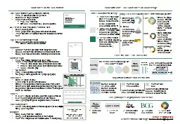
Guidelines on the BCG format Stay away from the margins Keep your charts, words, tables, line, etc where they are supposed to be Title and subtitles (Alt-Q macro to format) Title in sentence case, 24 pt, bold Subtitle in 16 pt, nonbold Maximum of two lines Two line main title OR one line main title + one line subtitle ALL text in slides should be sentence caseEven bullet pointsTitle page is the only place that uses title case‘Text Column’ or ‘Number Column’ functions to format textTop level of hierarchy is boldGreen bullet point, text is nonboldGreen dash, text is nonboldColumnsHeader font is 2 pts larger than body text, boldBoxes are not filled and have no lines around themBody text follows the same hierarchy as a text slideChart designFive tick marks maximum on the Y axisAxes (1-2 pt larger than axis labels or same size)Y-axis label above axis, left aligned text, blackX-axis label below axis, right aligned text, blackAxes lines are grayNo bordergray lines separate segmentsNo graph titles (optional for 1 graph per page)TimelinesBars in green or grayLight gray fill on the left hand sideGreen line separates month/week label from chartChart and date sections separated by thin gray linesSeparator gridlines are available in white – send green bars to the backTables2, 3 or 4 groups per page, columns, boxes or tables5 or more groups use columns or MS TablesUse light gray stripes to separate rows (if needed)Takeaway boxescolor, size and position of takeaway can not be changed. Only use 16 pt fontMarginsStay away from the "Margins"Keep your data and text out of the marginsTurn the margins on/off in BCG Home > Insert group Mostly (90%) No visible lines around objects line color = fill color Rare cases (10%) dotted line Solid line matches Calls attention to call-out Line is the same color as the fill, but darker shade White line for overlap Lose the line! The 90/10 rule Format slide title/sub-title Automatically formats the title (font size and bold) Switch between A4 and Letter. Switch between standard and WWOM format Format text box Automatically formats text boxes, including bold/ unbold of bullet points Important buttons and useful info 1. Data/ink ratio Send feedback and bugs : Service.Center@bcg.com Five principles of graphical excellence Version 9 October 2012 5. Selective use of color 2. Less is more 3. Information hierarchy 4. Fit with BCG brand Data Ink Less > More Color with care! 3x3 Guidelines on color usage Distinguish between group and concept 2. Show hierarchies, relationships between groups 3. Highlight key data/main points Three color rules to live by 1. Don’t use any color! Don’t fill every box. Black text on a white slide is clear and uncluttered. Kill the fill! 2. gray is a beautiful color! First color used should be light gray without a visible border 3. Respect the brand! Don’t change objects that are brand green (takeaways, headers, etc.) Only EVER use color to Three different color palettes Fills Stick to grays, blues, browns and greens Light colors: large objects Dark = smaller objects Dark Dark BCG green for macro elements (use sparingly) Other dark shades (rarely) Highlight Highlight key data Small patches of intense color