/
WCMS Template Package 4 (TP4):  UX Best Practices WCMS Template Package 4 (TP4):  UX Best Practices

WCMS Template Package 4 (TP4): UX Best Practices - PowerPoint Presentation

faustina-dinatale
faustina-dinatale . @faustina-dinatale
Follow
346 views
Uploaded On 2019-12-18

WCMS Template Package 4 (TP4): UX Best Practices - PPT Presentation

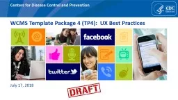
WCMS Template Package 4 TP4 UX Best Practices July 17 2018 Template 4X UX Recommendations Key items to review Viewports Grids Themes Icons Site Identity Navigation Area Under Left Navigation ID: 770882

page color viewports avoid color page avoid viewports overview colors accent content images navigation shown items amp title left

Share:

Link:

Embed:

Download Presentation from below link

Download Presentation The PPT/PDF document "WCMS Template Package 4 (TP4): UX Best ..." is the property of its rightful owner. Permission is granted to download and print the materials on this web site for personal, non-commercial use only, and to display it on your personal computer provided you do not modify the materials and that you retain all copyright notices contained in the materials. By downloading content from our website, you accept the terms of this agreement.


Presentation Transcript

WCMS Template Package 4 (TP4): UX Best Practices July 17, 2018

Template 4.X: UX Recommendations Key items to review: Viewports GridsThemes IconsSite IdentityNavigationArea Under Left NavigationContainers If there is time….. Template Types Breadcrumbs Page Sharing Feature Area Visual ElementPage TitlePage LanguagePage FormatPage Last ReviewedPersistent Content AreaFontsLinksImagesAccordions / Tabs4th Level Nav / Multipage NavTables

OVERVIEWViewports Most design decisions have been grouped into 2 categories: “Mobile” (XS, S, M) and “Desktop” (L, XL, XXL).

UX RECCOMENDATIONViewports Test designs in different viewports: Most external traffic is estimated to be viewing the TP4 pages in XS (42%), XL (28%), and XXL (13%). Ensure that designs are optimized for XS (Viewport 1) and XL (Viewport 5) at a minimum.

OVERVIEWGrids TP4 includes 12 Grid Columns 15 px left / right gutters 30 px gutter (15 px each left / right margins)

UX RECCOMENDATIONGrids Use a consistent column structure on your pages: Use common grid layouts for visual balance.

UX RECCOMENDATIONGrids Avoid changing the grid too many times on a page: While variation in the layout can make a page more interesting and also helps keep a page from feeling “boxy”, changing the number of columns too many times may make a page feel jumbled and cluttered. Avoid nested rows and columns as these can also cause complexity and added risk. Design in ‘sections’: If you do change the number of columns used on a page, consider designing sections to group related content and ensure that the layout flows seamlessly. Create visual hierarchy: Ensure that the most important element have a visual hierarchy so that it is easy to determine the ‘order of importance’ of a page.

EXAMPLE: Varying the grid in ‘screenfuls’ or ‘chunks’ can help to create distinct sections of a page that each have a defined purpose. The homepage is using 4 columns as a base (within the 12 column grid). Jumbotron: 100% Features: 50%; 25%; 25: Outbreaks / News: 50% CDC in Action: 50% Science at CDC: 25%

OVERVIEWThemes TP4 includes “Main” and “Accent” themes made up the colors below. 75% of current CDC.gov web pages use either the blue, purple, or green themes. Examples:

OVERVIEWThemes Ability to mix and match any shade from the two color palettes: A main theme (3 shades) and accent theme (3 shades) for a total of 6 colors, plus 6 grays, and white – for a total of 14 different colors to use

UX RECCOMENDATIONThemes Follow 60-30-10 Rule for designing a full page 60% White / Gray30% Main Theme10% (OR LESS) Accent Theme Use shades of the main color for visual interest: Using variations of the Main theme (primary, secondary, tertiary) colors can be used to help create visual interest and variation. Use accent sparingly: The accent color should be used sparingly to draw attention to key items. Avoid mixing colors too much: Avoid mixing colors the main and accent themes “too much”. When the colors are used together, it should be done with accent borders or buttons and not with background shading. Limit use of color in your pages and when used, ensure color is strategic: The areas that do receive color gain more attention, such as text, images, and individual elements like buttons.

EXAMPLE: Following the 60-30-10 Rule helps to keep the page fresh and clean, without overusing color. 60% White / Gray 30% Main Theme 10% (OR LESS) Accent Theme

UX RECCOMENDATIONThemes Use recommended color pairings.

GOOGLE RECOMMENDATIONSThemes: General Guidelines https://material.io/design/color/the-color-system.html#color-usage-palettes Use color to communicate page hierarchy Ensure text and icons are accessible and legible Use color to reinforce brand

GOOGLE RECOMMENDATIONSThemes: General Guidelines https://material.io/design/color/applying-color-to-ui.html# Use color to consistentlyUse color to create distinction between elementsUse color intentionally to convey meaning and relationship between elements or to use degrees of hierarchy

GOOGLE RECOMMENDATIONSThemes: Main Color https://material.io/design/color/the-color-system.html#color-usage-palettes Create contrast by using light and dark variants of your main theme (primary, secondary and tertiary color) The main color is the color displayed most frequently across your app’s screens and components. If you don’t have an accent color, your main color can also be used to accent elements. To create contrast between UI elements, such as distinguishing a top app bar from a system bar, you can use light or dark variants of your primary color on each elements.

EXAMPLE: Using shades of a single color can provide a uniform and attractive layout

GOOGLE RECOMMENDATIONSThemes: Accent Color https://material.io/design/color/the-color-system.html#color-usage-palettes Use accent colors sparingly Use accent colors to communicate actions or interactive elements Reserve the accent-primary colors for small elements like borders, buttons, heading, etc. Use light colors for background colors (white, gray, main-tertiary, accent-tertiary). An accent color provides more ways to accent and distinguish your product. Having an accent color is optional, and should be applied sparingly to accent select parts of your UI. Accent colors are best for:Floating action buttons Highlighting selected textLinks and headlines

EXAMPLE: Using accent colors sparingly can help to draw attention to key items or highlight important information.

EXAMPLE: Using colors in the same palette for different sections of the page can help to provide cohesiveness, while also providing visual interest by varying the color choices used throughout the page.

EXAMPLE: Avoid mixing colors too much : Avoid mixing colors the main and accent themes “too much”. When the colors are used together, it should be done with accent borders or buttons and not with background shading. Use accent colors sparingly to draw attention. Avoid using dark or especially bright colors for background colors. What NOT to do

EXAMPLE: Using too much color can actually distract from a page and make it hard to focus on any one item. Judiciously using color can help to draw attention to items and highlight key content. Color can also be used to help group related items and create visual separation between sections of a page. What NOT to do

EXAMPLE: Using too much color can actually distract from a page and make it hard to focus on any one item. Judiciously using color can help to draw attention to items and highlight key content. Color can also be used to help group related items and create visual separation between sections of a page. What NOT to do

ACCESSIBILITYThemes https://material.io/design/color/the-color-system.html#color-usage-palettes Ensure contrast between background colors and icons is sufficient to pass 508 WCAG standards All text should be legible and meet accessibility standards. The Web Content Accessibility Guidelines (WCAG 2.0) level AA requires a 4.5.1 color contrast between text and background for normal text, and 3:1 to large text.

OVERVIEWIcons All icons in SVG Different size optionsColor options

UX RECCOMENDATIONIcons Ensure color selections pass 508 and WCAG AA standards.

UX RECCOMENDATIONIcons Consider using a white or light gray background when using icons with color. Consider using a dark background with a white icon.

UX RECCOMENDATIONIcons If Background Color is set to bg-primarygray-darkestgray-darkerIcon color options are:[theme]-tertiarygray- mediumgraygray-lightwhite [default]

UX RECCOMENDATIONIcons If Background Color is set to bg-secondarygray-darkIcon color options are:black

UX RECCOMENDATIONIcons If Background Color is set to bg-tertiarygray-mediumgraygray-lightWhiteIcon color options are:[theme]-primary [default]blackgray-darkestgray-darker

UX RECCOMENDATIONIcons Use when using a background color, select an icon color from the same palette. Avoid mixing background colors and icon colors from different color palettes.

OVERVIEW Site Title Bar Site Title Site Title + Description (description hidden in mobile by default) Site Title + Image (option to hide image in mobile) Site Title + Description + Image

OVERVIEW Site Title Bar When to use: When the topic requires additional imagery beyond the textual title that must persist near the top of every page When the campaign requires an image or a banner that must persist near the top of every page When outbreak information must persist near the top of every page When NOT to use: If possible, avoid repeating the Topic Title text in the image As a logo or image that does not comply with CDC’s branding policies or competes with the CDC brand, effectively creating a co-brand As a way to inject a non-standard color palette onto every page in the site

UX RECCOMENDATION Site Title Bar Use images that do not increase the height of the site title bar on desktop viewports.Use white images.Use images to brand a site.Hide description in mobile. Use of Site Identity (images) need to be approved by DMB. Email Lisa Richman or contact the WCMS helpdesk to coordinate approval.

OVERVIEW Navigation Left navigation shown in “desktop” viewports. Section and Bottom navigation shown in “mobile” viewports. Left Navigation Section Navigation Bottom Navigation

UX RECCOMENDATION Navigation: Left / Bottom Home Link: Use a short label for the “Home” link. Try to avoid wrapping for this link. Level One: Aim for no more than 7 – 10 items. Navigation structures larger than 7 items can be unwieldy and difficult to use. Use short labels that are easy to scan. Level Two & Level Three: Aim for 3-7 items. Avoid only having 1-2 items. Use short labels that are easy to scan. External Links:External links should NOT be added to left navigation. Left Navigation should include internal (CDC.gov) links only and in most cases should only include links to pages within the specific sub-site the navigation represents.Left Navigation

UX RECCOMENDATION Navigation: Section Use short labels when overriding section nav label. Try to avoid long labels that wrap onto too many rows. Avoid navigation structures with only 1 child page. Section Navigation

OVERVIEW Area Under Left Navigation Shown in L, XL, XXL viewports under left navigation Shown in XS, S, M viewports under bottom navigation

UX RECCOMENDATION Area Under Left Navigation Avoid images and other brightly colored items. Avoid colors from the main or accent theme. Use ‘gray-lightest’ and keep containers ‘neutral’.

OVERVIEW Containers Navigation Buttons: large navigation elements, often used in groups Cards: variety of uses, built from Bootstrap 4 cards Vertical Layout: brief content in short columnar layout Horizontal Layout: wider content, better for summaries and lists Containers have a variety of design options:WidthContent ElementsHeader, Image, Title, Subtitle, Description, Source/Date, List Colorsall colors based on 2 themes, grays, whiteAlignment/Positiontop, right, bottom, left based on ElementMargin and Paddingmany options based on ElementInteractive Elements Clickable Container, Links, Buttons Other Visual Styles Border, Accent Border, Shadow

UX RECCOMENDATION Containers Use neutral colors (white / gray) as the background color the majority of your cards. Colored backgrounds should be used sparingly to draw attention or highlight key content.

UX RECCOMENDATION Containers Avoid using too many different styles on a page. Avoid using too many colors in a single container. Most containers will look best with a single color (using different shades) or a single color with a small accent (such as a button). Use of a single color with varying shades in a card. Use of a single color with a small accent color.

EXAMPLE: Using variations of the primary shade can help to tie a page together and be visually appealing.

EXAMPLE: Using variations of the primary shade can help to tie a page together and be visually appealing.

UX RECCOMENDATION Containers Use borders and shading consistently on your pages to provide a cohesive look and feel.

EXAMPLE: Using borders can help “group” a set of cards so that users mentally see these items as “like” items.

EXAMPLE: Using different shades of the same color for borders can provide visual interest. Example below uses ‘main-primary’ for the first card, ‘main-secondary’ for the second card, and ‘main-tertiary’ for the third card.

UX RECCOMENDATION Containers Use headings when creating cards with sections.

UX RECCOMENDATION Containers Use background row shading to visually group a set of related cards.

EXAMPLE: Using background rows (especially ‘gray-lightest’) can help to set off an area of a page and group similar items into ‘screenfuls’ or smaller ‘chunks’.

OVERVIEW Template Types Homepage: primary landing page for entire site, provides access to primary content areas, promotes key messages Landing Page: pages within a site that have child items (not an option in WCMS) Content Page: more detailed and descriptive content

UX RECCOMENDATIONTemplate Types Use no nav template for homepages. Use left nav template for content pages.Avoid placing content on "landing pages". Landing pages should be used as a navigational aid. Landing pages should provide a "table of contents" or "index" or "list" of its children.The Landing page model is very successful with mobile visitors as it allows them to easily navigate. Long content pages with several text heavy sections work better if the sections are broken up into separate pages linked together by a Landing page. Example landing page from TP3.

OVERVIEW Breadcrumbs Shown in “desktop” viewports Hidden in “mobile” viewports Option to hide in “desktop” view on homepages Can add custom prefix(es) to breadcrumbs Can manually create breadcrumbs Does not include current page

OVERVIEW Page Sharing Shown in “desktop” viewports in upper right corner Shown in “mobile” viewports as “sticky” nav pinned to bottom of browser Content syndication hidden in mobile Option to hide in “desktop” view on homepages

UX RECCOMENDATION Breadcrumbs & Page Sharing Hide breadcrumbs and page sharing options on homepages with fluid images.Hide breadcrumbs and page sharing options on homepages where jumbotrons are used.

OVERVIEW Feature Area Available on “no nav” template Fixed or fluid options Consider using responsive images in WCMS as it may work better for different viewports especially for images with text (need to use visual composer module). Consider viewports 1, 3, and 6 (at a minimum). Use for important, featured items. Consider minimum width of each viewport. Images won’t scale up so need to ensure that images fill XXL viewport. Images will scale down.

OVERVIEW Visual Element Can contain audience identity, pattern/texture, or other visual elements for the site section Shown in “desktop” viewports above page title Shown in “mobile” viewports below section nav Consider images no taller than 100 px. Consider using responsive images in WCMS as it may work better for different viewports especially for images with text (need to use visual composer module). Consider viewports 1, 3, and 6 (at a minimum).

OVERVIEW & RECOMMENDATIONSPage Titles Desktop viewports: Shown on content pages. Not shown on homepages. Mobile viewports: Hidden off screen for SEO/accessibility. (Section nav is populated from title in left navigation. If page is not included in left navigation, the page title is used to populate the section nav.) Use descriptive page titles for SEO and accessibility. Lead with most important keywords. Try to avoid page titles that wrap in ‘desktop’ viewports.

OVERVIEW & RECOMMENDATIONSPage Languages Desktop viewports: Shown under page title. Mobile viewports: Shown under section nav. Up to 3 languages shown as a list More than 3 languages shown as a dropdown

OVERVIEW & RECOMMENDATIONSPage Format Shown in all viewports at the bottom of the content area. Ensure content is “Digital First”. Alternate formats should only be used when printing is a key factor or consideration. In most instances, the content contained within these files could and should be integrated into the WCMS to be managed and displayed as “standard” web content. This approach best supports accessibility, Search Engine Optimization (SEO), and usability as well as consistent web management practices.

OVERVIEW & RECOMMENDATIONSPage Last Reviewed Desktop viewports: Shown beneath “Page Format” and above “Page Last Reviewed” Mobile viewports: “Page Last Reviewed” shown. "Page last updated" and "Page maintained by" are also included in the HTML as meta attributes on all pages, but not displayed in any viewport (users can inspect the code to see this information) Keep information up-to-date and review at least annually.

OVERVIEW & RECOMMENDATIONSPersistent Content Area Desktop viewports: Shown beneath “Page Format” and above “Page Last Reviewed” Mobile viewports: Hidden by default. Option to show. Hide in mobile. Avoid items that look or feel like “advertisements”.

OVERVIEW Fonts Two font families: Merriweather & Open Sans 6 heading styles 7 body styles 6 display styles Default is Open Sans, 17px Range from 26px to 102px Don’t change fonts.

OVERVIEW Links Standard Links Blue, underlined by default Defaults to opening in same window Exception to Standard Link Behavior Can override the default link behavior and open in a new window. Can hide underline on lists.

UX RECCOMENDATION Links Hide underline in lists. When all items in a list are links, the default underlining style for links may cause more difficulty for users reading the text. It is only recommended to hide the underline when every item is a link.

OVERVIEW Links: External Links to external content must comply with the HHS Web Standard: External Link Icon & Disclaimer. New exit notification / disclaimer policy modal shown on first view of a non .gov website within browser session Link to exit disclaimer added to footer Avoid using external links in card headers. Avoid using external links in left nav. Don’t turn off link decorations.

OVERVIEW & RECOMMENDATIONSImages: Jumbotron Large image with caption in WCMS. Use background shading that provides most contrast against image. Use high quality images that are interesting and engaging. Avoid text within images. Review L viewport (V4) to check the amount of text to check wrapping.

OVERVIEW & RECOMMENDATIONSImages: Styles Options include: Margins: 5 options; Extra Small (4px) to Large (51px) Borders: 6 borders + option for no border Rounded Shadow Margin Options Border Options Rounded Use styles consistently. Avoid intermixing too many image styles. Shadow Options

OVERVIEW & RECOMMENDATIONSImages: Large Image Viewer Shows image larger in modal with option to download. Option for images outside containers (“image only” option). Use with images that have a lot of detail and benefit from users being able to see larger. Use for infographics and other images that contain text or complex imagery.

OVERVIEW & RECOMMENDATIONSSlider (Standard, Carousel, Thumbnail) Three styling options. Can mix images and videos. Use titles for each item (image or video). Be cautious about mixing images and videos in the same slider. Avoid external links and links to other file formats. Avoid images of varying heights / widths. Avoid images with text at the bottom of images.

OVERVIEW & RECOMMENDATIONSAccordion & Collapsible Modules Accordion includes collapse / expand all options Use judiciously. Good examples for usage including data by year, by state, frequently asked questions, etc. Avoid nested accordions. Contents within accordions should be simple (i.e. avoid complex maps, videos, etc. within accordions). Make sure labels are clear and unambiguous. Avoid placing key content and important information in accordions and collapsible modules.

OVERVIEW & RECOMMENDATIONSTabs Tabs switch to accordions in mobile viewports. Use judiciously. Good examples for usage including data by year, by state, etc. Avoid placing key content and important information in tabs. Make sure labels are clear and unambiguous. Use short labels to try to avoid wrapping of tab titles in desktop viewports. Test the number of tab items in the smallest desktop viewport (L, Viewport 4) to ensure that tabs do not wrap onto two rows.

OVERVIEW & RECOMMENDATIONS4 th Level Nav Title is editable Block list, numbers, or bullets Page title appears above 4 th level nav container Avoid 4 th level nav, where possible. Try to keep navigation model to three levels where it is feasible. Use page “subtitle” field to add in descriptors such as the label in the 3rd level nav.

OVERVIEW & RECOMMENDATIONSMultipage Title is editable. Block list, numbers, or bullets, Collapsed by default in mobile viewports. Avoid using 4 th level nav on multipage documents. Use page “subtitle” field to add in descriptors, such as document title.

OVERVIEW & RECOMMENDATIONSTables: Horizontal Scrolling Enhanced Horizontal Scrolling can be enabled per table. When Enhanced Horizontal Scrolling is enabled, the maximum area of the table that will fit in the display space will be shown and users can scroll the table left and right to view all of the content. Use for tables that have many columns so that users can explore the additional details at their own convenience. Ensure most important columns are presented first so that they are visible to the user.

OVERVIEW & RECOMMENDATIONSTables: Vertical Scrolling Enhanced Vertical Scrolling can be enabled per table for mobile viewports. When is enabled, tapping the "Show More" button displays all of the table rows and hides the button. Use for tables that have many rows and may require users to vertically scroll for a long time before reaching any content below the table. Avoid shading that will make “Show More” button hard to see.

Questions? Lisa Richman cyn3@cdc.gov 404-964-9946