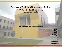
IND 5615 Building Systems Professor Katie Rothfield Midterm Presentantion Jacqueline Failer Katie Brown Sabrina Ocner Part I Research Paul Cejas Architecture Building Research Paul Cejas Architecture Building Photographs ID: 627462
Download Presentation The PPT/PDF document "Generator Building Renovation Project" is the property of its rightful owner. Permission is granted to download and print the materials on this web site for personal, non-commercial use only, and to display it on your personal computer provided you do not modify the materials and that you retain all copyright notices contained in the materials. By downloading content from our website, you accept the terms of this agreement.
Slide1
Generator Building Renovation Project
IND 5615 | Building SystemsProfessor Katie RothfieldMidterm Presentantion
Jacqueline FailerKatie BrownSabrina OcnerSlide2
Part I: Research
Paul Cejas Architecture Building Research Paul Cejas Architecture Building Photographs Processes and Methods
Case Studies Interviews Summary of IdeasSlide3
Paul Cejas Architecture Building Research
Project Identification
Building name: Paul Cejas School of ArchitectureLocation: 11200 SW 8th St. Miami, FL 33199
Year designed/planned: 1999
Year construction completed:
2003
Size:
102,000 sq. ft.
Architects:
Bernard
Tschumi
Architects & BEA International (Joint Venture)Client: Florida International University School of ArchitectureConsultants: Structural Engineer – BEA International Civil Engineer - CAP Engineers Mechanical Engineer – Tilden Lobnitz Cooper (TLC) Landscape Architect – Charles A. Aldenhttp://www2.fiu.edu/~soa/cejas/press_release.htmSlide4
Paul Cejas Architecture Building Research
Design Intent and Architectural Features
The Paul L. Cejas (PCA) Architecture complex at Florida International University is a hub of student creative activity. Completed in 2001, it was designed by Bernard Tschumi Architects, its principal being a renowned Swiss architect. According to FIU’s School of Architecture (SOA) website, the yellow and red tiled building is speculated by many to be an homage to either Antonio Gaudi or the setting Florida sun. The concept was based on Tschumi’s idea that “Architecture can generate interaction” (http://www2.fiu.edu/~soa/cejas/press_release.htm). In essence, the building was designed to encourage social and cultural connection.
The PCA complex is comprised of an administration building, the Generator, the student workshop/studio building, an auditorium building topped by an outdoor terrace, and an open courtyard connecting them all together. We will be renovating the interior spaces of the Generator, which is the central gathering space holding the student gallery, two critique rooms (rooms 240 and 340), and a large multipurpose space (room 341.)
According to Bernard
Tschumi’s
team, “The building must act as a generator, activating spaces as well as defining them” (http://www2.fiu.edu/~soa/cejas/architecture.htm). The School of Architecture space as a whole is comprised of three generators and two “sober wings” made of concrete, which house
the studios and offices. The area of palm trees behind the main generator, is considered the
“landscape architecture” generator.
Tschumi’s
idea was to bring together these different types of buildings in such a way that Florida International University brings together cultures. Slide5
The interior of the Generator has many problem areas, outlined by room-type. Before we began our research, we identified these problem
areas
:I. Gallery (140) It lacks a true “museum” quality, and it has the potential to feel much more “special” than it
does. Many works end up on the floor due to a lack of exhibit space.
There are inadequate lighting systems in place for the change between daylight and evening.
II. Critique Rooms (240 & 340)
The glare is unbearable, especially during the late afternoon hours, as the window-wall faces
west.
Due to the glare, the heat transference is uncomfortable as well.
There is inadequate seating and table-space.
The A/C ducts make a great amount of noise, and in combination with the concrete floors, this creates a major acoustic issue during critiques. Paul Cejas Architecture Building ResearchSlide6
Paul Cejas Architecture Building Research
III. Multipurpose Room (341)
NOTE: The issues in this room are very important to remedy, as this space is used for meetings and gatherings of stakeholders and advisory-board members, student-organizations, and visiting professionals, including panel/critique judges. This space must represent the dynamic and contemporary nature of FIU’s School of Architecture. The carpet is very thin, dirty, and worn…and the color is unappealing. Immediately upon entering the space, guests are greeted by a hulking six-foot rectangle directly
in front of the door.
The glare is unbearable all day, as floor-to-ceiling windows face north, east, and west.
Since there are many strange openings in the room (to be discussed and addressed in detail later
in the project) which lead to the gallery, noise pollutes the space and often banging and talking
can be heard.
The elevators make a lot of noise.
The strange angles of the space seem to bounce the noises around, rather than absorb them.
The walls are all white, adding to the glare.
The lighting is merely there, it does not make the space more appealing. Slide7
Paul Cejas Architecture Building Photographs
(Reading Room - Rm. 341)
This awkward large “block” stands in front of the door and takes up too much space and is visually unappealing.
The combination of track lighting, A/C vents, and recessed lighting is insufficient, and placement is too high.
Vertical blinds do not control the glare and they are not cleaned very often. They are also visually unappealing.
The furnishings are a combination of pieces from different places; they are not unified and look sloppy.
The carpet is very worn and stained. Additionally, it is difficult to clean or replace because it is in large strips instead of small tiles.
The strange shape of the room gives off
odd acoustic
qualities for the
varying uses of
t
he room.Slide8
Paul Cejas Architecture Building Photographs
(Critique Rooms - Rm. 240 & 340)
The HVAC system is very loud, contributing to the poor acoustic quality of these rooms.The afternoon glare is compounded by the white walls. There are no shading devices present. This also causes the crit
rooms to get very hot.
The track lighting looks dated and is too high to move if necessary.
There are either too few or too many chairs in the rooms at any given time. There is no design continuity.
The pin-up space needs to be maximized some how. A place for professors to write notes is also necessary, as these rooms are classrooms.
The A/C vents are very loud, and sometimes they cause the
room to be
unbearably
cold.Slide9
Paul Cejas Architecture Building Photographs
(Critique Rooms - Rm. 240 & 340)
The gallery does not give a feeling of pride in the students’ work. There are too many pieces on the floor, and appears to be thrown together.The Space may be maximized by adding different types of display systems. Chairs are needed for guests, students, and professors.
Vertical blinds do not control the glare and they are not cleaned very often. They are also visually unappealing.
These blocks are visually unappealing. Perhaps they could contain information on the students whose work is being presented.
Again, the elegant, modern gallery is lost in the disorganization. The different schools should have their work separated.
The track lighting is insufficient. Perhaps acoustics and
lighting can be combined.Slide10
Processes and Methods
Proposed Methods
To achieve our goals and objectives, research must be done to determine what needs to be done and how:Student and administrative interviews must be conducted, as these people are the true users of the spaces.
Interviews with architects or those involved with the project may help answer important questions.
Current architectural plans must be analyzed to help determine interior design limitations and opportunities.
Case-studies involving the renovation of other college galleries and workspaces must be analyzed and compared, to further learn about limitations and opportunities or spark a new idea.
Furniture brands, ecologically-sound materials, acoustical diagnostics and products, etc. must be researched to find the best fit for the budget.
During research, be sure to include as many sustainable features in furniture, fixtures, and/ or equipment choices.
Slide11
Processes and Methods
Actual Methods
This is the order in which we actually conducted our research, and how we plan on proceeding. We:Researched the building and the goals and concept of the Architect.
Took photographs of each space.
Conducted loose case-studies involving the renovation of other college galleries and creative workspaces, noting novel ideas and design plans and issues.
Interviewed faculty members, stakeholders (department heads and dean), the facilities manager, and students from each school regarding their opinions concerning the utility of all generator rooms.
Analyzed architectural drawings and simplified them for future use.
Researched furniture brands, choosing some that are very functional and environmentally sound, and others that were innovative and creative. We also researched some space-saving and design options
. Sustainable products will be selected
whenever possible.
Will develop floor plans, 3D models, elevations, choose definitive furniture and finishes, and
anayze
the budget for accuracy.
Slide12
Processes and Methods
Available Resources
Site tours Student interviews
Administration interviews
Other stakeholder interviews
Personal point of view
Personal digital images
Needed Resources*
List of “stakeholders” and contact information
for those willing to participate Contact information for architect associates or someone involved in the building/planning process.
Set of architectural plans
Tour of rooms in which we are denied access
What are the limitations as far as the
stakeholders and faculty?
*Currently, we have received all of the resources we
deemed necessary at the inception of this project.Slide13
Processes and Methods
Deliverables
Full project overview with research, concept statement, etc. on project board and PowerPoint
Plans (Floor, RCP, FF&E only)
Elevations
3D model(s) of new
spaces and special student-designed features
Materials/furniture choice
board including sustainable choices
Budget analysis
Slide14
Case Studies (Workspaces and Critique Areas)
1. Aftermodern Gallery
Location: San Francisco, CA Year construction completed: May, 2009Size: 8,500 square feet Architect: Sand Studios (Larissa Sand, Principal)
Client: Larissa & Jeff Sand, Sand StudiosConsultants: DK Design
Design Intent
The Aftermodern Gallery, a renovated 1940’s warehouse, has become part of a
multifunctional
facility housing the gallery, studio spaces, and apartments. The concept revolves around a studio/living culture and combining innovation and conservation; the design was created from the “urban environmentalism” outlook of the architects and clients. Sands saved as much of the existing building elements she could, and used natural and recycled products in place of those she could not salvage. Additionally, she introduced “new elements that complement the building’s humble character.”
Slide15
Case Studies (Gallery Renovation & Design)
(Aftermodern Gallery)
Architectural Features | Problems & SolutionsIts existing loft-like appearance contained many windows and skylights, which offered great amounts of natural light. Sculptural steelwork, fabricated by Sand Studios, minimalist plaster walls are the signature elements of the space. She removed existing partitions and drywall to reveal the structural concrete and wood beams, and added floating ceiling structures for the new systems equipment, and added wood flooring made from repurposed gymnasium floors. Additionally, she maximized space by creating a second floor in the high-ceilinged space.
Sand Studios also specializes in doors, hardware, and lighting, so there were many products for her to add to her new space. Many of the doors have special pivot-hinges to space and enhance its transformative quality. The gallery walls are also self-pivoting, moving a full 90 degrees to change as the gallery installations dictate. (
http://www.sandstudios.com/afterModern.html
10-31-10)Slide16
Case Studies (Gallery Renovation & Design)
(Aftermodern Gallery)
Images and Notes
These images show a most innovative idea for maximizing space. The pivot walls actually increase the square footage of the display space, yet take up only three inches of depth. We would like to implement some sort of pivot wall, similar to those shown.
(
http://www.sandstudios.com/afterModern.html
10-31-10) Slide17
Case Studies (Gallery Renovation & Design)
2.
Yale Sculptural GalleryLocation: New Haven, ConnecticutYear construction completed: September, 2007Size: 62,000 square feet
Architect: Kieran Timberlake and AssociatesClient: Yale University
Environmental Consultants: Atelier Ten
General Contractor: Shawmut Design and Construction
Design Intent
The newly renovated Sculpture Gallery at Yale University, a LEED Platinum-rated building, is now a unique four-story art studio. The bottom floor is used as the gallery space, and the other three floors are designated for parking. The goal of the design was to incorporate the gothic style of
architecture of the Yale campus, while giving it a contemporary spin. (http://greensource.construction.com 11-1-10)
Slide18
Case Studies (Gallery Renovation & Design)
(Yale Sculptural Gallery)
Problems & Solutions | Images & NotesAccording to John
Stoller, an associate of Kieran Timberlake Associates, it was important for the design team to “make the envelope do as much as possible so that the mechanical systems could do as little as possible;” they wanted to change the interior mechanics of the building (http://greensource.construction.com 11-1-10). As a solution, the gallery was surrounded by a large curtain wall that would transmit natural light, but still insulate the building’s core. Other architectural features include large, open transformational gallery space with ample storage and multiple ways of configuration to accommodate the rotating sculpture and installation shows, and display walls that hang on a pulley-system.
http://greensource.construction.com/projects/0807_YaleSculptureGallery/Images/4.jpg
The hanging partitions, also demountable, are a great idea for
transforming space as the displays change. The perpendicular walls direct and pull the viewer to each exhibit piece as a story
. This
would work particularly well
in the gallery.Slide19
Case Studies (Workspaces and Critique Areas)
3. Wong
Doody AdvertisingLocation: Culver City, CA Architect: Shubin
& Donaldson Contemporary ArchitectsClient: Wong
Doody
Advertising
Consultants: DK Design
Design Intent
Wong
Doody
is an advertising/media/PR firm with offices in Seattle and Los Angeles. They chose Shubin & Donaldson (S&D) to design the interior of their newest office, located in Culver City, CA. As in all of their offices, they wanted the space to convey the image of the modern company as well as their values. The key concepts were “1) a democracy of ideas, 2) having fun, 3) continuous improvement, 4) the development and cultivation of relationships with clients and colleagues, and 5) that the space reflect the quality of work that Wong Doody produces.” (www.fastcompany.com 10-31-10) Slide20
Case Studies (Gallery Renovation & Design)
(Wong
Doody Advertising) Problems & Solutions | Images & Notes
In response to their needs, S&D created multi-functional spaces such as conference rooms, “war rooms” (rooms where ideas are discussed and debated), editing bay, storage space, library, and most importantly, open workstations. The workspaces contain concrete flooring, skylights, recessed fluorescent lighting, and cork flooring throughout the remaining spaces. The walls of the war workrooms are multifunctional in that they are clad in idea-inducing materials such as cork, dry erase, and chalkboard paint, all of which are tools for brainstorming, teaching, learning, and presenting.
http://www.sandarc.com
We admire their use of “idea-inducing” materials like cork, dry erase, and chalkboard paint. We definitely want to include some sort of permanent writing surface in the critique rooms
. Some writing boards are also magnetic and interactive.Slide21
Case Studies (Workspaces and Critique Areas)
4. Performance Capture Studio
Location: San Francisco, CA Year construction completed: January 2009Size: 120,000 square feet Architect: Kanner
Architects & Lorcan
O’Herliby
Architects
Client:
ImageMovers
Digital,
Kanner
Architects & Lorcan O’Herliby Architects Design IntentA former aircraft hangar located in San Francisco was converted into a film production studio and architectural firm. The 120,000 square feet Hamilton Air Base closed in 1976, and was restored years later. The space was designed for the collaborative work of ImageMovers Digital and the two architecture firms: Kanner Architects and Lorcan
O’Herliby
Architects. The concept of this project is a “strange loop,” a term often used in filmmaking to portray a continuous movement in a storyline that returns to the same moment it began. Slide22
Case Studies (Gallery Renovation & Design)
(Performance Capture Studio)
Architectural Features | Problems & SolutionsThey developed a flexible, adaptable display wall made with 11-by-17-inch “flags” that display images of their current projects. The images are printed on magnetized vinyl and can be easily mounted and demounted. The wall is also comprised of cork material made from recycled plastic, where artists can pin-up their work for discussions. This wall system brings together the different departments to engage in collaborative work in a non-linear format. Additionally, strategically placed curvilinear nodes further promote collaboration and enhance the experience. This intricate wall system serves as a strong way-finding
device
to move visitors through the space easily and efficiently. It also allowed for the addition of a suspended blackout curtain for flexible horizontal
light control in the different workstations. (
http://archrecord.construction.com/projects/interiors/archives/09_Performance-Capture-Studio/default.asp
)
For this program, the architects needed to consider an easy way to orient visitors and guide them through such a large the space; they needed to control the amount of daylight penetrating the space for the editors and animators working there, but at the same time keeping the interiors as open
as
possible. They
also considered sound control issues for a productive working environment. (http://www.designmind.co.za/profiles/blogs/incredible-architecture-of)Slide23
Case Studies (Gallery Renovation & Design)
(Performance Capture Studio)
Images and Notes
(http://
www.archdaily.com/55686)
This studio utilizes a variety of conceptual and transformative ideas for showcasing projects. The walls are made of multiple materials and allow for many different ways to display pieces of work.Slide24
Each group member interviewed a stakeholder (a department head), three students (one from each school), and a faculty member. We also met with the dean and facilities manager as a group. We asked questions about their opinions regarding the utility of the space.
I. Stakeholders IV. Other:Janine King (Interior Design) Brian Bergwall (Associate Dean of Arch.)Marta Canaves
(Landscape Architecture) Patty Ruiz (Facilities Manager)
II. Faculty
Phil Abbott
Katie
Rothfield
Sarah Sherman
Students
InterviewsKarissa Mason Ismabys Senra Ryan Correia Isis Fumero
Jaime Soto Mario
Rojo
Marcela
Arbelaez
Mohammed
ElsayedSlide25
Each respondent’s answers were recorded and analyzed, and the common points were recorded. These
commonalities are as follows:
Each respondent mentioned that the acoustics (in every room) need improvement due to the HVAC system not being insulated enough, but funding and preserving the intent of the space may be an issue. The gallery lighting needs improvement, possibly spot lighting or track lights. Student work in the gallery needs some sort of transformable display system, but needs to take into account the storage space and must fit there. The walls of all rooms (unanimously) need to stay light-colored, as are most gallery and pin-up walls. The heat and glare in 240, 240, and 341 are especially an issue. Another major issue is the amount of pin-up space in room 341. While the system they have in place now works, it is an eye sore; a common comment is there must be a better way to increase space.
The furnishings were also an issue that was brought up several times. Common thoughts were that the multiple types or furnishings look like a mixture of different collections. The studio is very short on chairs because many have been moved to any of the referenced rooms. Obviously, the number or types of seating are inadequate. Many respondents also mentioned the need for carpeting instead of concrete.
Ultimately, the four biggest issues are:
1. Glare in rooms 240, 340, and 341
2. Lighting system needs improvement or more variety
3. Pin-up space needs to be increased
4. Acoustic improvement
Summary of IdeasSlide26
Part II: Program
Gallery (Rm.140) Critique Rooms (Rm. 240 & 340) Reading Room (Rm. 341) Materials and Furnishings OptionsSlide27
Gallery (Rm. 140) Program
Added storage space (possibly same size as existing)
Pivot walls (quantity: 4, varying sizes) will add 68 sq. ft. of pin-up space.3. Walls – use homosote (as is already being used) and keep
white. We believe that adding carpeting and acoustical clouds to the room will be sufficient for acoustical improvement.
4. Small groupings of seating , lounge or ottoman-like, (quantity: 4 to 6
). To be placed around the structural pin-up blocks.
5. Carpet tiles
throughout – made of recycled content and in a dark array of colors to mask wear and tear.
6. Pivot shelving
– to be designed
– pivot 90 degrees from floor, student work display
Acoustical ceiling panels – hanging/floating (acoustical cloud), so as not to disrupt open-ceiling conditionSuspended and track lighting that allows multiple lights to be “strung” and moved as displays
changeSlide28
Critique Room (Rm. 240 & 340) Program
1. Pivot walls (quantity: 1 or 2 @ 3 sq. ft., located in middle of north and south walls to increase surface area.)
2. Walls – use homasote (as is already being used) and keep white. We believe that adding carpeting and acoustical clouds to the room will be sufficient for acoustical improvement.
Seating – Stackable chairs (quantity: 15
)
and meeting
tables (quantity: 2
,
foldable)
4. Carpet tiles
throughout – made of recycled content and in a dark array of colors to mask wear and tear.
5. Pivot shelving – to be designed, located on east and west walls (depending on space after pivot walls – pivot 90 degrees from floor, student work display (for architecture students) – mounted @ 2 ½ feet from floor.6. Acoustical ceiling panels – hanging/floating (acoustical clouds), so as not to disrupt open-ceiling condition
Suspended and track
lighting that allows multiple lights to be “strung” and moved as displays change
White
multifunctional (interactive, magnetic, etc.)
white-
board
attached to wall (4’ x 6’)
Slide29
Multipurpose/Reading Room (Rm. 341) Program
1. Pivot/accordion wall (quantity: 1)
located on the east wall wall to increase surface area (12 sq. ft.), made of homasote
) Remove large pin-up block.
2. Seating – Stackable chairs (quantity:
40
)
3. Meeting tables (quantity:
8, foldable, with storage dolly)
4. Carpet tiles
throughout
- made of recycled content and in a dark array of colors to mask wear and tear.5. Pivot shelving – to be designed, located on east and west walls (depending on space after pivot walls – pivot 90 degrees from floor, student work display (for architecture students)6. Acoustical ceiling panels – hanging/floating, so as not to disrupt open-ceiling condition
Track lighting that allows multiple lights to be “strung” and moved as displays change
White (
interactive
, magnetic, etc.) white-board
board attached to wall (4’ x 6
’)
with wall-mounted
projector
Slide30
Room 341 - Chair Option #2 - Herman
Miller
“Caper Chair”To develop a better solution for hard-working, multiuse spaces, Herman Miller built on its extensive work chair research base and applied it to secondary seating. The result, the lively Caper chair, was designed by Jeff Weber of Studio Weber + Associates, using universal design principles to create one seating product that accommodates the diversity of people, tasks, and behaviors in a multitude of work areas.
Weber believes that design is "the connective tissue" between people and the environment, and that the quality of that design--whether of a building or a chair--profoundly effects the quality of life. The Caper chair, he says, achieves its high level of performance and comfort by "using standard materials in novel ways." The Caper family provides all this at an affordable price. "Too much good design seems expensive," Weber says. "I wanted to break that cliché.“
Chairs used as secondary seating in spaces like conference, project, training, and multipurpose rooms have traditionally been designed for some other purpose. They have lacked important capabilities - easy mobility, light scale, compact footprint, and simple-to-use adjustments.
General Dimensions
stacking chair
height: 32.5 in.
width: 17.5 in.
depth: 16.5 in.
multipurpose chair
height: 32.5 in.width: 17.75 in.depth: 17.5 in.Earth-Friendly
Each Caper chair is 100% recyclable and made of 21% recycled material. Because all Caper chairs, including the multipurpose chair, weigh about half as much as competitive models, fewer materials and less energy are required for their manufacture. Caper chairs adhere to McDonough
Braungart
Design Chemistry (MBDC) Cradle to Cradle Design Protocol and are GREENGUARD certified and may contribute to LEED credits.
http://www.hermanmiller.com/Products/Caper-ChairsSlide31
Room 341 - Chair Option #1 - Howe’s “40/4 Chair” by David Rowland
Since 1951, Rowland’s “40/4” chair it
has been honored with numerous design awards and is exhibited in MoMA and design museums all over the world. the chair is renowned for its unsurpassed stacking and handling qualities combined with an elegant and spare aesthetic and
superior ergonomic features.
A favorite
of
specifiers
, 40/4 can be dressed to suit absolutely any application
– in practical
plastic resin, finely-crafted wood veneers to elegant leather upholstery.
General Dimensions
stacking chairheight: 30 in. width: 19.25 in.depth: 21.25 in.Stacked chiars (40)height: 57 in.width: 36 in.Earth-Friendly
Taking
a genuine interest in
their surroundings is
deeply ingrained in
HOWE’s
strategic thinking.
Their long-lasting
,
space-saving and
multi-usage furniture
solutions means
fewer resources needed; and thus fewer affects on the
environment, contributing to their overall LEED-credit
.
Accreditation
:
FSC
LEEd
contribution
Packaging:
recycled
material
recyclable
after use
Factory
:
saving
energy
Green
energy
only
saving
paper
S
uppliers
:
FSC accredited
http://www.howe.com/product/404Slide32
Room 240, 340, and 341 - Work Table Option #1
Casala’s “Tavo” Folding T
ableCasala’s Tavo table is slender, stable, and available in a several varieties and finishes. It can be stacked, rolled, folded, or stored. This makes the
Tavo table perfect not only for meetings and training sessions, but for spaces that have regularly changing arrangements.
General Dimensions
stacking chair
Length:
63 in.
width: 30 in.
height
: 30 in.
Earth-Friendly If desired, the Tavo table can be specified with sustainable veneer tops.
(http
://
www.casala.com/start/index.php?whereami=Products%2FProductreview)Slide33
Having achieved success with their plywood and molded plastic chairs, Charles and Ray Eames challenged themselves to make a reasonably priced, strong but lightweight, quality chair out of bent wire.
Introduced in 1951, it was an immediate hit. Distinctively, unmistakably Eames, the wire chair has stood the test of time and is as popular today as it was half a century ago.Wire only. Wire with a one-piece leather seat pad. Wire with a
criss-cross two-piece leather pad (the "bikini"). The seat and base are chrome, and the leather pads are available in a range of colors. Glide choices. Standard glides feature a durable plastic bottom and can be ordered with felt bottoms to protect bare floors; both styles tilt slightly to help with leveling.
The matching wire table makes a great companion piece.
Gallery Furnishings - Herman Miller Eames Wire Chair and Wire Table
Chair - General
Dimensions
height
: 32.75 in.
width
: 19 in.
depth: 21.25 in.http://www.hermanmiller.com/Products/Eames-Wire-ChairsTable - General Dimensionsheight: 10 in. width:15.5 in.depth
: 13.25 in.Slide34
These tables work anywhere you decide to use them, so it's logical they'd be called Everywhere tables. Two traits give them their anywhere versatility.
Fine lines—a refined, single aesthetic means they complement any space, bringing unity and visual calm. No boundaries—a simple kit of top shapes and leg styles can be combined in nearly limitless ways. And if these choices aren't enough for you, feel free to create your own because Everywhere tables are easy to customize.
Room 240, 340, and 341 - Work Table Option #2Herman Miller – Everywhere TableNearly Limitless Choices
Begin with your table shape—even a shape you design. Choose your finish, then select from among several leg styles and finishes. Then choose a height—standard, adjustable, or standing. Choose casters or glides. Add power and data with Connect inserts which allows for easy access to power and data.
You can even specify tops that flip, so that the tables can be nested for efficient storage—perfect for education areas.
Feel Better. Work Better.
Everywhere tables with adjustable height give you an easy and ergonomically sound way to vary posture throughout the day. As one of the performance tables in our Thrive portfolio, all the Everywhere tables are designed to help people work safely, effectively, and comfortably.
Adaptable to Change
Everywhere tables adapt to big changes and small ones. Whether you're moving or reconfiguring, use Everywhere tables in different ways to make the most of a new space—or an old one.
Rearrange the tables—without disrupting power applications—to change a conference room to a training center. Move grouped tables to single workstations to accommodate new employees. Or group tables to support impromptu gatherings.
Earth-Friendly
Everywhere tables are made of 67 percent recycled materials and are up to 27 percent recyclable at the end of their useful lives. They are also GREENGUARD certified.
The simple kit of 15 parts also provides environmental benefits: Not only is replacing components easy on you, but replacing a part instead of an entire table is easier on the environment.
General Dimensions
height
: 22-48 inches
width
: 24-84 inches
depth
: 18-42 inches
http://www.hermanmiller.com/Products/Everywhere-TablesSlide35
Innozense
Materials;polished clear acrylic
stainless steel fittingsThis suspended transparent table maximizes space. It's cantilevered design allows chairs to be placed anywhere around it. The table can be hung from the wall or ceiling by stainless steel cables and fittings. It provides a contemporary modern atmosphere.Designer:
Uli Kutschka
(United States)
Manufacturer:
salamander-design (United States)
http://www.designspotter.com/product/2008/10/innozense.html
http://www.designspotter.com/product/2005/04/workshopdesign_1.php
Workshop Design
Flatmate
A contemporary interpretation of the classic secretary's flatmate: At only 12 cm depth, functional equipment and connections for a portable computer, the graceful furniture a complete workstation.
flatmate
has a working area lighting, the interior is fully configurable and behind the narrow side doors hide your
folders.
These
are
inspiration images, from which we developed our “wall-folding
” shelves for model-display. Our version will be very durable and will have legs that touch the floor for added support.Slide36
Part
III: Architectural Plans Gallery (Rm.140) Floor Plan and RCP Critique Rooms (Rm. 240 & 340) Floor Plan and RCP
Reading Room (Rm. 341) Floor Plan and RCPSlide37
Gallery
(Rm.140) Floor Plan Slide38
Gallery
(Rm.140) Reflected Ceiling Plan(We only added acoustic clouds and suspended lighting fixtures only; our researchis not yet complete.) Slide39
Critique
Rooms (Rm. 240 & 340) Floor PlanSlide40
Critique
Rooms (Rm. 240 & 340) Reflected Ceiling Plan(We only added acoustic clouds and suspended lighting fixtures only; our researchis not yet complete.)Slide41
Reading
Room (Rm. 341) Floor PlanSlide42
Reading
Room (Rm. 341) Reflected Ceiling Plan(We only added acoustic clouds and suspended lighting fixtures only; our research is not yet complete.)Slide43
References
(These are not in order yet, we are keeping a list until the end.)http://www.sandstudios.com/afterModern.html 10-31-10http://greensource.construction.com/projects/0807_YaleSculptureGallery.asp 10-31-10
www.fastcompany.com 10-31-10
http://www.greenwichlibrary.org/blog/library_news
10-31-10
http://goldwaterlibrary.typepad.com
10-31-10
http://www.designmind.co.za/profiles/blogs/incredible-architecture-of
11-1-10
http://www.hermanmiller.com/Products/Eames-Wire-Chairs
http
://www.casala.com/start/index.php?whereami=Products%2FProductreviewhttp://www.howe.com/product/404http://www.hermanmiller.com/Products/Caper-Chair
http://archrecord.construction.com/projects/interiors/archives/09_Performance-Capture-Studio/default.asp
11-1-10
http
://-
www.archdaily.com/55686/performance-capture-studio-kanner-architects-lorcan-herlihy-architects
http://www.designspotter.com/product/2008/10/innozense.html
http
://www.hermanmiller.com/Products/Everywhere-Tables
http
://www.hermanmiller.com/Products/Eames-Wire-Chairs