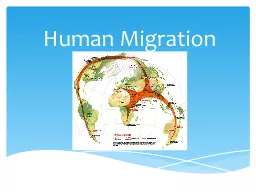
Santiago Arias Kelton Fredric Bernardo Gonzalez Kayla Lockcuff Background Gross Domestic Product GDP commonly used as indicator of countrys status effectiveness or appeal Social Progress Index SPI is separate weighted combination of indicators based on holistic evaluation of count ID: 585640
Download Presentation The PPT/PDF document "Human Migration and Health care synopsis..." is the property of its rightful owner. Permission is granted to download and print the materials on this web site for personal, non-commercial use only, and to display it on your personal computer provided you do not modify the materials and that you retain all copyright notices contained in the materials. By downloading content from our website, you accept the terms of this agreement.
Slide1
Human Migration and Health care synopsis in a global world
Santiago Arias,
Kelton
Fredric, Bernardo Gonzalez, Kayla LockcuffSlide2
Background
Gross Domestic Product (GDP) commonly used as indicator of country’s status, effectiveness or appeal
Social Progress Index (SPI) is separate weighted combination of indicators based on holistic evaluation of country’s status
Want to compare indicators of country’s wellbeing with GDP and SPI to see correlationSlide3
Methodology
Search for data relevant to main goal
Select data indexes and parse through selecting 133 countries containing SPI values
Use geospatial analysis to compare indexes and create visual or numerical system to indicate trends or correlations
Create Metadata/interpret information regarding all correlations or trends
Draw conclusions using Metadata, visual aids, and geographical relationsSlide4
Scope
SPI (social progress index) obtained for roughly 133 countries used for comparison
GDP for all selected countries is obtained, along with GDP per capita in US Dollars
Total expenditure on health care as percentage of GDP is recorded for the selected countries
Net migration rate is obtained for the 133 countries
The SPI, GDP, Healthcare Exp, Infant Mortality and Net migration will be used for as many countries as possible and complementary data may be gathered. Slide5
Main goal
Net migration is connected to quality of life
Correlate SPI and net migration and verify an indicator linked to both GDP and quality of life
Use indicators to bridge gap between a national wealth, and quality of life
Determine trends, indicators, or logical connections of migrations to GDP, SPI, and geography Correlate health care expenditure and overall health like infant mortality rate to net migration Slide6
SPI BASICS
SPI trends are easily revealed by setting up classes or plotting them against other indicators such as GDP. A multitude of information can be made available through similar functions. Slide7
Net Migration vs. SPI
A clear correlation exists, but what drives it?
SPI considers many aspects of human life. So this trend is expected but can now be quantified.
A clear Trend between SPI and Net Migration Rates.
SPI’s below75 tend to have an outflow of people
SPI’s above 75 all have an influx of people
Some outliers exist
Slide8
Net Migration vs GDP per capita
Much like SPI net migrations tend towards positive for more prosperous conditions. Low GDP per capita outliers may be due to anomalies, such as war and famine.Slide9
Net migration Map
ArcMap classes can reveal much about geographical trends or allow one to make inferences.
The map reveals high influxes of people in certain regions, and areas of
outflux
. Much of Africa has a negative net migration rate.
(Correlates to low SPI and GDP values)Slide10
Net Migration and SPI explained
X-Y
scatterplot
correlates between SPI and Migration rates, but cannot give information about geographical trends directly
The information provided from a class map of many nations reveals trends regionally and can empower users to make more educated inferences about what drives these migration ratesClassically high emigration rates of African nations are linked to low SPI and GDP values Slide11
GDP Per Capita
GDP per capita measures theoretical
avg
distribution of wealth
Correlates more effectively with SPI than raw GDP
Concentrations of wealth exists but are negligible
Helps to indicate expendable income of populationSlide12
GDP per Capita
Trends in GDP per capita are clearly tied with geographical location. The red countries are those with a the lowest GDP per capita, and vice-versa for the green countries.Slide13
Health Care Expenditure
Displays correlation with increasing per capita health care spending there is increasing life expectancy
Most 3
rd
world countries have lower life expectanciesSlide14
Health Care Expenditure
Shows developed countries tend to dedicate a larger portion of GDP to heath care
Asia has some of the least GDP dedicated to health careSlide15
Health Care vs. Infant Mortality
Clear correlation between GDP percentage towards healthcare and infant mortality
Nations with higher infant mortality have lower percentages of GDP towards health careSlide16
Infant Mortality vs. GDP per capita
Infant mortality also correlates strongly with GDP per capita because both are so highly tied to health care expenditureSlide17
Symptoms like net migration and indicators like SPI, GDP per capita, and health care can reveal deep social issues with strong regional ties such as infant mortality
Endemic Problems Slide18
Conclusion
Many problems are endemic to regions, this may be due to geographic or cultural factors.
Health care is a considerably higher priority in the developed world, leading to lower infant mortality
Human migration patterns often follow regional trends. Emigrants tend to move to adjoining countries, so the rates tend to lessen farther out from a high
outflux country. US deviation from GDP per capita vs. life exp. due to endemic obesity, suggests outliers hint to unseen causesSlide19
Questions?