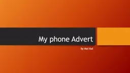
By Mel Kel I have chosen this design to show that it can be suitable to around Teenagers and early adults Phone review 1 Harriet Booth Is the advert suitable for its age group Yes because its colourful and bright ID: 524786
Download Presentation The PPT/PDF document "My phone Advert" is the property of its rightful owner. Permission is granted to download and print the materials on this web site for personal, non-commercial use only, and to display it on your personal computer provided you do not modify the materials and that you retain all copyright notices contained in the materials. By downloading content from our website, you accept the terms of this agreement.
Slide1
My phone Advert
By Mel
KelSlide2
I have chosen this design to show that it can be suitable to around Teenagers and early adults. Slide3
Phone review 1 – Harriet Booth
Is the advert suitable for its age group?
Yes because its colourful and bright
What is good about the advert?
Captures the age and audience
What needs improving?
Maybe like make the advert more appealing to boysSlide4
Phone review 2 – Cara Dunham
Is the advert suitable for its age group?
This advert is very suitable for its age group as it is colourful and bold.
What is good about the advert?
It has different fonts of text and is eye catching
What needs improving?
The writing needs to be made a little clearer.Slide5
Phone review 3 – Charlotte Oates
Is the advert suitable for its age group
?
Yes, the advert is suitable for its age group because you can tell when you look at the advert its for both genders.
What if good about the advert
?
Its good because she has created the phone herself. The background of her advert grabs the audiences attention. She has given information about the phone so you know a little bit about it.
What needs improving
?
The text isn’t as clear because when you look at it, its slightly blurry. Slide6
Evaluation
My advert is for both genders boys and girls, and all ages. The colours and catches the eyes of others. I feel like I could have done better like making the writing a lot more clearer. I also could’ve done better by using
more Effects to make it neater and more professional.