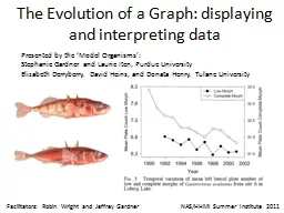
NASHHMI Summer Institute 2011 Presented by the Model Organisms Stephanie Gardner and Laurie Iten Purdue University Elizabeth Derryberry David Heins and Donata Henry Tulane University ID: 411972
Download Presentation The PPT/PDF document "The Evolution of a Graph: displaying and..." is the property of its rightful owner. Permission is granted to download and print the materials on this web site for personal, non-commercial use only, and to display it on your personal computer provided you do not modify the materials and that you retain all copyright notices contained in the materials. By downloading content from our website, you accept the terms of this agreement.
Slide1
The Evolution of a Graph: displaying and interpreting data
NAS/HHMI Summer Institute 2011
Presented by the ‘Model Organisms’:
Stephanie Gardner
and Laurie Iten, Purdue UniversityElizabeth Derryberry, David Heins, and Donata Henry, Tulane University
Facilitators: Robin Wright and Jeffrey GardnerSlide2
Context
100-level biology
majors’ class that covers evolutionary biology
Before this teaching unit, students introduced to: - Different data types
- Collecting data Instruments & techniques Methods & limitations - Basic descriptive & inferential statisticsTeaching unit takes two 50 min. lecture or lab periods.Slide3
Our teaching unit = snapshotSlide4
Of larger coverage of gathering, displaying & interpreting dataSlide5
Teachable Unit: “The Evolution of a Graph”
Learning Goals
Students will understand:
the importance of quantitative approaches to interpret data.
that evolution is the change in frequency of phenotypes (alleles) over time (across generations).Learning OutcomesStudents will be able to:make a prediction in a real scientific context.choose the appropriate test to analyze a set of evolutionary data.
create an appropriate graph of their data.
interpret the result and scope of the inferential statistic in the context of the hypothesis that there has been evolutionary change.Slide6
Threespine
sticklebackSlide7
“Low Morph”
“Complete Morph”
Mini-lecture:
Threespine
sticklebackBell et al 2004 Evolution
More armor
Advantageous where there are no hiding places.
Less armor
Advantageous where there are places to hide.Slide8
Q: Which of the following relationships between stickleback plate phenotype and habitat would you expect to find
?
A. Complete
in
ocean & complete in lakeB. Low in
ocean & complete in lakeC. Complete in
ocean &
low in lake
D. Low
in
ocean &
low in lake
OCEAN HABITAT
LAKE HABITATSlide9
Group Activity
Using your knowledge of the biology of these fishes (see your handout), take
10
minutes and write a prediction about how the frequency of occurrence of the two phenotypes might change over time.
Work in pairs. Slide10
Year
n
Complete
MorphLow Morph
19911000.760.160200133040.1120.752
Group Activity
In
pairs
,
Take the data from your field sampling efforts (see table below) and produce a graph (remember to include appropriate components). You have
5
minutes (10-15 minutes for students).
Table: Frequency of occurrence of two stickleback morphs in
Loberg
Lake, Alaska. n = sample size
From: Bell et al 2004
EvolutionSlide11
Group assessment
Exchange your graph with another pair
Annotate (i.e. make changes to) the other group’s graph, with two thoughts in mind:
Is this type of graph the most effective format for conveying the information?Are all the appropriate components included?You have 3 minutes (10 for students) minutes for this exercise.Give the graph back to the original group.Slide12
Class discussion
Let’s come up with some ideas about what makes a graph effective and what the appropriate components of a graph are.
These ideas will be used to guide in the creation and evaluation of future graphs.Slide13
Clicker question 1
Which of these graphs most effectively conveys the data from our stickleback study?
A
B
CSlide14
Clicker question 2
A
B
C
Which of these graphs includes the most complete set of appropriate components?Slide15
Synthesize your work from today!
Take your prediction and your corrected graph and write two sentences to explain:
whether or not your data supported your prediction
(2) how representing these data in a graphical format aided in your understanding of the evolution of morphology in stickleback.
Bring your written statement to the next class!HomeworkSlide16
Teachable Unit: “The Evolution of a Graph”
Learning Goals
Students will understand:
the importance of quantitative approaches to interpret data.
that evolution is the change in frequency of phenotypes (alleles) over time (across generations).Learning OutcomesStudents will be able to:make a prediction in a real scientific context.choose the appropriate test to analyze a set of evolutionary data.
create an appropriate graph of their data.
interpret the result and scope of the inferential statistic in the context of the hypothesis that there has been evolutionary change.Slide17Slide18
Teachable Unit: “The Evolution of a Graph”
Learning Goals
Students will understand:
the importance of quantitative approaches to interpret data.
that evolution is the change in frequency of phenotypes (alleles) over time (across generations).Learning OutcomesStudents will be able to:make a prediction in a real scientific context.choose the appropriate test to analyze a set of evolutionary data.
create an appropriate graph of their data.
interpret the result and scope of the inferential statistic in the context of the hypothesis that there has been evolutionary change.Slide19
Additional fun stuff
http://learn.genetics.utah.edu/content/variation/stickleback/Slide20Slide21
Threespine
stickleback as a supermodel
in evolutionary biologySlide22
Adaptive radiation
Insert image of Darwin’s finchesSlide23