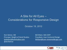
Considerations for Responsive Design October 19 2012 Dori Kelner MS Principal SleightofHand Studios dmkelnersohstudioscom dorikelner Bill Killam MA CHFP President UserCentered Design ID: 560141
Download Presentation The PPT/PDF document "A Site for All Eyes –" is the property of its rightful owner. Permission is granted to download and print the materials on this web site for personal, non-commercial use only, and to display it on your personal computer provided you do not modify the materials and that you retain all copyright notices contained in the materials. By downloading content from our website, you accept the terms of this agreement.
Slide1
A Site for All Eyes –Considerations for Responsive DesignOctober 19, 2012
Dori Kelner, MSPrincipal, Sleight-of-Hand Studiosdmkelner@sohstudios.com@dorikelner
Bill Killam, MA
CHFP
President, User-Centered Design
bkilliam@user-centereddesign.comSlide2
August, 198110/19/2012 Slide 2© 2012 Sleight-of-Hand Studios and User-Centered DesignSlide3
Hardware/IDx from the Xerox 8010Removable storageThe first local networkBit mapped displays Mouse
Windows
Icons
Menus
Desktop Metaphor
WYSIWYG
Direct Manipulation
10/19/2012 Slide
3
© 2012 Sleight-of-Hand Studios and User-Centered DesignSlide4
Technology Advances First10/19/2012 Slide 4© 2012 Sleight-of-Hand Studios and User-Centered DesignSlide5
WindowsMacWeb-based Application
Client-servers and the Web10/19/2012 Slide 5© 2012 Sleight-of-Hand Studios and User-Centered DesignSlide6
Displays10/19/2012 Slide 6© 2012 Sleight-of-Hand Studios and User-Centered DesignSlide7
New Devices – New Challenges
10/19/2012 Slide
7
© 2012 Sleight-of-Hand Studios and User-Centered DesignSlide8
Should we care?
10/19/2012 Slide 8© 2012 Sleight-of-Hand Studios and User-Centered DesignSlide9
10/19/2012 Slide 9© 2012 Sleight-of-Hand Studios and User-Centered DesignWhat do we do?Slide10
TabletSmartphoneiOS
WebOSAndroid
Blackberry
Other
Touch
Keyboard
B&W
Color
Pixel density
“Responsive design is the real deal. It is not a fad. It’s a legitimate attempt to address the massive challenge of delivering great experiences to this explosion of devices and browsers. But don’t feel like it’s the end-all be-all of website construction. This ain’t religion. This is web design.”
Brad Frost
Orientation
Inflight
Appliances
TV
Gaming
10/19/2012 Slide
10
© 2012 Sleight-of-Hand Studios and User-Centered DesignSlide11
OverviewFramework: fluid grid, media queries, flexible imagesBehavioral issues: design for the userTypography: size mattersProcess: rethinking how we workPerformance: you need to hear this
10/19/2012 Slide 11© 2012 Sleight-of-Hand Studios and User-Centered DesignSlide12
960px
.
col
-a
634px
.
col
-b
306px
.
col
-a {width: 66.0416666%} /* 634 / 960 */
.
col
-b {width: 31.875%} /* 306 / 960 */
10/19/2012 Slide
12
© 2012 Sleight-of-Hand Studios and User-Centered DesignSlide13
810px
1050px620px
480px
10/19/2012 Slide
13
© 2012 Sleight-of-Hand Studios and User-Centered DesignSlide14
Respond to different screen pixel width/height in HTMLRespond to different screen pixel densitiesRespond to users zooming in on imagesProvide user agents with the information they need to select the most appropriate image source in low-bandwidth situations, via media queries (not yet available)August 29, 2012
Preserve separation of content markup and stylingProvide a purely client-side solution that can include JavaScript, but doesn't require itProvide different crops of an image according to the viewport or device through which it is viewed
first draft of official specification from W3C for RESPONSIVE IMAGES
Courtesy: Anselm
Hannemann
,
.net
Magazine10/19/2012 Slide 14© 2012 Sleight-of-Hand Studios and User-Centered DesignSlide15
Behavioral IssuesFormsButtonsGestures10/19/2012 Slide 15© 2012 Sleight-of-Hand Studios and User-Centered DesignSlide16
MenusFlyout or ToggleSelect ListDropdown10/19/2012 Slide 16© 2012 Sleight-of-Hand Studios and User-Centered DesignSlide17
image courtesy: Oliver Reichenstein, iAResponsive Typography10/19/2012 Slide 17
© 2012 Sleight-of-Hand Studios and User-Centered DesignSlide18
A Viable Process10/19/2012 Slide 18© 2012 Sleight-of-Hand Studios and User-Centered DesignSlide19
Responsive layouts, responsively wireframedcourtesy: James Mellers, Adobe10/19/2012 Slide 19© 2012 Sleight-of-Hand Studios and User-Centered DesignSlide20
Users will only wait 2-3 seconds to load your pagedisplay: none; only hides content (bad) but doesn’t lighten the pageImages account for a large proportion of the page loadDesigners must know performance implicationsPerformance10/19/2012 Slide 20© 2012 Sleight-of-Hand Studios and User-Centered DesignSlide21
Wrap it UpOur goal is a device agnostic webDesign for user experienceStart with content strategyMobile first progressive enhancementIterative design/development in the browserBaked in performance
10/19/2012 Slide 21© 2012 Sleight-of-Hand Studios and User-Centered DesignSlide22
Resourceshttp://responsive.ishttp://www.responsinator.com/http://bradfrost.github.com/this-is-responsive/resources.htmlhttp://www.alistapart.com/articles/responsive-web-designhttp://www.netmagazine.com/features/top-responsive-web-design-problems-and-how-avoid-themhttp://bradfrostweb.com/blog/web/responsive-nav-patterns/
http://www.netmagazine.com/features/road-responsive-images
http://www.protytype.com/
http://informationarchitects.net/blog/
responsive-typography-the-basics/
http://blog.typekit.com/2011/11/09/
type-study-sizing-the-legible-letter/
http://www.guypo.com/mobile/performance-implications-of-responsive-design-book-contribution/Dori Kelner, MSPrincipal, Sleight-of-Hand Studiosdmkelner@sohstudios.com
@
dorikelner
Bill Killam, MA
CHFP
President, User-Centered Design
bkilliam@user-centereddesign.com
10/19/2012 Slide
22
© 2012 Sleight-of-Hand Studios and User-Centered Design