/
Using Color in Your Diagrams and Presentations Using Color in Your Diagrams and Presentations

Using Color in Your Diagrams and Presentations - PowerPoint Presentation

tatiana-dople
tatiana-dople . @tatiana-dople
Follow
366 views
Uploaded On 2018-02-08

Using Color in Your Diagrams and Presentations - PPT Presentation

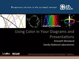
Kenneth Moreland Sandia National Laboratories What is color Is black a color 001 nm 01 nm 1 nm 10 nm 100 nm 1 μm 10 μ m 100 μm 1 mm 1 cm 10 c m 1 m 10 m 100 m 1 km ID: 629413

color colors dynamic range colors color range dynamic pros good rainbow response 100 red ordering implicit high cons distinguish

Share:

Link:

Embed:

Download Presentation from below link

Download Presentation The PPT/PDF document "Using Color in Your Diagrams and Present..." is the property of its rightful owner. Permission is granted to download and print the materials on this web site for personal, non-commercial use only, and to display it on your personal computer provided you do not modify the materials and that you retain all copyright notices contained in the materials. By downloading content from our website, you accept the terms of this agreement.


Presentation Transcript

Slide1

Using Color in Your Diagrams and Presentations

Kenneth Moreland

Sandia National LaboratoriesSlide2

What is color?

Is black a color?Slide3

0.01 nm

0.1 nm

1 nm

10 nm

100 nm

1

μm

10

μ

m

100

μm

1 mm

1 cm

10

c

m

1 m

10 m

100 m

1 km

Gamma-rays

X-rays

Visible

Infra-red

Ultraviolet

Microwaves

Radio, TV

Long-waves

7

00 nm

400 nmSlide4
Slide5

Corollary

Color is perceived through the response of three cone receptor typesTherefore, any color can be represented by the intensity of three given wavelengths based on their relative responses

Known as the trichromatic theorySlide6

Blue

Green

RedSlide7

Caveat

Some colors (particularly pure frequencies) have a response that requires a negative response by R, G, or BNot physically possibleSlide8
Slide9
Slide10
Slide11
Slide12
Slide13
Slide14
Slide15
Slide16
Slide17
Slide18
Slide19
Slide20
Slide21

Isoluminant

colors (colors with the same brightness) are sometimes recommended because they have several advantages. They avoid dominance of one color over another and can be applied to 3D objects without interfering with shading cues.

However, in addition to generally being ugly,

isoluminant colors are harder to distinguish from one another, particularly at close range. That is, their high frequency response is poor. That is why these words are hard to read. They might be vibrating your visual field and/or producing a headache.Slide22
Slide23

Number by Colors

Sequential A continuous spectrum with low and high ends

Temperature, Pressure, Mass, Stress, Strain, Volume Fraction, RainfallDiverging A continuous spectrum with a significant middle pointTemperature around freezing, Elevation around sea level

Qualitative A discrete set of classes with no particular orderSeries in a plotEvent typesSlide24

Example Sequential Color MapsSlide25

Rainbow

Pros:

Pretty

Good dynamic rangeCons:

GarishBad for color deficienciesNo implicit orderNot perceptually evenSlide26

Rainbow: Color DeficienciesSlide27

Rainbow: Implicit Ordering

✗Slide28

Rainbow: Implicit OrderingSlide29

Rainbow: Perceptually Uneven

Blue

Cyan

Green

Yellow

Orange

RedSlide30
Slide31
Slide32

Grayscale

Pros:

Good dynamic range

Excellent contrastCons:

Dark colors disrupt 3D shadingSusceptible to bias from surroundingsDullSlide33

Black Body Radiation

Pros:

Good dynamic range

Excellent contrastCons:

Dark colors disrupt 3D shadingSlide34

Saturation Scale

Pros:

Clear ordering (polarity may depend on context)

Easy to customize (choose any color)Can be layered by other colors

Cons:Moderate dynamic rangeSlide35

Green/Red

Pros:

Decent dynamic range

On color-opponent perceptual axisIsoluminant(ish)

Cons:Isoluminant

(

ish

)

Very susceptible to color deficiencies

UglySlide36

Blue/Yellow

Pros:

Good dynamic range

On color-opponent perceptual axisAlso has high luminance variety

Cons:Hard to layer other colorsSlide37

Diverging Color Maps

Pick two colors and a neutral centerSlide38

Using Diverging for SequentialSlide39

Choosing Qualitative Colors

Consider colors named in different languages across culturesIndicative of perceptually noticeable colors without cultural bias

Berlin and Kay (1969)>100 languagesWare (2004)In order of likelihood of incidence

WhiteBlackRedGreenYellow

BlueBrownPinkPurpleOrange

GreySlide40
Slide41
Slide42

Qualitative Color Guidelines

Choose colors easy to distinguish (previous colors a good start)Use bold, saturated colors for “thin” objects

Plots, points, linesUse muted colors for thick objectsMaps, block diagrams, areasAvoid too many categoriesHard to distinguish past 12 colors (including background)

Generally hard to consider more than 7 tokens anywayConsider grouping categories (different shades of similar color)Slide43

http://colorbrewer.org