
After this lesson you should be able to: Make and
BR
Published · 58 slides · 0 views

1 / 1


Description
After this lesson you should be able to: Make and interpret dotplots of quantitative data. Describe the shape of a distribution. Describe or compare distributions of quantitative data with dotplots. Learning Targets In the previous lesson
Related Topics
Share
Embed code
Download this presentation From Below
"After this lesson you should be able to: Make and" is the property of its rightful owner. Permission is granted to download and print the materials on this website for personal, non-commercial use only, and to display it on your personal computer provided you do not modify the materials and that you retain all copyright notices contained in the materials. By downloading content from our website, you accept the terms of this agreement.
Presentation Transcript
01
After this lesson you should be able to:
Make and interpret dotplots of quantitative data.
Describe the shape of a distribution.
Describe or compare distributions of quantitative data with dotplots. Learning Targets<br>
Make and interpret dotplots of quantitative data.
Describe the shape of a distribution.
Describe or compare distributions of quantitative data with dotplots. Learning Targets<br>
02
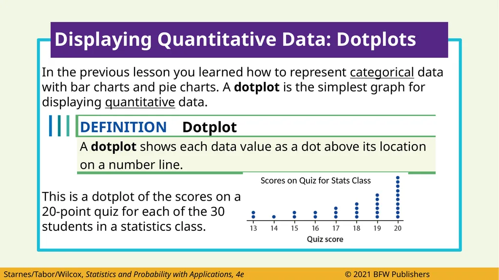
In the previous lesson you learned how to represent categorical data with bar charts and pie charts. A dotplot is the simplest graph for displaying quantitative data.
This is a dotplot of the scores on a
20-point quiz for each of the 30
students in a statistics class. Displaying Quantitative Data: Dotplots Scores on Quiz for Stats Class<br>
This is a dotplot of the scores on a
20-point quiz for each of the 30
students in a statistics class. Displaying Quantitative Data: Dotplots Scores on Quiz for Stats Class<br>
03
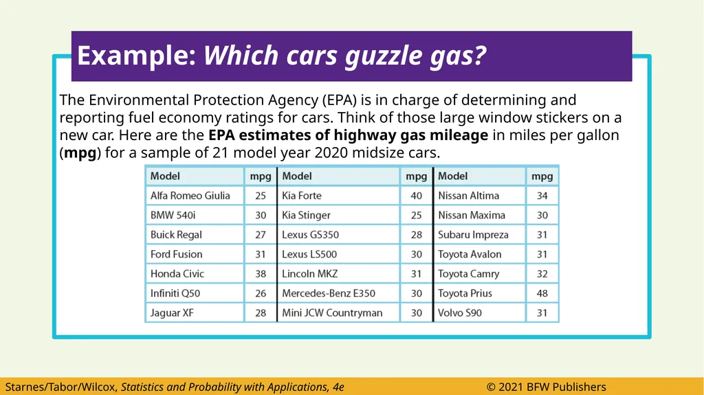
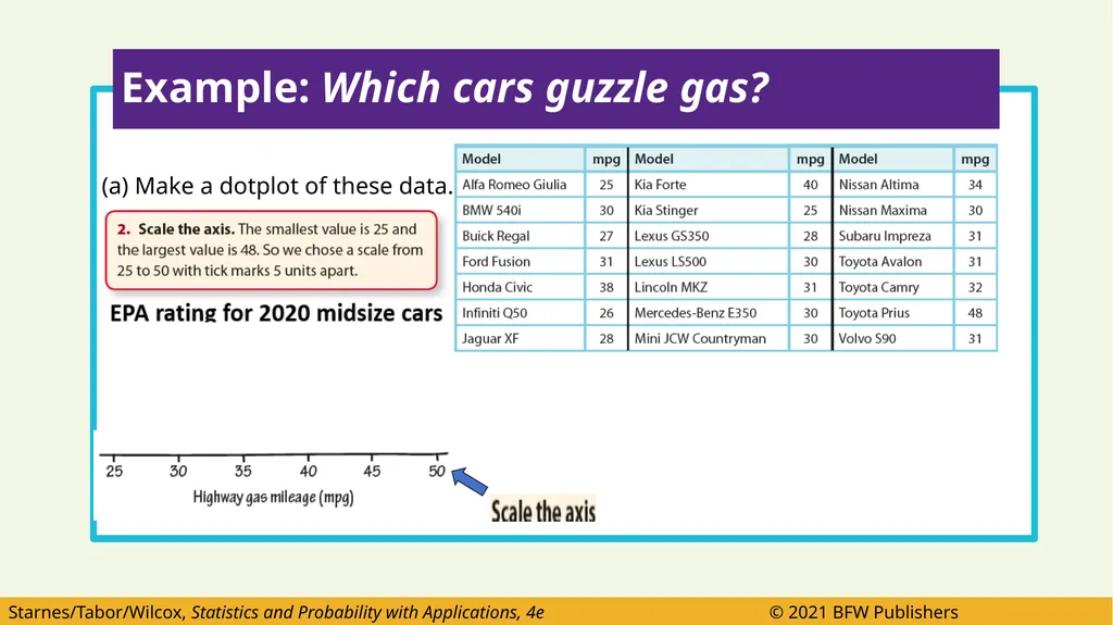
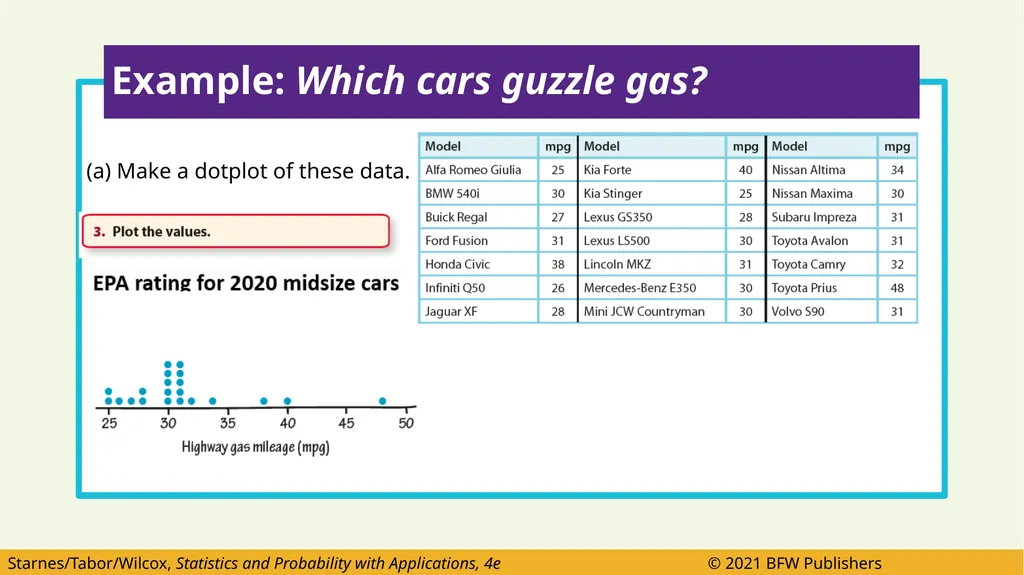
The Environmental Protection Agency (EPA) is in charge of determining and reporting fuel economy ratings for cars. Think of those large window stickers on a new car. Here are the EPA estimates of highway gas mileage in miles per gallon (mpg) for a sample of 21 model year 2020 midsize cars. Example: Which cars guzzle gas?<br>
04
(a) Make a dotplot of these data.
title
Horizontal axis Example: Which cars guzzle gas? EPA rating for 2020 midsize cars<br>
title
Horizontal axis Example: Which cars guzzle gas? EPA rating for 2020 midsize cars<br>
05
(a) Make a dotplot of these data. Example: Which cars guzzle gas?<br>
06
(a) Make a dotplot of these data. Example: Which cars guzzle gas?<br>
07
Pretend this is a Test question.
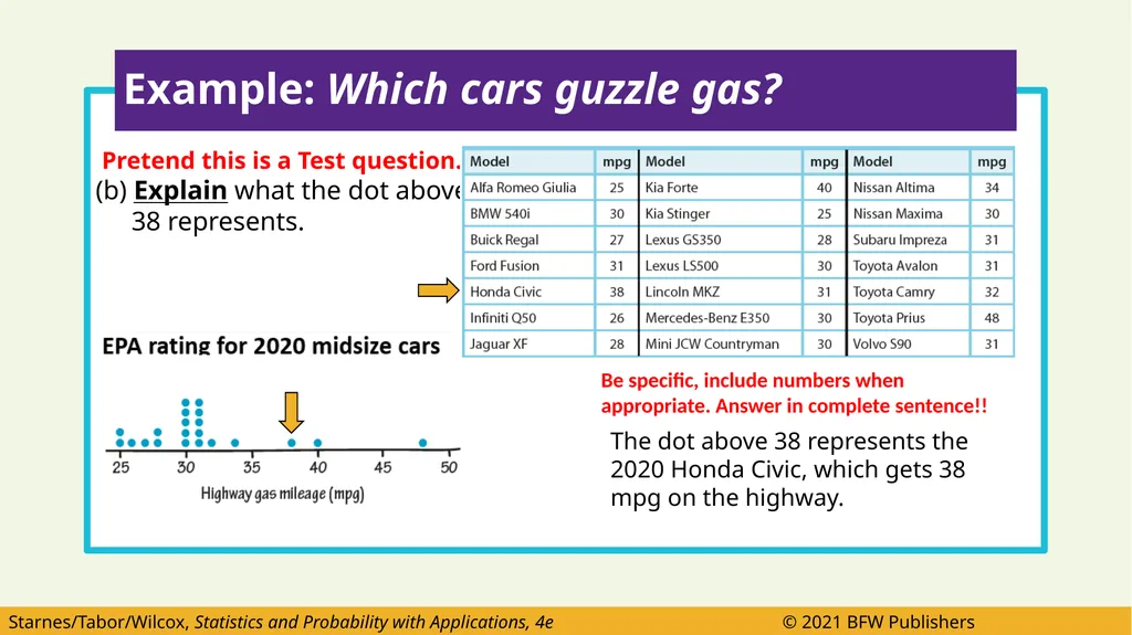
(b) Explain what the dot above
38 represents. Example: Which cars guzzle gas? The dot above 38 represents the 2020 Honda Civic, which gets 38 mpg on the highway. Be specific, include numbers when appropriate. Answer in complete sentence!!<br>
(b) Explain what the dot above
38 represents. Example: Which cars guzzle gas? The dot above 38 represents the 2020 Honda Civic, which gets 38 mpg on the highway. Be specific, include numbers when appropriate. Answer in complete sentence!!<br>
08
Pretend this is a Test question
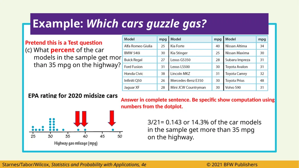
(c) What percent of the car
models in the sample get more
than 35 mpg on the highway? Example: Which cars guzzle gas? 3/21= 0.143 or 14.3% of the car models in the sample get more than 35 mpg on the highway. Answer in complete sentence. Be specific show computation using numbers from the dotplot.<br>
(c) What percent of the car
models in the sample get more
than 35 mpg on the highway? Example: Which cars guzzle gas? 3/21= 0.143 or 14.3% of the car models in the sample get more than 35 mpg on the highway. Answer in complete sentence. Be specific show computation using numbers from the dotplot.<br>
09
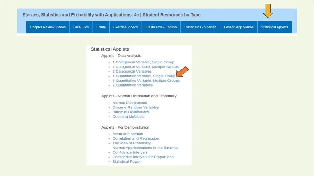
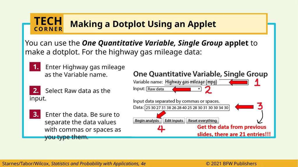
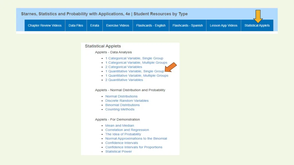
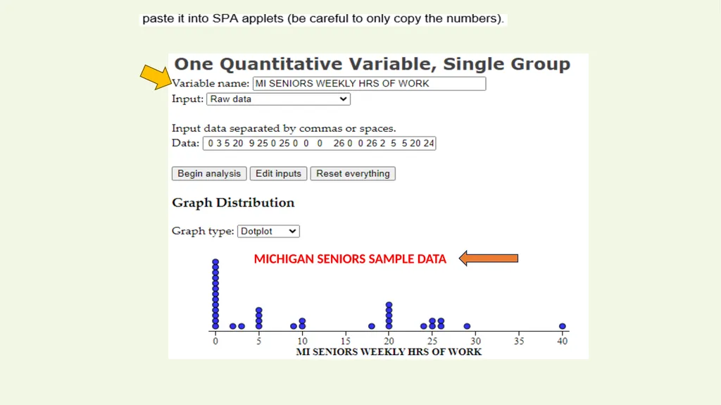
You can use the One Quantitative Variable, Single Group applet to make a dotplot. For the highway gas mileage data: TECH
CORNER Making a Dotplot Using an Applet 1. Enter Highway gas mileage as the Variable name.
2. Select Raw data as the input.
3. Enter the data. Be sure to separate the data values with commas or spaces as you type them. Get the data from previous slides, there are 21 entries!!!<br>
2. Select Raw data as the input.
3. Enter the data. Be sure to separate the data values with commas or spaces as you type them. Get the data from previous slides, there are 21 entries!!!<br>
10
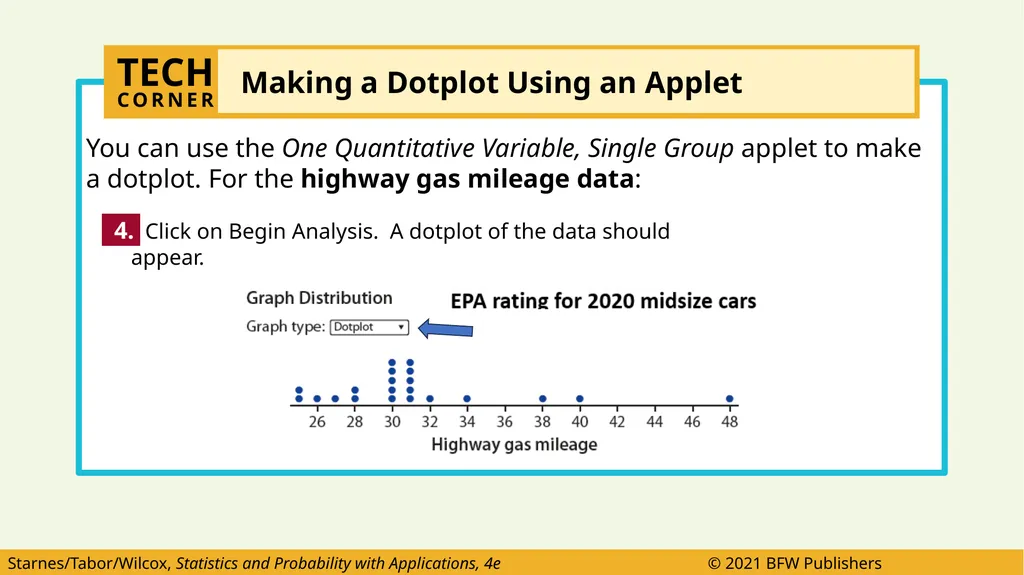
You can use the One Quantitative Variable, Single Group applet to make a dotplot. For the highway gas mileage data: 4. Click on Begin Analysis. A dotplot of the data should appear. TECH
CORNER Making a Dotplot Using an Applet<br>
11
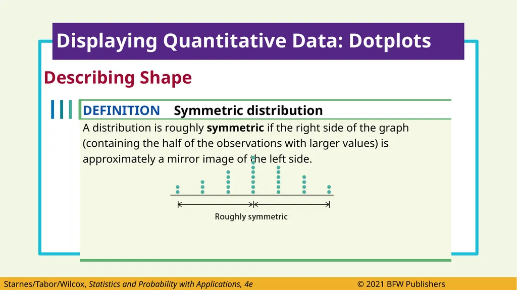
Describing Shape
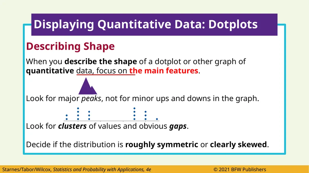
When you describe the shape of a dotplot or other graph of quantitative data, focus on the main features.
Look for major peaks, not for minor ups and downs in the graph.
Look for clusters of values and obvious gaps.
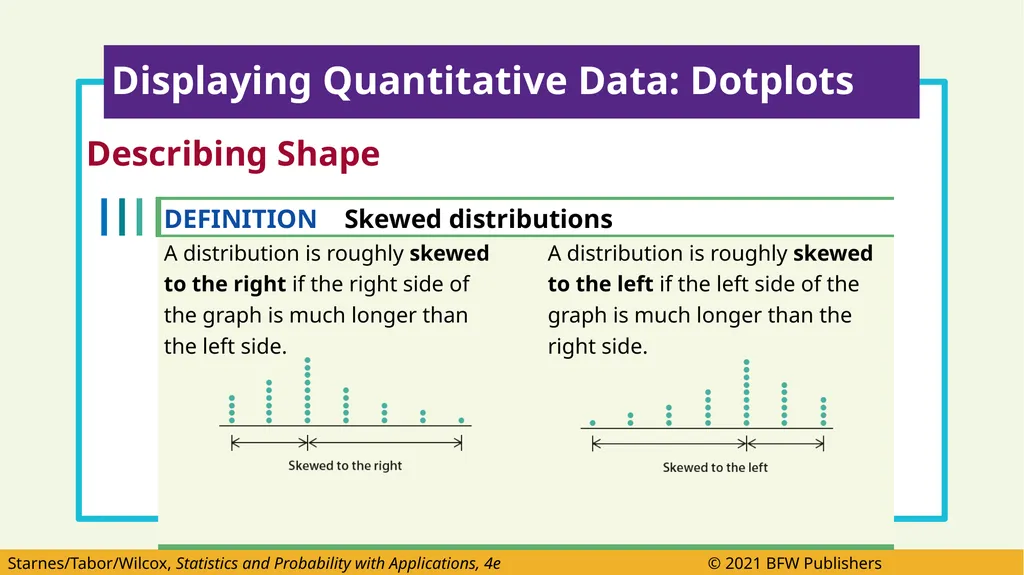
Decide if the distribution is roughly symmetric or clearly skewed. Displaying Quantitative Data: Dotplots<br>
When you describe the shape of a dotplot or other graph of quantitative data, focus on the main features.
Look for major peaks, not for minor ups and downs in the graph.
Look for clusters of values and obvious gaps.
Decide if the distribution is roughly symmetric or clearly skewed. Displaying Quantitative Data: Dotplots<br>
12
Describing Shape Displaying Quantitative Data: Dotplots<br>
13
Describing Shape Displaying Quantitative Data: Dotplots<br>
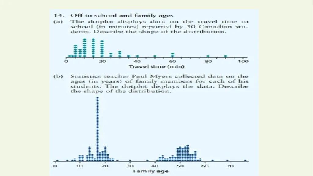
14
Describing Shape
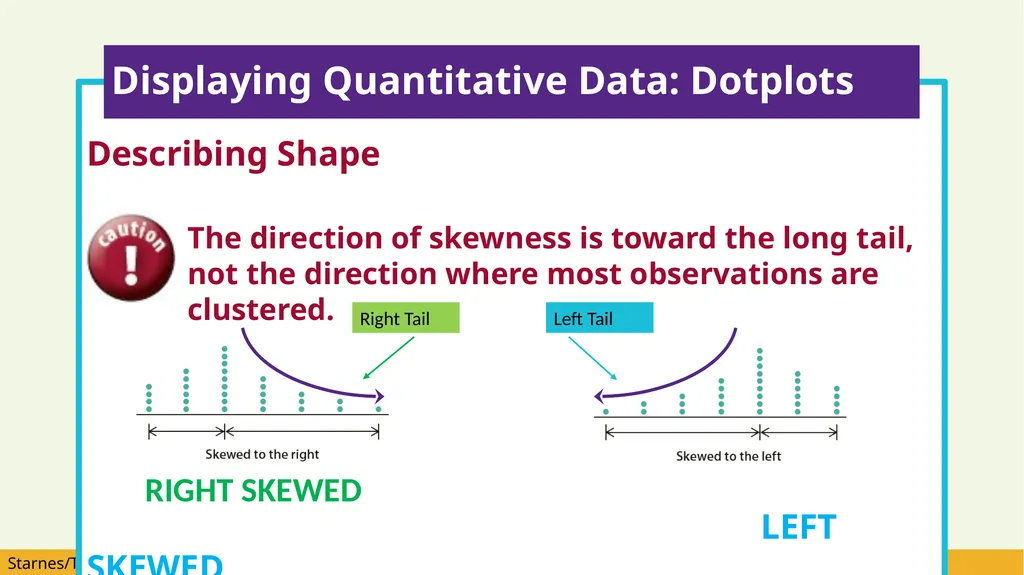
The direction of skewness is toward the long tail, not the direction where most observations are clustered.
LEFT SKEWED Displaying Quantitative Data: Dotplots Right Tail Left Tail RIGHT SKEWED<br>
The direction of skewness is toward the long tail, not the direction where most observations are clustered.
LEFT SKEWED Displaying Quantitative Data: Dotplots Right Tail Left Tail RIGHT SKEWED<br>
15
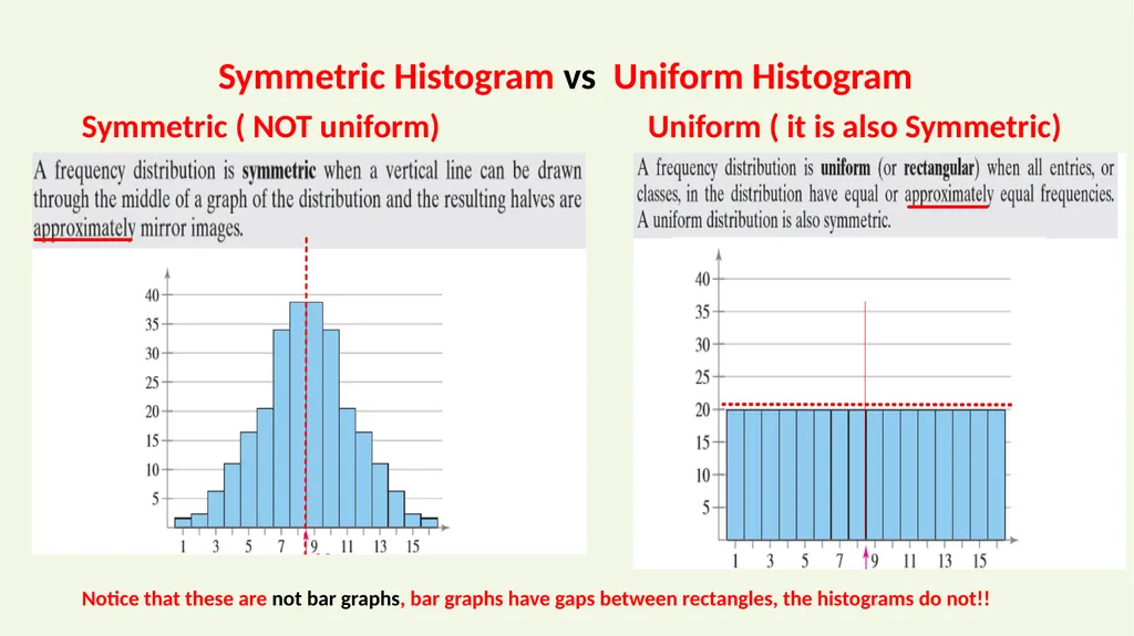
Symmetric ( NOT uniform) Uniform ( it is also Symmetric) Symmetric Histogram vs Uniform Histogram Notice that these are not bar graphs, bar graphs have gaps between rectangles, the histograms do not!!<br>
16
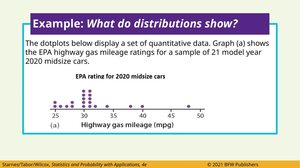
The dotplots below display a set of quantitative data. Graph (a) shows the EPA highway gas mileage ratings for a sample of 21 model year 2020 midsize cars. Example: What do distributions show?<br>
17
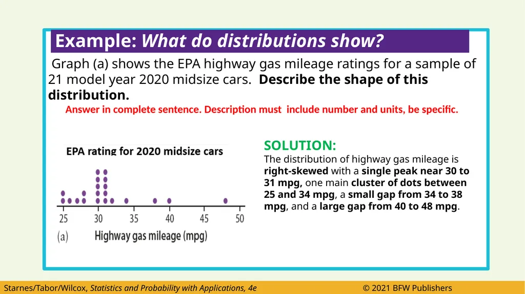
Graph (a) shows the EPA highway gas mileage ratings for a sample of 21 model year 2020 midsize cars. Describe the shape of this distribution.
Answer in complete sentence. Description must include number and units, be specific. Example: What do distributions show? SOLUTION:
The distribution of highway gas mileage is right-skewed with a single peak near 30 to 31 mpg, one main cluster of dots between 25 and 34 mpg, a small gap from 34 to 38 mpg, and a large gap from 40 to 48 mpg.<br>
Answer in complete sentence. Description must include number and units, be specific. Example: What do distributions show? SOLUTION:
The distribution of highway gas mileage is right-skewed with a single peak near 30 to 31 mpg, one main cluster of dots between 25 and 34 mpg, a small gap from 34 to 38 mpg, and a large gap from 40 to 48 mpg.<br>
18
The dotplots below display a set of quantitative data.
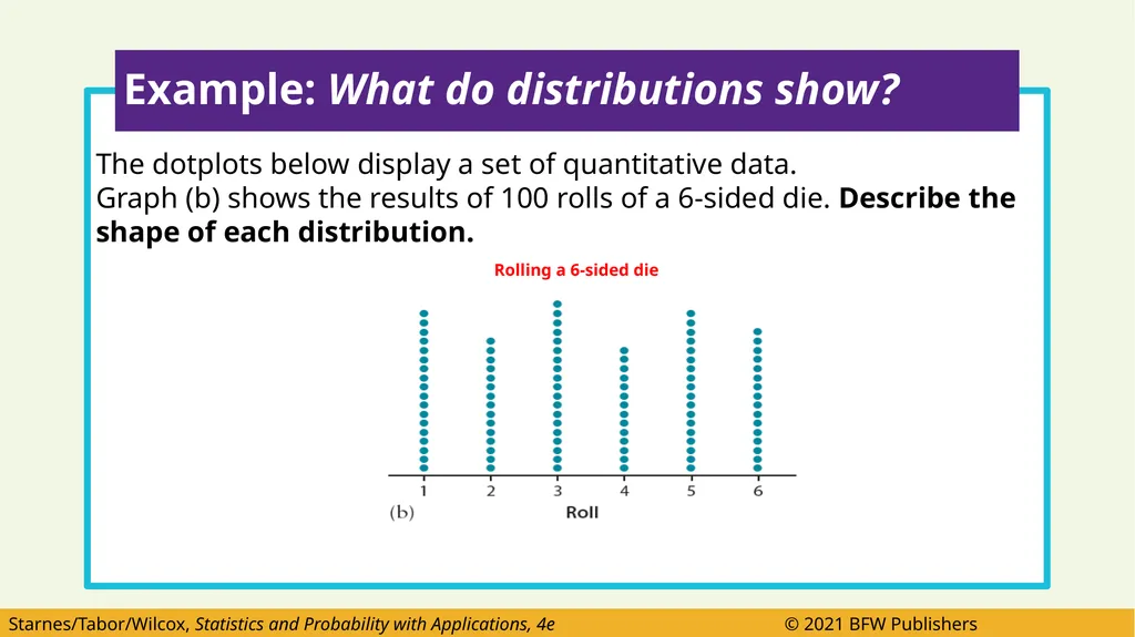
Graph (b) shows the results of 100 rolls of a 6-sided die. Describe the shape of each distribution.
Rolling a 6-sided die Example: What do distributions show?<br>
Graph (b) shows the results of 100 rolls of a 6-sided die. Describe the shape of each distribution.
Rolling a 6-sided die Example: What do distributions show?<br>
19
Graph (b) shows the results of 100 rolls of a 6-sided die. Describe the shape of this distribution.
Answer in complete sentence. Description must include values, be specific. Example: What do distributions show? SOLUTION:
The distribution of die rolls is roughly symmetric with no clear peak. It has about the same height for all values from 1 to 6. So it’s approximately uniform.<br>
Answer in complete sentence. Description must include values, be specific. Example: What do distributions show? SOLUTION:
The distribution of die rolls is roughly symmetric with no clear peak. It has about the same height for all values from 1 to 6. So it’s approximately uniform.<br>
20
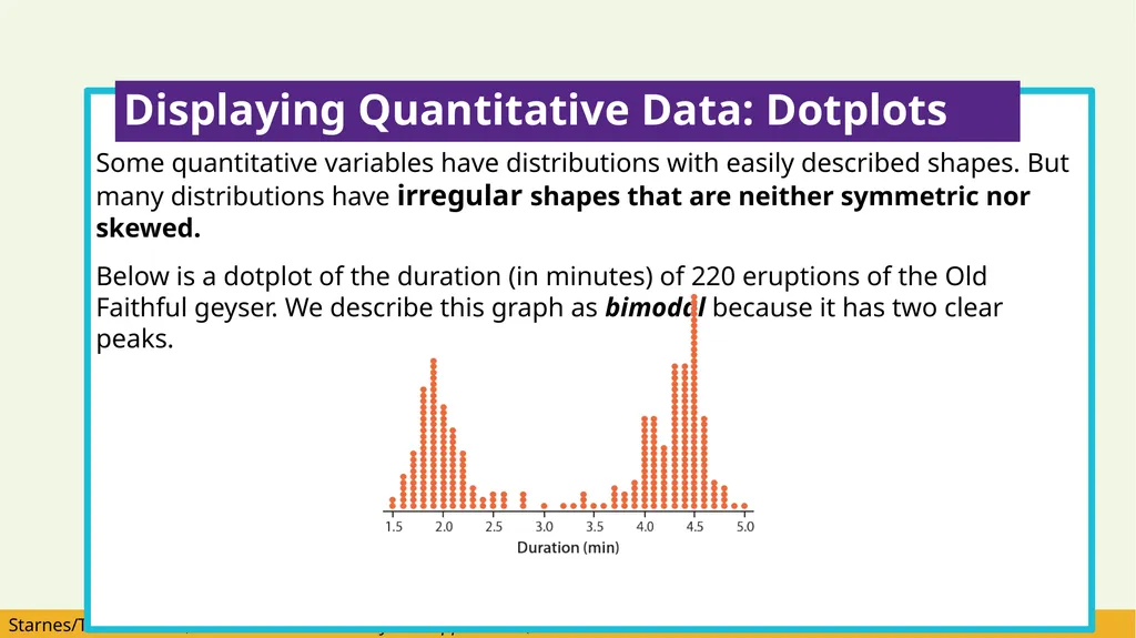
Some quantitative variables have distributions with easily described shapes. But many distributions have irregular shapes that are neither symmetric nor skewed.
Below is a dotplot of the duration (in minutes) of 220 eruptions of the Old Faithful geyser. We describe this graph as bimodal because it has two clear peaks. Displaying Quantitative Data: Dotplots<br>
Below is a dotplot of the duration (in minutes) of 220 eruptions of the Old Faithful geyser. We describe this graph as bimodal because it has two clear peaks. Displaying Quantitative Data: Dotplots<br>
21
Displaying Quantitative Data: Dotplots<br>
22
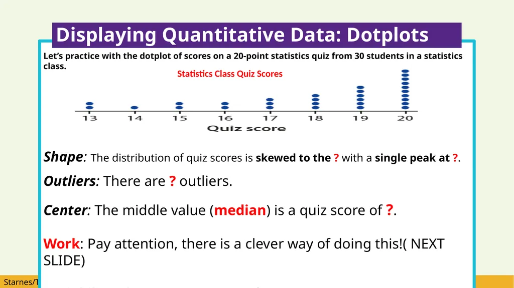
Let’s practice with the dotplot of scores on a 20-point statistics quiz from 30 students in a statistics class.
Shape: The distribution of quiz scores is skewed to the ? with a single peak at ?.
Outliers: There are ? outliers.
Center: The middle value (median) is a quiz score of ?.
Work: Pay attention, there is a clever way of doing this!( NEXT SLIDE)
Variability: The quiz scores vary from ? to ?. Displaying Quantitative Data: Dotplots Statistics Class Quiz Scores<br>
Shape: The distribution of quiz scores is skewed to the ? with a single peak at ?.
Outliers: There are ? outliers.
Center: The middle value (median) is a quiz score of ?.
Work: Pay attention, there is a clever way of doing this!( NEXT SLIDE)
Variability: The quiz scores vary from ? to ?. Displaying Quantitative Data: Dotplots Statistics Class Quiz Scores<br>
23
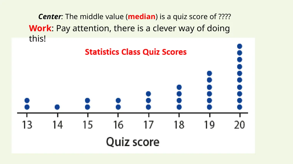
Work: Pay attention, there is a clever way of doing this! Center: The middle value (median) is a quiz score of ????<br>
24
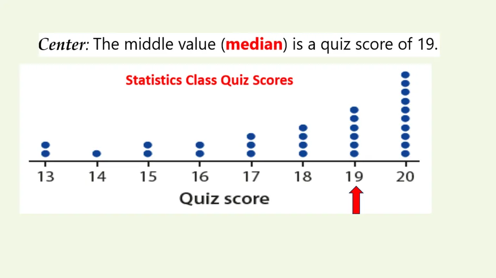
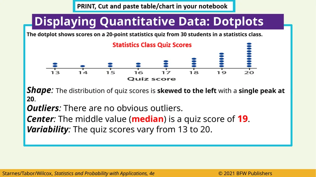
The dotplot shows scores on a 20-point statistics quiz from 30 students in a statistics class.
Shape: The distribution of quiz scores is skewed to the left with a single peak at 20.
Outliers: There are no obvious outliers.
Center: The middle value (median) is a quiz score of 19.
Variability: The quiz scores vary from 13 to 20. Displaying Quantitative Data: Dotplots<br>
Shape: The distribution of quiz scores is skewed to the left with a single peak at 20.
Outliers: There are no obvious outliers.
Center: The middle value (median) is a quiz score of 19.
Variability: The quiz scores vary from 13 to 20. Displaying Quantitative Data: Dotplots<br>
25
Some of the most interesting statistical questions involve comparing two or more groups.
Do high school graduates earn more, on average, than students who do not graduate from high school?
Which of two popular diets leads to greater long-term weight loss?
Copy the following note:
You should always discuss shape, outliers, center, and variability whenever you compare distributions of a quantitative variable. Displaying Quantitative Data: Dotplots<br>
Do high school graduates earn more, on average, than students who do not graduate from high school?
Which of two popular diets leads to greater long-term weight loss?
Copy the following note:
You should always discuss shape, outliers, center, and variability whenever you compare distributions of a quantitative variable. Displaying Quantitative Data: Dotplots<br>
26
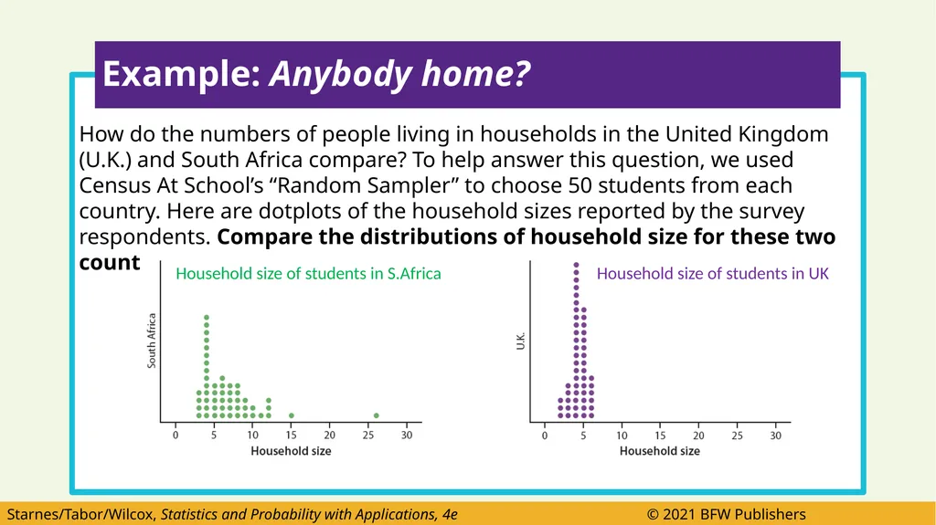
How do the numbers of people living in households in the United Kingdom (U.K.) and South Africa compare? To help answer this question, we used Census At School’s “Random Sampler” to choose 50 students from each country. Here are dotplots of the household sizes reported by the survey respondents. Compare the distributions of household size for these two countries. Example: Anybody home? Household size of students in UK Household size of students in S.Africa<br>
27
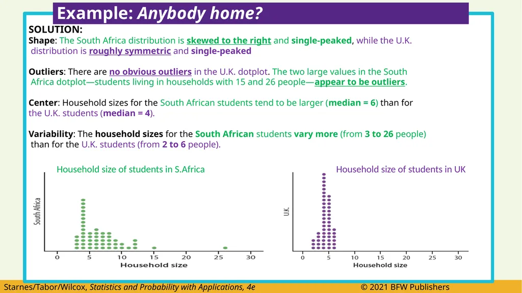
SOLUTION:
Shape: The South Africa distribution is skewed to the right and single-peaked, while the U.K.
distribution is roughly symmetric and single-peaked
Outliers: There are no obvious outliers in the U.K. dotplot. The two large values in the South
Africa dotplot—students living in households with 15 and 26 people—appear to be outliers.
Center: Household sizes for the South African students tend to be larger (median = 6) than for
the U.K. students (median = 4).
Variability: The household sizes for the South African students vary more (from 3 to 26 people)
than for the U.K. students (from 2 to 6 people). Example: Anybody home? Household size of students in S.Africa Household size of students in UK<br>
Shape: The South Africa distribution is skewed to the right and single-peaked, while the U.K.
distribution is roughly symmetric and single-peaked
Outliers: There are no obvious outliers in the U.K. dotplot. The two large values in the South
Africa dotplot—students living in households with 15 and 26 people—appear to be outliers.
Center: Household sizes for the South African students tend to be larger (median = 6) than for
the U.K. students (median = 4).
Variability: The household sizes for the South African students vary more (from 3 to 26 people)
than for the U.K. students (from 2 to 6 people). Example: Anybody home? Household size of students in S.Africa Household size of students in UK<br>
28
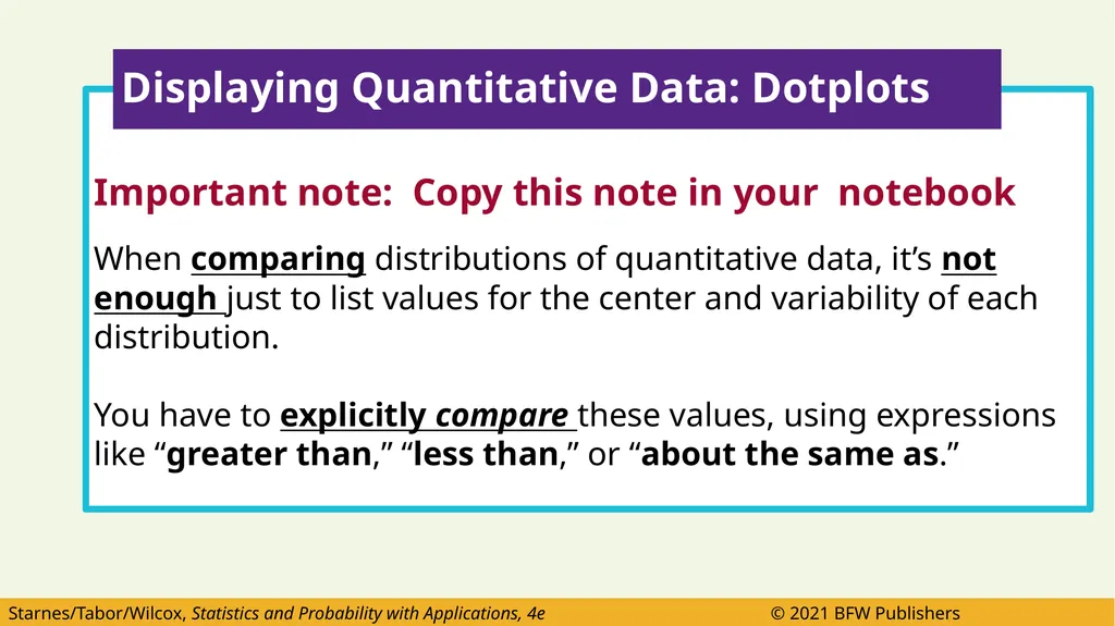
Important note: Copy this note in your notebook
When comparing distributions of quantitative data, it’s not enough just to list values for the center and variability of each distribution.
You have to explicitly compare these values, using expressions like “greater than,” “less than,” or “about the same as.” Displaying Quantitative Data: Dotplots<br>
When comparing distributions of quantitative data, it’s not enough just to list values for the center and variability of each distribution.
You have to explicitly compare these values, using expressions like “greater than,” “less than,” or “about the same as.” Displaying Quantitative Data: Dotplots<br>
29
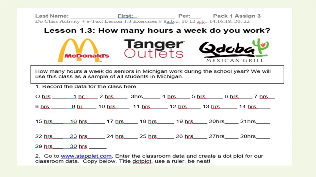
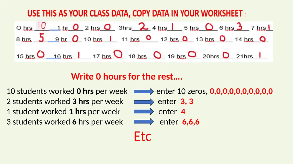
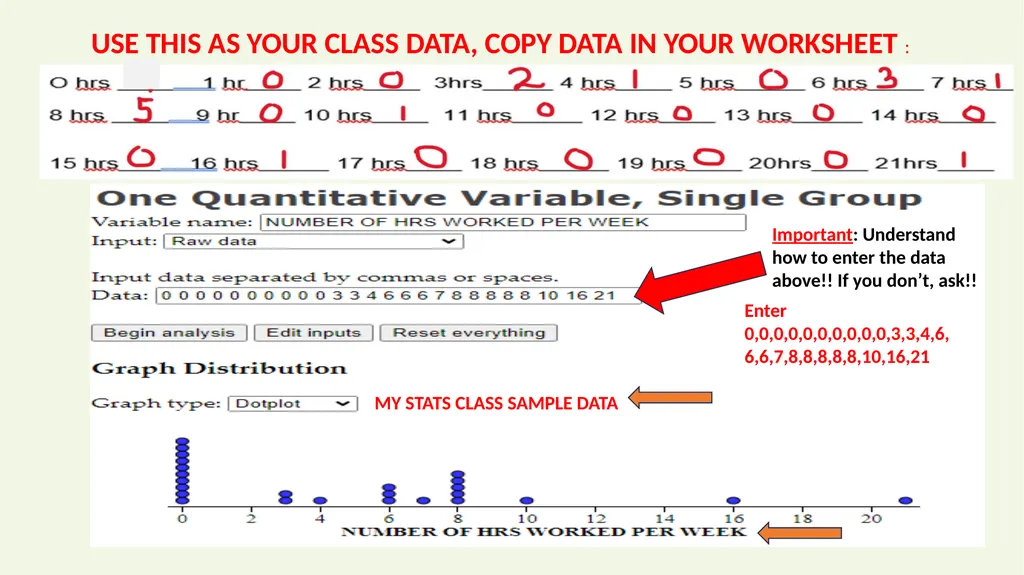
10 students worked 0 hrs per week enter 10 zeros, 0,0,0,0,0,0,0,0,0,0
2 students worked 3 hrs per week enter 3, 3
1 student worked 1 hrs per week enter 4
3 students worked 6 hrs per week enter 6,6,6
Etc Write 0 hours for the rest….<br>
2 students worked 3 hrs per week enter 3, 3
1 student worked 1 hrs per week enter 4
3 students worked 6 hrs per week enter 6,6,6
Etc Write 0 hours for the rest….<br>
30
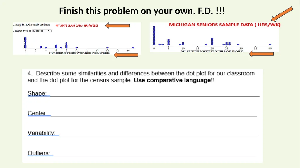
USE THIS AS YOUR CLASS DATA, COPY DATA IN YOUR WORKSHEET : MY STATS CLASS SAMPLE DATA Enter 0,0,0,0,0,0,0,0,0,0,3,3,4,6,6,6,7,8,8,8,8,8,10,16,21 Important: Understand how to enter the data above!! If you don’t, ask!!<br>
31
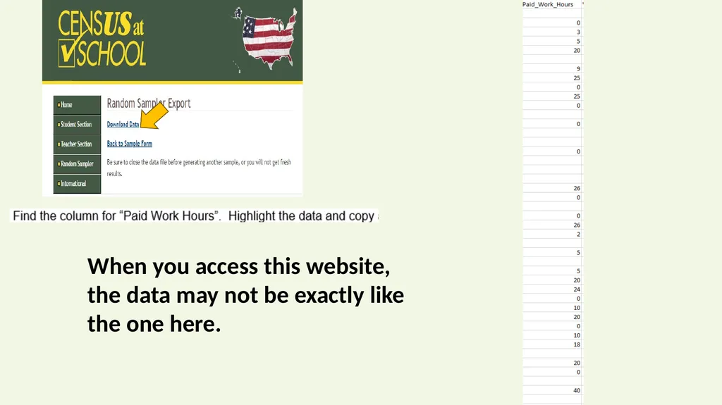
When you access this website, the data may not be exactly like the one here.<br>
32
MICHIGAN SENIORS SAMPLE DATA<br>
33
Finish this problem on your own. F.D. !!!<br>
34
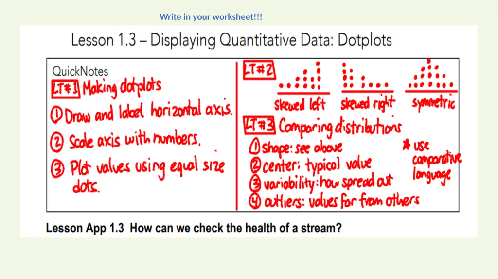
Write in your worksheet!!!<br>
35
Watch the video and complete worksheet<br>
36
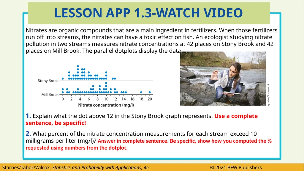
Nitrates are organic compounds that are a main ingredient in fertilizers. When those fertilizers run off into streams, the nitrates can have a toxic effect on fish. An ecologist studying nitrate pollution in two streams measures nitrate concentrations at 42 places on Stony Brook and 42 places on Mill Brook. The parallel dotplots display the data.
1. Explain what the dot above 12 in the Stony Brook graph represents. Use a complete sentence, be specific!
2. What percent of the nitrate concentration measurements for each stream exceed 10 milligrams per liter (mg/l)? Answer in complete sentence. Be specific, show how you computed the % requested using numbers from the dotplot. LESSON APP 1.3-WATCH VIDEO<br>
1. Explain what the dot above 12 in the Stony Brook graph represents. Use a complete sentence, be specific!
2. What percent of the nitrate concentration measurements for each stream exceed 10 milligrams per liter (mg/l)? Answer in complete sentence. Be specific, show how you computed the % requested using numbers from the dotplot. LESSON APP 1.3-WATCH VIDEO<br>
37
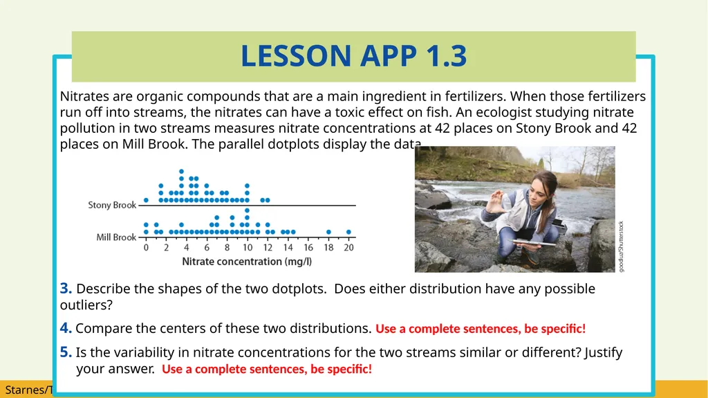
Nitrates are organic compounds that are a main ingredient in fertilizers. When those fertilizers run off into streams, the nitrates can have a toxic effect on fish. An ecologist studying nitrate pollution in two streams measures nitrate concentrations at 42 places on Stony Brook and 42 places on Mill Brook. The parallel dotplots display the data.
3. Describe the shapes of the two dotplots. Does either distribution have any possible outliers?
4. Compare the centers of these two distributions. Use a complete sentences, be specific!
5. Is the variability in nitrate concentrations for the two streams similar or different? Justify your answer. Use a complete sentences, be specific! LESSON APP 1.3<br>
3. Describe the shapes of the two dotplots. Does either distribution have any possible outliers?
4. Compare the centers of these two distributions. Use a complete sentences, be specific!
5. Is the variability in nitrate concentrations for the two streams similar or different? Justify your answer. Use a complete sentences, be specific! LESSON APP 1.3<br>
38
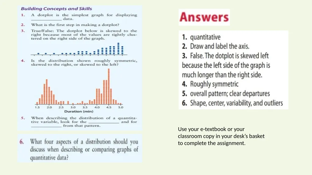
Use your e-textbook or your classroom copy in your desk’s basket to complete the assignment.<br>
39
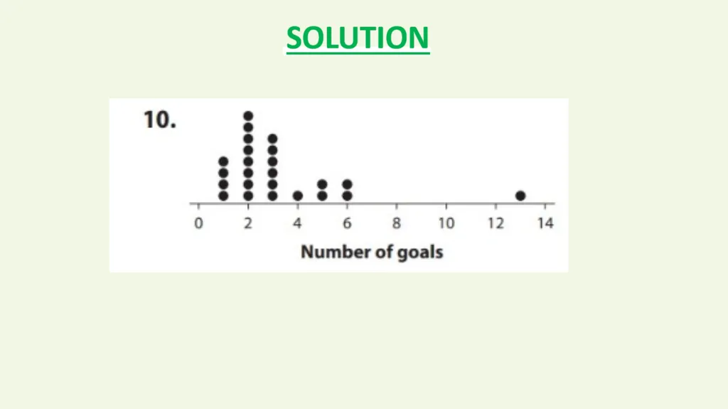
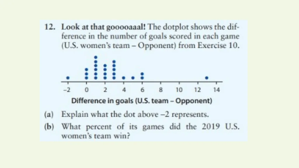
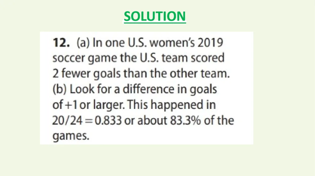
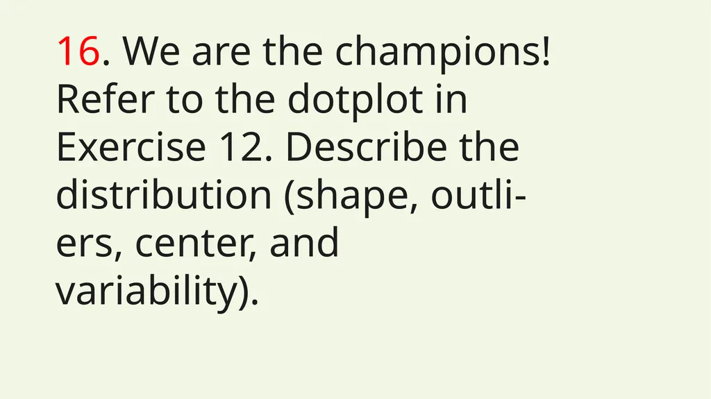
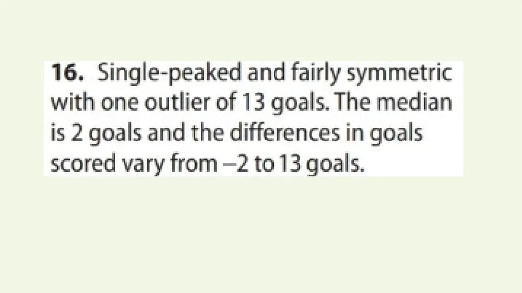
16. We are the champions! Refer to the dotplot in Exercise 12. Describe the distribution (shape, outli-ers, center, and variability).<br>
40
What did you learn?
Make and interpret dotplots of quantitative data.
Describe the shape of a distribution.
Describe or compare distributions of quantitative data with dotplots. Learning Targets<br>
Make and interpret dotplots of quantitative data.
Describe the shape of a distribution.
Describe or compare distributions of quantitative data with dotplots. Learning Targets<br>