
CHAPTER 2 (PART A) Organizing and Graphing
Description: CHAPTER 2 (PART A) Organizing and Graphing Qualitative Quantitative Data Prem Mann, Introductory Statistics, 8E Copyright 2013 John Wiley Sons. All rights reserved. RAW DATA Definition Data recorded in the sequence in which they are
Related Topics
Download Presentation
"CHAPTER 2 (PART A) Organizing and Graphing" is the property of its rightful owner. Permission is granted to download and print the materials on this website for personal, non-commercial use only, and to display it on your personal computer provided you do not modify the materials and that you retain all copyright notices contained in the materials. By downloading content from our website, you accept the terms of this agreement.
Presentation Transcript
slide1. CHAPTER 2 (PART A) Organizing and Graphing Qualitative & Quantitative Data Prem Mann, Introductory Statistics, 8/E Copyright © 2013 John Wiley & Sons. All rights reserved.<br>
slide2. RAW DATA Definition
Data recorded in the sequence in which they are collected and before they are processed or ranked are called raw data. Prem Mann, Introductory Statistics, 8/E Copyright © 2013 John Wiley & Sons. All rights reserved.<br>
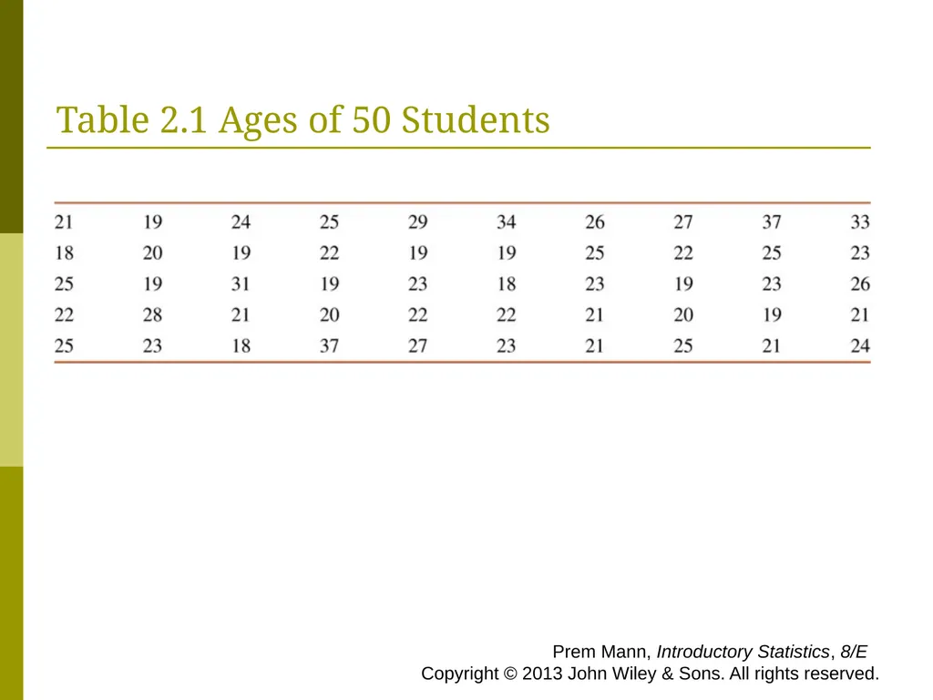
slide3. Table 2.1 Ages of 50 Students Prem Mann, Introductory Statistics, 8/E Copyright © 2013 John Wiley & Sons. All rights reserved.<br>
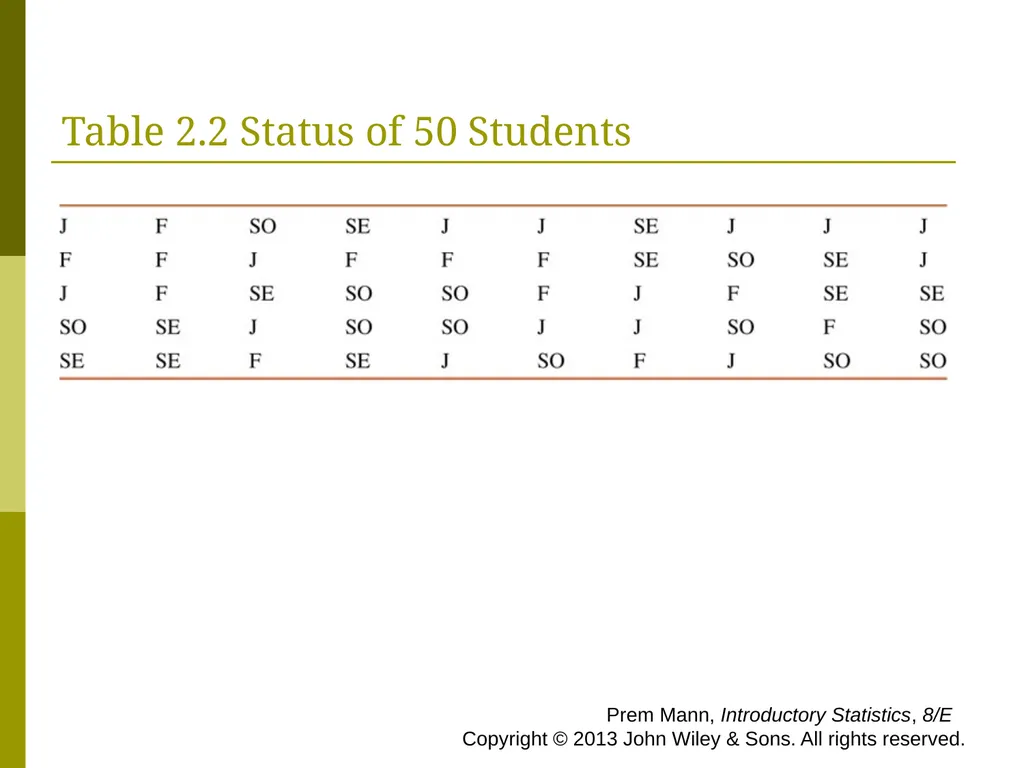
slide4. Table 2.2 Status of 50 Students Prem Mann, Introductory Statistics, 8/E Copyright © 2013 John Wiley & Sons. All rights reserved.<br>
slide5. ORGANIZING AND GRAPHING DATA Frequency Distributions
Relative Frequency and Percentage Distributions
Graphical Presentation of Qualitative Data Prem Mann, Introductory Statistics, 8/E Copyright © 2013 John Wiley & Sons. All rights reserved.<br>
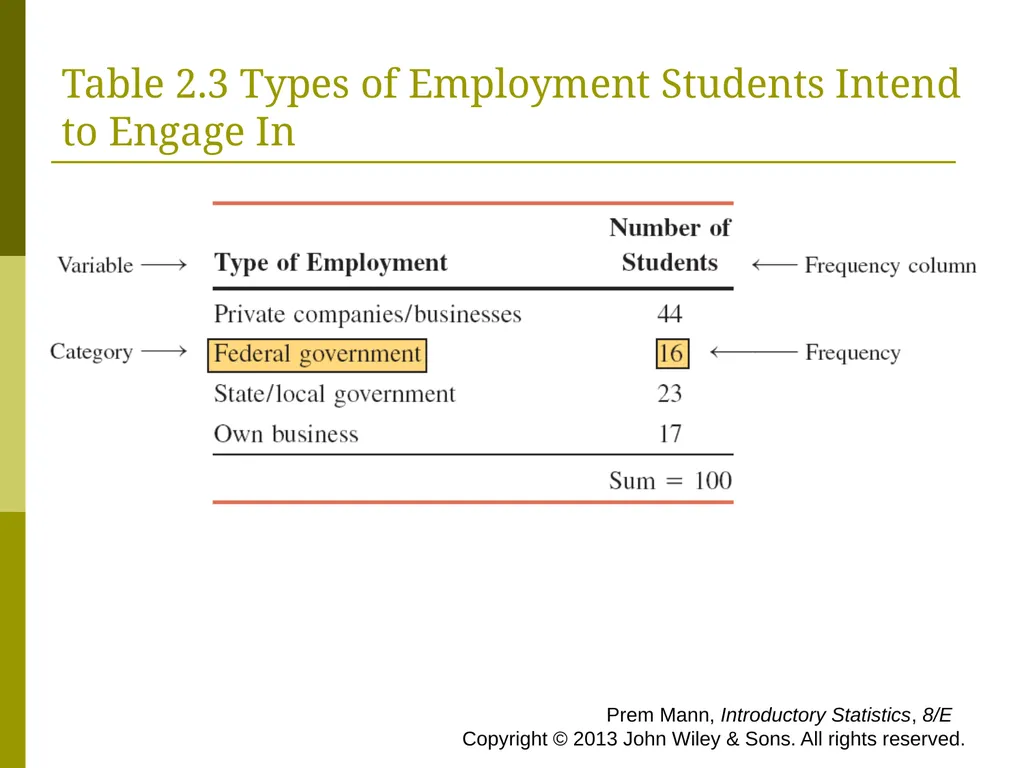
slide6. Table 2.3 Types of Employment Students Intend to Engage In Prem Mann, Introductory Statistics, 8/E Copyright © 2013 John Wiley & Sons. All rights reserved.<br>
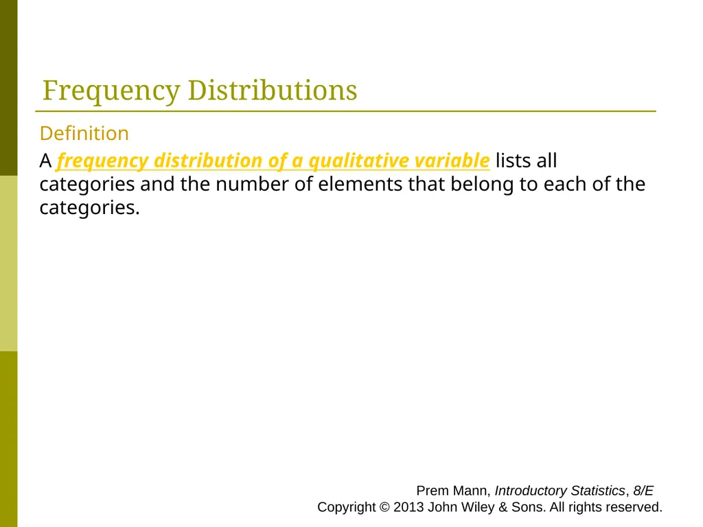
slide7. Frequency Distributions Definition
A frequency distribution of a qualitative variable lists all categories and the number of elements that belong to each of the categories. Prem Mann, Introductory Statistics, 8/E Copyright © 2013 John Wiley & Sons. All rights reserved.<br>
slide8. Example 2-1 A sample of 30 persons who often consume donuts were asked what variety of donuts was their favorite. The responses from these 30 persons were as follows: Prem Mann, Introductory Statistics, 8/E Copyright © 2013 John Wiley & Sons. All rights reserved.<br>
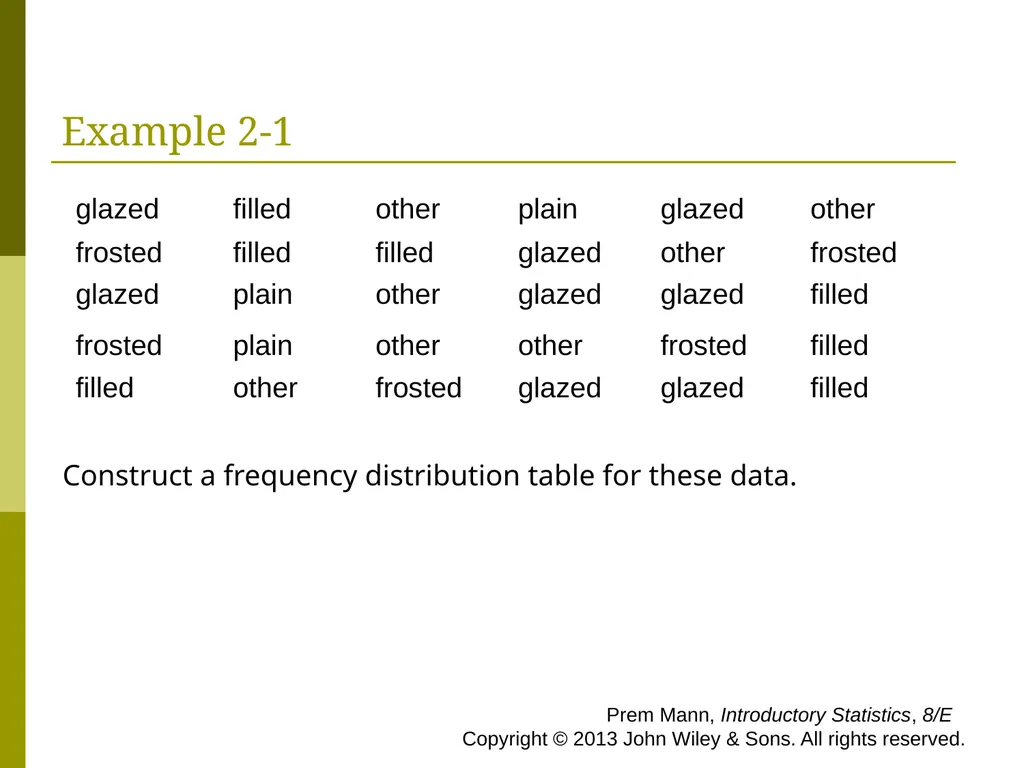
slide9. Example 2-1 Construct a frequency distribution table for these data. Prem Mann, Introductory Statistics, 8/E Copyright © 2013 John Wiley & Sons. All rights reserved.<br>
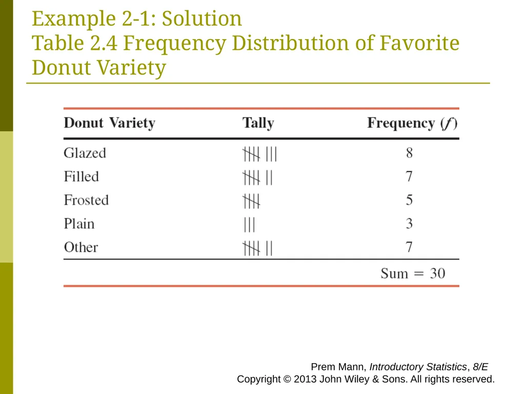
slide10. Example 2-1: Solution Table 2.4 Frequency Distribution of Favorite Donut Variety Prem Mann, Introductory Statistics, 8/E Copyright © 2013 John Wiley & Sons. All rights reserved.<br>
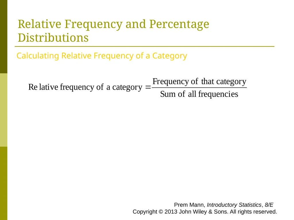
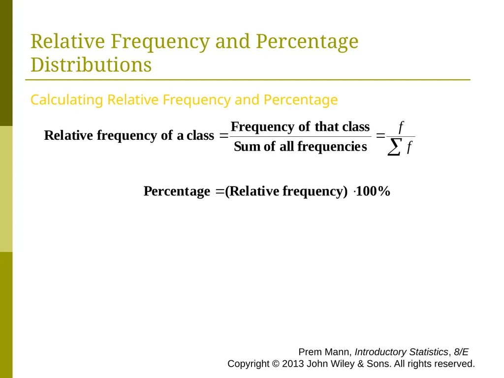
slide11. Relative Frequency and Percentage Distributions Calculating Relative Frequency of a Category Prem Mann, Introductory Statistics, 8/E Copyright © 2013 John Wiley & Sons. All rights reserved.<br>
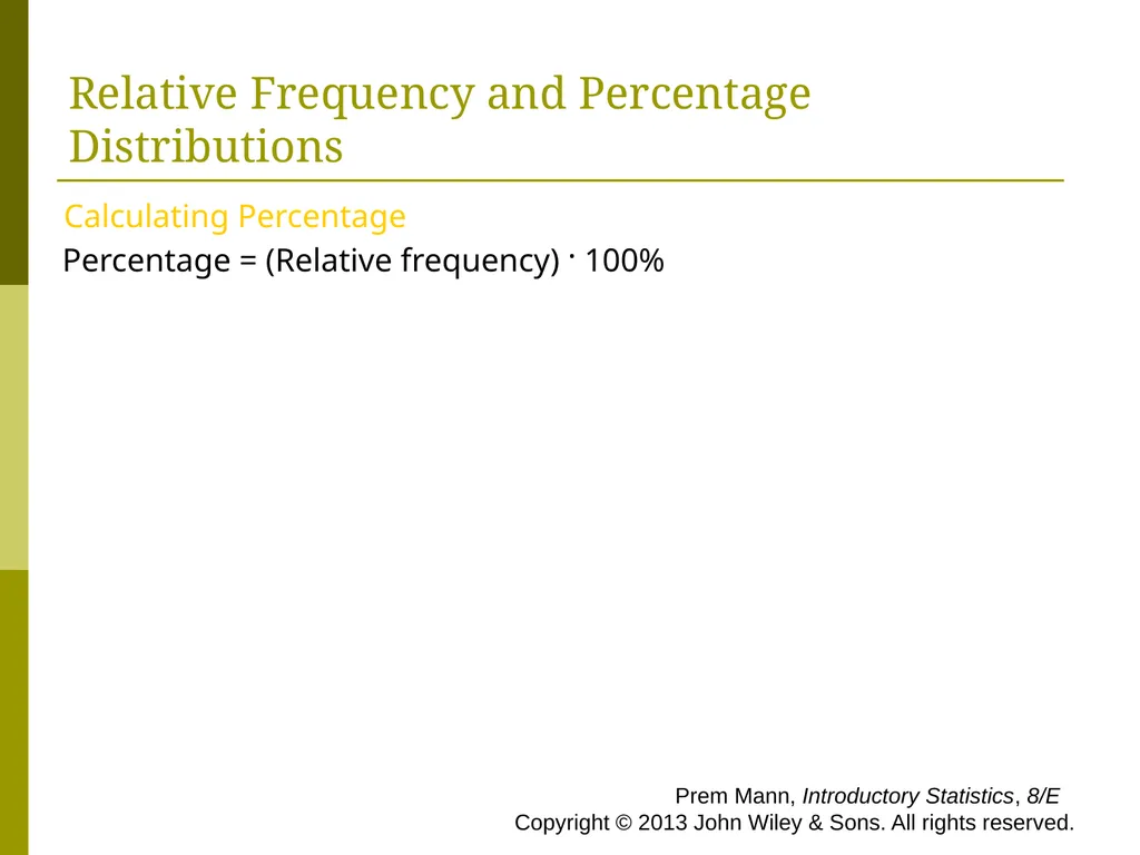
slide12. Relative Frequency and Percentage Distributions Calculating Percentage
Percentage = (Relative frequency) · 100% Prem Mann, Introductory Statistics, 8/E Copyright © 2013 John Wiley & Sons. All rights reserved.<br>
slide13. Example 2-2 Determine the relative frequency and percentage for the data in Table 2.4. Prem Mann, Introductory Statistics, 8/E Copyright © 2013 John Wiley & Sons. All rights reserved.<br>
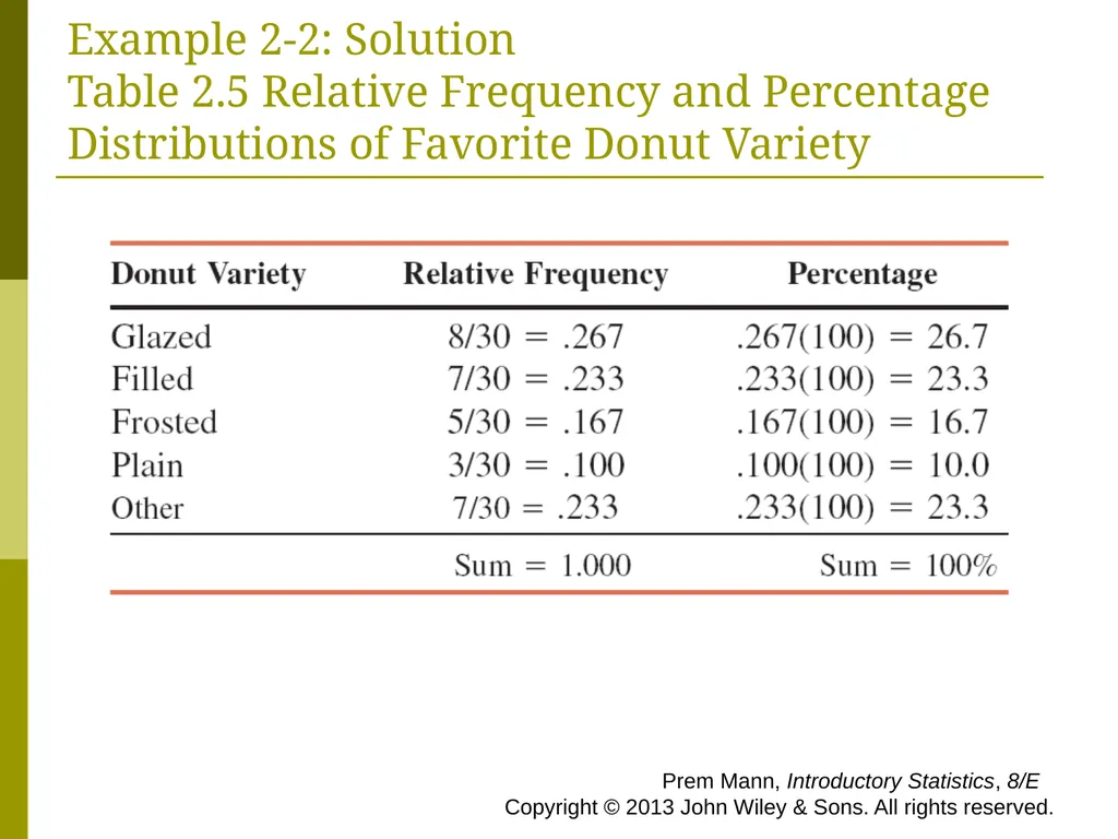
slide14. Example 2-2: Solution Table 2.5 Relative Frequency and Percentage Distributions of Favorite Donut Variety Prem Mann, Introductory Statistics, 8/E Copyright © 2013 John Wiley & Sons. All rights reserved.<br>
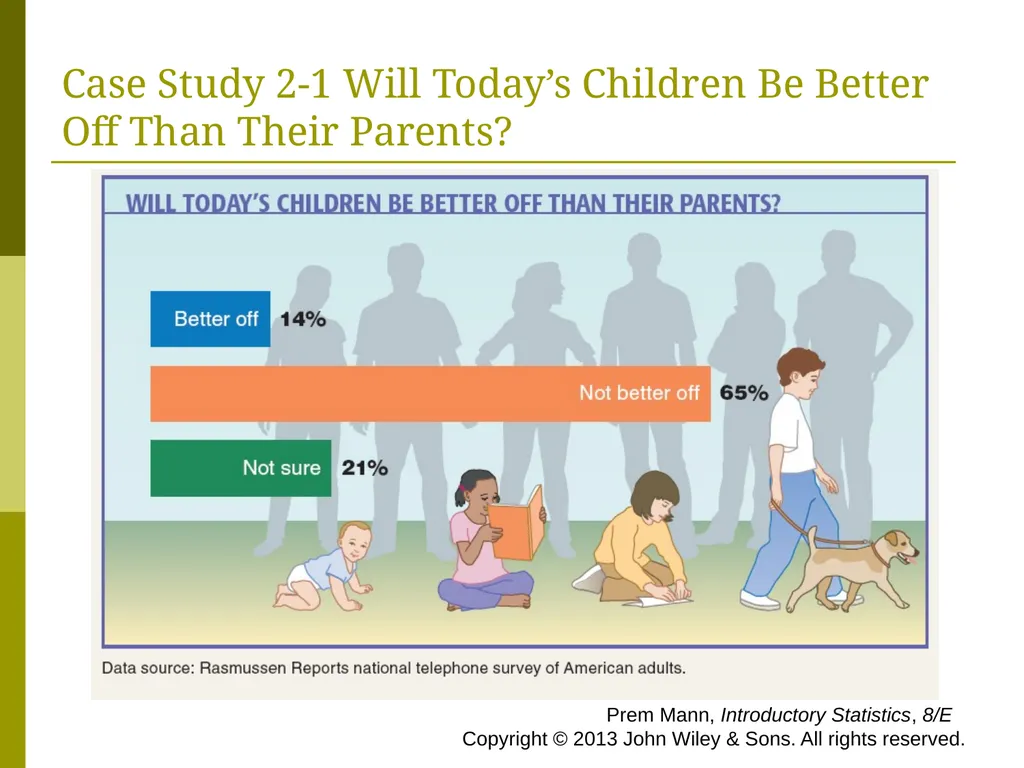
slide15. Case Study 2-1 Will Today’s Children Be Better Off Than Their Parents? Prem Mann, Introductory Statistics, 8/E Copyright © 2013 John Wiley & Sons. All rights reserved.<br>
slide16. Graphical Presentation of Qualitative Data Definition
A graph made of bars whose heights represent the frequencies of respective categories is called a bar graph. Prem Mann, Introductory Statistics, 8/E Copyright © 2013 John Wiley & Sons. All rights reserved.<br>
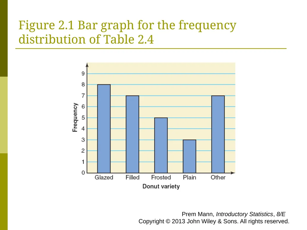
slide17. Figure 2.1 Bar graph for the frequency distribution of Table 2.4 Prem Mann, Introductory Statistics, 8/E Copyright © 2013 John Wiley & Sons. All rights reserved.<br>
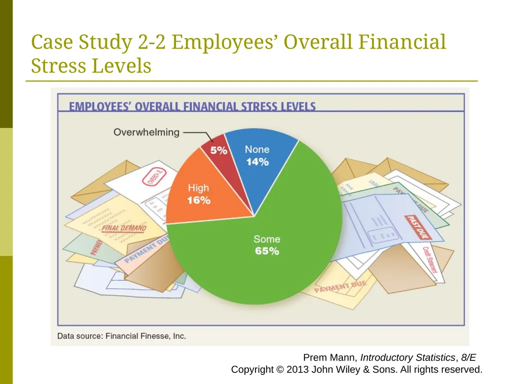
slide18. Case Study 2-2 Employees’ Overall Financial Stress Levels Prem Mann, Introductory Statistics, 8/E Copyright © 2013 John Wiley & Sons. All rights reserved.<br>
slide19. Graphical Presentation of Qualitative Data Definition
A circle divided into portions that represent the relative frequencies or percentages of a population or a sample belonging to different categories is called a pie chart. Prem Mann, Introductory Statistics, 8/E Copyright © 2013 John Wiley & Sons. All rights reserved.<br>
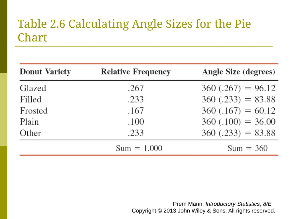
slide20. Table 2.6 Calculating Angle Sizes for the Pie Chart Prem Mann, Introductory Statistics, 8/E Copyright © 2013 John Wiley & Sons. All rights reserved.<br>
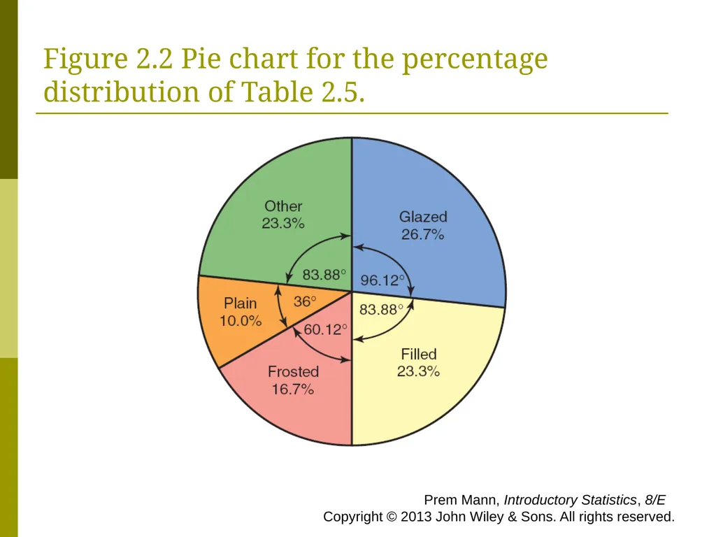
slide21. Figure 2.2 Pie chart for the percentage distribution of Table 2.5. Prem Mann, Introductory Statistics, 8/E Copyright © 2013 John Wiley & Sons. All rights reserved.<br>
slide22. ORGANIZING AND GRAPHING QUANTITATIVE Frequency Distributions
Constructing Frequency Distribution Tables
Relative and Percentage Distributions
Graphing Grouped Data Prem Mann, Introductory Statistics, 8/E Copyright © 2013 John Wiley & Sons. All rights reserved.<br>
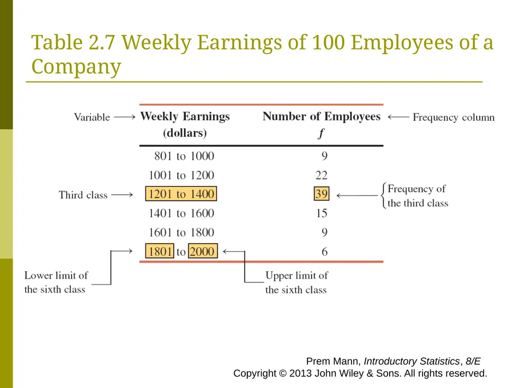
slide23. Table 2.7 Weekly Earnings of 100 Employees of a Company Prem Mann, Introductory Statistics, 8/E Copyright © 2013 John Wiley & Sons. All rights reserved.<br>
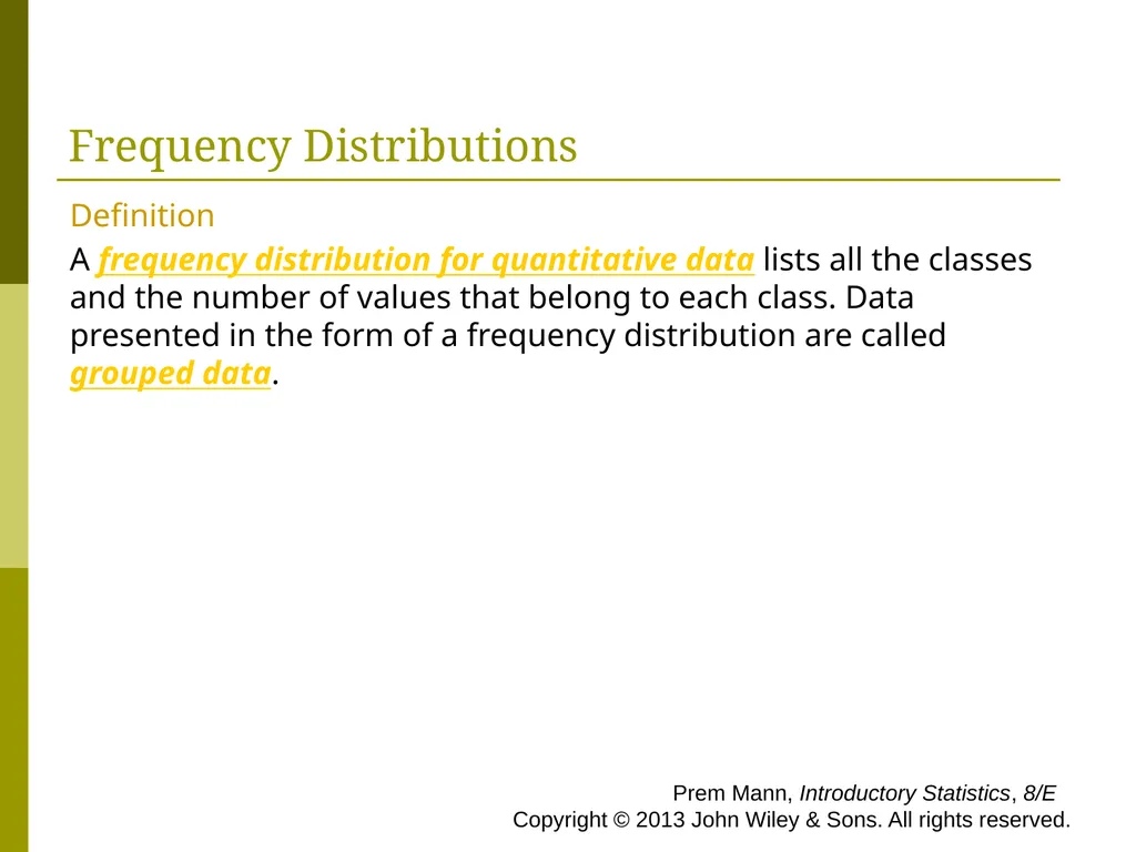
slide24. Frequency Distributions Definition
A frequency distribution for quantitative data lists all the classes and the number of values that belong to each class. Data presented in the form of a frequency distribution are called grouped data. Prem Mann, Introductory Statistics, 8/E Copyright © 2013 John Wiley & Sons. All rights reserved.<br>
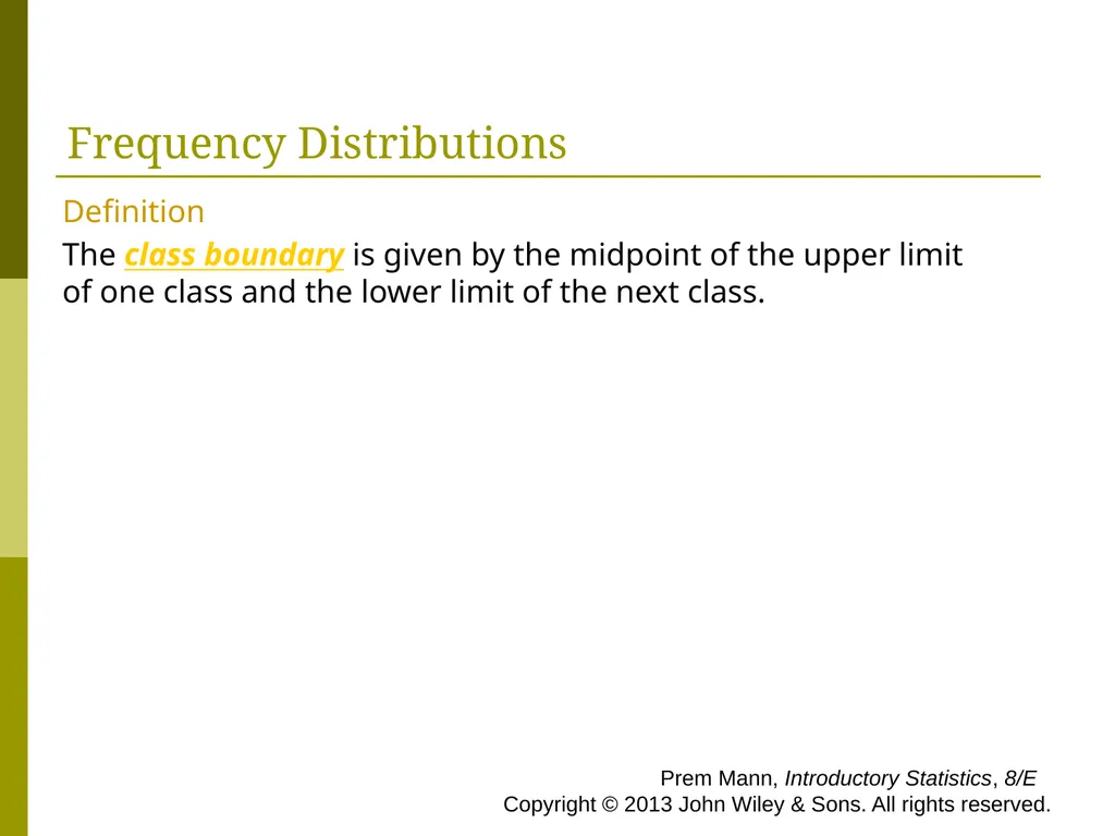
slide25. Frequency Distributions Definition
The class boundary is given by the midpoint of the upper limit of one class and the lower limit of the next class. Prem Mann, Introductory Statistics, 8/E Copyright © 2013 John Wiley & Sons. All rights reserved.<br>
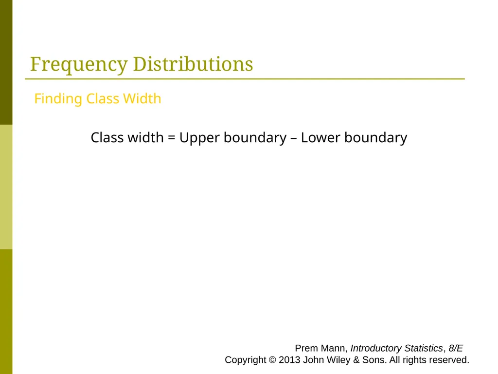
slide26. Frequency Distributions Finding Class Width
Class width = Upper boundary – Lower boundary Prem Mann, Introductory Statistics, 8/E Copyright © 2013 John Wiley & Sons. All rights reserved.<br>
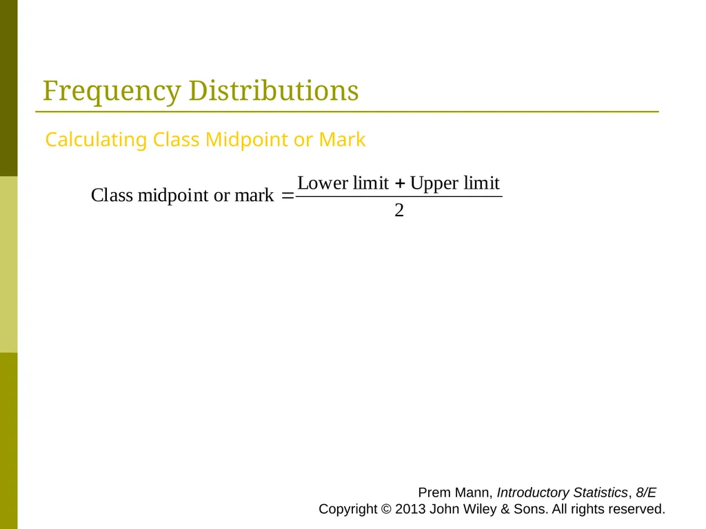
slide27. Frequency Distributions Calculating Class Midpoint or Mark Prem Mann, Introductory Statistics, 8/E Copyright © 2013 John Wiley & Sons. All rights reserved.<br>
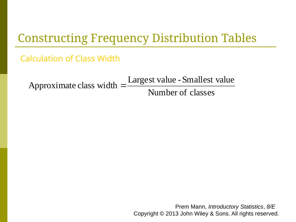
slide28. Constructing Frequency Distribution Tables Calculation of Class Width Prem Mann, Introductory Statistics, 8/E Copyright © 2013 John Wiley & Sons. All rights reserved.<br>
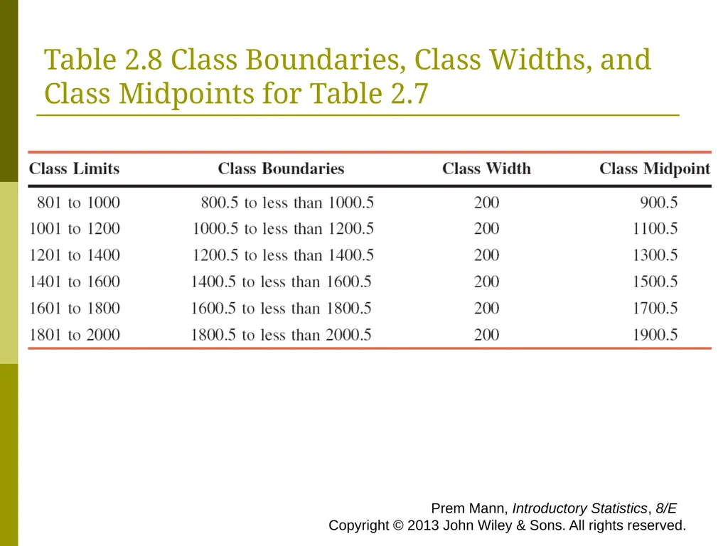
slide29. Table 2.8 Class Boundaries, Class Widths, and Class Midpoints for Table 2.7 Prem Mann, Introductory Statistics, 8/E Copyright © 2013 John Wiley & Sons. All rights reserved.<br>
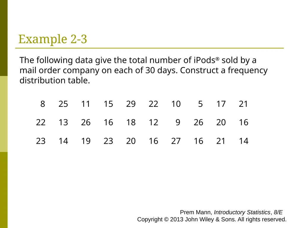
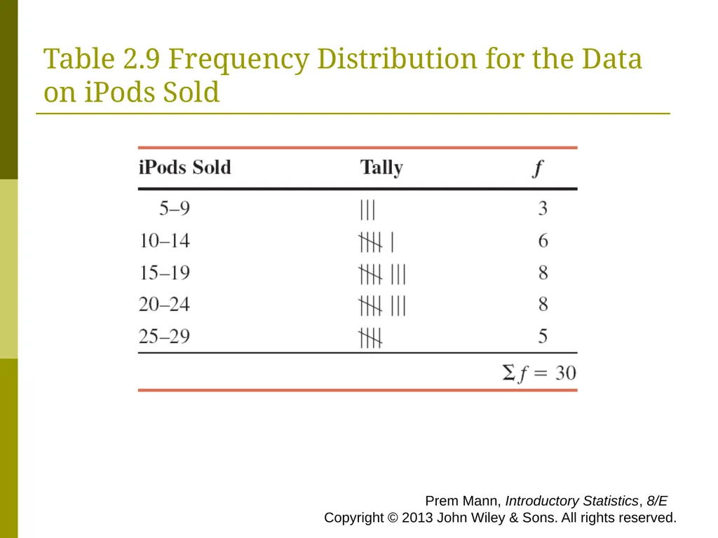
slide30. Example 2-3 The following data give the total number of iPods® sold by a mail order company on each of 30 days. Construct a frequency distribution table. Prem Mann, Introductory Statistics, 8/E Copyright © 2013 John Wiley & Sons. All rights reserved.<br>
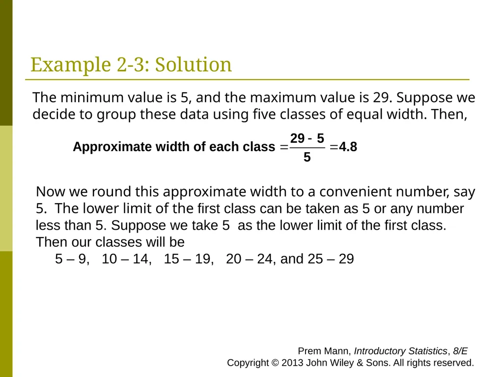
slide31. Example 2-3: Solution Now we round this approximate width to a convenient number, say 5. The lower limit of the first class can be taken as 5 or any number less than 5. Suppose we take 5 as the lower limit of the first class. Then our classes will be
5 – 9, 10 – 14, 15 – 19, 20 – 24, and 25 – 29 The minimum value is 5, and the maximum value is 29. Suppose we decide to group these data using five classes of equal width. Then, Prem Mann, Introductory Statistics, 8/E Copyright © 2013 John Wiley & Sons. All rights reserved.<br>
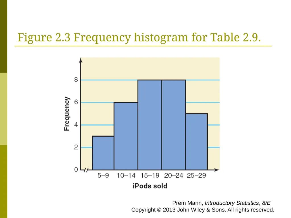
slide32. Table 2.9 Frequency Distribution for the Data on iPods Sold Prem Mann, Introductory Statistics, 8/E Copyright © 2013 John Wiley & Sons. All rights reserved.<br>
slide33. Relative Frequency and Percentage Distributions Calculating Relative Frequency and Percentage Prem Mann, Introductory Statistics, 8/E Copyright © 2013 John Wiley & Sons. All rights reserved.<br>
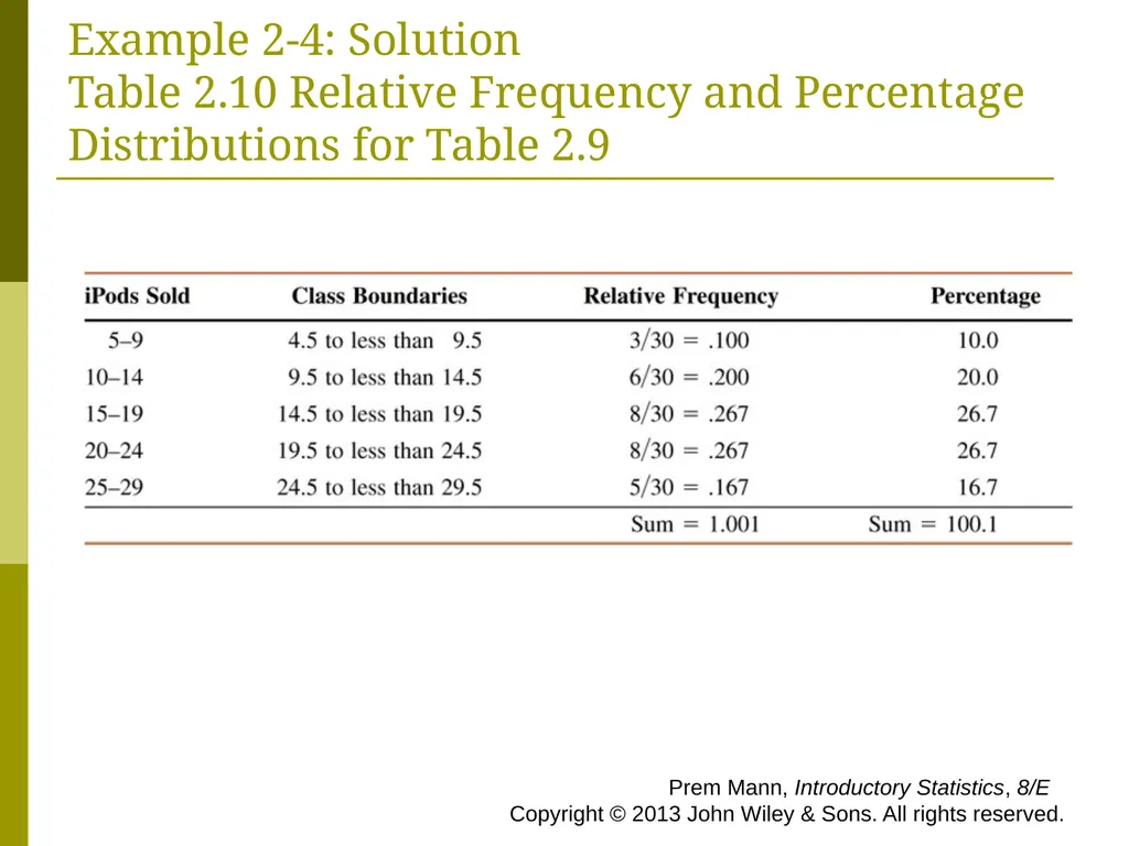
slide34. Example 2-4 Calculate the relative frequencies and percentages for Table 2.9. Prem Mann, Introductory Statistics, 8/E Copyright © 2013 John Wiley & Sons. All rights reserved.<br>
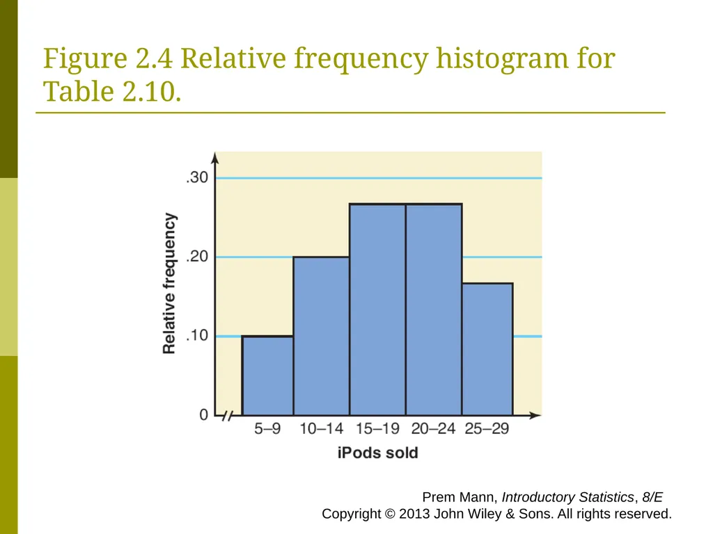
slide35. Example 2-4: Solution Table 2.10 Relative Frequency and Percentage Distributions for Table 2.9 Prem Mann, Introductory Statistics, 8/E Copyright © 2013 John Wiley & Sons. All rights reserved.<br>
slide36. Graphing Grouped Data Definition
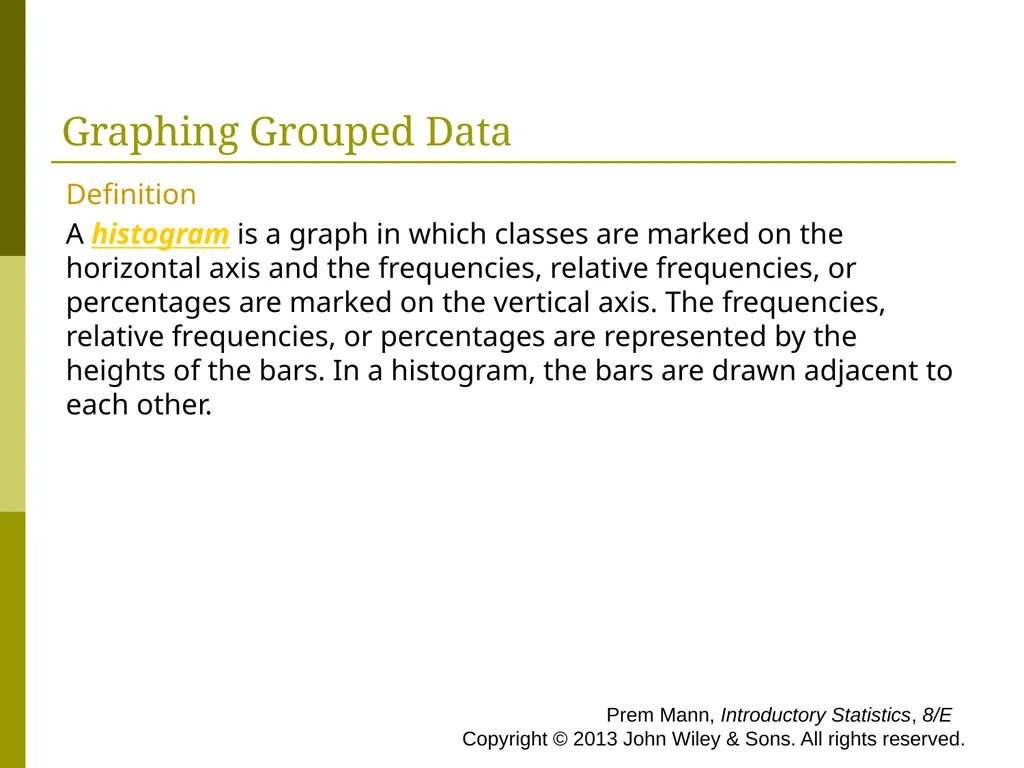
A histogram is a graph in which classes are marked on the horizontal axis and the frequencies, relative frequencies, or percentages are marked on the vertical axis. The frequencies, relative frequencies, or percentages are represented by the heights of the bars. In a histogram, the bars are drawn adjacent to each other. Prem Mann, Introductory Statistics, 8/E Copyright © 2013 John Wiley & Sons. All rights reserved.<br>
slide37. Figure 2.3 Frequency histogram for Table 2.9. Prem Mann, Introductory Statistics, 8/E Copyright © 2013 John Wiley & Sons. All rights reserved.<br>
slide38. Figure 2.4 Relative frequency histogram for Table 2.10. Prem Mann, Introductory Statistics, 8/E Copyright © 2013 John Wiley & Sons. All rights reserved.<br>
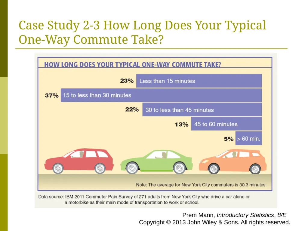
slide39. Case Study 2-3 How Long Does Your Typical One-Way Commute Take? Prem Mann, Introductory Statistics, 8/E Copyright © 2013 John Wiley & Sons. All rights reserved.<br>
slide40. Graphing Grouped Data Definition
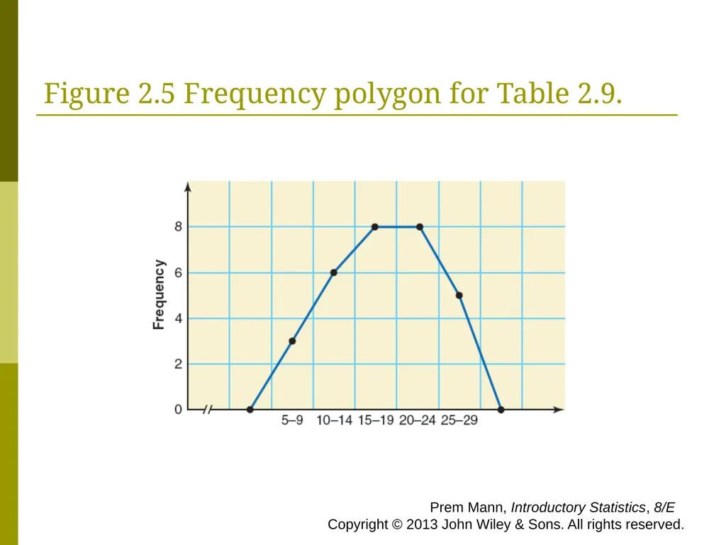
A graph formed by joining the midpoints of the tops of successive bars in a histogram with straight lines is called a polygon. Prem Mann, Introductory Statistics, 8/E Copyright © 2013 John Wiley & Sons. All rights reserved.<br>
slide41. Figure 2.5 Frequency polygon for Table 2.9. Prem Mann, Introductory Statistics, 8/E Copyright © 2013 John Wiley & Sons. All rights reserved.<br>
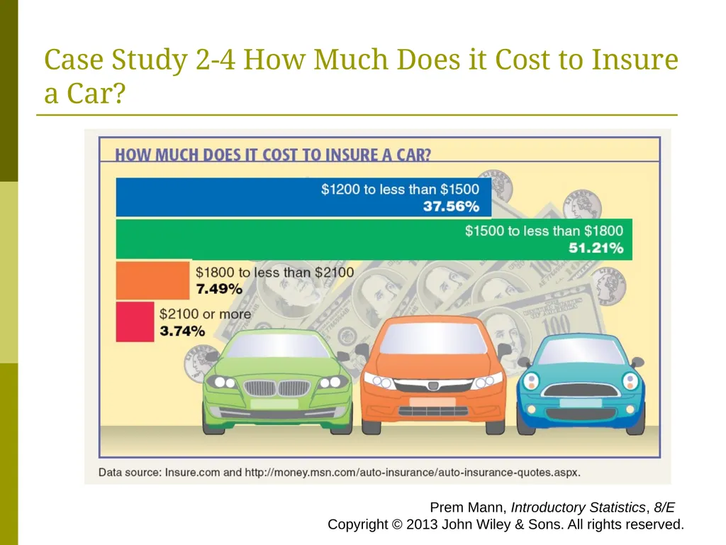
slide42. Case Study 2-4 How Much Does it Cost to Insure a Car? Prem Mann, Introductory Statistics, 8/E Copyright © 2013 John Wiley & Sons. All rights reserved.<br>
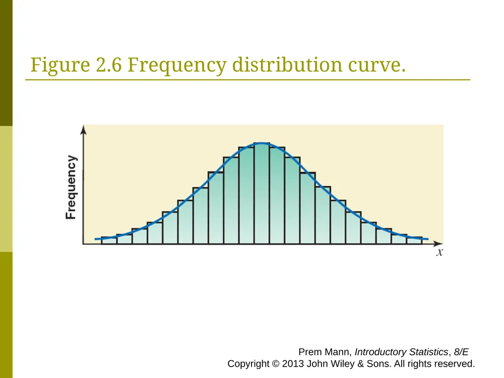
slide43. Figure 2.6 Frequency distribution curve. Prem Mann, Introductory Statistics, 8/E Copyright © 2013 John Wiley & Sons. All rights reserved.<br>
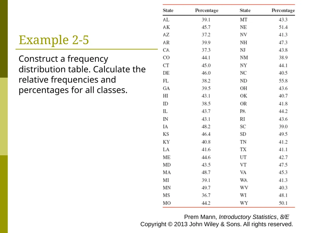
slide44. Example 2-5 The percentage of the population working in the United States peaked in 2000 but dropped to the lowest level in 30 years in 2010. Table 2.11 shows the percentage of the population working in each of the 50 states in 2010. These percentages exclude military personnel and self-employed persons. (Source: USA TODAY, April 14, 2011. Based on data from the U.S. Census Bureau and U.S. Bureau of Labor Statistics.) Prem Mann, Introductory Statistics, 8/E Copyright © 2013 John Wiley & Sons. All rights reserved.<br>
slide45. Example 2-5 Construct a frequency distribution table. Calculate the relative frequencies and percentages for all classes. Prem Mann, Introductory Statistics, 8/E Copyright © 2013 John Wiley & Sons. All rights reserved.<br>
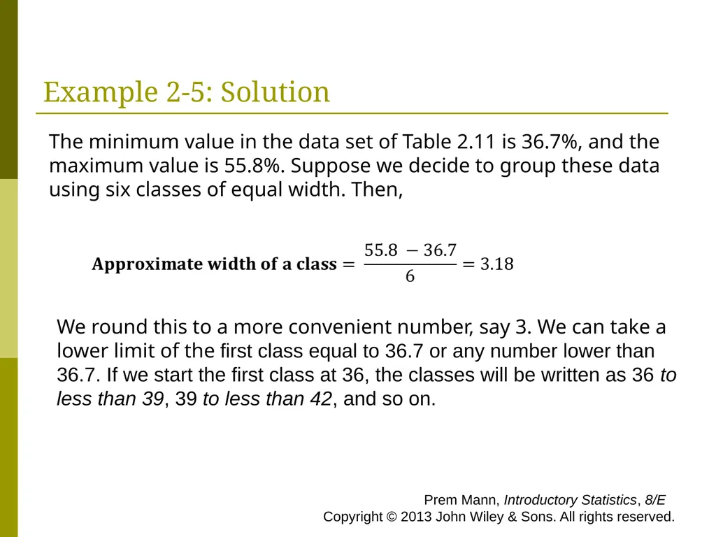
slide46. Example 2-5: Solution The minimum value in the data set of Table 2.11 is 36.7%, and the maximum value is 55.8%. Suppose we decide to group these data using six classes of equal width. Then, We round this to a more convenient number, say 3. We can take a lower limit of the first class equal to 36.7 or any number lower than 36.7. If we start the first class at 36, the classes will be written as 36 to less than 39, 39 to less than 42, and so on. Prem Mann, Introductory Statistics, 8/E Copyright © 2013 John Wiley & Sons. All rights reserved.<br>
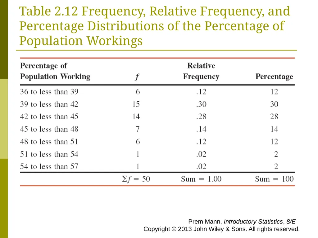
slide47. Table 2.12 Frequency, Relative Frequency, and Percentage Distributions of the Percentage of Population Workings Prem Mann, Introductory Statistics, 8/E Copyright © 2013 John Wiley & Sons. All rights reserved.<br>
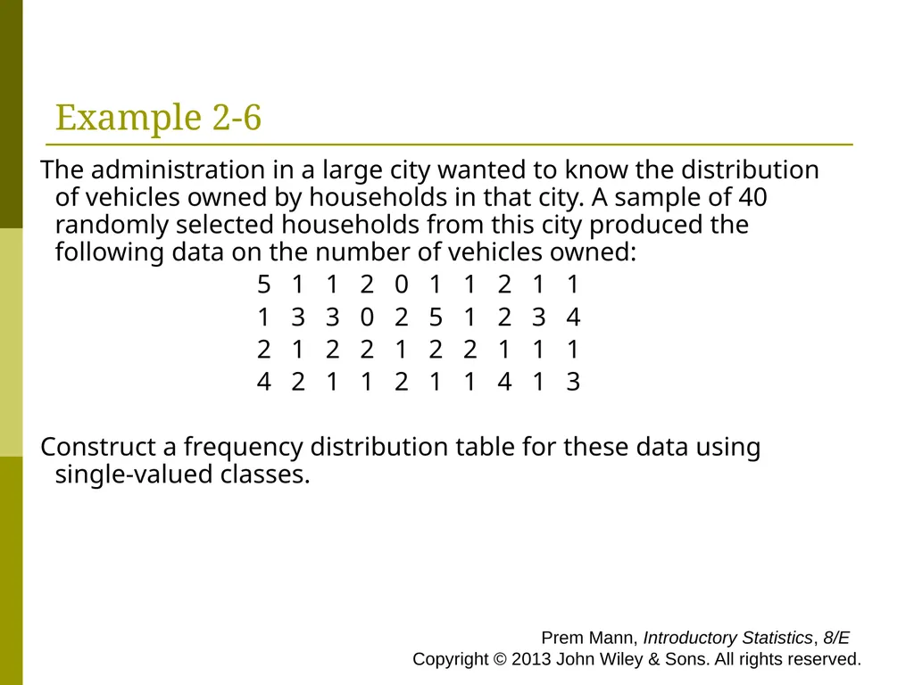
slide48. Example 2-6 The administration in a large city wanted to know the distribution of vehicles owned by households in that city. A sample of 40 randomly selected households from this city produced the following data on the number of vehicles owned:
5 1 1 2 0 1 1 2 1 1
1 3 3 0 2 5 1 2 3 4
2 1 2 2 1 2 2 1 1 1
4 2 1 1 2 1 1 4 1 3
Construct a frequency distribution table for these data using single-valued classes. Prem Mann, Introductory Statistics, 8/E Copyright © 2013 John Wiley & Sons. All rights reserved.<br>
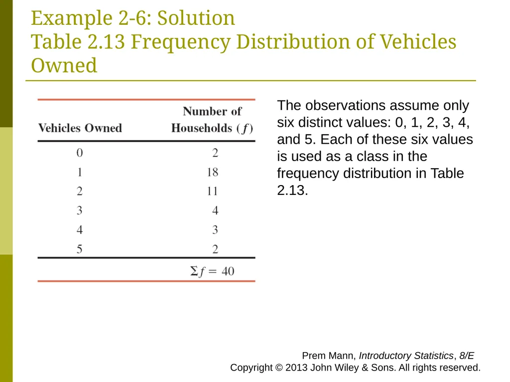
slide49. Example 2-6: Solution Table 2.13 Frequency Distribution of Vehicles Owned The observations assume only six distinct values: 0, 1, 2, 3, 4, and 5. Each of these six values is used as a class in the frequency distribution in Table 2.13. Prem Mann, Introductory Statistics, 8/E Copyright © 2013 John Wiley & Sons. All rights reserved.<br>
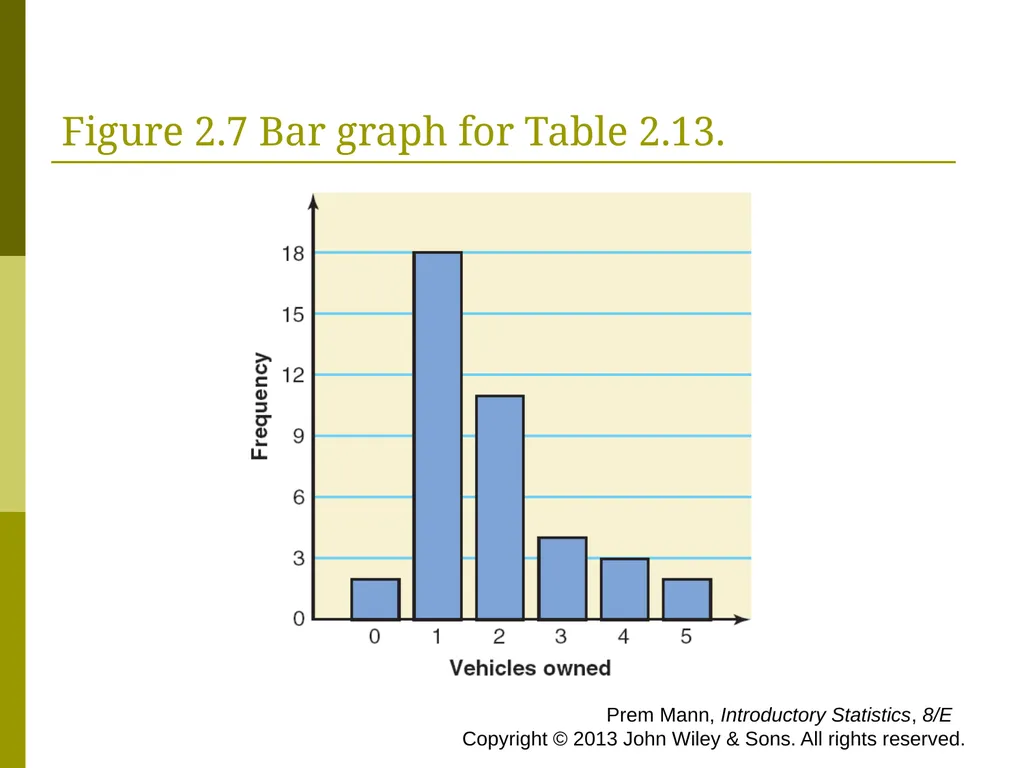
slide50. Figure 2.7 Bar graph for Table 2.13. Prem Mann, Introductory Statistics, 8/E Copyright © 2013 John Wiley & Sons. All rights reserved.<br>
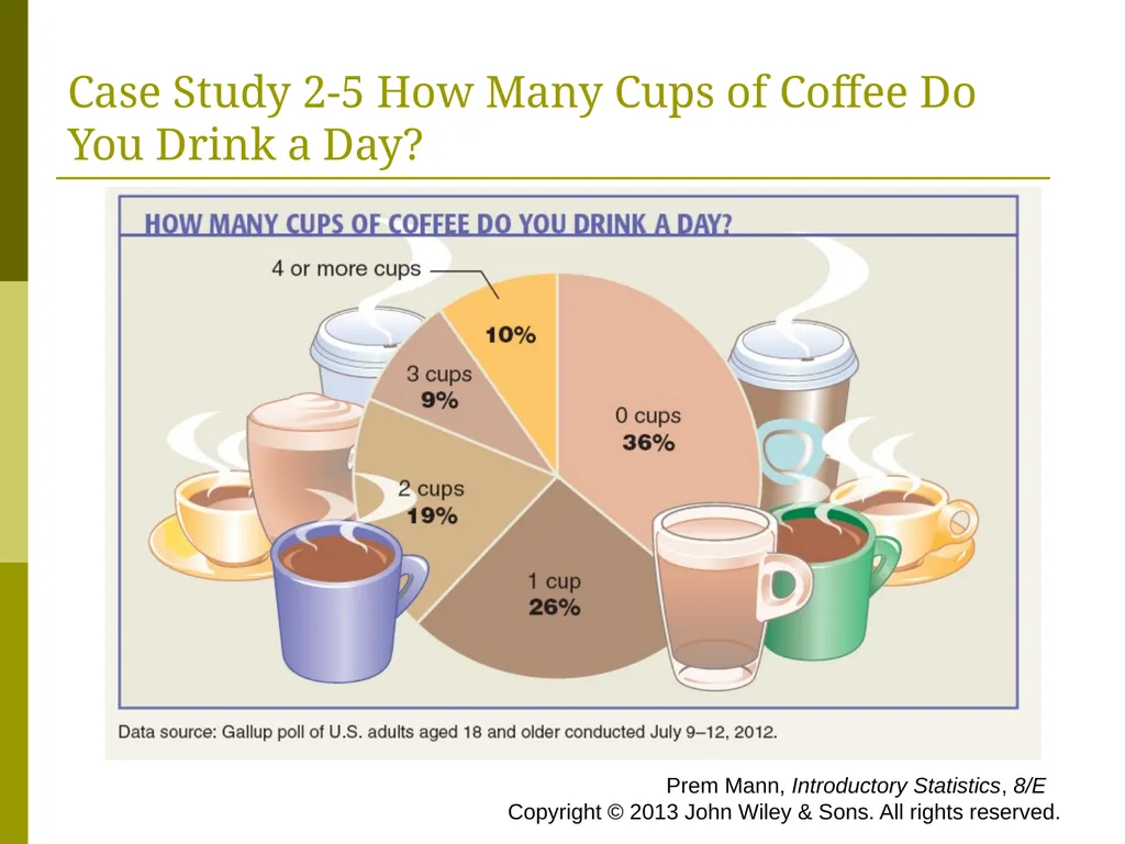
slide51. Case Study 2-5 How Many Cups of Coffee Do You Drink a Day? Prem Mann, Introductory Statistics, 8/E Copyright © 2013 John Wiley & Sons. All rights reserved.<br>
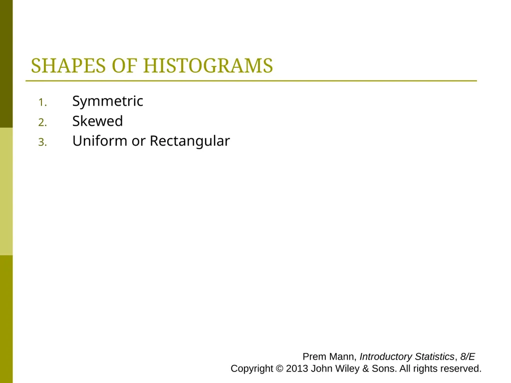
slide52. SHAPES OF HISTOGRAMS Symmetric
Skewed
Uniform or Rectangular Prem Mann, Introductory Statistics, 8/E Copyright © 2013 John Wiley & Sons. All rights reserved.<br>
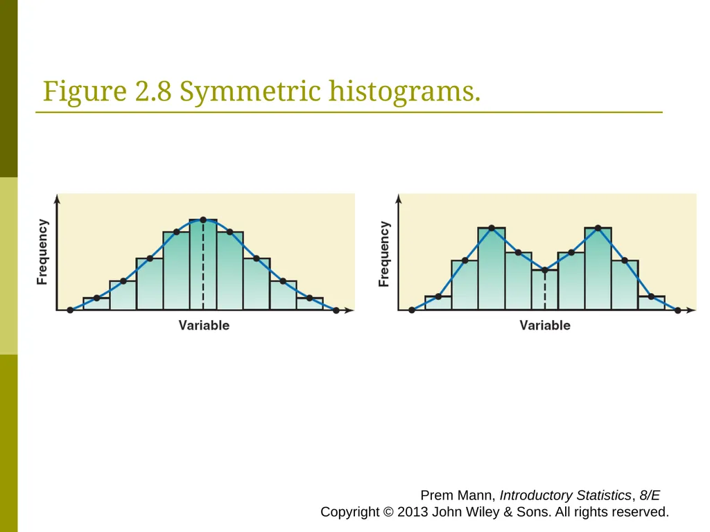
slide53. Figure 2.8 Symmetric histograms. Prem Mann, Introductory Statistics, 8/E Copyright © 2013 John Wiley & Sons. All rights reserved.<br>
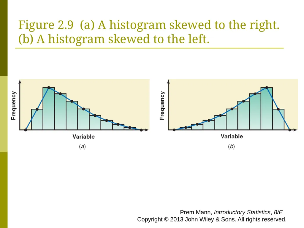
slide54. Figure 2.9 (a) A histogram skewed to the right. (b) A histogram skewed to the left. Prem Mann, Introductory Statistics, 8/E Copyright © 2013 John Wiley & Sons. All rights reserved.<br>
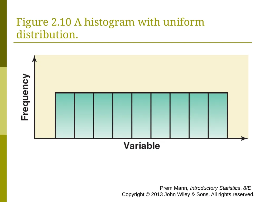
slide55. Figure 2.10 A histogram with uniform distribution. Prem Mann, Introductory Statistics, 8/E Copyright © 2013 John Wiley & Sons. All rights reserved.<br>
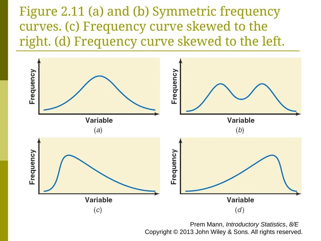
slide56. Figure 2.11 (a) and (b) Symmetric frequency curves. (c) Frequency curve skewed to the right. (d) Frequency curve skewed to the left. Prem Mann, Introductory Statistics, 8/E Copyright © 2013 John Wiley & Sons. All rights reserved.<br>
slide2. RAW DATA Definition
Data recorded in the sequence in which they are collected and before they are processed or ranked are called raw data. Prem Mann, Introductory Statistics, 8/E Copyright © 2013 John Wiley & Sons. All rights reserved.<br>
slide3. Table 2.1 Ages of 50 Students Prem Mann, Introductory Statistics, 8/E Copyright © 2013 John Wiley & Sons. All rights reserved.<br>
slide4. Table 2.2 Status of 50 Students Prem Mann, Introductory Statistics, 8/E Copyright © 2013 John Wiley & Sons. All rights reserved.<br>
slide5. ORGANIZING AND GRAPHING DATA Frequency Distributions
Relative Frequency and Percentage Distributions
Graphical Presentation of Qualitative Data Prem Mann, Introductory Statistics, 8/E Copyright © 2013 John Wiley & Sons. All rights reserved.<br>
slide6. Table 2.3 Types of Employment Students Intend to Engage In Prem Mann, Introductory Statistics, 8/E Copyright © 2013 John Wiley & Sons. All rights reserved.<br>
slide7. Frequency Distributions Definition
A frequency distribution of a qualitative variable lists all categories and the number of elements that belong to each of the categories. Prem Mann, Introductory Statistics, 8/E Copyright © 2013 John Wiley & Sons. All rights reserved.<br>
slide8. Example 2-1 A sample of 30 persons who often consume donuts were asked what variety of donuts was their favorite. The responses from these 30 persons were as follows: Prem Mann, Introductory Statistics, 8/E Copyright © 2013 John Wiley & Sons. All rights reserved.<br>
slide9. Example 2-1 Construct a frequency distribution table for these data. Prem Mann, Introductory Statistics, 8/E Copyright © 2013 John Wiley & Sons. All rights reserved.<br>
slide10. Example 2-1: Solution Table 2.4 Frequency Distribution of Favorite Donut Variety Prem Mann, Introductory Statistics, 8/E Copyright © 2013 John Wiley & Sons. All rights reserved.<br>
slide11. Relative Frequency and Percentage Distributions Calculating Relative Frequency of a Category Prem Mann, Introductory Statistics, 8/E Copyright © 2013 John Wiley & Sons. All rights reserved.<br>
slide12. Relative Frequency and Percentage Distributions Calculating Percentage
Percentage = (Relative frequency) · 100% Prem Mann, Introductory Statistics, 8/E Copyright © 2013 John Wiley & Sons. All rights reserved.<br>
slide13. Example 2-2 Determine the relative frequency and percentage for the data in Table 2.4. Prem Mann, Introductory Statistics, 8/E Copyright © 2013 John Wiley & Sons. All rights reserved.<br>
slide14. Example 2-2: Solution Table 2.5 Relative Frequency and Percentage Distributions of Favorite Donut Variety Prem Mann, Introductory Statistics, 8/E Copyright © 2013 John Wiley & Sons. All rights reserved.<br>
slide15. Case Study 2-1 Will Today’s Children Be Better Off Than Their Parents? Prem Mann, Introductory Statistics, 8/E Copyright © 2013 John Wiley & Sons. All rights reserved.<br>
slide16. Graphical Presentation of Qualitative Data Definition
A graph made of bars whose heights represent the frequencies of respective categories is called a bar graph. Prem Mann, Introductory Statistics, 8/E Copyright © 2013 John Wiley & Sons. All rights reserved.<br>
slide17. Figure 2.1 Bar graph for the frequency distribution of Table 2.4 Prem Mann, Introductory Statistics, 8/E Copyright © 2013 John Wiley & Sons. All rights reserved.<br>
slide18. Case Study 2-2 Employees’ Overall Financial Stress Levels Prem Mann, Introductory Statistics, 8/E Copyright © 2013 John Wiley & Sons. All rights reserved.<br>
slide19. Graphical Presentation of Qualitative Data Definition
A circle divided into portions that represent the relative frequencies or percentages of a population or a sample belonging to different categories is called a pie chart. Prem Mann, Introductory Statistics, 8/E Copyright © 2013 John Wiley & Sons. All rights reserved.<br>
slide20. Table 2.6 Calculating Angle Sizes for the Pie Chart Prem Mann, Introductory Statistics, 8/E Copyright © 2013 John Wiley & Sons. All rights reserved.<br>
slide21. Figure 2.2 Pie chart for the percentage distribution of Table 2.5. Prem Mann, Introductory Statistics, 8/E Copyright © 2013 John Wiley & Sons. All rights reserved.<br>
slide22. ORGANIZING AND GRAPHING QUANTITATIVE Frequency Distributions
Constructing Frequency Distribution Tables
Relative and Percentage Distributions
Graphing Grouped Data Prem Mann, Introductory Statistics, 8/E Copyright © 2013 John Wiley & Sons. All rights reserved.<br>
slide23. Table 2.7 Weekly Earnings of 100 Employees of a Company Prem Mann, Introductory Statistics, 8/E Copyright © 2013 John Wiley & Sons. All rights reserved.<br>
slide24. Frequency Distributions Definition
A frequency distribution for quantitative data lists all the classes and the number of values that belong to each class. Data presented in the form of a frequency distribution are called grouped data. Prem Mann, Introductory Statistics, 8/E Copyright © 2013 John Wiley & Sons. All rights reserved.<br>
slide25. Frequency Distributions Definition
The class boundary is given by the midpoint of the upper limit of one class and the lower limit of the next class. Prem Mann, Introductory Statistics, 8/E Copyright © 2013 John Wiley & Sons. All rights reserved.<br>
slide26. Frequency Distributions Finding Class Width
Class width = Upper boundary – Lower boundary Prem Mann, Introductory Statistics, 8/E Copyright © 2013 John Wiley & Sons. All rights reserved.<br>
slide27. Frequency Distributions Calculating Class Midpoint or Mark Prem Mann, Introductory Statistics, 8/E Copyright © 2013 John Wiley & Sons. All rights reserved.<br>
slide28. Constructing Frequency Distribution Tables Calculation of Class Width Prem Mann, Introductory Statistics, 8/E Copyright © 2013 John Wiley & Sons. All rights reserved.<br>
slide29. Table 2.8 Class Boundaries, Class Widths, and Class Midpoints for Table 2.7 Prem Mann, Introductory Statistics, 8/E Copyright © 2013 John Wiley & Sons. All rights reserved.<br>
slide30. Example 2-3 The following data give the total number of iPods® sold by a mail order company on each of 30 days. Construct a frequency distribution table. Prem Mann, Introductory Statistics, 8/E Copyright © 2013 John Wiley & Sons. All rights reserved.<br>
slide31. Example 2-3: Solution Now we round this approximate width to a convenient number, say 5. The lower limit of the first class can be taken as 5 or any number less than 5. Suppose we take 5 as the lower limit of the first class. Then our classes will be
5 – 9, 10 – 14, 15 – 19, 20 – 24, and 25 – 29 The minimum value is 5, and the maximum value is 29. Suppose we decide to group these data using five classes of equal width. Then, Prem Mann, Introductory Statistics, 8/E Copyright © 2013 John Wiley & Sons. All rights reserved.<br>
slide32. Table 2.9 Frequency Distribution for the Data on iPods Sold Prem Mann, Introductory Statistics, 8/E Copyright © 2013 John Wiley & Sons. All rights reserved.<br>
slide33. Relative Frequency and Percentage Distributions Calculating Relative Frequency and Percentage Prem Mann, Introductory Statistics, 8/E Copyright © 2013 John Wiley & Sons. All rights reserved.<br>
slide34. Example 2-4 Calculate the relative frequencies and percentages for Table 2.9. Prem Mann, Introductory Statistics, 8/E Copyright © 2013 John Wiley & Sons. All rights reserved.<br>
slide35. Example 2-4: Solution Table 2.10 Relative Frequency and Percentage Distributions for Table 2.9 Prem Mann, Introductory Statistics, 8/E Copyright © 2013 John Wiley & Sons. All rights reserved.<br>
slide36. Graphing Grouped Data Definition
A histogram is a graph in which classes are marked on the horizontal axis and the frequencies, relative frequencies, or percentages are marked on the vertical axis. The frequencies, relative frequencies, or percentages are represented by the heights of the bars. In a histogram, the bars are drawn adjacent to each other. Prem Mann, Introductory Statistics, 8/E Copyright © 2013 John Wiley & Sons. All rights reserved.<br>
slide37. Figure 2.3 Frequency histogram for Table 2.9. Prem Mann, Introductory Statistics, 8/E Copyright © 2013 John Wiley & Sons. All rights reserved.<br>
slide38. Figure 2.4 Relative frequency histogram for Table 2.10. Prem Mann, Introductory Statistics, 8/E Copyright © 2013 John Wiley & Sons. All rights reserved.<br>
slide39. Case Study 2-3 How Long Does Your Typical One-Way Commute Take? Prem Mann, Introductory Statistics, 8/E Copyright © 2013 John Wiley & Sons. All rights reserved.<br>
slide40. Graphing Grouped Data Definition
A graph formed by joining the midpoints of the tops of successive bars in a histogram with straight lines is called a polygon. Prem Mann, Introductory Statistics, 8/E Copyright © 2013 John Wiley & Sons. All rights reserved.<br>
slide41. Figure 2.5 Frequency polygon for Table 2.9. Prem Mann, Introductory Statistics, 8/E Copyright © 2013 John Wiley & Sons. All rights reserved.<br>
slide42. Case Study 2-4 How Much Does it Cost to Insure a Car? Prem Mann, Introductory Statistics, 8/E Copyright © 2013 John Wiley & Sons. All rights reserved.<br>
slide43. Figure 2.6 Frequency distribution curve. Prem Mann, Introductory Statistics, 8/E Copyright © 2013 John Wiley & Sons. All rights reserved.<br>
slide44. Example 2-5 The percentage of the population working in the United States peaked in 2000 but dropped to the lowest level in 30 years in 2010. Table 2.11 shows the percentage of the population working in each of the 50 states in 2010. These percentages exclude military personnel and self-employed persons. (Source: USA TODAY, April 14, 2011. Based on data from the U.S. Census Bureau and U.S. Bureau of Labor Statistics.) Prem Mann, Introductory Statistics, 8/E Copyright © 2013 John Wiley & Sons. All rights reserved.<br>
slide45. Example 2-5 Construct a frequency distribution table. Calculate the relative frequencies and percentages for all classes. Prem Mann, Introductory Statistics, 8/E Copyright © 2013 John Wiley & Sons. All rights reserved.<br>
slide46. Example 2-5: Solution The minimum value in the data set of Table 2.11 is 36.7%, and the maximum value is 55.8%. Suppose we decide to group these data using six classes of equal width. Then, We round this to a more convenient number, say 3. We can take a lower limit of the first class equal to 36.7 or any number lower than 36.7. If we start the first class at 36, the classes will be written as 36 to less than 39, 39 to less than 42, and so on. Prem Mann, Introductory Statistics, 8/E Copyright © 2013 John Wiley & Sons. All rights reserved.<br>
slide47. Table 2.12 Frequency, Relative Frequency, and Percentage Distributions of the Percentage of Population Workings Prem Mann, Introductory Statistics, 8/E Copyright © 2013 John Wiley & Sons. All rights reserved.<br>
slide48. Example 2-6 The administration in a large city wanted to know the distribution of vehicles owned by households in that city. A sample of 40 randomly selected households from this city produced the following data on the number of vehicles owned:
5 1 1 2 0 1 1 2 1 1
1 3 3 0 2 5 1 2 3 4
2 1 2 2 1 2 2 1 1 1
4 2 1 1 2 1 1 4 1 3
Construct a frequency distribution table for these data using single-valued classes. Prem Mann, Introductory Statistics, 8/E Copyright © 2013 John Wiley & Sons. All rights reserved.<br>
slide49. Example 2-6: Solution Table 2.13 Frequency Distribution of Vehicles Owned The observations assume only six distinct values: 0, 1, 2, 3, 4, and 5. Each of these six values is used as a class in the frequency distribution in Table 2.13. Prem Mann, Introductory Statistics, 8/E Copyright © 2013 John Wiley & Sons. All rights reserved.<br>
slide50. Figure 2.7 Bar graph for Table 2.13. Prem Mann, Introductory Statistics, 8/E Copyright © 2013 John Wiley & Sons. All rights reserved.<br>
slide51. Case Study 2-5 How Many Cups of Coffee Do You Drink a Day? Prem Mann, Introductory Statistics, 8/E Copyright © 2013 John Wiley & Sons. All rights reserved.<br>
slide52. SHAPES OF HISTOGRAMS Symmetric
Skewed
Uniform or Rectangular Prem Mann, Introductory Statistics, 8/E Copyright © 2013 John Wiley & Sons. All rights reserved.<br>
slide53. Figure 2.8 Symmetric histograms. Prem Mann, Introductory Statistics, 8/E Copyright © 2013 John Wiley & Sons. All rights reserved.<br>
slide54. Figure 2.9 (a) A histogram skewed to the right. (b) A histogram skewed to the left. Prem Mann, Introductory Statistics, 8/E Copyright © 2013 John Wiley & Sons. All rights reserved.<br>
slide55. Figure 2.10 A histogram with uniform distribution. Prem Mann, Introductory Statistics, 8/E Copyright © 2013 John Wiley & Sons. All rights reserved.<br>
slide56. Figure 2.11 (a) and (b) Symmetric frequency curves. (c) Frequency curve skewed to the right. (d) Frequency curve skewed to the left. Prem Mann, Introductory Statistics, 8/E Copyright © 2013 John Wiley & Sons. All rights reserved.<br>