
Descriptive Statistics and Public policy Mukul
BR
Published · 72 slides · 0 views
1 / 1

Description
Descriptive Statistics and Public policy Mukul Asher Mukul.ashergmail.com Amrita Centre for Economics Governance Amrita Vishwa Vidyapeetham University June 2023 Organization Preliminaries Lessons from Darrel Huffs 1954 Book-How to Lie
Related Topics
Share
Embed code
Download this presentation From Below
"Descriptive Statistics and Public policy Mukul" is the property of its rightful owner. Permission is granted to download and print the materials on this website for personal, non-commercial use only, and to display it on your personal computer provided you do not modify the materials and that you retain all copyright notices contained in the materials. By downloading content from our website, you accept the terms of this agreement.
Presentation Transcript
01
Descriptive Statistics and Public policy
Mukul Asher Mukul.asher@gmail.com
Amrita Centre for Economics & Governance
Amrita Vishwa Vidyapeetham University
June 2023<br>
Amrita Centre for Economics & Governance
Amrita Vishwa Vidyapeetham University
June 2023<br>
02
Organization Preliminaries
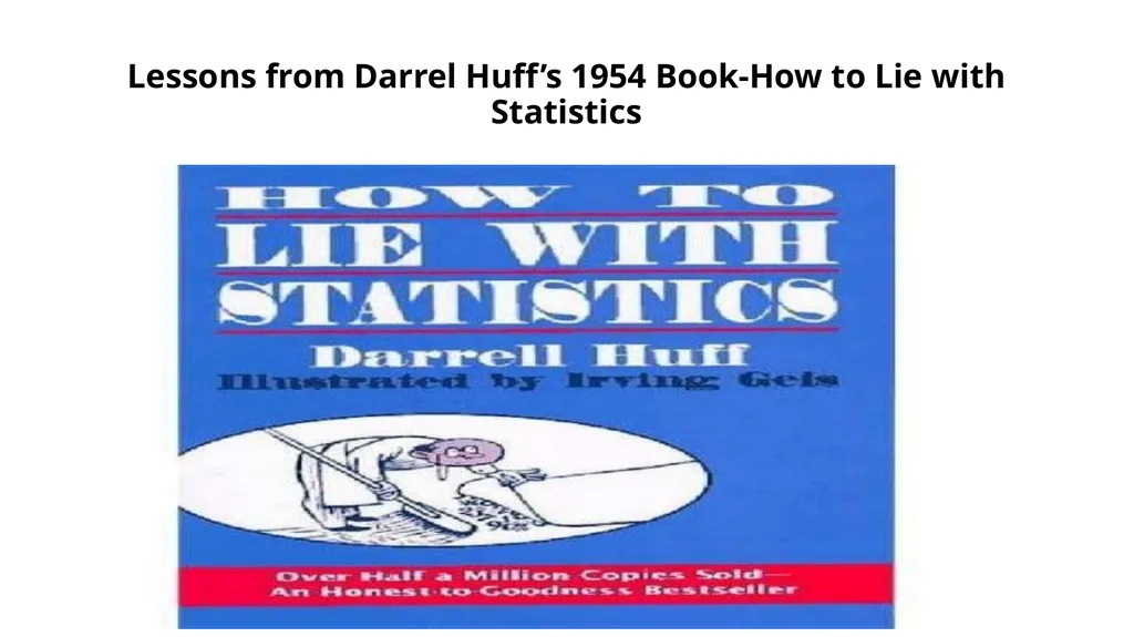
Lessons from Darrel Huff’s 1954 Book-How to Lie with Statistics
Select Examples from India<br>
Lessons from Darrel Huff’s 1954 Book-How to Lie with Statistics
Select Examples from India<br>
03
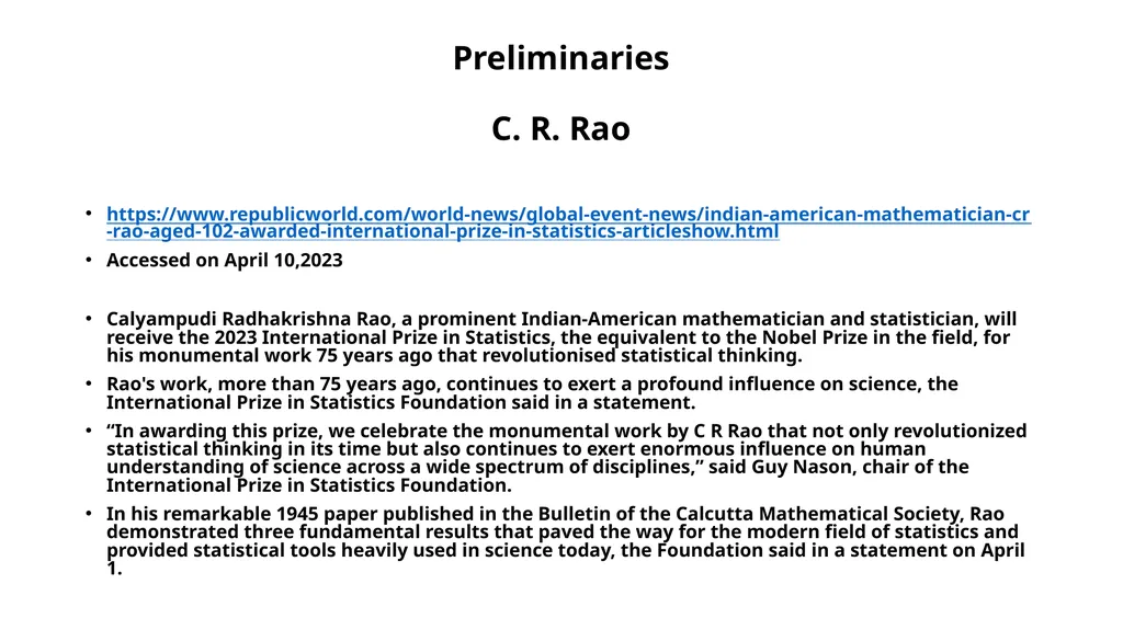
Preliminaries
C. R. Rao https://www.republicworld.com/world-news/global-event-news/indian-american-mathematician-cr-rao-aged-102-awarded-international-prize-in-statistics-articleshow.html
Accessed on April 10,2023
Calyampudi Radhakrishna Rao, a prominent Indian-American mathematician and statistician, will receive the 2023 International Prize in Statistics, the equivalent to the Nobel Prize in the field, for his monumental work 75 years ago that revolutionised statistical thinking.
Rao's work, more than 75 years ago, continues to exert a profound influence on science, the International Prize in Statistics Foundation said in a statement.
“In awarding this prize, we celebrate the monumental work by C R Rao that not only revolutionized statistical thinking in its time but also continues to exert enormous influence on human understanding of science across a wide spectrum of disciplines,” said Guy Nason, chair of the International Prize in Statistics Foundation.
In his remarkable 1945 paper published in the Bulletin of the Calcutta Mathematical Society, Rao demonstrated three fundamental results that paved the way for the modern field of statistics and provided statistical tools heavily used in science today, the Foundation said in a statement on April 1.<br>
Accessed on April 10,2023
Calyampudi Radhakrishna Rao, a prominent Indian-American mathematician and statistician, will receive the 2023 International Prize in Statistics, the equivalent to the Nobel Prize in the field, for his monumental work 75 years ago that revolutionised statistical thinking.
Rao's work, more than 75 years ago, continues to exert a profound influence on science, the International Prize in Statistics Foundation said in a statement.
“In awarding this prize, we celebrate the monumental work by C R Rao that not only revolutionized statistical thinking in its time but also continues to exert enormous influence on human understanding of science across a wide spectrum of disciplines,” said Guy Nason, chair of the International Prize in Statistics Foundation.
In his remarkable 1945 paper published in the Bulletin of the Calcutta Mathematical Society, Rao demonstrated three fundamental results that paved the way for the modern field of statistics and provided statistical tools heavily used in science today, the Foundation said in a statement on April 1.<br>
04
Preliminaries
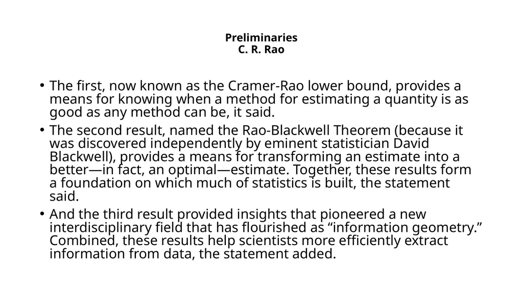
C. R. Rao The first, now known as the Cramer-Rao lower bound, provides a means for knowing when a method for estimating a quantity is as good as any method can be, it said.
The second result, named the Rao-Blackwell Theorem (because it was discovered independently by eminent statistician David Blackwell), provides a means for transforming an estimate into a better—in fact, an optimal—estimate. Together, these results form a foundation on which much of statistics is built, the statement said.
And the third result provided insights that pioneered a new interdisciplinary field that has flourished as “information geometry.” Combined, these results help scientists more efficiently extract information from data, the statement added.<br>
The second result, named the Rao-Blackwell Theorem (because it was discovered independently by eminent statistician David Blackwell), provides a means for transforming an estimate into a better—in fact, an optimal—estimate. Together, these results form a foundation on which much of statistics is built, the statement said.
And the third result provided insights that pioneered a new interdisciplinary field that has flourished as “information geometry.” Combined, these results help scientists more efficiently extract information from data, the statement added.<br>
05
Preliminaries
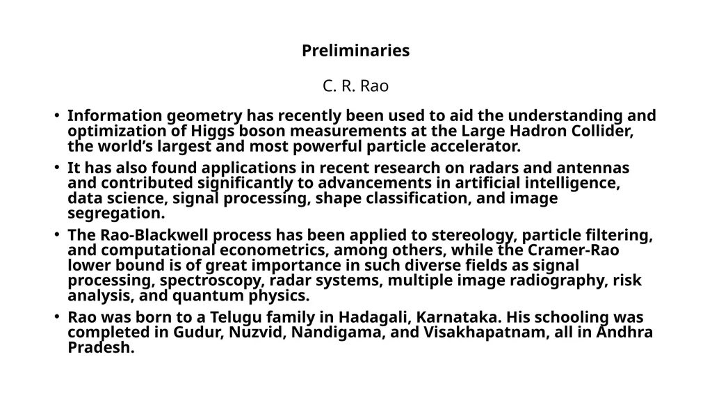
C. R. Rao Information geometry has recently been used to aid the understanding and optimization of Higgs boson measurements at the Large Hadron Collider, the world’s largest and most powerful particle accelerator.
It has also found applications in recent research on radars and antennas and contributed significantly to advancements in artificial intelligence, data science, signal processing, shape classification, and image segregation.
The Rao-Blackwell process has been applied to stereology, particle filtering, and computational econometrics, among others, while the Cramer-Rao lower bound is of great importance in such diverse fields as signal processing, spectroscopy, radar systems, multiple image radiography, risk analysis, and quantum physics.
Rao was born to a Telugu family in Hadagali, Karnataka. His schooling was completed in Gudur, Nuzvid, Nandigama, and Visakhapatnam, all in Andhra Pradesh.<br>
It has also found applications in recent research on radars and antennas and contributed significantly to advancements in artificial intelligence, data science, signal processing, shape classification, and image segregation.
The Rao-Blackwell process has been applied to stereology, particle filtering, and computational econometrics, among others, while the Cramer-Rao lower bound is of great importance in such diverse fields as signal processing, spectroscopy, radar systems, multiple image radiography, risk analysis, and quantum physics.
Rao was born to a Telugu family in Hadagali, Karnataka. His schooling was completed in Gudur, Nuzvid, Nandigama, and Visakhapatnam, all in Andhra Pradesh.<br>
06
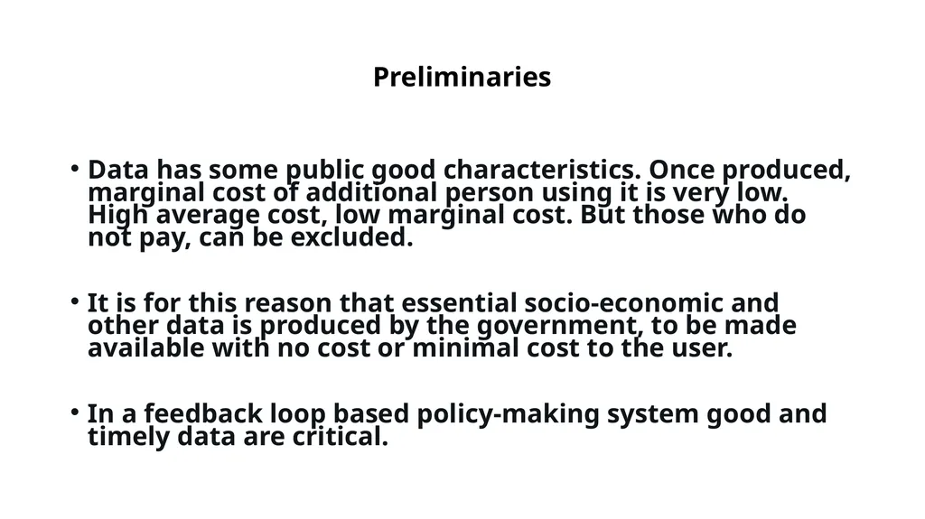
Preliminaries Data has some public good characteristics. Once produced, marginal cost of additional person using it is very low. High average cost, low marginal cost. But those who do not pay, can be excluded.
It is for this reason that essential socio-economic and other data is produced by the government, to be made available with no cost or minimal cost to the user.
In a feedback loop based policy-making system good and timely data are critical.<br>
It is for this reason that essential socio-economic and other data is produced by the government, to be made available with no cost or minimal cost to the user.
In a feedback loop based policy-making system good and timely data are critical.<br>
07
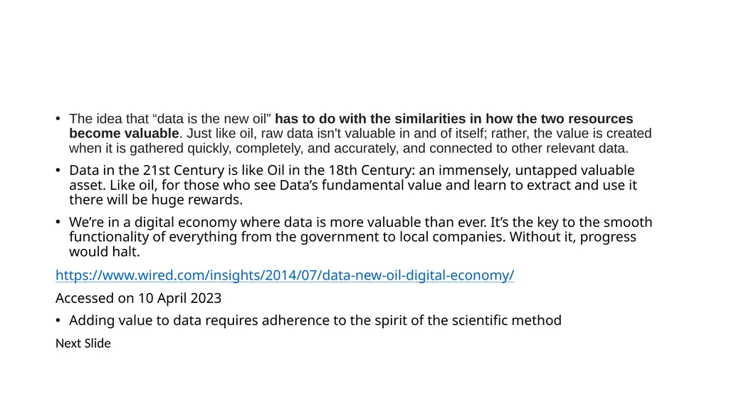
The idea that “data is the new oil” has to do with the similarities in how the two resources become valuable. Just like oil, raw data isn't valuable in and of itself; rather, the value is created when it is gathered quickly, completely, and accurately, and connected to other relevant data.
Data in the 21st Century is like Oil in the 18th Century: an immensely, untapped valuable asset. Like oil, for those who see Data’s fundamental value and learn to extract and use it there will be huge rewards.
We’re in a digital economy where data is more valuable than ever. It’s the key to the smooth functionality of everything from the government to local companies. Without it, progress would halt.
https://www.wired.com/insights/2014/07/data-new-oil-digital-economy/
Accessed on 10 April 2023
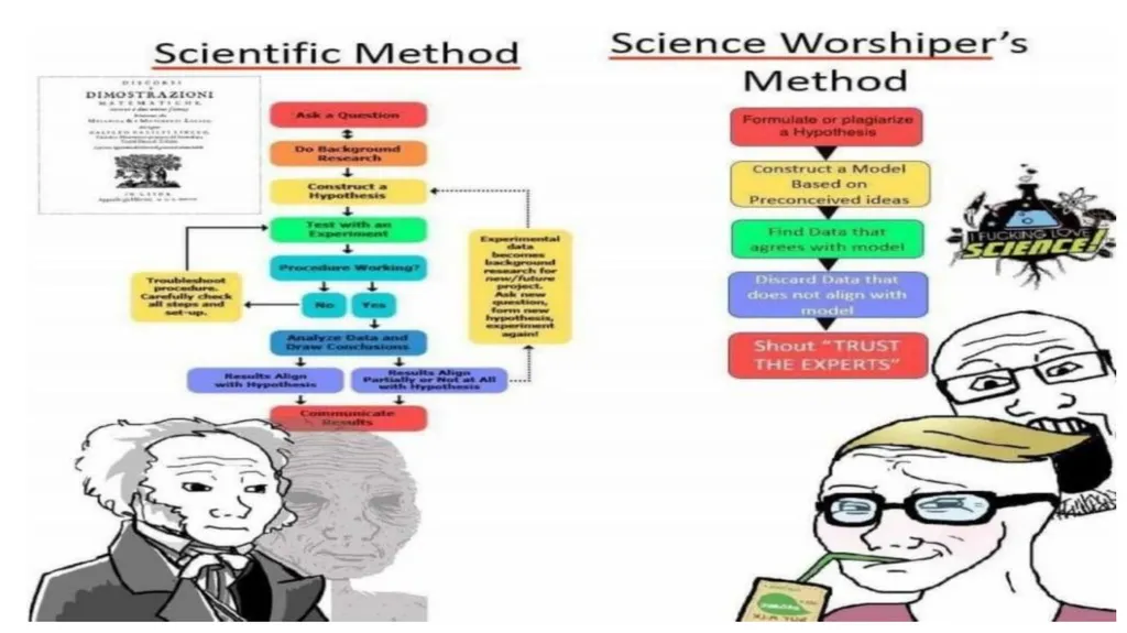
Adding value to data requires adherence to the spirit of the scientific method
Next Slide<br>
Data in the 21st Century is like Oil in the 18th Century: an immensely, untapped valuable asset. Like oil, for those who see Data’s fundamental value and learn to extract and use it there will be huge rewards.
We’re in a digital economy where data is more valuable than ever. It’s the key to the smooth functionality of everything from the government to local companies. Without it, progress would halt.
https://www.wired.com/insights/2014/07/data-new-oil-digital-economy/
Accessed on 10 April 2023
Adding value to data requires adherence to the spirit of the scientific method
Next Slide<br>
08
w<br>
09
#PublicEcon, #RegulatoryEc How many ministries, departments, agencies, central or state, know how to do “#cost-#benefit #analysis” that informs whether & how to regulate, and/or how to allocate public investment?
My guess 0 to 10, in whole of India
Arvind Virmani, Member, NITI Aayog
This suggests plenty of scope for capacity building in Monitoring and Evaluation<br>
My guess 0 to 10, in whole of India
Arvind Virmani, Member, NITI Aayog
This suggests plenty of scope for capacity building in Monitoring and Evaluation<br>
10
Steward Brand “Interesting: how much bad news is anecdotal and good news is statistical. (And how invisible the statistical is.)
Still, if only one of the two can be good news, I would rather it be the statistical.
It accumulates toward qualitative change that lasts.”<br>
Still, if only one of the two can be good news, I would rather it be the statistical.
It accumulates toward qualitative change that lasts.”<br>
11
Lessons from Darrel Huff’s 1954 Book-How to Lie with Statistics<br>
12
Lessons from Darrel Huff’s 1954 Book-How to Lie with Statistics These lessons are copied from :
https://towardsdatascience.com/lessons-from-how-to-lie-with-statistics-57060c0d2f19
By Will Koehrsen
Accessed on 10 April 2023
The rest of the slides on the Lessons are words of Will Kohersen and not mine.<br>
https://towardsdatascience.com/lessons-from-how-to-lie-with-statistics-57060c0d2f19
By Will Koehrsen
Accessed on 10 April 2023
The rest of the slides on the Lessons are words of Will Kohersen and not mine.<br>
13
Lessons from Darrel Huff’s 1954 Book-How to Lie with Statistics How to Lie With Statistics is a 65-year-old book that can be read in an hour and will teach you more practical information you can use every day than any book on “big data” or “deep learning.”
For all promised by machine learning and petabyte-scale data, the most effective techniques in data science are still small tables, graphs, or even a single number that summarize a situation and help us — or our bosses — make a decision informed by data.
As producers of tables and graphs, we need to effectively present valid summaries. As consumers of information, we need to spot misleading/exaggerated statistics which manipulate us to take action that benefits someone else at our expense.
These skills fall under a category called “data literacy”: the ability to read, understand, argue with, and make decisions from information. Compared to algorithms or big data processing, data literacy may not seem exciting, but it should form the basis for any data science education.<br>
For all promised by machine learning and petabyte-scale data, the most effective techniques in data science are still small tables, graphs, or even a single number that summarize a situation and help us — or our bosses — make a decision informed by data.
As producers of tables and graphs, we need to effectively present valid summaries. As consumers of information, we need to spot misleading/exaggerated statistics which manipulate us to take action that benefits someone else at our expense.
These skills fall under a category called “data literacy”: the ability to read, understand, argue with, and make decisions from information. Compared to algorithms or big data processing, data literacy may not seem exciting, but it should form the basis for any data science education.<br>
14
Lessons from Darrel Huff’s 1954 Book-How to Lie with Statistics 1. View Correlations with Skepticism
When two variables X and Y are correlated — meaning they increase together, decrease together, or one goes up as the other does down — there are four possible explanations:
A. X causes Y
B. Y causes X
C. A 3rd variable, Z, affects both X and Y
D. X and Y are completely unrelated
We often immediately jump to — or are led to believe — A or B when C or D may be as likely. For example, when we hear that more years of college education is positively correlated with a higher income, we conclude that additional years of university lead to greater wealth. However, it could also be a 3rd factor, such as willingness to work hard or parental income, is behind the increase in both more years of tertiary education and higher income. The 3rd hidden variable can lead us to incorrect conclusions about causality.<br>
When two variables X and Y are correlated — meaning they increase together, decrease together, or one goes up as the other does down — there are four possible explanations:
A. X causes Y
B. Y causes X
C. A 3rd variable, Z, affects both X and Y
D. X and Y are completely unrelated
We often immediately jump to — or are led to believe — A or B when C or D may be as likely. For example, when we hear that more years of college education is positively correlated with a higher income, we conclude that additional years of university lead to greater wealth. However, it could also be a 3rd factor, such as willingness to work hard or parental income, is behind the increase in both more years of tertiary education and higher income. The 3rd hidden variable can lead us to incorrect conclusions about causality.<br>
15
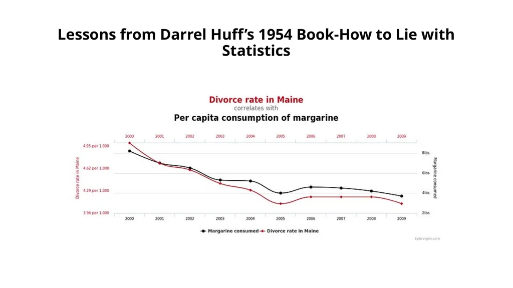
Other times two variables may appear to be correlated, but really have nothing to do with each other. If you make enough comparisons between datasets, you are bound to find some interesting relationships that look to move in sync. These are called Spurious Correlations.<br>
16
Lessons from Darrel Huff’s 1954 Book-How to Lie with Statistics<br>
17
Lessons from Darrel Huff’s 1954 Book-How to Lie with Statistics We’ve all heard the advice that correlation does not imply causation, but even when there is a causal effect, it’s often uncertain which way it goes.
Does more praise of students from a teacher lead to higher grades? Do higher grades cause more praise? Or is there a third factor, smaller class sizes or more natural lighting in a class, causing both variables to increase?
Questions of cause are answered by randomized controlled trials, not by observational studies where we cannot rule out additional factors that we do not measure.
To avoid being misled, approach correlations between variables with skepticism by looking for confounding factors. Humans like neat, causal narratives, but that’s usually not what the data is telling us.<br>
Does more praise of students from a teacher lead to higher grades? Do higher grades cause more praise? Or is there a third factor, smaller class sizes or more natural lighting in a class, causing both variables to increase?
Questions of cause are answered by randomized controlled trials, not by observational studies where we cannot rule out additional factors that we do not measure.
To avoid being misled, approach correlations between variables with skepticism by looking for confounding factors. Humans like neat, causal narratives, but that’s usually not what the data is telling us.<br>
18
Lessons from Darrel Huff’s 1954 Book-How to Lie with Statistics 2. Relationships Don’t Last Forever
If you have successfully identified a correlation, don’t assume it lasts forever in either the positive or negative direction. Linear relationships are almost always only linear in a limited region of both variables. Beyond a point, the relationship may become logarithmic, completely disappear, or even reverse.
Extrapolating beyond the region of applicability for a relationship is known as a generalization error. You are taking a local phenomenon and trying to apply it globally. As people rise out of poverty, they tend to become more satisfied with life. However, once they hit a certain point (perhaps $75,000/year in the United States) happiness does not increase with wealth and may even decrease. This suggests there are diminishing returns to increasing wealth, just as there are in many aspects of human activity, like studying for a test.<br>
If you have successfully identified a correlation, don’t assume it lasts forever in either the positive or negative direction. Linear relationships are almost always only linear in a limited region of both variables. Beyond a point, the relationship may become logarithmic, completely disappear, or even reverse.
Extrapolating beyond the region of applicability for a relationship is known as a generalization error. You are taking a local phenomenon and trying to apply it globally. As people rise out of poverty, they tend to become more satisfied with life. However, once they hit a certain point (perhaps $75,000/year in the United States) happiness does not increase with wealth and may even decrease. This suggests there are diminishing returns to increasing wealth, just as there are in many aspects of human activity, like studying for a test.<br>
19
Lessons from Darrel Huff’s 1954 Book-How to Lie with Statistics We see extrapolations all the time: growth rates for companies, population demographics, prices of stocks, national spending, etc. Oftentimes, people will use a valid relationship in one region to make a point about a region off the chart (for example claiming that $1 million/year will bring pure bliss). Remember, relationships in a local area do not always apply globally. Even if you have verified a causal relationship — or see one in a chart — make sure you don’t understand outside the limited region of validity.<br>
20
Lessons from Darrel Huff’s 1954 Book-How to Lie with Statistics 3. Always Look at the Axes on a Chart
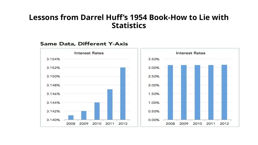
Adjusting the axes of a graph to make a point is a classic technique in manipulating charts. As a first principle, the y-axis on a bar chart should always start at 0. If not, it’s easy to prove an argument by manipulating the range, by for example, turning minor increases into massive changes:<br>
Adjusting the axes of a graph to make a point is a classic technique in manipulating charts. As a first principle, the y-axis on a bar chart should always start at 0. If not, it’s easy to prove an argument by manipulating the range, by for example, turning minor increases into massive changes:<br>
21
Lessons from Darrel Huff’s 1954 Book-How to Lie with Statistics<br>
22
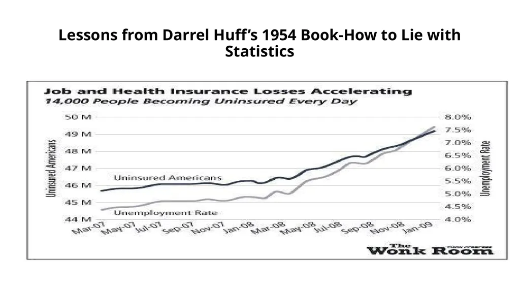
Lessons from Darrel Huff’s 1954 Book-How to Lie with Statistics Another example of misleading graphs is y-axes with different scales. By carefully adjusting values, you produce surprising trends where none exist.<br>
23
Lessons from Darrel Huff’s 1954 Book-How to Lie with Statistics<br>
24
Lessons from Darrel Huff’s 1954 Book-How to Lie with Statistics While this may seem like an obvious manipulation, advertisers and newspapers get away with it because people do not read information. Most people see a graph and immediately draw a conclusion from the shape of the lines or bars, exactly as the person who made the graph wants. To counter this, try reading axes values. A simple examination may tell you changes are not as big as they look and trends have been created from nothing!
Once you get some practice making graphs, you realize how easy it is to manipulate them to your advantage. The best protection against inaccurate figures may be firsthand practice in making them yourself.
(If you want a good book on making legitimate data visualizations, check out The Visual Display of Quantitative Information by Edward Tufte or Fundamentals of Data Visualization by Claus Wilke.)<br>
Once you get some practice making graphs, you realize how easy it is to manipulate them to your advantage. The best protection against inaccurate figures may be firsthand practice in making them yourself.
(If you want a good book on making legitimate data visualizations, check out The Visual Display of Quantitative Information by Edward Tufte or Fundamentals of Data Visualization by Claus Wilke.)<br>
25
Lessons from Darrel Huff’s 1954 Book-How to Lie with Statistics 4. Small Samples Produce Shocking Statistics
Would you be surprised if I told you the highest cancer rates tend to occur in the counties with the smallest populations? Not that shocking. How about when I add that the lowest cancer rates also tend to occur in counties with the lowest number of people? This a verified example of what occurs with small sample sizes: extreme values.
Any time researchers conduct a study, they use what is called a sample: a subset of the population meant to represent the entire population. This might work fine when the sample is large enough and has the same distribution of the larger population, but often, because of limited funding or response rates, psychological, behavioral, and medical studies are conducted with small samples, leading to results that are questionable and cannot be reproduced.<br>
Would you be surprised if I told you the highest cancer rates tend to occur in the counties with the smallest populations? Not that shocking. How about when I add that the lowest cancer rates also tend to occur in counties with the lowest number of people? This a verified example of what occurs with small sample sizes: extreme values.
Any time researchers conduct a study, they use what is called a sample: a subset of the population meant to represent the entire population. This might work fine when the sample is large enough and has the same distribution of the larger population, but often, because of limited funding or response rates, psychological, behavioral, and medical studies are conducted with small samples, leading to results that are questionable and cannot be reproduced.<br>
26
Lessons from Darrel Huff’s 1954 Book-How to Lie with Statistics Scientists are usually limited to small samples by legitimate problems, but advertisers use small numbers of participants in their favor by conducting many tiny studies, one of which will produce a positive result. Humans are not great at adjusting for sample sizes when evaluating a study which in practice means we treat the results of a 1000 person trial the same as a 10 person trial. This is known as “insensitivity to sample size” or “sample size neglect”.<br>
27
Lessons from Darrel Huff’s 1954 Book-How to Lie with Statistics Here’s another example; if you consider yourself to be data literate, then you will have no problem with this question:
A certain town is served by two hospitals. In the larger hospital, about 45 babies are born each day, and in the smaller hospital, about 15 babies are born each day. As you know, about 50% of all babies are boys. However, the exact percentage varies from day to day. Sometimes it may be higher than 50%, sometimes lower.
For a period of 1 year, each hospital recorded the days on which more than 60% of the babies born were boys. Which hospital do you think recorded more such days?
1. The larger hospital
2. The smaller hospital
3. About the same (that is, within 5% of each other)<br>
A certain town is served by two hospitals. In the larger hospital, about 45 babies are born each day, and in the smaller hospital, about 15 babies are born each day. As you know, about 50% of all babies are boys. However, the exact percentage varies from day to day. Sometimes it may be higher than 50%, sometimes lower.
For a period of 1 year, each hospital recorded the days on which more than 60% of the babies born were boys. Which hospital do you think recorded more such days?
1. The larger hospital
2. The smaller hospital
3. About the same (that is, within 5% of each other)<br>
28
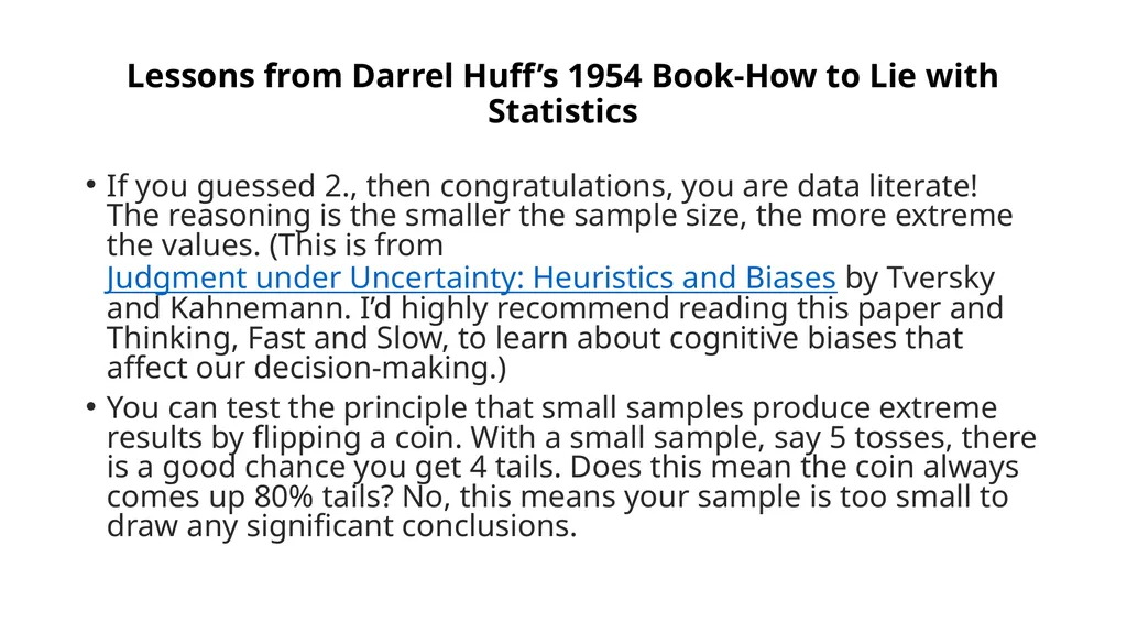
Lessons from Darrel Huff’s 1954 Book-How to Lie with Statistics If you guessed 2., then congratulations, you are data literate! The reasoning is the smaller the sample size, the more extreme the values. (This is from Judgment under Uncertainty: Heuristics and Biases by Tversky and Kahnemann. I’d highly recommend reading this paper and Thinking, Fast and Slow, to learn about cognitive biases that affect our decision-making.)
You can test the principle that small samples produce extreme results by flipping a coin. With a small sample, say 5 tosses, there is a good chance you get 4 tails. Does this mean the coin always comes up 80% tails? No, this means your sample is too small to draw any significant conclusions.<br>
You can test the principle that small samples produce extreme results by flipping a coin. With a small sample, say 5 tosses, there is a good chance you get 4 tails. Does this mean the coin always comes up 80% tails? No, this means your sample is too small to draw any significant conclusions.<br>
29
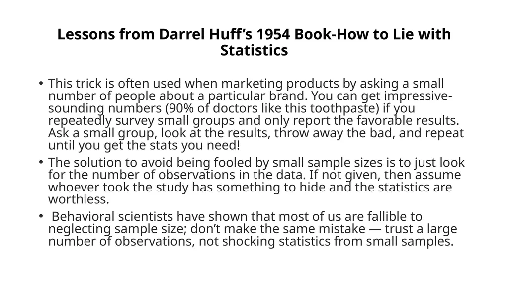
Lessons from Darrel Huff’s 1954 Book-How to Lie with Statistics This trick is often used when marketing products by asking a small number of people about a particular brand. You can get impressive-sounding numbers (90% of doctors like this toothpaste) if you repeatedly survey small groups and only report the favorable results. Ask a small group, look at the results, throw away the bad, and repeat until you get the stats you need!
The solution to avoid being fooled by small sample sizes is to just look for the number of observations in the data. If not given, then assume whoever took the study has something to hide and the statistics are worthless.
Behavioral scientists have shown that most of us are fallible to neglecting sample size; don’t make the same mistake — trust a large number of observations, not shocking statistics from small samples.<br>
The solution to avoid being fooled by small sample sizes is to just look for the number of observations in the data. If not given, then assume whoever took the study has something to hide and the statistics are worthless.
Behavioral scientists have shown that most of us are fallible to neglecting sample size; don’t make the same mistake — trust a large number of observations, not shocking statistics from small samples.<br>
30
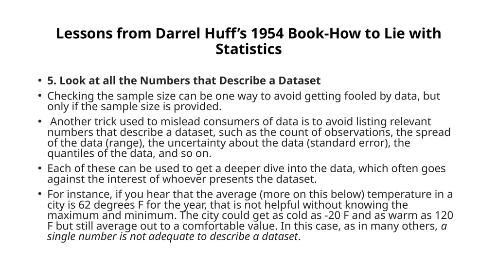
Lessons from Darrel Huff’s 1954 Book-How to Lie with Statistics 5. Look at all the Numbers that Describe a Dataset
Checking the sample size can be one way to avoid getting fooled by data, but only if the sample size is provided.
Another trick used to mislead consumers of data is to avoid listing relevant numbers that describe a dataset, such as the count of observations, the spread of the data (range), the uncertainty about the data (standard error), the quantiles of the data, and so on.
Each of these can be used to get a deeper dive into the data, which often goes against the interest of whoever presents the dataset.
For instance, if you hear that the average (more on this below) temperature in a city is 62 degrees F for the year, that is not helpful without knowing the maximum and minimum. The city could get as cold as -20 F and as warm as 120 F but still average out to a comfortable value. In this case, as in many others, a single number is not adequate to describe a dataset.<br>
Checking the sample size can be one way to avoid getting fooled by data, but only if the sample size is provided.
Another trick used to mislead consumers of data is to avoid listing relevant numbers that describe a dataset, such as the count of observations, the spread of the data (range), the uncertainty about the data (standard error), the quantiles of the data, and so on.
Each of these can be used to get a deeper dive into the data, which often goes against the interest of whoever presents the dataset.
For instance, if you hear that the average (more on this below) temperature in a city is 62 degrees F for the year, that is not helpful without knowing the maximum and minimum. The city could get as cold as -20 F and as warm as 120 F but still average out to a comfortable value. In this case, as in many others, a single number is not adequate to describe a dataset.<br>
31
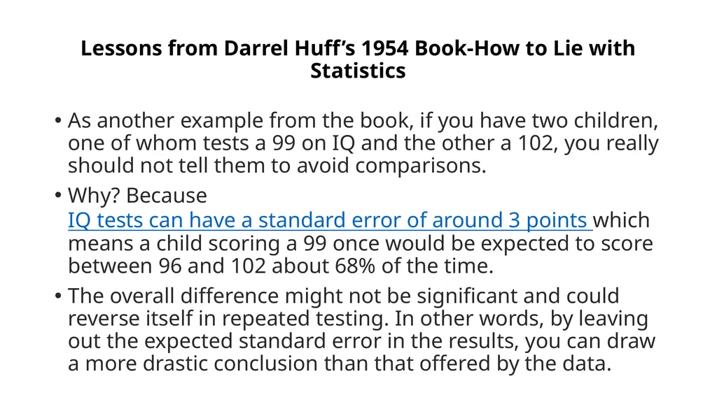
Lessons from Darrel Huff’s 1954 Book-How to Lie with Statistics As another example from the book, if you have two children, one of whom tests a 99 on IQ and the other a 102, you really should not tell them to avoid comparisons.
Why? Because IQ tests can have a standard error of around 3 points which means a child scoring a 99 once would be expected to score between 96 and 102 about 68% of the time.
The overall difference might not be significant and could reverse itself in repeated testing. In other words, by leaving out the expected standard error in the results, you can draw a more drastic conclusion than that offered by the data.<br>
Why? Because IQ tests can have a standard error of around 3 points which means a child scoring a 99 once would be expected to score between 96 and 102 about 68% of the time.
The overall difference might not be significant and could reverse itself in repeated testing. In other words, by leaving out the expected standard error in the results, you can draw a more drastic conclusion than that offered by the data.<br>
32
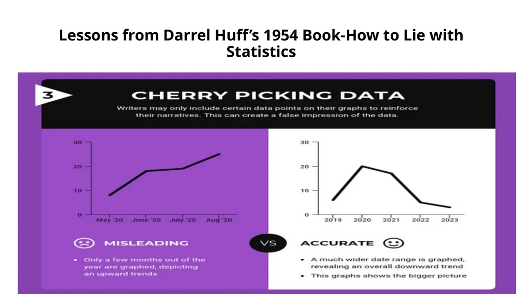
Lessons from Darrel Huff’s 1954 Book-How to Lie with Statistics Studies that don’t report more than one number usually have something to hide. Likewise, if a graph looks like it cuts off some of the data, it’s not trustworthy. It’s too easy to change a narrative by subsetting data.<br>
33
Lessons from Darrel Huff’s 1954 Book-How to Lie with Statistics<br>
34
Lessons from Darrel Huff’s 1954 Book-How to Lie with Statistics Think of it this way: if there was a medicine that increased lifespan by 2 years on average would you take it?
Would it change your mind if the worst impact was a loss of 12 years of life and the maximum a gain of 14 years? It usually is the details that matter and one summary statistic cannot tell the whole story.<br>
Would it change your mind if the worst impact was a loss of 12 years of life and the maximum a gain of 14 years? It usually is the details that matter and one summary statistic cannot tell the whole story.<br>
35
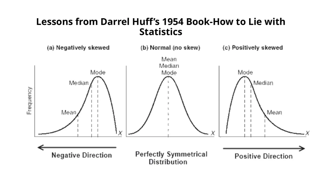
Lessons from Darrel Huff’s 1954 Book-How to Lie with Statistics 6. Check which Average is Used
Another useful way to tell whatever story you want with data is to vary the definition of “average”. You have 3 options (maybe more if you’re clever):
Mean: sum the values and divide by the number of observations
Median: order the values from smallest to greatest and find the middle
Mode: find the value that occurs most often
the mean and median of a distribution are the same only if it is normal and we live in a world with mostly non-normal data.
This means the mean and median of a dataset are not the same value, often by a considerable amount.<br>
Another useful way to tell whatever story you want with data is to vary the definition of “average”. You have 3 options (maybe more if you’re clever):
Mean: sum the values and divide by the number of observations
Median: order the values from smallest to greatest and find the middle
Mode: find the value that occurs most often
the mean and median of a distribution are the same only if it is normal and we live in a world with mostly non-normal data.
This means the mean and median of a dataset are not the same value, often by a considerable amount.<br>
36
Lessons from Darrel Huff’s 1954 Book-How to Lie with Statistics<br>
37
Lessons from Darrel Huff’s 1954 Book-How to Lie with Statistics The way to avoid this is to look at the mean, median, and mode of a dataset (again you need all these numbers!). Figure out which one is most appropriate (usually the median for highly skewed datasets such as income, city size, life span, housing prices and so on) and use that if you need a one figure summary.
If you can, graph the entire set of values in a histogram and look at the distribution.
Try to use more than a single number to describe a dataset, and if you report an average, specify which you are using.
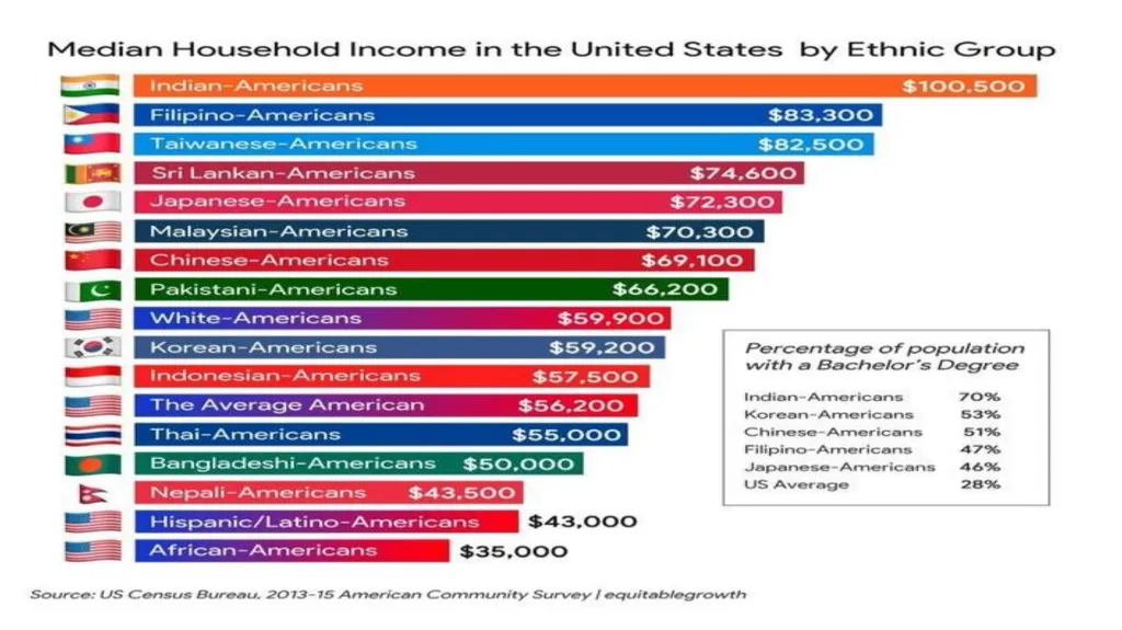
See why more than one umber is needed in the next slide. Data are a decade old, but they make a point.
Also see slide after the next on Indian data on child marriages<br>
If you can, graph the entire set of values in a histogram and look at the distribution.
Try to use more than a single number to describe a dataset, and if you report an average, specify which you are using.
See why more than one umber is needed in the next slide. Data are a decade old, but they make a point.
Also see slide after the next on Indian data on child marriages<br>
38
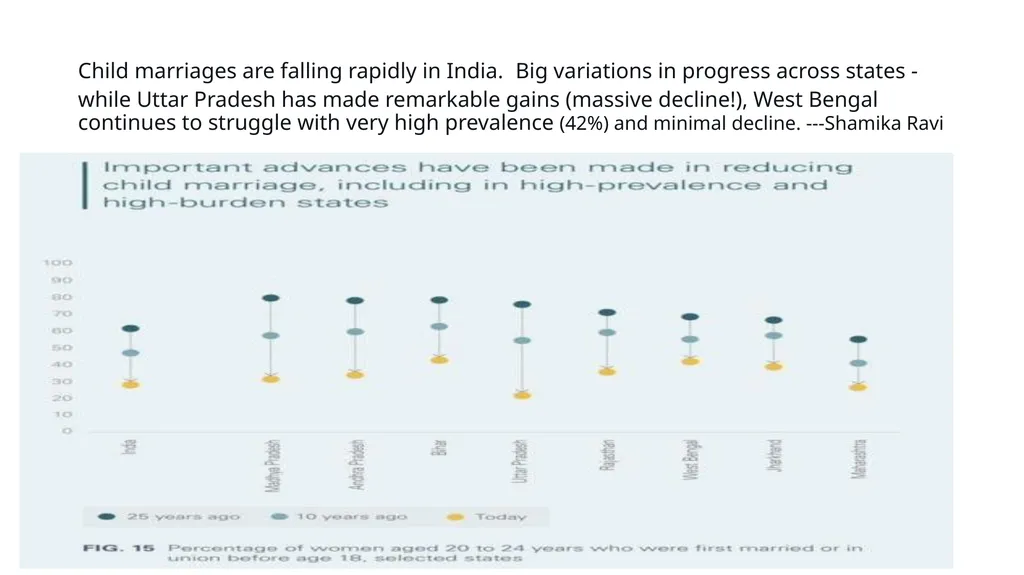
Child marriages are falling rapidly in India. Big variations in progress across states - while Uttar Pradesh has made remarkable gains (massive decline!), West Bengal continues to struggle with very high prevalence (42%) and minimal decline. ---Shamika Ravi<br>
39
Lessons from Darrel Huff’s 1954 Book-How to Lie with Statistics 7. Use Comparisons to a Common Baseline
When viewing a statistic, the important question often is not what is the value, but how does the current value compare to the previous value?
In other words, what is the relative change compared to the absolute magnitude.
If I tell you the US GDP was $19.39 trillion in 2017, that sounds incredible because of your everyday experience. However, if you compare that to US GDP in the previous year, $18.62 trillion, it doesn’t look nearly as impressive.<br>
When viewing a statistic, the important question often is not what is the value, but how does the current value compare to the previous value?
In other words, what is the relative change compared to the absolute magnitude.
If I tell you the US GDP was $19.39 trillion in 2017, that sounds incredible because of your everyday experience. However, if you compare that to US GDP in the previous year, $18.62 trillion, it doesn’t look nearly as impressive.<br>
40
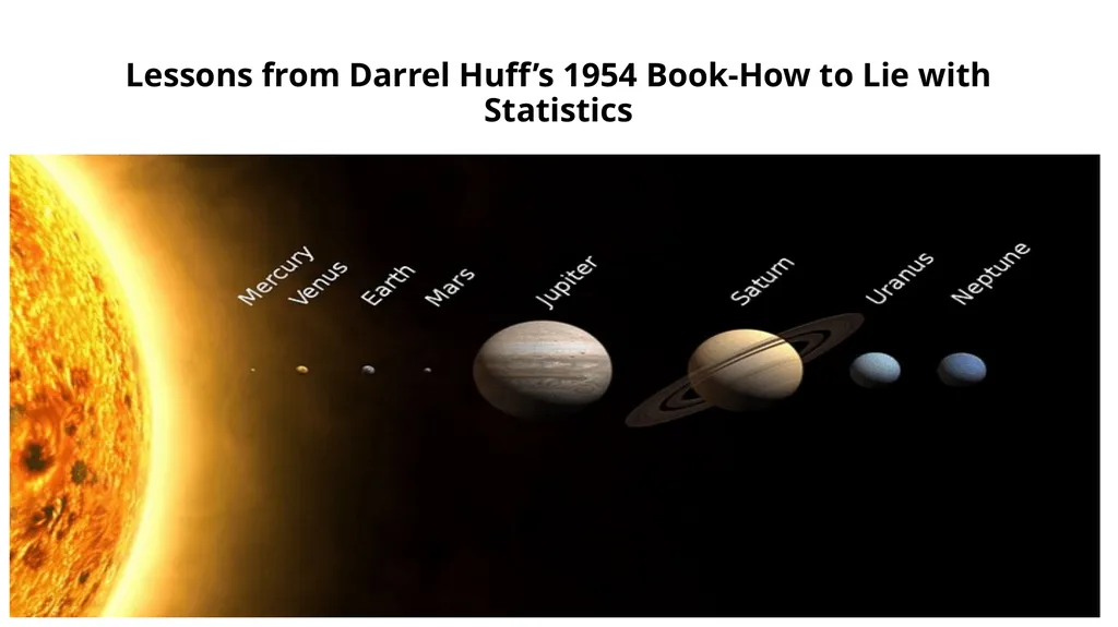
Data is often on scales with which we are unfamiliar, and we need a comparison to other numbers to know if a statistic represents a real change. Is a mean radius of 3389 km for Mars large? I have no conception of what that means until it’s compared to other planets!<br>
41
Lessons from Darrel Huff’s 1954 Book-How to Lie with Statistics<br>
42
Lessons from Darrel Huff’s 1954 Book-How to Lie with Statistics Not only do we want to compare a statistic to values in the past and to numbers in the same category, but we also want to make sure the definition of the stat doesn’t change.
According to “How to Lie”, The number of farms in the US increased from 1930 to 1935 by 500,000 because the definition of a farm from the Census Bureau changed!
The easiest way to lower unemployment is just to change the definition to exclude people who have stopped looking for work.<br>
According to “How to Lie”, The number of farms in the US increased from 1930 to 1935 by 500,000 because the definition of a farm from the Census Bureau changed!
The easiest way to lower unemployment is just to change the definition to exclude people who have stopped looking for work.<br>
43
Lessons from Darrel Huff’s 1954 Book-How to Lie with Statistics Changes in the way data is gathered or in the definition of values can often produce extreme results mistaken for actual trends.
To counter this, first, look at the entire series of values for perspective.
Second, make sure the definition has not changed over the time range. Only then can you start to draw conclusions from the data series. You can scare people by saying New York had 289 murders in 2018, but when you compare that to 2245 in 1990, you realize New York City has never been safer!
It’s usually the comparison that matters; don’t let an isolated number sway your rational thinking.<br>
To counter this, first, look at the entire series of values for perspective.
Second, make sure the definition has not changed over the time range. Only then can you start to draw conclusions from the data series. You can scare people by saying New York had 289 murders in 2018, but when you compare that to 2245 in 1990, you realize New York City has never been safer!
It’s usually the comparison that matters; don’t let an isolated number sway your rational thinking.<br>
44
Lessons from Darrel Huff’s 1954 Book-How to Lie with Statistics 8. Look for Bias in Sample Selection
Remember when we talked about all data being gathered from samples which we hope are representative of the population? In addition to being concerned about sample size, we also need to look for any bias in the sample.
This could come from the measurement method used: a landline phone screen might favor wealthier, older participants. It could also come from the physical location: surveying only people who live in cities because it’s cheaper might bias results toward more progressive views. Sample bias is particularly prevalent in political polling where 2016 showed that sometimes samples are not representative of an entire population.<br>
Remember when we talked about all data being gathered from samples which we hope are representative of the population? In addition to being concerned about sample size, we also need to look for any bias in the sample.
This could come from the measurement method used: a landline phone screen might favor wealthier, older participants. It could also come from the physical location: surveying only people who live in cities because it’s cheaper might bias results toward more progressive views. Sample bias is particularly prevalent in political polling where 2016 showed that sometimes samples are not representative of an entire population.<br>
45
Lessons from Darrel Huff’s 1954 Book-How to Lie with Statistics When examining a study, we need to ask who is being included in the sample and who is being excluded.
For decades, psychology and sociology studies have been hurt by the WEIRD bias. Samples only included people (often college students) from Western, Education, Industrialized, Rich, Democratic, Nations.
It’s hard to reasonably say a survey represents all of humanity when the participants are this limited!
We should also look for sampling bias in our sources of information. Most of us now impose information selection bias on our selves by choosing sources that we tend to agree with. This leads to dangerous situations where we don’t encounter people who have different opinions and so we grow more entrenched in our views.
The solution to this is simple but difficult: read different sources of news, particularly those that don’t agree with you.<br>
For decades, psychology and sociology studies have been hurt by the WEIRD bias. Samples only included people (often college students) from Western, Education, Industrialized, Rich, Democratic, Nations.
It’s hard to reasonably say a survey represents all of humanity when the participants are this limited!
We should also look for sampling bias in our sources of information. Most of us now impose information selection bias on our selves by choosing sources that we tend to agree with. This leads to dangerous situations where we don’t encounter people who have different opinions and so we grow more entrenched in our views.
The solution to this is simple but difficult: read different sources of news, particularly those that don’t agree with you.<br>
46
Lessons from Darrel Huff’s 1954 Book-How to Lie with Statistics For those who are feeling adventurous, you can even try talking to people who disagree with you. While this may seem intimidating, I’ve found that people who disagree outwardly often have more in common — the same core driving desires — motivating them to choose their respective sides.
It’s much easier to come to a common understanding in person but even engaging in civil discourse online is possible and productive and can help you escape a self-imposed information-selection bias.<br>
It’s much easier to come to a common understanding in person but even engaging in civil discourse online is possible and productive and can help you escape a self-imposed information-selection bias.<br>
47
Lessons from Darrel Huff’s 1954 Book-How to Lie with Statistics In summary, we need to be wary both of outside sampling bias and self-created sampling bias from our choice of media sources.
You would not like someone telling you to read only a single newspaper, so don’t do the same to yourself.
Diverse viewpoints lead to better outcomes, and incorporating different sources of information with varying opinions will give you a better overall picture of events.
We can’t always get to the complete truth of a matter, but we can at least see it from multiple sides. Similarly, when reading a study, make sure you recognize that the sample may not be indicative of the entire population and try to figure out which way the bias goes<br>
You would not like someone telling you to read only a single newspaper, so don’t do the same to yourself.
Diverse viewpoints lead to better outcomes, and incorporating different sources of information with varying opinions will give you a better overall picture of events.
We can’t always get to the complete truth of a matter, but we can at least see it from multiple sides. Similarly, when reading a study, make sure you recognize that the sample may not be indicative of the entire population and try to figure out which way the bias goes<br>
48
Lessons from Darrel Huff’s 1954 Book-How to Lie with Statistics 9. Be Wary of “Big Names” on Studies and Scrutinize Authority
Huff describes the idea of an “O.K name” as one added to a study to lend it an air of authority. Medical professionals (doctors), universities, scientific institutions, and large companies have names that lead us to automatically trust the results they produce.
However, many times these “experts” did not actually produce the work but only were tangentially involved and the name has been added to sway us.
Other times, such as when cigarette makers used doctors to sell their deadly products, the authorities are directly paid to lie.<br>
Huff describes the idea of an “O.K name” as one added to a study to lend it an air of authority. Medical professionals (doctors), universities, scientific institutions, and large companies have names that lead us to automatically trust the results they produce.
However, many times these “experts” did not actually produce the work but only were tangentially involved and the name has been added to sway us.
Other times, such as when cigarette makers used doctors to sell their deadly products, the authorities are directly paid to lie.<br>
49
Lessons from Darrel Huff’s 1954 Book-How to Lie with Statistics One way to avoid being persuaded by an impressive name is to “make sure the name on the study stands behind the study and not beside it.” Don’t see an institutional name and immediately assume the study is infallible. I don’t think we should look at the author or university until we’ve analyzed the statistics to avoid any unconscious bias we impose on ourselves.
Even when the results come from a confirmed “expert” that does not mean you should accept them without question. The argument from authority is a fallacy that occurs when we assume someone with greater power is more likely to be correct. This is false because past success has no bearing on whether current results are correct.
As Carl Sagan put it: “Authorities must prove their contentions like everybody else.” (from The Demon-Haunted World: Science as a Candle in the Dark).<br>
Even when the results come from a confirmed “expert” that does not mean you should accept them without question. The argument from authority is a fallacy that occurs when we assume someone with greater power is more likely to be correct. This is false because past success has no bearing on whether current results are correct.
As Carl Sagan put it: “Authorities must prove their contentions like everybody else.” (from The Demon-Haunted World: Science as a Candle in the Dark).<br>
50
Lessons from Darrel Huff’s 1954 Book-How to Lie with Statistics No one is above skepticism, as we’ve seen throughout the history of science (remember when Aristotle said there were 5 elements? or when the president of IBM said “I think there is a world market for maybe five computers”.)
Many of the greatest findings have come from challenging authority and accepted wisdom.
A statistic with a big name attached should get just as much scrutiny as any other.
Statistics and data have no allegiance to a higher power.<br>
Many of the greatest findings have come from challenging authority and accepted wisdom.
A statistic with a big name attached should get just as much scrutiny as any other.
Statistics and data have no allegiance to a higher power.<br>
51
Lessons from Darrel Huff’s 1954 Book-How to Lie with Statistics 10. Don’t Place Too Much Faith in any One Statistic
The overall theme of “How to Lie with Statistics” is: view any single statistic with skepticism. Any number represents a distillation of a set of data, which was taken on a sample of a population by mistake-prone humans, using imperfect tools, in constantly changing conditions at a single point in time.
The data was analyzed by another human, who works for an institution, which may have outside funders with differing motivations.
Finally, the statistic or graph was delivered to you by a publisher that has its own interests in getting you to believe one idea.<br>
The overall theme of “How to Lie with Statistics” is: view any single statistic with skepticism. Any number represents a distillation of a set of data, which was taken on a sample of a population by mistake-prone humans, using imperfect tools, in constantly changing conditions at a single point in time.
The data was analyzed by another human, who works for an institution, which may have outside funders with differing motivations.
Finally, the statistic or graph was delivered to you by a publisher that has its own interests in getting you to believe one idea.<br>
52
Lessons from Darrel Huff’s 1954 Book-How to Lie with Statistics All this leads to two conclusions:
If you put all your faith in one number, then you will be overfitting to the particular circumstances that produced the number.
Statistics and data are never purely objective. A statistic is one interpretation of uncertain data designed to persuade
We should not completely abandon statistics and data gathering. With the right design, studies can find critical trends — smoking is bad for you, chloroflourocarbons created a hole in the ozone layer, greater wealth leads to more happiness, and flouridated water vastly improves dental health— that then lead to better overall outcomes.
Rather, we need to acknowledge data gathering and processing is an uncertain process with many factors influencing the final numbers we see.<br>
If you put all your faith in one number, then you will be overfitting to the particular circumstances that produced the number.
Statistics and data are never purely objective. A statistic is one interpretation of uncertain data designed to persuade
We should not completely abandon statistics and data gathering. With the right design, studies can find critical trends — smoking is bad for you, chloroflourocarbons created a hole in the ozone layer, greater wealth leads to more happiness, and flouridated water vastly improves dental health— that then lead to better overall outcomes.
Rather, we need to acknowledge data gathering and processing is an uncertain process with many factors influencing the final numbers we see.<br>
53
Lessons from Darrel Huff’s 1954 Book-How to Lie with Statistics Humans are variable, and the world is variable — that’s part of what makes it so great to be living in it — and so we should be wary of statistics claiming to summarize it neatly in one graph or table.
We should look for the range of values, report numbers with confidence intervals, gather more data before jumping to conclusions, compare multiple studies, and ask about the design of the data-gathering process.
We need to admit that we are wrong and change our minds when the burden of evidence is irrefutable.
There may not be objective truths that hold for the entire universe, but we can become less wrong over time. That is basically the goal of science: light a little more of the darkness with each new study.
This should also be the goal of data science: uncover a bit more of the structure of our world with each new dataset.
At the same time, we need to recognize the limits of data and not over-generalize.
More data is not a panacea, but more data with debate, multiple analyses, and scrutiny can lead to better real-world decisions and that’s what we hope for as data literate citizens.<br>
We should look for the range of values, report numbers with confidence intervals, gather more data before jumping to conclusions, compare multiple studies, and ask about the design of the data-gathering process.
We need to admit that we are wrong and change our minds when the burden of evidence is irrefutable.
There may not be objective truths that hold for the entire universe, but we can become less wrong over time. That is basically the goal of science: light a little more of the darkness with each new study.
This should also be the goal of data science: uncover a bit more of the structure of our world with each new dataset.
At the same time, we need to recognize the limits of data and not over-generalize.
More data is not a panacea, but more data with debate, multiple analyses, and scrutiny can lead to better real-world decisions and that’s what we hope for as data literate citizens.<br>
54
Lessons from Darrel Huff’s 1954 Book-How to Lie with Statistics Conclusions
If I’ve learned anything in the data science field, it’s that the most effective way to spend my time is to make a bar chart with 4 numbers.
Machine learning modeling is cutting-edge, but in the end, all the CEO wants to see is a simple chart from which he/she can draw a conclusion. There is nothing inherently wrong with this: as data scientists, our job is to extract meaning from large quantities of data.
Meaning does not imply showing hundreds of numbers, it means displaying a limited few with high value. How we present those numbers can make a large impact on how — or if — they are used.<br>
If I’ve learned anything in the data science field, it’s that the most effective way to spend my time is to make a bar chart with 4 numbers.
Machine learning modeling is cutting-edge, but in the end, all the CEO wants to see is a simple chart from which he/she can draw a conclusion. There is nothing inherently wrong with this: as data scientists, our job is to extract meaning from large quantities of data.
Meaning does not imply showing hundreds of numbers, it means displaying a limited few with high value. How we present those numbers can make a large impact on how — or if — they are used.<br>
55
Lessons from Darrel Huff’s 1954 Book-How to Lie with Statistics Data literacy means having the skills to interpret graphs, charts, and statistics and draw actionable conclusions.
These conclusions do not have to agree with whoever produced the chart, and you should be skeptical when they do.
As consumers of data products, we need to understand how easy it is to manipulate data to prove a point or turn a negative into a positive. Getting practice reading statistics and visualizations — actually reading a figure — helps.
Another useful tactic is to make a lot of charts yourself. Practice using the best techniques and make sure to not deliberately mislead others.<br>
These conclusions do not have to agree with whoever produced the chart, and you should be skeptical when they do.
As consumers of data products, we need to understand how easy it is to manipulate data to prove a point or turn a negative into a positive. Getting practice reading statistics and visualizations — actually reading a figure — helps.
Another useful tactic is to make a lot of charts yourself. Practice using the best techniques and make sure to not deliberately mislead others.<br>
56
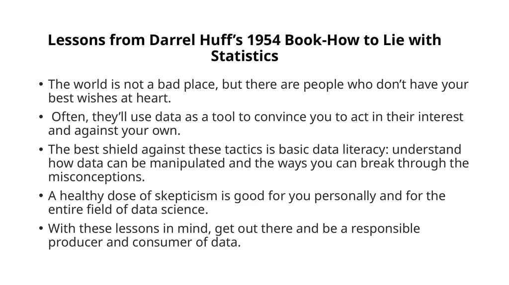
Lessons from Darrel Huff’s 1954 Book-How to Lie with Statistics The world is not a bad place, but there are people who don’t have your best wishes at heart.
Often, they’ll use data as a tool to convince you to act in their interest and against your own.
The best shield against these tactics is basic data literacy: understand how data can be manipulated and the ways you can break through the misconceptions.
A healthy dose of skepticism is good for you personally and for the entire field of data science.
With these lessons in mind, get out there and be a responsible producer and consumer of data.<br>
Often, they’ll use data as a tool to convince you to act in their interest and against your own.
The best shield against these tactics is basic data literacy: understand how data can be manipulated and the ways you can break through the misconceptions.
A healthy dose of skepticism is good for you personally and for the entire field of data science.
With these lessons in mind, get out there and be a responsible producer and consumer of data.<br>
57
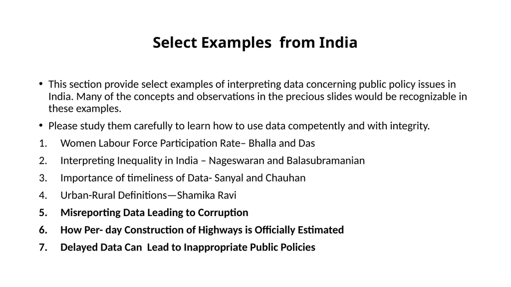
Select Examples from India This section provide select examples of interpreting data concerning public policy issues in India. Many of the concepts and observations in the precious slides would be recognizable in these examples.
Please study them carefully to learn how to use data competently and with integrity.
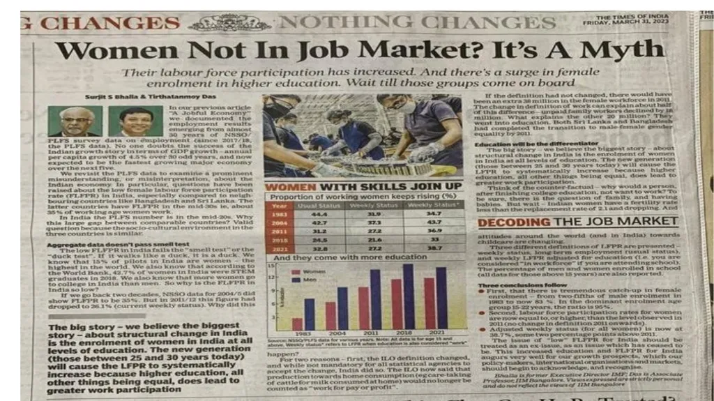
Women Labour Force Participation Rate– Bhalla and Das
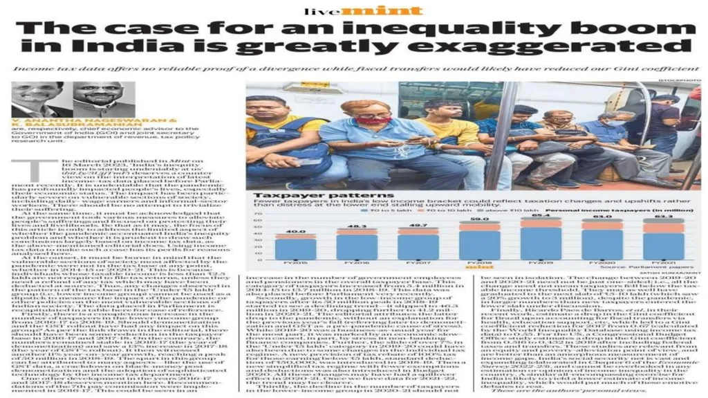
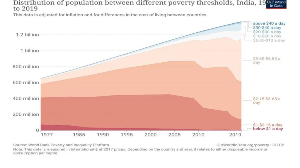
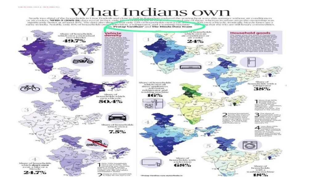
Interpreting Inequality in India – Nageswaran and Balasubramanian
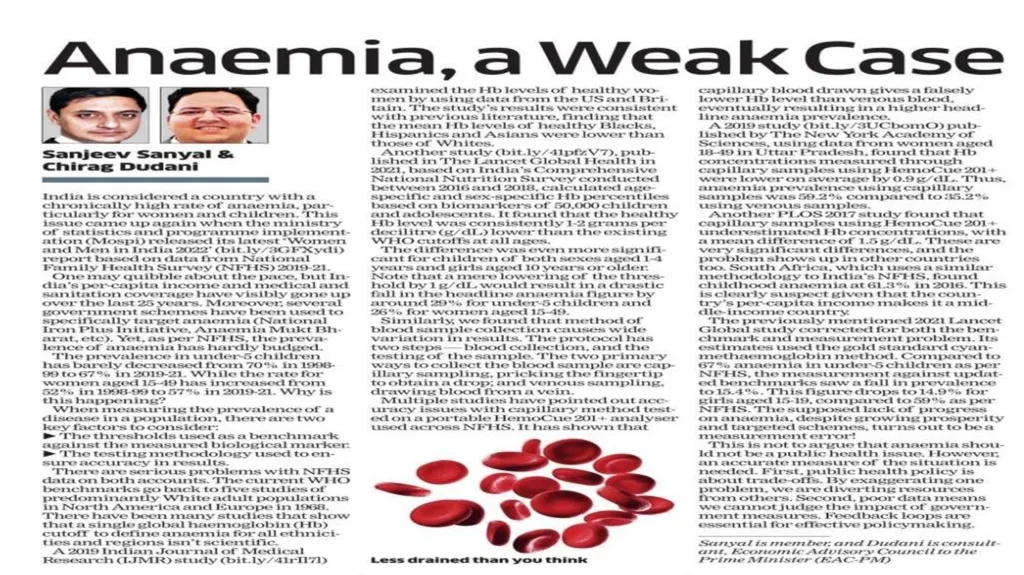
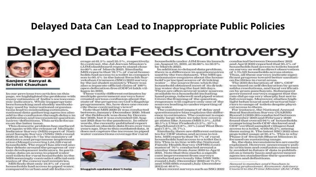
Importance of timeliness of Data- Sanyal and Chauhan
Urban-Rural Definitions—Shamika Ravi
Misreporting Data Leading to Corruption
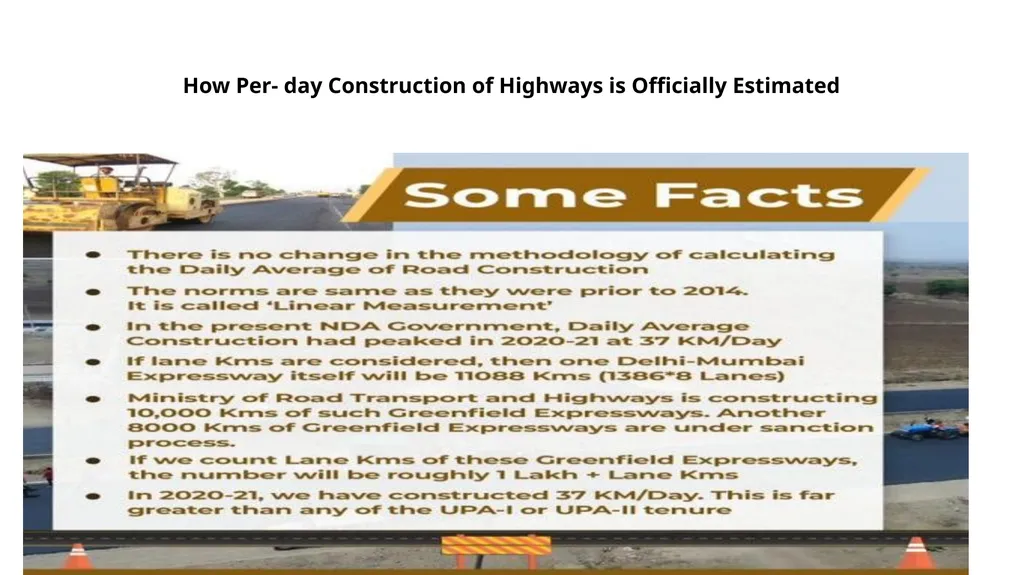
How Per- day Construction of Highways is Officially Estimated
Delayed Data Can Lead to Inappropriate Public Policies<br>
Please study them carefully to learn how to use data competently and with integrity.
Women Labour Force Participation Rate– Bhalla and Das
Interpreting Inequality in India – Nageswaran and Balasubramanian
Importance of timeliness of Data- Sanyal and Chauhan
Urban-Rural Definitions—Shamika Ravi
Misreporting Data Leading to Corruption
How Per- day Construction of Highways is Officially Estimated
Delayed Data Can Lead to Inappropriate Public Policies<br>
58
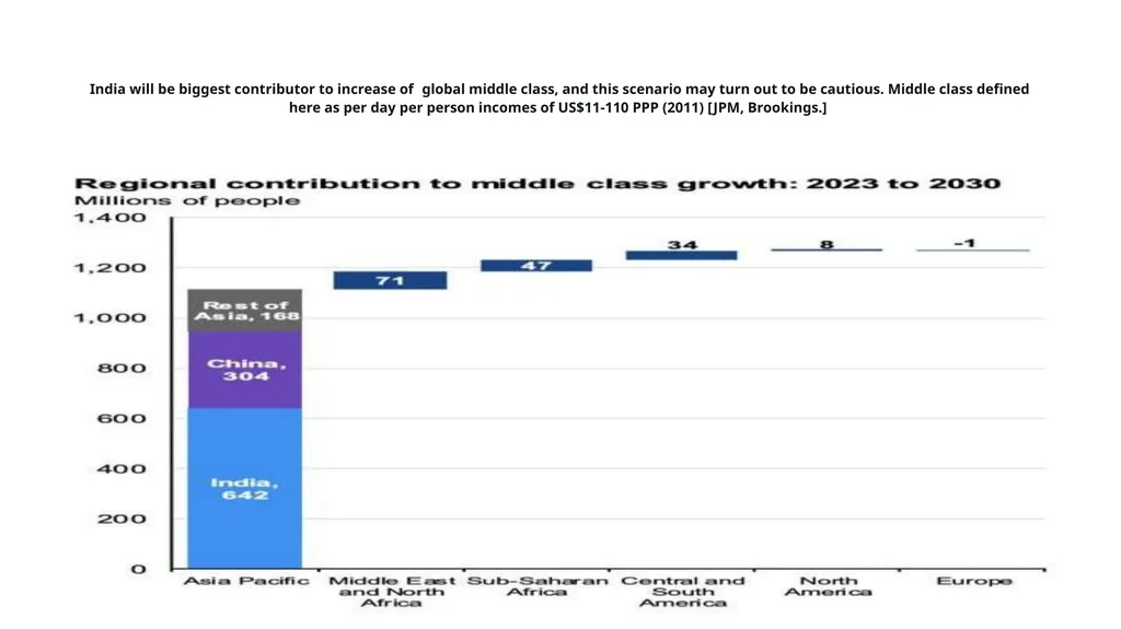
India will be biggest contributor to increase of global middle class, and this scenario may turn out to be cautious. Middle class defined here as per day per person incomes of US$11-110 PPP (2011) [JPM, Brookings.]<br>
59
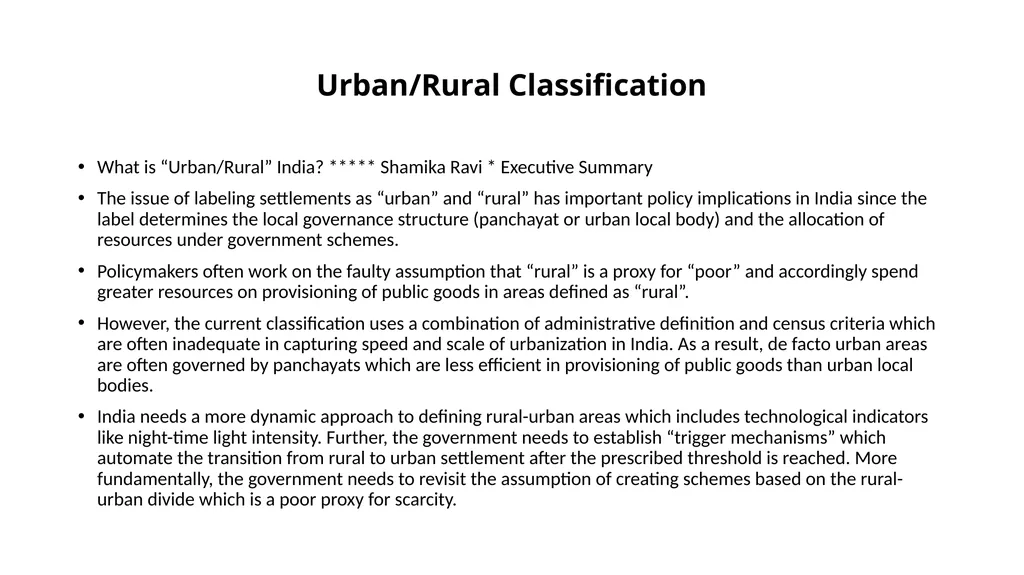
Urban/Rural Classification What is “Urban/Rural” India? ***** Shamika Ravi * Executive Summary
The issue of labeling settlements as “urban” and “rural” has important policy implications in India since the label determines the local governance structure (panchayat or urban local body) and the allocation of resources under government schemes.
Policymakers often work on the faulty assumption that “rural” is a proxy for “poor” and accordingly spend greater resources on provisioning of public goods in areas defined as “rural”.
However, the current classification uses a combination of administrative definition and census criteria which are often inadequate in capturing speed and scale of urbanization in India. As a result, de facto urban areas are often governed by panchayats which are less efficient in provisioning of public goods than urban local bodies.
India needs a more dynamic approach to defining rural-urban areas which includes technological indicators like night-time light intensity. Further, the government needs to establish “trigger mechanisms” which automate the transition from rural to urban settlement after the prescribed threshold is reached. More fundamentally, the government needs to revisit the assumption of creating schemes based on the rural-urban divide which is a poor proxy for scarcity.<br>
The issue of labeling settlements as “urban” and “rural” has important policy implications in India since the label determines the local governance structure (panchayat or urban local body) and the allocation of resources under government schemes.
Policymakers often work on the faulty assumption that “rural” is a proxy for “poor” and accordingly spend greater resources on provisioning of public goods in areas defined as “rural”.
However, the current classification uses a combination of administrative definition and census criteria which are often inadequate in capturing speed and scale of urbanization in India. As a result, de facto urban areas are often governed by panchayats which are less efficient in provisioning of public goods than urban local bodies.
India needs a more dynamic approach to defining rural-urban areas which includes technological indicators like night-time light intensity. Further, the government needs to establish “trigger mechanisms” which automate the transition from rural to urban settlement after the prescribed threshold is reached. More fundamentally, the government needs to revisit the assumption of creating schemes based on the rural-urban divide which is a poor proxy for scarcity.<br>
60
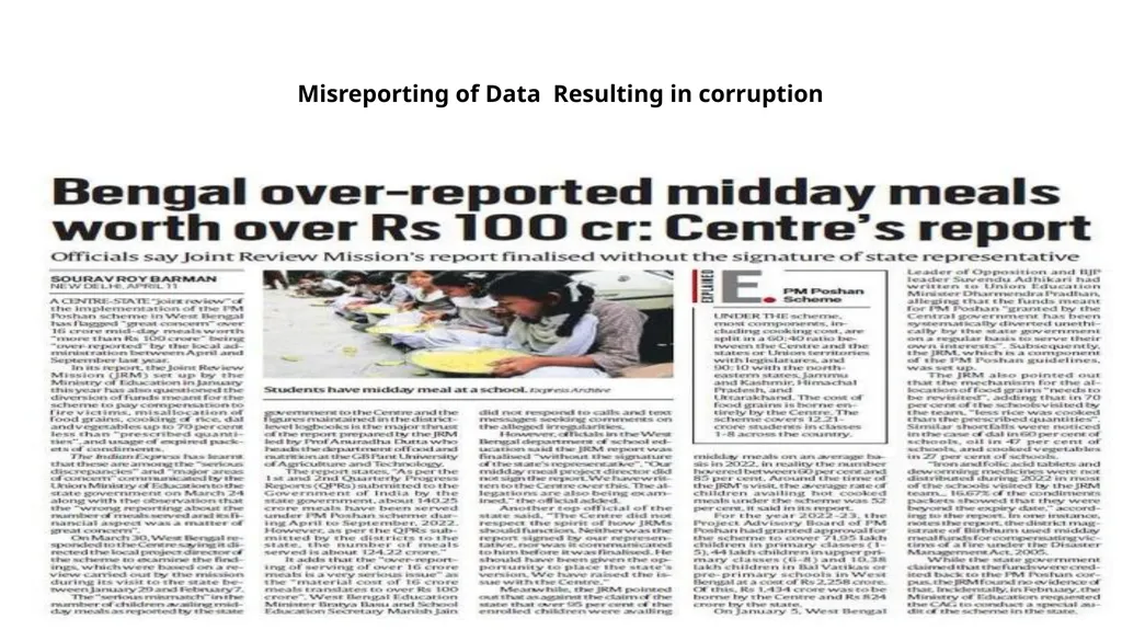
Misreporting of Data Resulting in corruption<br>
61
How Per- day Construction of Highways is Officially Estimated<br>
62
Delayed Data Can Lead to Inappropriate Public Policies<br>
63
Select Additional References A Secular Democracy in Practice: Objective Assessment of Amenities Programs in India
Shamika Ravi
Economic Advisory Council to the Prime Minister (EAC)
EAC-PM Working Paper Series EAC-PM/WP/18/2023 ,April, 2023
Siddharth Tiwari, Frank Packer, and Rahul Matthan,2023.
“Data by People, for People” Finance and Development, March
TIWARI-Data-People.pdf
Accessed on 1 June 2023<br>
Shamika Ravi
Economic Advisory Council to the Prime Minister (EAC)
EAC-PM Working Paper Series EAC-PM/WP/18/2023 ,April, 2023
Siddharth Tiwari, Frank Packer, and Rahul Matthan,2023.
“Data by People, for People” Finance and Development, March
TIWARI-Data-People.pdf
Accessed on 1 June 2023<br>
64
Select Additional References EAC-PM Working Paper Series EAC-PM/WP/15/2023
What is “Urban/Rural” India? By
Shamika Ravi Economic Advisory Council to the Prime Minister March, 2023
Helping Doctors and Patients Make Sense of Health Statistics
By Gerd Gigerenzer, Wolfgang Gaissmaier,Elke Kurz-Milcke, Lisa M. Schwartz, and Steven Woloshin
PSYCHOLOGICAL SCIENCE IN THE PUBLIC INTEREST, Volume 8—Number 2, 2008
Health Statistics.pdf
Accessed on 1 June 2023<br>
What is “Urban/Rural” India? By
Shamika Ravi Economic Advisory Council to the Prime Minister March, 2023
Helping Doctors and Patients Make Sense of Health Statistics
By Gerd Gigerenzer, Wolfgang Gaissmaier,Elke Kurz-Milcke, Lisa M. Schwartz, and Steven Woloshin
PSYCHOLOGICAL SCIENCE IN THE PUBLIC INTEREST, Volume 8—Number 2, 2008
Health Statistics.pdf
Accessed on 1 June 2023<br>