
Mirae Asset Sharekhan rules for making PowerPoint
FD
Published · 38 slides · 0 views
1 / 1

Description
Mirae Asset Sharekhan rules for making PowerPoint presentations Internal Communications Edward Francis December 11, 2024 For internal circulation only A quick word We have presented here guidelines and suggestions for the lay-out, use of
Related Topics
Share
Embed code
Download this presentation From Below
"Mirae Asset Sharekhan rules for making PowerPoint" is the property of its rightful owner. Permission is granted to download and print the materials on this website for personal, non-commercial use only, and to display it on your personal computer provided you do not modify the materials and that you retain all copyright notices contained in the materials. By downloading content from our website, you accept the terms of this agreement.
Presentation Transcript
01
Mirae Asset Sharekhan rules for
making PowerPoint presentations Internal Communications / Edward Francis December 11, 2024 For internal circulation only<br>
02
A quick word We have presented here guidelines and suggestions for the lay-out, use of fonts, colours, graphics, Mirae Asset Sharekhan logos and much more, keep this rule book handy and refer to it every time you prepare PPT presentations to ensure your presentations are aligned with the Mirae Asset Sharekhan guidelines for making effective and engaging PPT presentations.
Preparing PowerPoint (PPT) presentations is a critical part of your job and to make your job super easy, we have also shared with you PPT templates that will pretty much address all your presentation needs and help you prepare killer decks.
Please use only these templates as these have been designed in keeping with the Mirae Asset guidelines and the best practices of making PPT presentations.<br>
Preparing PowerPoint (PPT) presentations is a critical part of your job and to make your job super easy, we have also shared with you PPT templates that will pretty much address all your presentation needs and help you prepare killer decks.
Please use only these templates as these have been designed in keeping with the Mirae Asset guidelines and the best practices of making PPT presentations.<br>
03
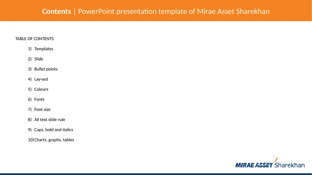
Contents | PowerPoint presentation template of Mirae Asset Sharekhan TABLE OF CONTENTS
Templates
Slide
Bullet points
Lay-out
Colours
Fonts
Font size
All text slide rule
Caps, bold and italics
Charts, graphs, tables<br>
Templates
Slide
Bullet points
Lay-out
Colours
Fonts
Font size
All text slide rule
Caps, bold and italics
Charts, graphs, tables<br>
04
Contents | PowerPoint presentation template of Mirae Asset Sharekhan TABLE OF CONTENTS
Images and illustrations
How to make an image grayscale
Face-to-face presentation
Online presentation
Print
Animation
Mascot
Rules for using Mirae Asset Sharekhan logo
Segment logo usage in the center
Sharekhan Classroom logo usage at the bottom<br>
Images and illustrations
How to make an image grayscale
Face-to-face presentation
Online presentation
Animation
Mascot
Rules for using Mirae Asset Sharekhan logo
Segment logo usage in the center
Sharekhan Classroom logo usage at the bottom<br>
05
Contents | PowerPoint presentation template of Mirae Asset Sharekhan TABLE OF CONTENTS
InvesTiger logo usage at the bottom
TradeTiger logo usage at the bottom
SharekhanOne logo usage at the bottom
Super Investor logo usage at the bottom
Super Trader logo usage at the bottom
Sharekhan Classic logo usage at the bottom
Sharekhan app logo usage at the bottom<br>
InvesTiger logo usage at the bottom
TradeTiger logo usage at the bottom
SharekhanOne logo usage at the bottom
Super Investor logo usage at the bottom
Super Trader logo usage at the bottom
Sharekhan Classic logo usage at the bottom
Sharekhan app logo usage at the bottom<br>
06
Templates Always use Mirae Asset Sharekhan PowerPoint templates to make presentations.
The templates come with recommended font sizes, colours, style, format etc, please stick to the recommendations.<br>
The templates come with recommended font sizes, colours, style, format etc, please stick to the recommendations.<br>
07
Slide Limit each slide to one idea, use only a few bullet points to describe the idea.
On a slide, highlight key points or reinforce what you have to say.
Keep it short and to the point, include only key words and phrases for visual reinforcement.
So that your presentation can fit on most screens, always place text and images within 95% of the PowerPoint slide. That is the entire white area on this slide!
To make a slide stand out, change the font or background but use this technique sparingly, only one slide in a deck.<br>
On a slide, highlight key points or reinforce what you have to say.
Keep it short and to the point, include only key words and phrases for visual reinforcement.
So that your presentation can fit on most screens, always place text and images within 95% of the PowerPoint slide. That is the entire white area on this slide!
To make a slide stand out, change the font or background but use this technique sparingly, only one slide in a deck.<br>
08
Bullet points Use bullet points to communicate.
Limit each bullet point to only a few words to avoid long sentences that go on and on!
Keep each bullet to one line, two at the most.
Limit the number of bullets on a screen to six; four if there is a large title, logo, picture etc<br>
Limit each bullet point to only a few words to avoid long sentences that go on and on!
Keep each bullet to one line, two at the most.
Limit the number of bullets on a screen to six; four if there is a large title, logo, picture etc<br>
09
Lay-out Presentation slides should be made with clear visibility and message delivery as top priority.
Please refrain from inserting too much information (text, image, charts) in one slide.
Follow layout continuity from slide to slide to convey a sense of completeness.
Headings, subheadings and logos should show up in the same spot on each slide.
Margins, fonts, font size and colors should be consistent with graphics located in the same general position on each slide.
Lines, boxes, borders and open space also should be consistent throughout.
Use only Mirae Asset Sharekhan PPT templates, these take care of all these rules and have been shared with you.
Click here to download Mirae Asset Sharekhan PPT templates.<br>
Please refrain from inserting too much information (text, image, charts) in one slide.
Follow layout continuity from slide to slide to convey a sense of completeness.
Headings, subheadings and logos should show up in the same spot on each slide.
Margins, fonts, font size and colors should be consistent with graphics located in the same general position on each slide.
Lines, boxes, borders and open space also should be consistent throughout.
Use only Mirae Asset Sharekhan PPT templates, these take care of all these rules and have been shared with you.
Click here to download Mirae Asset Sharekhan PPT templates.<br>
10
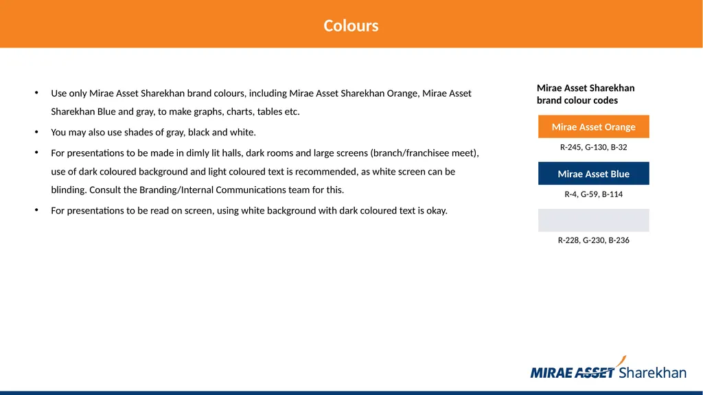
Colours Use only Mirae Asset Sharekhan brand colours, including Mirae Asset Sharekhan Orange, Mirae Asset Sharekhan Blue and gray, to make graphs, charts, tables etc.
You may also use shades of gray, black and white.
For presentations to be made in dimly lit halls, dark rooms and large screens (branch/franchisee meet), use of dark coloured background and light coloured text is recommended, as white screen can be blinding. Consult the Branding/Internal Communications team for this.
For presentations to be read on screen, using white background with dark coloured text is okay. Mirae Asset Orange Mirae Asset Blue R-245, G-130, B-32 R-4, G-59, B-114 R-228, G-230, B-236 Mirae Asset Sharekhan brand colour codes<br>
You may also use shades of gray, black and white.
For presentations to be made in dimly lit halls, dark rooms and large screens (branch/franchisee meet), use of dark coloured background and light coloured text is recommended, as white screen can be blinding. Consult the Branding/Internal Communications team for this.
For presentations to be read on screen, using white background with dark coloured text is okay. Mirae Asset Orange Mirae Asset Blue R-245, G-130, B-32 R-4, G-59, B-114 R-228, G-230, B-236 Mirae Asset Sharekhan brand colour codes<br>
11
Fonts Use Calibri or Roboto font only.
Standardise the font throughout – this presentation is in Calibri.<br>
Standardise the font throughout – this presentation is in Calibri.<br>
12
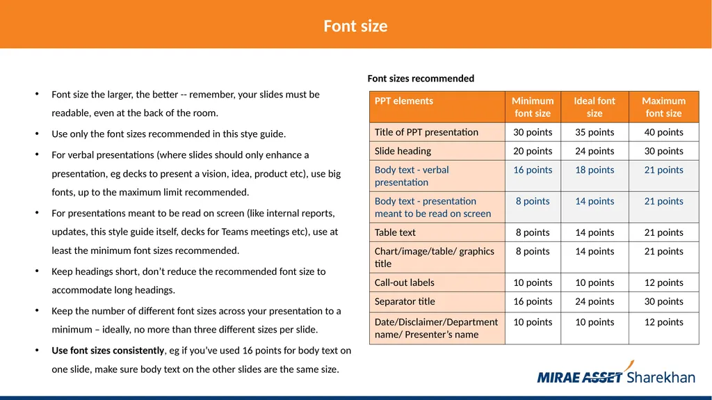
Font size Font size the larger, the better -- remember, your slides must be readable, even at the back of the room.
Use only the font sizes recommended in this stye guide.
For verbal presentations (where slides should only enhance a presentation, eg decks to present a vision, idea, product etc), use big fonts, up to the maximum limit recommended.
For presentations meant to be read on screen (like internal reports, updates, this style guide itself, decks for Teams meetings etc), use at least the minimum font sizes recommended.
Keep headings short, don’t reduce the recommended font size to accommodate long headings.
Keep the number of different font sizes across your presentation to a minimum – ideally, no more than three different sizes per slide.
Use font sizes consistently, eg if you’ve used 16 points for body text on one slide, make sure body text on the other slides are the same size. Font sizes recommended<br>
Use only the font sizes recommended in this stye guide.
For verbal presentations (where slides should only enhance a presentation, eg decks to present a vision, idea, product etc), use big fonts, up to the maximum limit recommended.
For presentations meant to be read on screen (like internal reports, updates, this style guide itself, decks for Teams meetings etc), use at least the minimum font sizes recommended.
Keep headings short, don’t reduce the recommended font size to accommodate long headings.
Keep the number of different font sizes across your presentation to a minimum – ideally, no more than three different sizes per slide.
Use font sizes consistently, eg if you’ve used 16 points for body text on one slide, make sure body text on the other slides are the same size. Font sizes recommended<br>
13
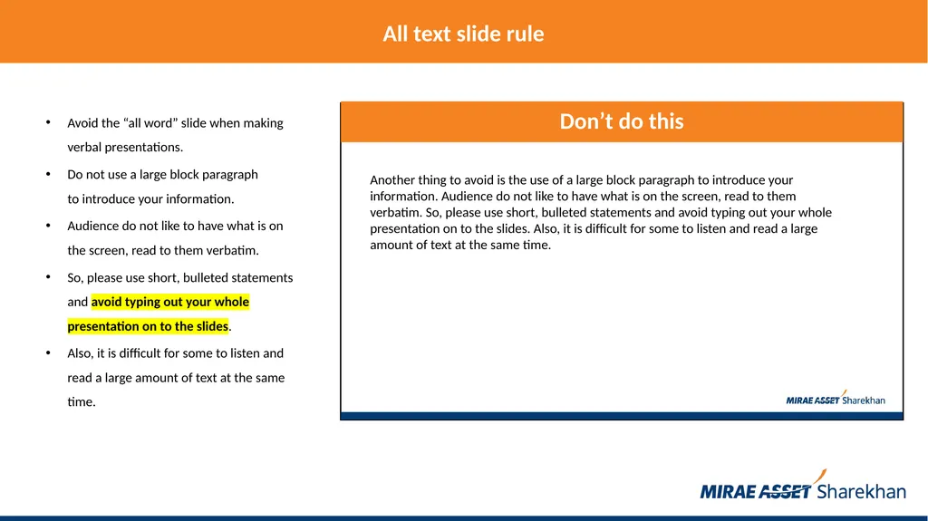
All text slide rule Avoid the “all word” slide when making
verbal presentations.
Do not use a large block paragraph to introduce your information.
Audience do not like to have what is on the screen, read to them verbatim.
So, please use short, bulleted statements and avoid typing out your whole presentation on to the slides.
Also, it is difficult for some to listen and read a large amount of text at the same time.<br>
Do not use a large block paragraph to introduce your information.
Audience do not like to have what is on the screen, read to them verbatim.
So, please use short, bulleted statements and avoid typing out your whole presentation on to the slides.
Also, it is difficult for some to listen and read a large amount of text at the same time.<br>
14
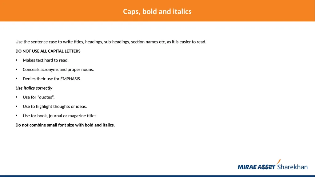
Caps, bold and italics Use the sentence case to write titles, headings, sub-headings, section names etc, as it is easier to read.
DO NOT USE ALL CAPITAL LETTERS
Makes text hard to read.
Conceals acronyms and proper nouns.
Denies their use for EMPHASIS.
Use italics correctly
Use for “quotes”.
Use to highlight thoughts or ideas.
Use for book, journal or magazine titles.
Do not combine small font size with bold and italics.<br>
DO NOT USE ALL CAPITAL LETTERS
Makes text hard to read.
Conceals acronyms and proper nouns.
Denies their use for EMPHASIS.
Use italics correctly
Use for “quotes”.
Use to highlight thoughts or ideas.
Use for book, journal or magazine titles.
Do not combine small font size with bold and italics.<br>
15
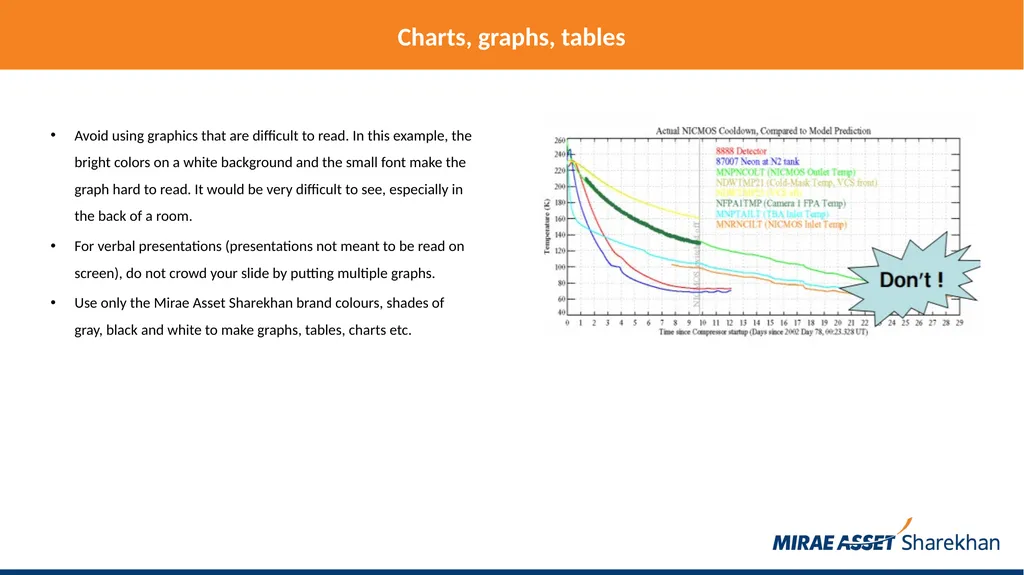
Charts, graphs, tables Avoid using graphics that are difficult to read. In this example, the bright colors on a white background and the small font make the graph hard to read. It would be very difficult to see, especially in the back of a room.
For verbal presentations (presentations not meant to be read on screen), do not crowd your slide by putting multiple graphs.
Use only the Mirae Asset Sharekhan brand colours, shades of gray, black and white to make graphs, tables, charts etc.<br>
For verbal presentations (presentations not meant to be read on screen), do not crowd your slide by putting multiple graphs.
Use only the Mirae Asset Sharekhan brand colours, shades of gray, black and white to make graphs, tables, charts etc.<br>
16
Charts, graphs, tables This graph contains too much information in an unreadable format. Display only what is relevant to make your point.<br>
17
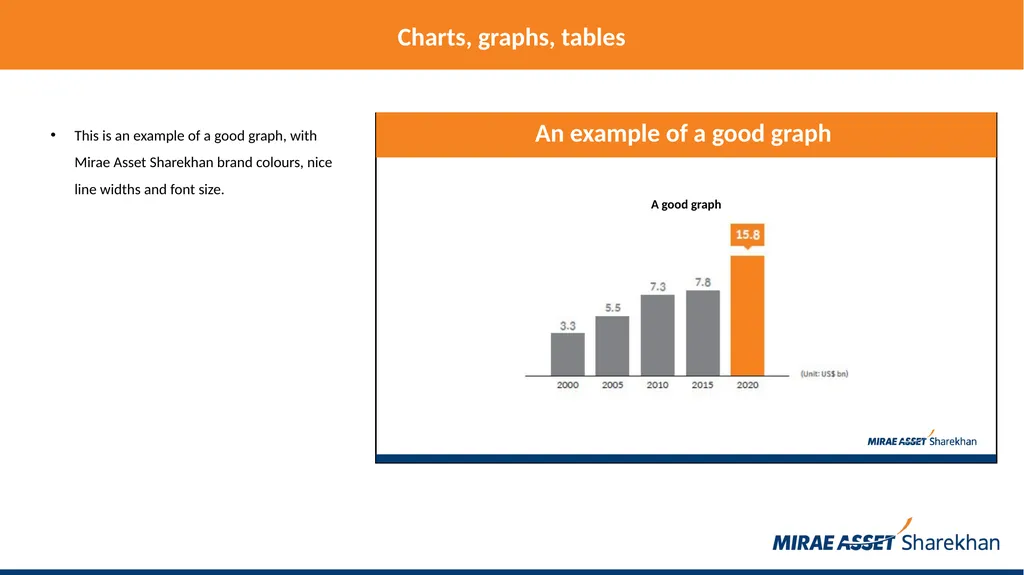
Charts, graphs, tables This is an example of a good graph, with Mirae Asset Sharekhan brand colours, nice line widths and font size. A good graph<br>
18
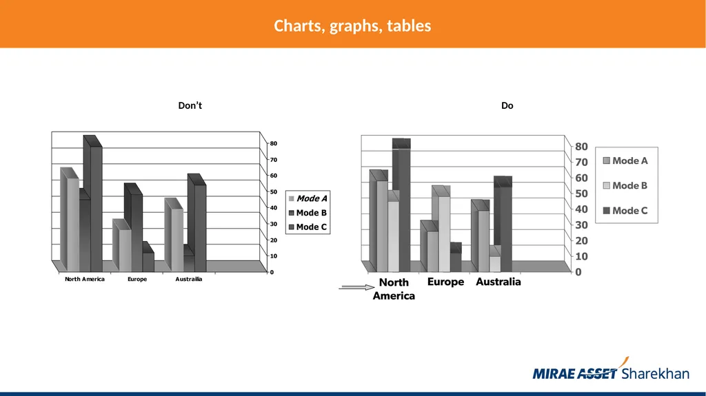
Charts, graphs, tables Don’t Do<br>
19
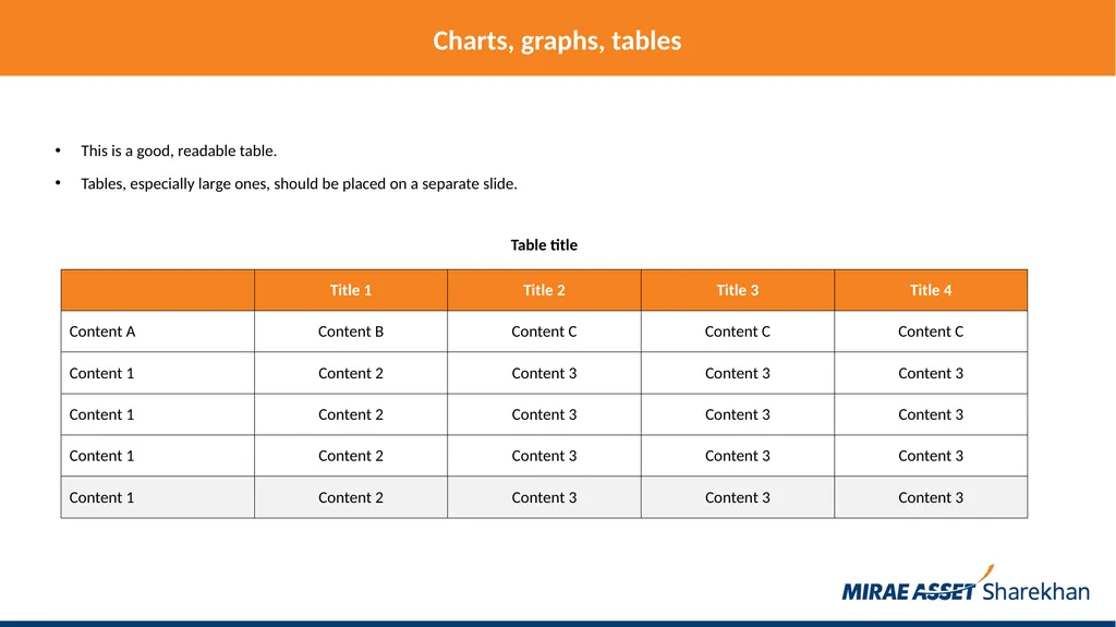
Charts, graphs, tables This is a good, readable table.
Tables, especially large ones, should be placed on a separate slide. Table title<br>
Tables, especially large ones, should be placed on a separate slide. Table title<br>
20
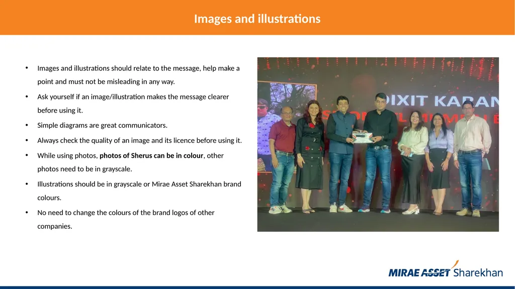
Images and illustrations Images and illustrations should relate to the message, help make a point and must not be misleading in any way.
Ask yourself if an image/illustration makes the message clearer before using it.
Simple diagrams are great communicators.
Always check the quality of an image and its licence before using it.
While using photos, photos of Sherus can be in colour, other photos need to be in grayscale.
Illustrations should be in grayscale or Mirae Asset Sharekhan brand colours.
No need to change the colours of the brand logos of other companies.<br>
Ask yourself if an image/illustration makes the message clearer before using it.
Simple diagrams are great communicators.
Always check the quality of an image and its licence before using it.
While using photos, photos of Sherus can be in colour, other photos need to be in grayscale.
Illustrations should be in grayscale or Mirae Asset Sharekhan brand colours.
No need to change the colours of the brand logos of other companies.<br>
21
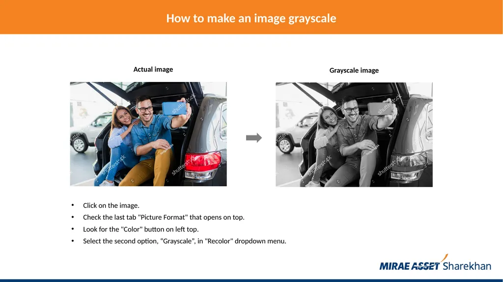
How to make an image grayscale Click on the image.
Check the last tab "Picture Format" that opens on top.
Look for the "Color" button on left top.
Select the second option, “Grayscale”, in "Recolor" dropdown menu.<br>
Check the last tab "Picture Format" that opens on top.
Look for the "Color" button on left top.
Select the second option, “Grayscale”, in "Recolor" dropdown menu.<br>
22
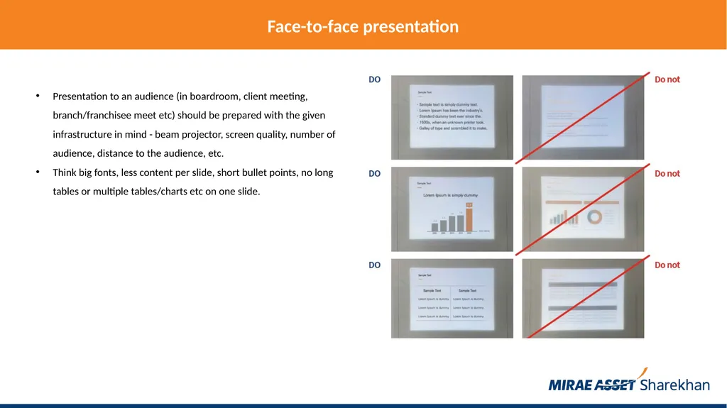
Face-to-face presentation Presentation to an audience (in boardroom, client meeting, branch/franchisee meet etc) should be prepared with the given infrastructure in mind - beam projector, screen quality, number of audience, distance to the audience, etc.
Think big fonts, less content per slide, short bullet points, no long tables or multiple tables/charts etc on one slide.<br>
Think big fonts, less content per slide, short bullet points, no long tables or multiple tables/charts etc on one slide.<br>
23
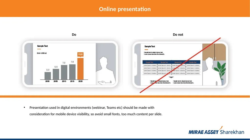
Online presentation Presentation used in digital environments (webinar, Teams etc) should be made with consideration for mobile device visibility, so avoid small fonts, too much content per slide.<br>
24
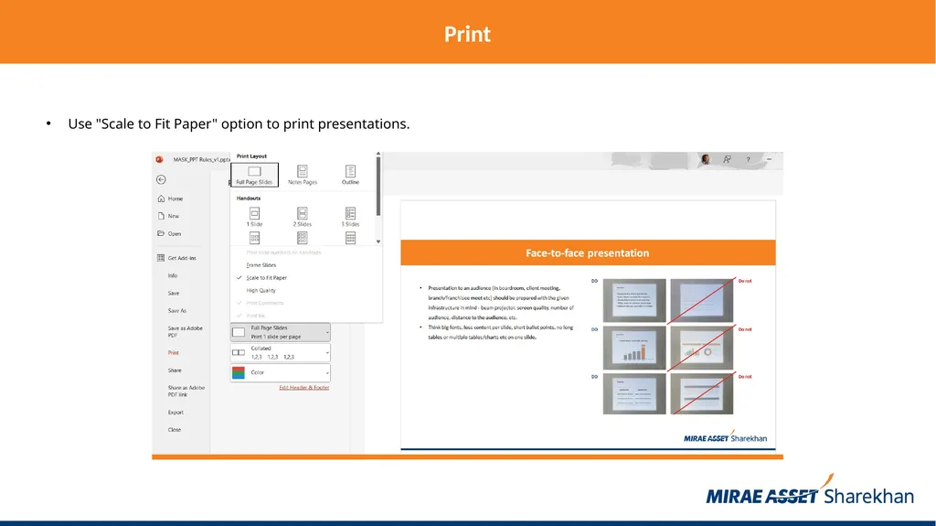
Print Use "Scale to Fit Paper" option to print presentations.<br>
25
Animation Animation can be distracting, limit the use of animation.
If you go for it, use the same animation throughout the entire presentation.<br>
If you go for it, use the same animation throughout the entire presentation.<br>
26
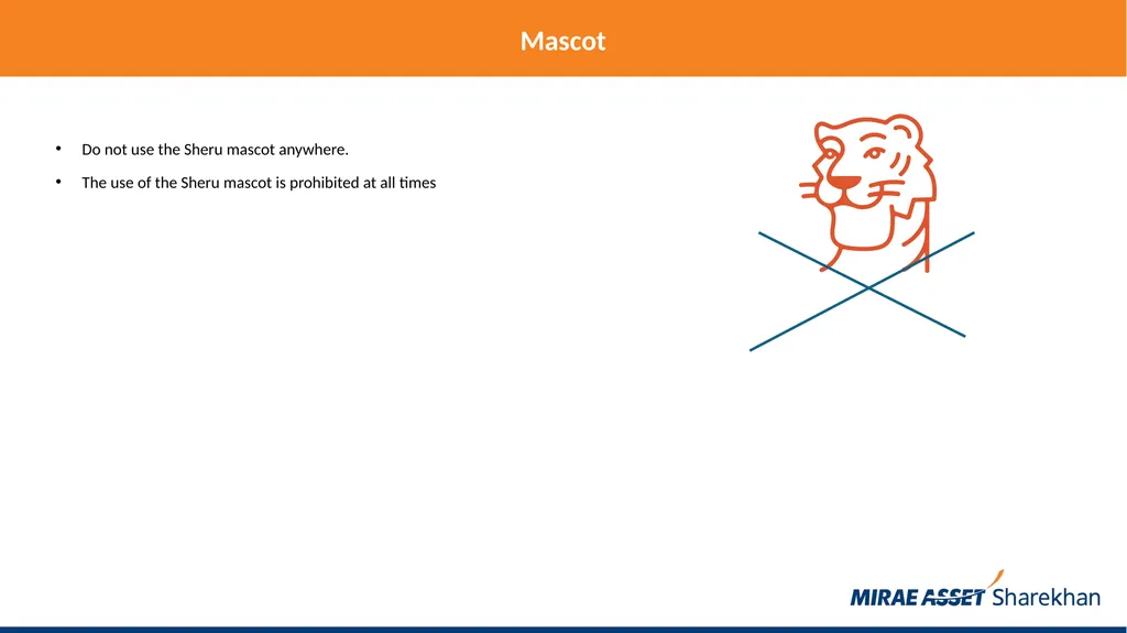
Mascot Do not use the Sheru mascot anywhere.
The use of the Sheru mascot is prohibited at all times<br>
The use of the Sheru mascot is prohibited at all times<br>
27
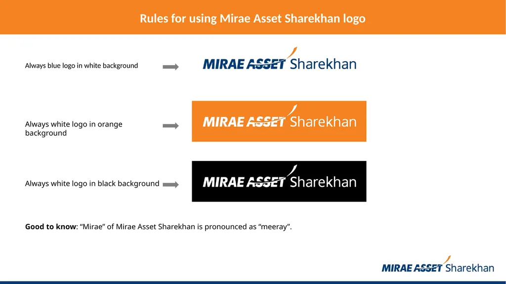
Always blue logo in white background Rules for using Mirae Asset Sharekhan logo Always white logo in orange background Always white logo in black background Good to know: “Mirae” of Mirae Asset Sharekhan is pronounced as “meeray”.<br>
28
Segment logo usage in the center If segment logos are to be used in the center of a slide, use the following segment logos:<br>
29
Sharekhan Classroom logo usage at the bottom<br>
30
Sharekhan Education logo usage at the bottom<br>
31
InvesTiger logo usage at the bottom<br>
32
TradeTiger logo usage at the bottom<br>
33
SharekhanOne logo usage at the bottom<br>
34
Super Investor logo usage at the bottom<br>
35
Super Trader logo usage at the bottom<br>
36
Sharekhan Classic logo usage at the bottom<br>
37
Sharekhan app logo usage at the bottom<br>
38
Thank you.<br>