
Pyramid Graphs for Studying Age Structure in
MT
Published · 24 slides · 0 views

1 / 1

Description
Pyramid Graphs for Studying Age Structure in Populations Modified from the 2018 Power of the Pyramids activity from populationeducation.org. Suitable for hybrid, distance, or in-person learning. Part 1: What is a Population Pyramid? A
Related Topics
Share
Embed code
Download this presentation From Below
"Pyramid Graphs for Studying Age Structure in" is the property of its rightful owner. Permission is granted to download and print the materials on this website for personal, non-commercial use only, and to display it on your personal computer provided you do not modify the materials and that you retain all copyright notices contained in the materials. By downloading content from our website, you accept the terms of this agreement.
Presentation Transcript
01
Pyramid Graphs for Studying Age Structure in Populations Modified from the 2018 Power of the Pyramids activity from populationeducation.org. Suitable for hybrid, distance, or in-person learning.<br>
02
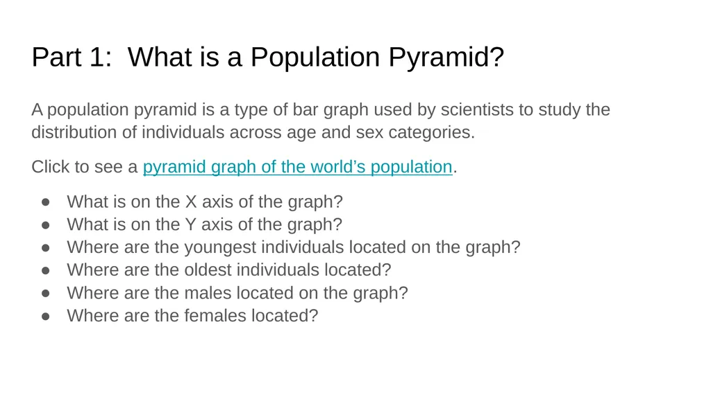
Part 1: What is a Population Pyramid? A population pyramid is a type of bar graph used by scientists to study the distribution of individuals across age and sex categories.
Click to see a pyramid graph of the world’s population.
What is on the X axis of the graph?
What is on the Y axis of the graph?
Where are the youngest individuals located on the graph?
Where are the oldest individuals located?
Where are the males located on the graph?
Where are the females located?<br>
Click to see a pyramid graph of the world’s population.
What is on the X axis of the graph?
What is on the Y axis of the graph?
Where are the youngest individuals located on the graph?
Where are the oldest individuals located?
Where are the males located on the graph?
Where are the females located?<br>
03
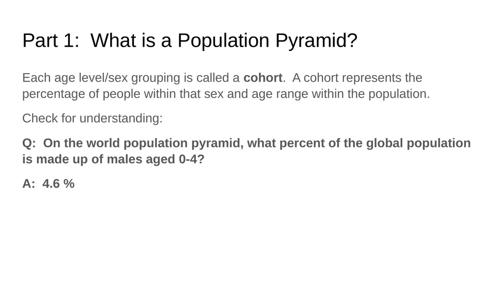
Part 1: What is a Population Pyramid? Each age level/sex grouping is called a cohort. A cohort represents the percentage of people within that sex and age range within the population.
Check for understanding:
Q: On the world population pyramid, what percent of the global population is made up of males aged 0-4?
A: 4.6 %<br>
Check for understanding:
Q: On the world population pyramid, what percent of the global population is made up of males aged 0-4?
A: 4.6 %<br>
04
Part 1: What is a Population Pyramid? Discussion Questions:
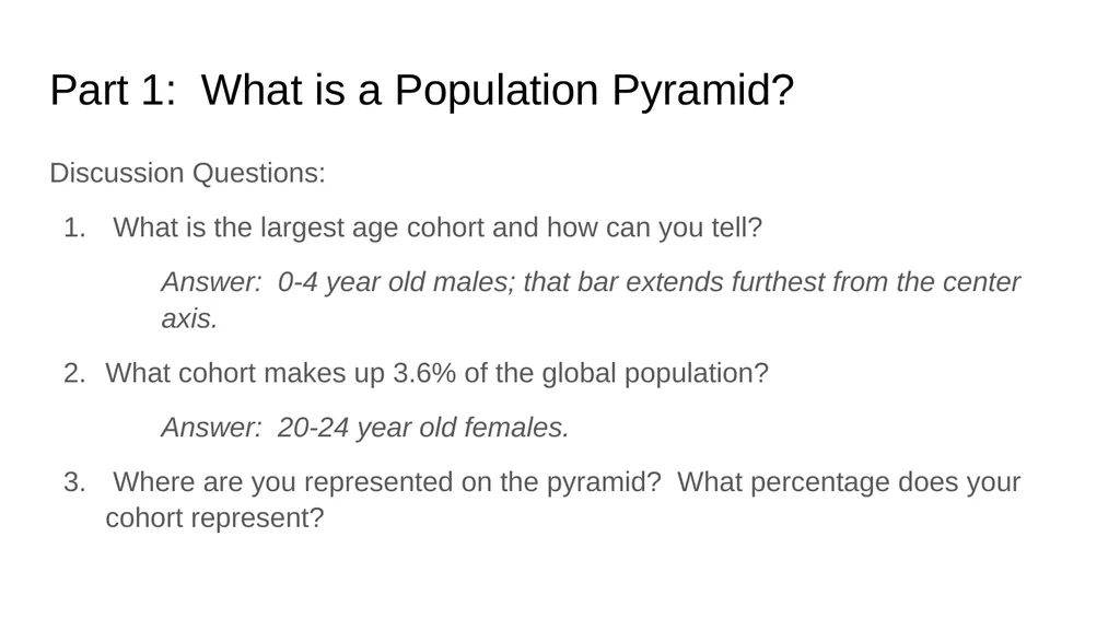
What is the largest age cohort and how can you tell?
Answer: 0-4 year old males; that bar extends furthest from the center axis.
What cohort makes up 3.6% of the global population?
Answer: 20-24 year old females.
Where are you represented on the pyramid? What percentage does your cohort represent?<br>
What is the largest age cohort and how can you tell?
Answer: 0-4 year old males; that bar extends furthest from the center axis.
What cohort makes up 3.6% of the global population?
Answer: 20-24 year old females.
Where are you represented on the pyramid? What percentage does your cohort represent?<br>
05
Part 1: What is a Population Pyramid? Discussion Questions, continued:
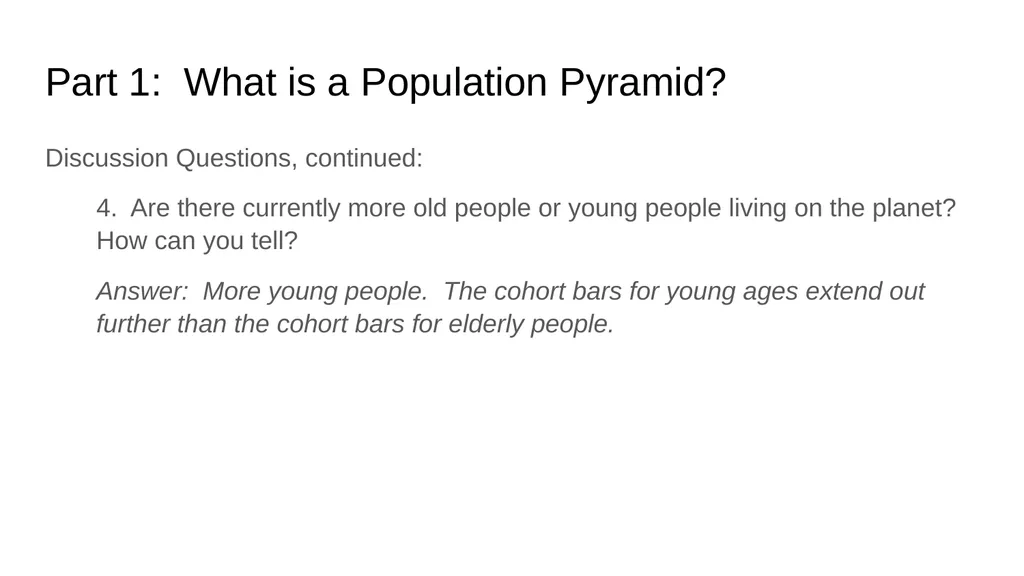
4. Are there currently more old people or young people living on the planet? How can you tell?
Answer: More young people. The cohort bars for young ages extend out further than the cohort bars for elderly people.<br>
4. Are there currently more old people or young people living on the planet? How can you tell?
Answer: More young people. The cohort bars for young ages extend out further than the cohort bars for elderly people.<br>
06
Part 1: What is a Population Pyramid? Discussion Questions, continued:
5. In general, the bars get smaller as we move up the graph until the top cohorts - they break the pattern and extend further out. Why? Hint: Look at the y-axis and the ages represented in each cohort.
Answer: All of the previous cohorts span a 5 year age increment. The cohorts at the top of the graph - 75+ males and 75+ females - represent everyone aged 75 years or older. Those cohorts cover a much larger span of ages than the other cohorts.<br>
5. In general, the bars get smaller as we move up the graph until the top cohorts - they break the pattern and extend further out. Why? Hint: Look at the y-axis and the ages represented in each cohort.
Answer: All of the previous cohorts span a 5 year age increment. The cohorts at the top of the graph - 75+ males and 75+ females - represent everyone aged 75 years or older. Those cohorts cover a much larger span of ages than the other cohorts.<br>
07
Part 1: What is a Population Pyramid? Discussion Questions, continued:
6. Look at the shape of the world population pyramid. Do you think this graph represents a population that is growing or shrinking? Explain your reasoning. Hint: Notice the reproductive categories labeled on the right side of the graph (Pre-Reproductive, Reproductive, and Post-Reproductive). The percentage of a population that falls within each reproductive category provides clues to the population’s further growth. As such, the shape of a population pyramid reveals a lot about how a population is growing.<br>
6. Look at the shape of the world population pyramid. Do you think this graph represents a population that is growing or shrinking? Explain your reasoning. Hint: Notice the reproductive categories labeled on the right side of the graph (Pre-Reproductive, Reproductive, and Post-Reproductive). The percentage of a population that falls within each reproductive category provides clues to the population’s further growth. As such, the shape of a population pyramid reveals a lot about how a population is growing.<br>
08
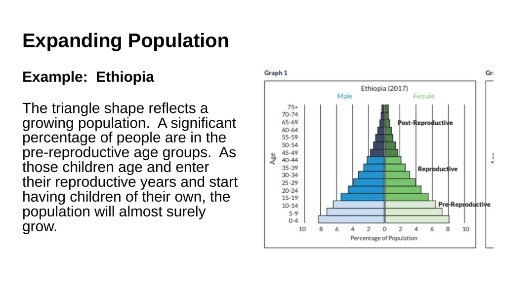
Expanding Population Example: Ethiopia
The triangle shape reflects a growing population. A significant percentage of people are in the pre-reproductive age groups. As those children age and enter their reproductive years and start having children of their own, the population will almost surely grow.<br>
The triangle shape reflects a growing population. A significant percentage of people are in the pre-reproductive age groups. As those children age and enter their reproductive years and start having children of their own, the population will almost surely grow.<br>
09
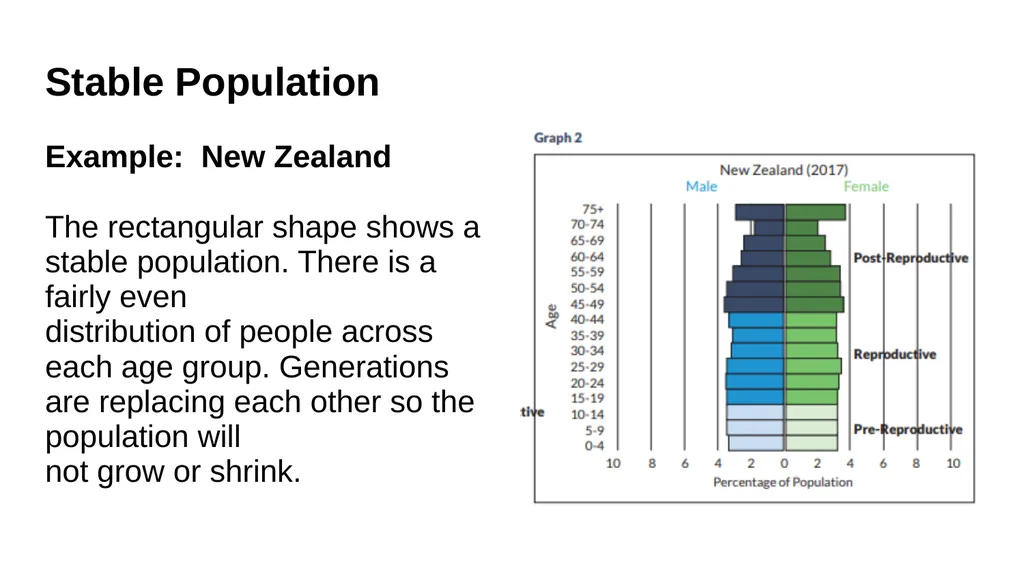
Stable Population Example: New Zealand
The rectangular shape shows a stable population. There is a fairly even
distribution of people across each age group. Generations are replacing each other so the population will
not grow or shrink.<br>
The rectangular shape shows a stable population. There is a fairly even
distribution of people across each age group. Generations are replacing each other so the population will
not grow or shrink.<br>
10
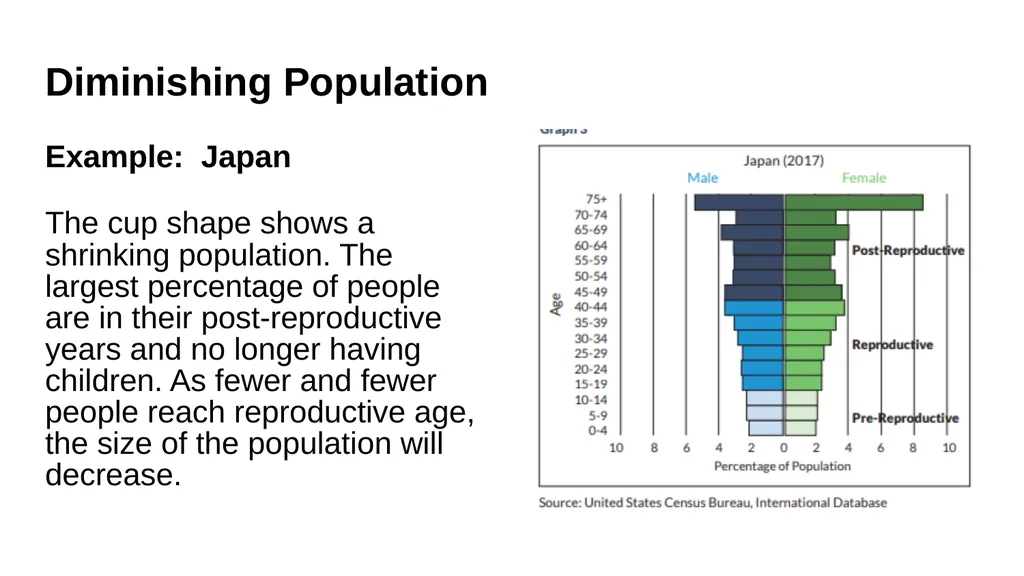
Diminishing Population Example: Japan
The cup shape shows a shrinking population. The largest percentage of people are in their post-reproductive years and no longer having children. As fewer and fewer people reach reproductive age, the size of the population will decrease.<br>
The cup shape shows a shrinking population. The largest percentage of people are in their post-reproductive years and no longer having children. As fewer and fewer people reach reproductive age, the size of the population will decrease.<br>
11
Part 2: Building Population Pyramids You and your group will be assigned data from one of the following countries to graph:
United States
China
Nigeria
Guatemala
Germany
India<br>
United States
China
Nigeria
Guatemala
Germany
India<br>
12
Part 2: Building Population Pyramids Click on the tab for your country next to the World (example graph) tab. Then follow these instructions, which are also written on your assigned graph page:
1. Select one color to use for the Male cohorts (the left side of the graph) and a different color to use for the Female cohorts (the right side of the graph). You'll be using the "Fill color" tool to color in the rows.
2. Start with the cohort of Males aged 0-4. On the data chart below the graph, find the percentage for this cohort. Round the percentage to the nearest 0.2%. (For example: If the percentage is 6.9%, round to 6.8% or 7%.)
3. In the graph area, find the row for ages 0-4 and the correct side for Males. Each cell represents 0.2%; so every five cells represents 1%.
4. Highlight the appropriate cells to represent the percentage (rounded to the nearest 0.2%) of Males aged 0-4 and fill with the color you've selected for Males.
5. Continue with the remaining age cohorts for Males. And then repeat the process for all of the age cohorts for Females.<br>
1. Select one color to use for the Male cohorts (the left side of the graph) and a different color to use for the Female cohorts (the right side of the graph). You'll be using the "Fill color" tool to color in the rows.
2. Start with the cohort of Males aged 0-4. On the data chart below the graph, find the percentage for this cohort. Round the percentage to the nearest 0.2%. (For example: If the percentage is 6.9%, round to 6.8% or 7%.)
3. In the graph area, find the row for ages 0-4 and the correct side for Males. Each cell represents 0.2%; so every five cells represents 1%.
4. Highlight the appropriate cells to represent the percentage (rounded to the nearest 0.2%) of Males aged 0-4 and fill with the color you've selected for Males.
5. Continue with the remaining age cohorts for Males. And then repeat the process for all of the age cohorts for Females.<br>
13
Discussion Questions 1. Can you tell from the data if there are more male or female babies in each country?
Yes, there are more male babies. There is a slightly greater probability of giving birth to male children. For every 100 girls born, there are about 105 boys born. For most countries, this 5 percent difference is reflected in the numbers on the data sheet. There are two countries in this set (India and China) where the sex difference is more pronounced. In India, there are nearly 13 percent more boys than girls ages 0-4 and in China there are 15.6 percent more boys than girls in that age group. This is due to sex selection based on a preference for sons.<br>
Yes, there are more male babies. There is a slightly greater probability of giving birth to male children. For every 100 girls born, there are about 105 boys born. For most countries, this 5 percent difference is reflected in the numbers on the data sheet. There are two countries in this set (India and China) where the sex difference is more pronounced. In India, there are nearly 13 percent more boys than girls ages 0-4 and in China there are 15.6 percent more boys than girls in that age group. This is due to sex selection based on a preference for sons.<br>
14
Discussion Questions 2. Can you tell from the graphs which country has the most people?
No. The graphs represent 100 percent of the population of each country broken down by age groups. Demographers typically use the percentage data instead of the raw data so that each pyramid fits on the same size grid and can be compared to other population pyramids.
3. Are there more elderly women or men? Why might that be the case?
There are more elderly women. Throughout the world, life expectancy for women is higher than for men. This is due to a number of genetic and social factors. In general, men are more predisposed to certain health risks than women. Also, men make up the majority of the military and are more likely to die during wars.<br>
No. The graphs represent 100 percent of the population of each country broken down by age groups. Demographers typically use the percentage data instead of the raw data so that each pyramid fits on the same size grid and can be compared to other population pyramids.
3. Are there more elderly women or men? Why might that be the case?
There are more elderly women. Throughout the world, life expectancy for women is higher than for men. This is due to a number of genetic and social factors. In general, men are more predisposed to certain health risks than women. Also, men make up the majority of the military and are more likely to die during wars.<br>
15
Discussion Questions 4. If you had a business and wanted to capitalize on your information about the population age distribution for the United States, what would you sell and why? What about a business in Nigeria? A business in Germany?
United States – Answers should include any products for people between 20-29 or 50-59 because they make up the largest percentages of people. Nigeria – Answers should include any products for children and infants. Germany – Answers should include any products for older people.<br>
United States – Answers should include any products for people between 20-29 or 50-59 because they make up the largest percentages of people. Nigeria – Answers should include any products for children and infants. Germany – Answers should include any products for older people.<br>
16
Discussion Questions 5. Which of the six countries is growing the fastest? How do you know? Can you think of any other information we can infer from the pyramid shape?
Nigeria is growing the fastest. It has the widest base, and the largest percentage of the population in pre-reproductive and reproductive years. Population growth occurs when the segment of the population currently in its childbearing years (ages 15-44; bars 4-9 on the graphs) has produced a generation larger than itself (bars 1-3). The triangular pyramid shape also indicates that a relatively small proportion of the population is elderly – the bars at the top of the graph are very small – and could mean that life expectancy is low.<br>
Nigeria is growing the fastest. It has the widest base, and the largest percentage of the population in pre-reproductive and reproductive years. Population growth occurs when the segment of the population currently in its childbearing years (ages 15-44; bars 4-9 on the graphs) has produced a generation larger than itself (bars 1-3). The triangular pyramid shape also indicates that a relatively small proportion of the population is elderly – the bars at the top of the graph are very small – and could mean that life expectancy is low.<br>
17
Discussion Questions 6. Looking at the pyramids, which countries appear to have the slowest rates of population growth? How can you tell?
Germany has the slowest population growth with over half of the country’s population in their post-reproductive years. The pyramid is inverted with a wide top and thin base showing that 53 percent of the population is over the age of 45 (bars 10-16 on the graphs). The United States is also growing slowly. The graph is closer to a rectangle than a pyramid, showing more uniform population size across the age groups and therefore a more stable population.<br>
Germany has the slowest population growth with over half of the country’s population in their post-reproductive years. The pyramid is inverted with a wide top and thin base showing that 53 percent of the population is over the age of 45 (bars 10-16 on the graphs). The United States is also growing slowly. The graph is closer to a rectangle than a pyramid, showing more uniform population size across the age groups and therefore a more stable population.<br>
18
Discussion Questions 7. Which country would you suspect is closest to zero population growth?
Zero population growth (ZPG) occurs when a country’s birth rate and death rate are roughly equal. If there is significant migration in or out of the country, that must be taken into account as well. Though the graphs do not display birth and death rates, we can reason by their shapes, that Germany and the U.S. are closest to reaching ZPG.<br>
Zero population growth (ZPG) occurs when a country’s birth rate and death rate are roughly equal. If there is significant migration in or out of the country, that must be taken into account as well. Though the graphs do not display birth and death rates, we can reason by their shapes, that Germany and the U.S. are closest to reaching ZPG.<br>
19
Discussion Questions 7. Which country would you suspect is closest to zero population growth?
Zero population growth (ZPG) occurs when a country’s birth rate and death rate are roughly equal. If there is significant migration in or out of the country, that must be taken into account as well. Though the graphs do not display birth and death rates, we can reason by their shapes, that Germany and the U.S. are closest to reaching ZPG.<br>
Zero population growth (ZPG) occurs when a country’s birth rate and death rate are roughly equal. If there is significant migration in or out of the country, that must be taken into account as well. Though the graphs do not display birth and death rates, we can reason by their shapes, that Germany and the U.S. are closest to reaching ZPG.<br>
20
Discussion Questions 8. What factors would change the shape of the pyramids in the future?
A decrease in the birth rate. The people in their childbearing years would be having fewer children, and therefore, be producing a generation more similar in size to itself. This would change the shape of the graph over time from a pyramid to more of a rectangle, indicating a more stable population. Additionally, as life expectancy increases and the proportion of older people increases, the top bars will expand.<br>
A decrease in the birth rate. The people in their childbearing years would be having fewer children, and therefore, be producing a generation more similar in size to itself. This would change the shape of the graph over time from a pyramid to more of a rectangle, indicating a more stable population. Additionally, as life expectancy increases and the proportion of older people increases, the top bars will expand.<br>
21
Discussion Questions 9. There are two noticeable “bumps” on the U.S. population pyramid. What do these larger cohorts correspond to?
The “bump” closer to the top of the pyramid reflects the baby boom generation – children born following World War II. (The baby boom generation includes those born between 1946 and 1964. ) The “bump” lower down the pyramid is an echo boom – the children of baby boomers.<br>
The “bump” closer to the top of the pyramid reflects the baby boom generation – children born following World War II. (The baby boom generation includes those born between 1946 and 1964. ) The “bump” lower down the pyramid is an echo boom – the children of baby boomers.<br>
22
Discussion Questions 10. China’s population pyramid is the most varied of the six. Can you think of any historic events from the past 75 years that helped shape the Chinese pyramid?
In the early 1950s, Chinese women were having an average of six children. Then the Great Leap Forward (1958-1962), a national campaign that moved many agricultural workers into industries, created widespread famine and an estimated 20-40 million people died of starvation. The years 1958-1962 are represented by the cohorts for ages 55-59 on the pyramid, which are smaller than the surrounding cohorts. The Chinese population continued to grow in the 1960s and 1970s and in 1980, the one-child policy was put in place. The birth rate dropped as many people were allowed only one child, and this is reflected in the cohorts for ages 35-39. The one-child policy remained until 2016. The larger percentages for the 20-24 year old cohorts are an “echo boom,” the children of those in the 45-49 year old bars.<br>
In the early 1950s, Chinese women were having an average of six children. Then the Great Leap Forward (1958-1962), a national campaign that moved many agricultural workers into industries, created widespread famine and an estimated 20-40 million people died of starvation. The years 1958-1962 are represented by the cohorts for ages 55-59 on the pyramid, which are smaller than the surrounding cohorts. The Chinese population continued to grow in the 1960s and 1970s and in 1980, the one-child policy was put in place. The birth rate dropped as many people were allowed only one child, and this is reflected in the cohorts for ages 35-39. The one-child policy remained until 2016. The larger percentages for the 20-24 year old cohorts are an “echo boom,” the children of those in the 45-49 year old bars.<br>
23
Discussion Questions 11. Which of the three general pyramid shapes would you use to describe India’s population pyramid? What does this mean for India’s future growth?
The top portion of India’s pyramid is triangular while the bottom portion is rectangular. This shows that in years past, India was growing significantly with each younger cohort larger than its predecessor. In more recent years, India’s growth has slowed and we see that the bottom four cohorts are more evenly balanced. It is important to note that India’s population is still increasing and will do so until the birth rate (currently 21) and death rate (currently 7) are equal.<br>
The top portion of India’s pyramid is triangular while the bottom portion is rectangular. This shows that in years past, India was growing significantly with each younger cohort larger than its predecessor. In more recent years, India’s growth has slowed and we see that the bottom four cohorts are more evenly balanced. It is important to note that India’s population is still increasing and will do so until the birth rate (currently 21) and death rate (currently 7) are equal.<br>
24
Discussion Questions 12. Compare and contrast the population pyramids of Nigeria and Guatemala. How are they similar/different and what does this mean for each countries’ future growth?
The pyramids for both Nigeria and Guatemala are generally a triangle shape – the base of each is much wider than its top, and every younger cohort is larger than its predecessor. So we know that both countries are growing. However, we can see in the pyramid for Guatemala that younger cohorts are showing less variation. For instance, compare the male 0-4 cohort with the male 15-19 cohort within each pyramid. There is a small difference between these two cohorts on the Guatemala pyramid of only 0.4 percent (6.0 vs. 5.6), while on the Nigerian pyramid the difference is 2.7 percent (8.2 vs. 5.5). Less variation between the younger cohorts shows the pyramid of Guatemala is starting to become more rectangular and, as such, the population will most likely grow at a slower rate.<br>
The pyramids for both Nigeria and Guatemala are generally a triangle shape – the base of each is much wider than its top, and every younger cohort is larger than its predecessor. So we know that both countries are growing. However, we can see in the pyramid for Guatemala that younger cohorts are showing less variation. For instance, compare the male 0-4 cohort with the male 15-19 cohort within each pyramid. There is a small difference between these two cohorts on the Guatemala pyramid of only 0.4 percent (6.0 vs. 5.6), while on the Nigerian pyramid the difference is 2.7 percent (8.2 vs. 5.5). Less variation between the younger cohorts shows the pyramid of Guatemala is starting to become more rectangular and, as such, the population will most likely grow at a slower rate.<br>