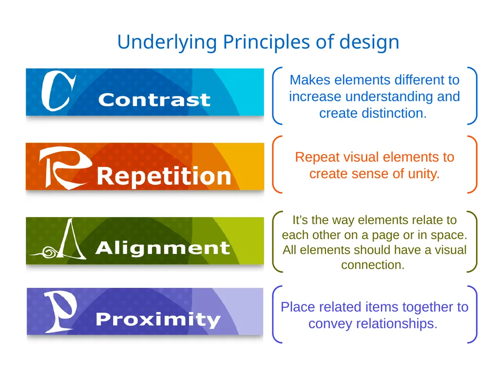
Underlying Principles of design Makes elements different to increase understanding and create distinction. Repeat visual elements to create sense of unity. Its the way elements relate to each other on a page or in space. All elements
"Underlying Principles of design Makes elements" is the property of its rightful owner. Permission is granted to
download and print the materials on this website for personal, non-commercial use only, and to display it
on your personal computer provided you do not modify the materials and that you retain all copyright
notices contained in the materials. By downloading content from our website, you accept the terms of this
agreement.
Presentation Transcript
01
Underlying Principles of design Makes elements different to increase understanding and create distinction. Repeat visual elements to create sense of unity. It’s the way elements relate to each other on a page or in space. All elements should have a visual connection. Place related items together to convey relationships.<br>
02
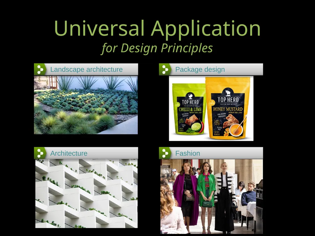
Universal Application
for Design Principles<br>
03
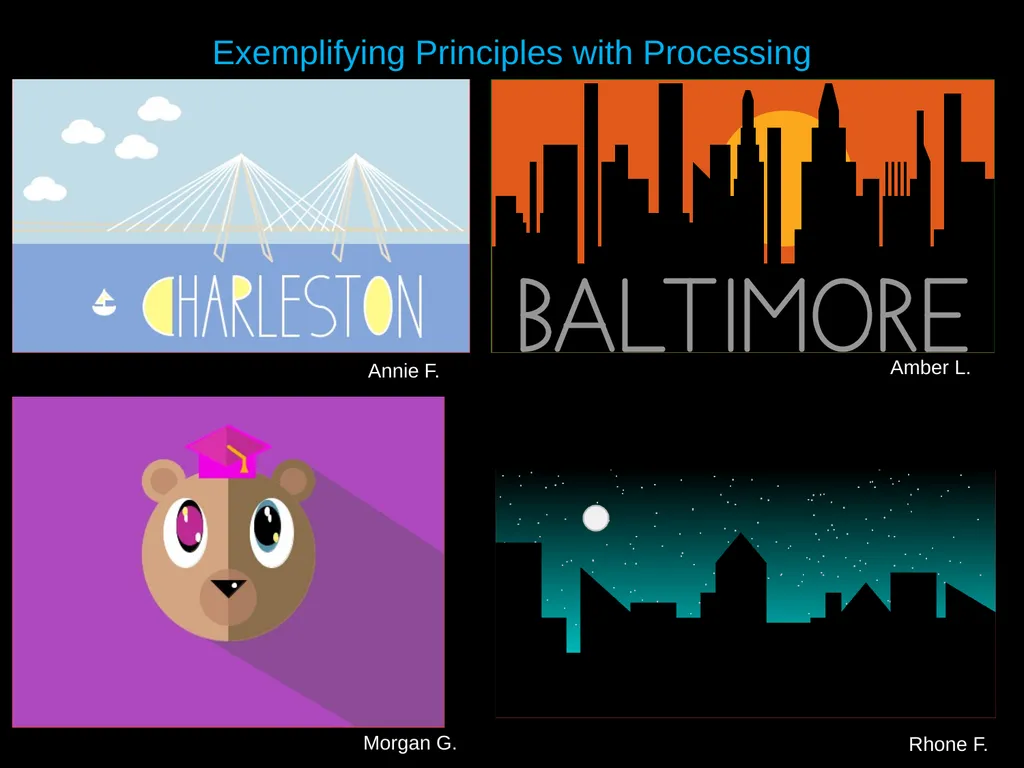
Exemplifying Principles with Processing Amber L. Annie F. Morgan G. Rhone F.<br>
04
A quick read. It has pictures so you can peruse easily.
www.stonesoupcreative.com/your-design-is-full-of-crap
This is only "Contrast", but if you like it, they have videos on the others
www.youtube.com/watch?v=Q6lMkkl7TY0
6 minutes of audio visuals that get to the point and keeps your attention
www.youtube.com/watch?v=admfIU5UkUs
"C.R.A.P. Design Principles to Improve Visual Appeal"-- While the examples are not so visually compelling, the information provided in this article is spot on and helpful.
http://blogs.quovantis.com/crap-design-principles
More and more, I read/hear about CRAP principles as a foundation of UI (User Interface) design
medium.com/@maxiiemmii/crap-a-beginners-guide-to-design-principles-in-ui-design-c81ddfed450a Learn More from These Resources:<br>
05
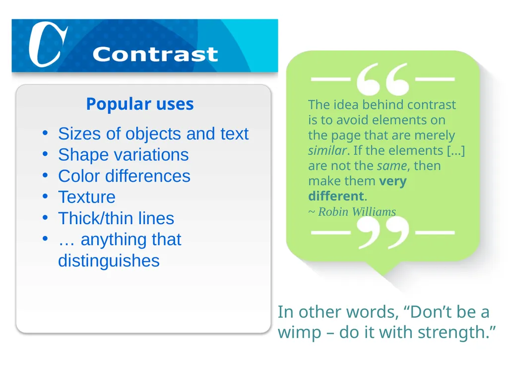
Sizes of objects and text
Shape variations
Color differences
Texture
Thick/thin lines
… anything that distinguishes Popular uses The idea behind contrast is to avoid elements on the page that are merely similar. If the elements [...] are not the same, then make them very different.
~ Robin Williams In other words, “Don’t be a wimp – do it with strength.”<br>
06
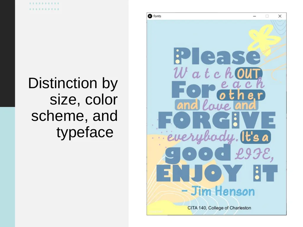
Distinction by size, color scheme, and typeface<br>
07
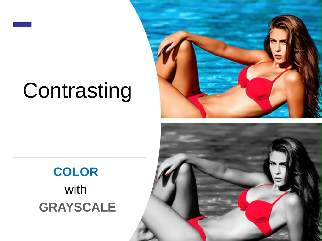
Contrasting COLOR
with
GRAYSCALE<br>
08
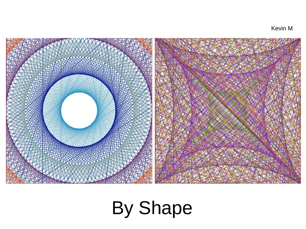
By Shape Kevin M<br>
09
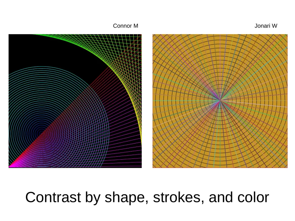
Contrast by shape, strokes, and color Connor M Jonari W<br>
10
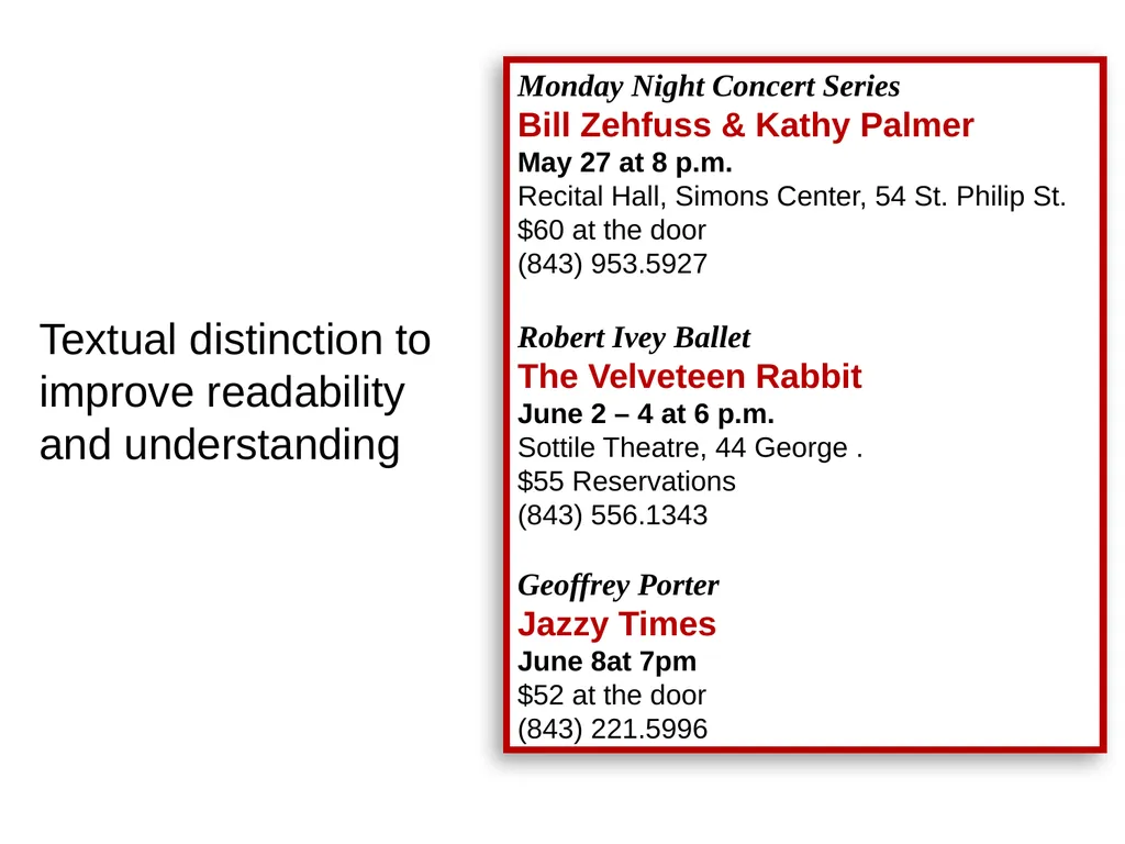
Textual distinction to improve readability and understanding Monday Night Concert Series
Bill Zehfuss & Kathy Palmer May 27 at 8 p.m. Recital Hall, Simons Center, 54 St. Philip St. $60 at the door (843) 953.5927
Robert Ivey Ballet
The Velveteen Rabbit June 2 – 4 at 6 p.m. Sottile Theatre, 44 George . $55 Reservations
(843) 556.1343
Geoffrey Porter
Jazzy Times
June 8at 7pm
$52 at the door
(843) 221.5996<br>
11
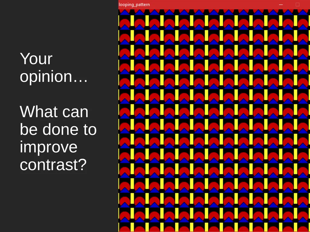
Your opinion… What can be done to improve contrast?<br>
12
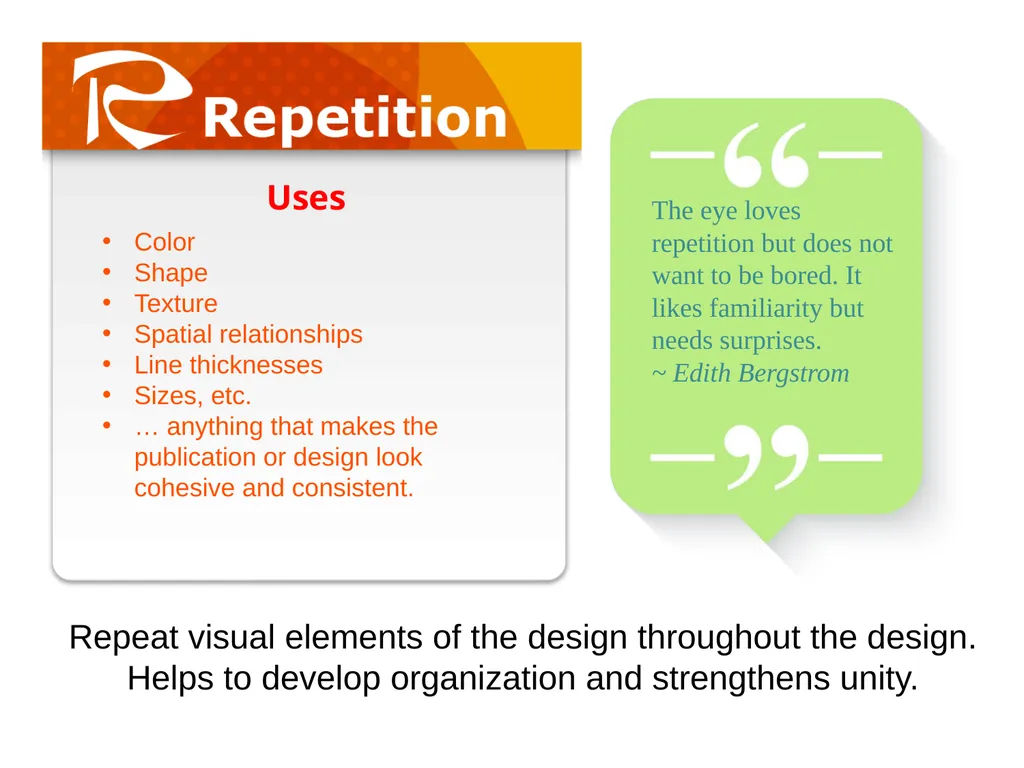
Repeat visual elements of the design throughout the design. Helps to develop organization and strengthens unity. Color
Shape
Texture
Spatial relationships
Line thicknesses
Sizes, etc.
… anything that makes the publication or design look cohesive and consistent. Uses The eye loves repetition but does not want to be bored. It likes familiarity but needs surprises.
~ Edith Bergstrom<br>
13
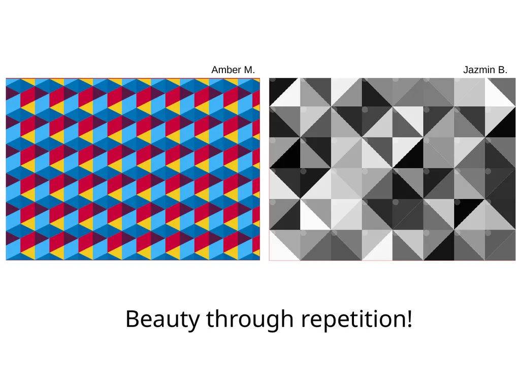
Amber M. Beauty through repetition! Jazmin B.<br>
14
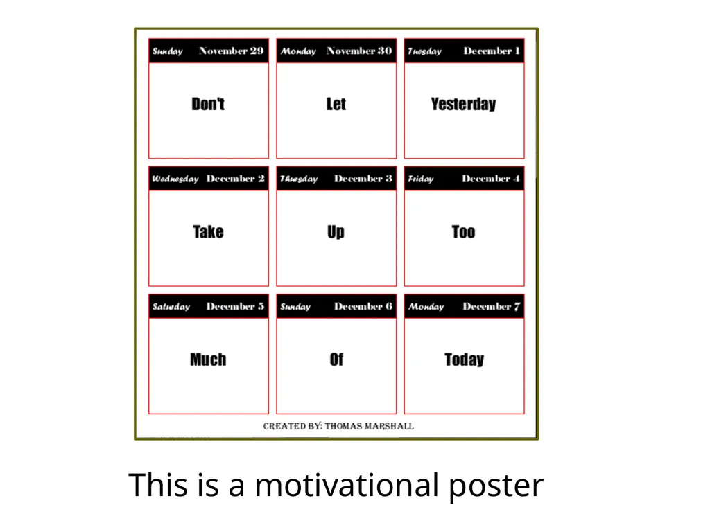
This is a motivational poster<br>
15
To create balance
To create visual connections
To create a grid system
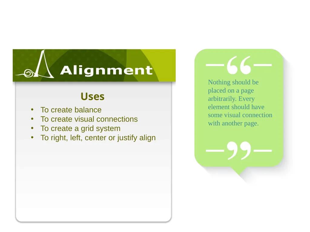
To right, left, center or justify align Uses Nothing should be placed on a page arbitrarily. Every element should have some visual connection with another page.<br>
16
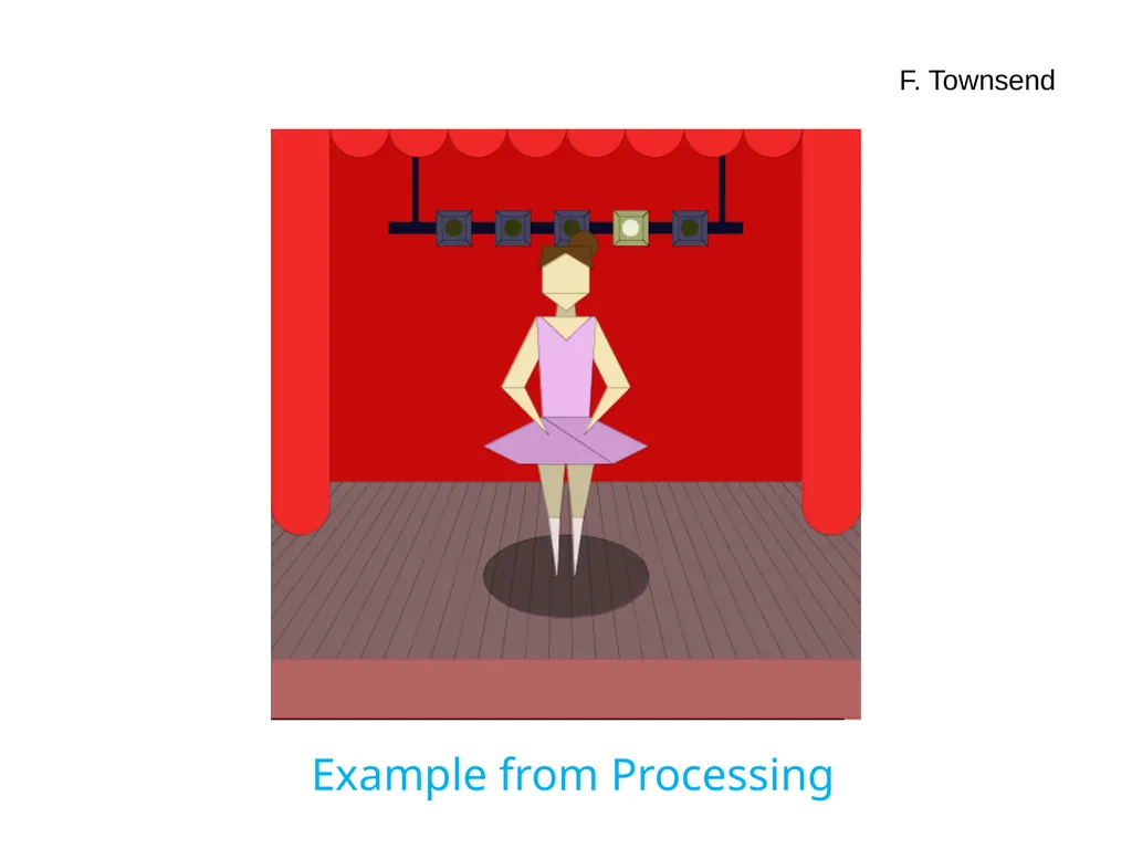
Example from Processing F. Townsend<br>
17
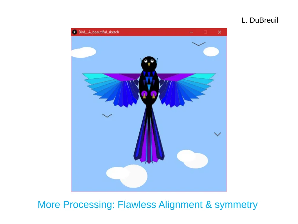
More Processing: Flawless Alignment & symmetry L. DuBreuil<br>
18
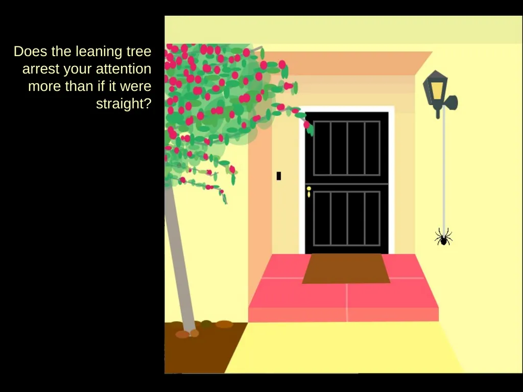
Does the leaning tree arrest your attention more than if it were straight?<br>
19
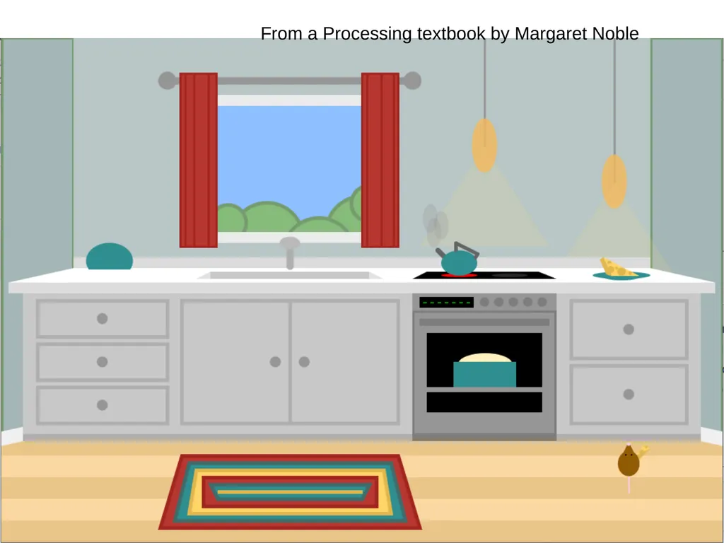
From a Processing textbook by Margaret Noble<br>
20
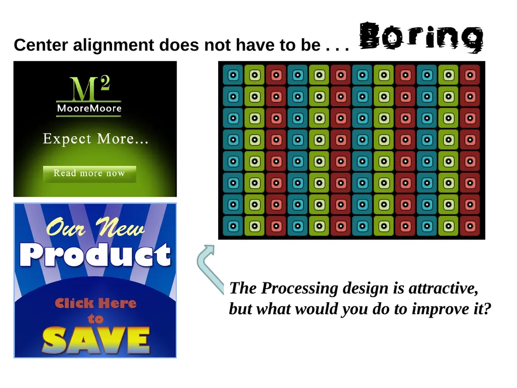
Center alignment does not have to be . . . The Processing design is attractive, but what would you do to improve it?<br>
21
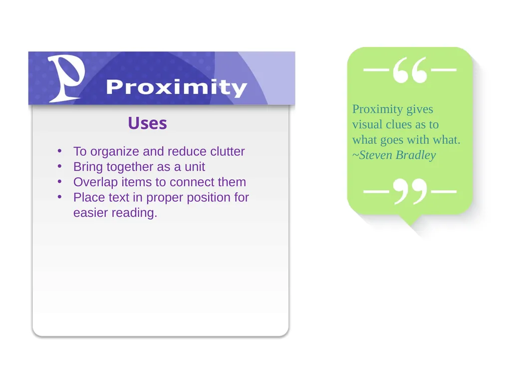
To organize and reduce clutter
Bring together as a unit
Overlap items to connect them
Place text in proper position for easier reading. Uses Proximity gives visual clues as to what goes with what.
~Steven Bradley<br>
22
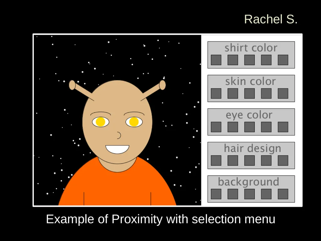
Example of Proximity with selection menu Rachel S.<br>
23
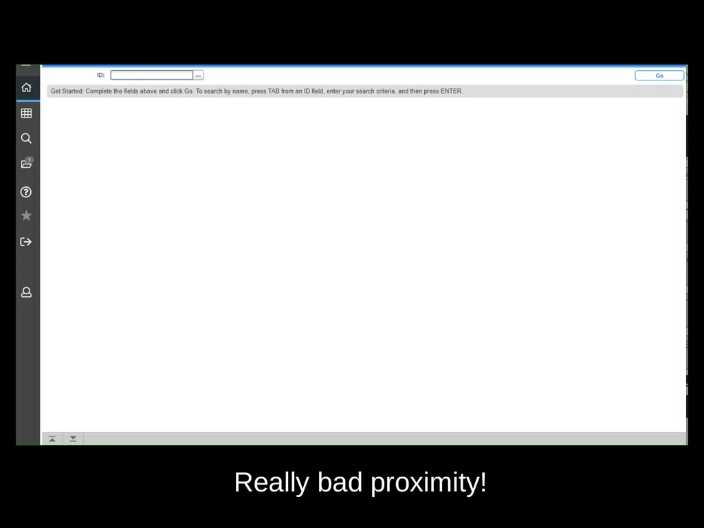
Really bad proximity!<br>
24
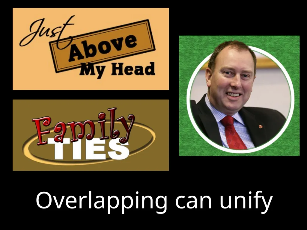
Overlapping can unify<br>
25
The take-away… Start applying these broad principles to your designs.<br>