04
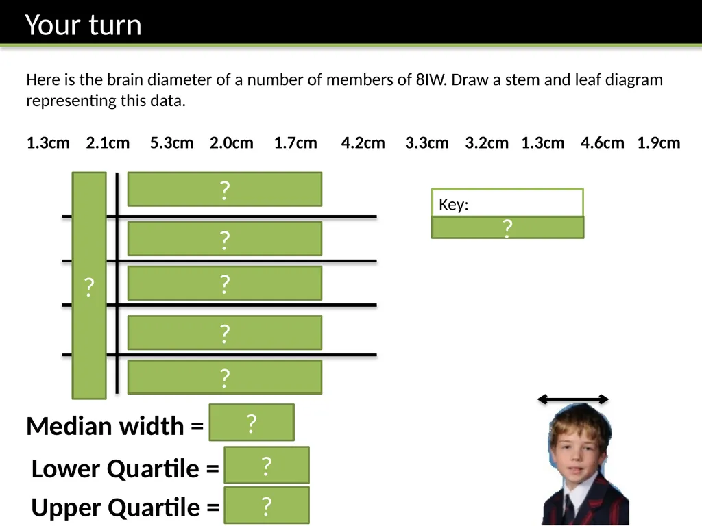
Here is the brain diameter of a number of members of 8IW. Draw a stem and leaf diagram representing this data.
1.3cm 2.1cm 5.3cm 2.0cm 1.7cm 4.2cm 3.3cm 3.2cm 1.3cm 4.6cm 1.9cm 1
2
3
4
5 3 3 7 9
0 1
2 3
2 6
3 ? ? ? ? ? ? Key:
3 | 8 means 3.8cm ? Median width = 2.1cm ? Lower Quartile = 1.7cm Upper Quartile = 4.2cm ? ?<br>
05
Q1 on your provided worksheet.
(Ref: Yr8-DataHandlingWorksheet.doc)<br>
06
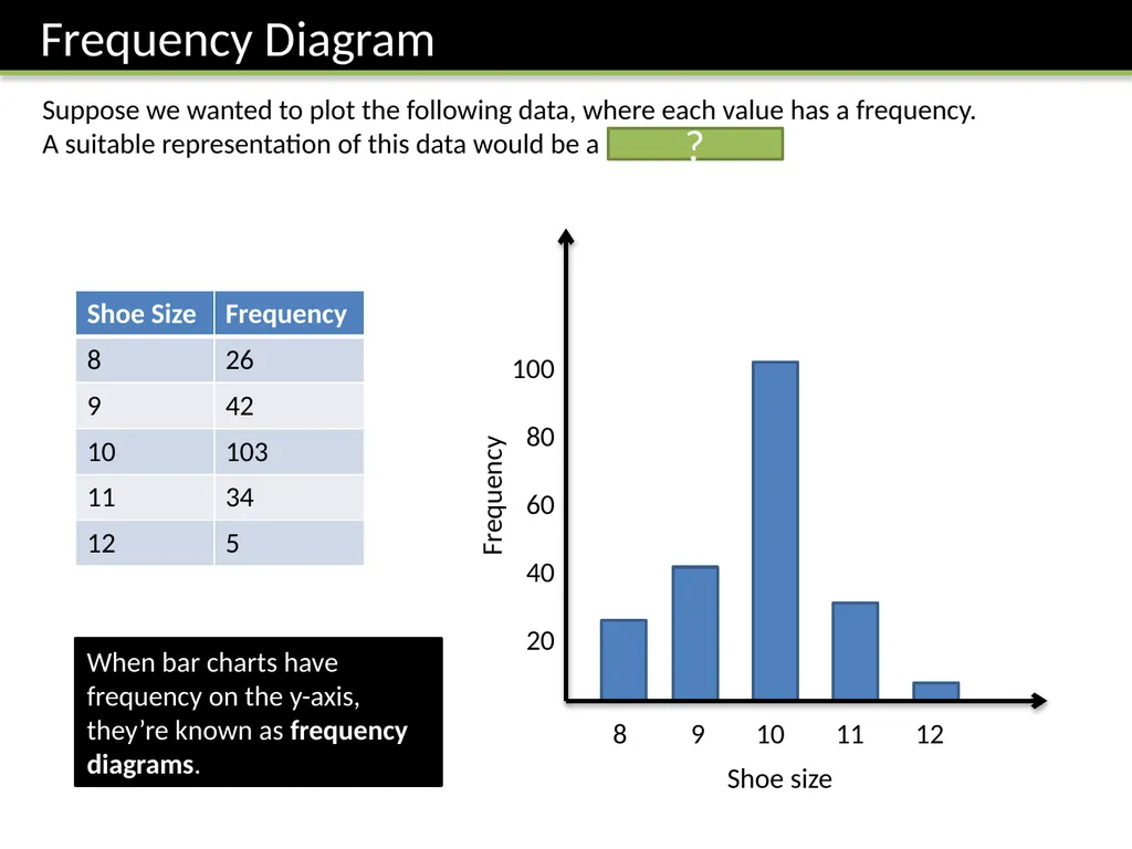
Suppose we wanted to plot the following data, where each value has a frequency.
A suitable representation of this data would be a bar chart. ? When bar charts have frequency on the y-axis, they’re known as frequency diagrams.<br>
07
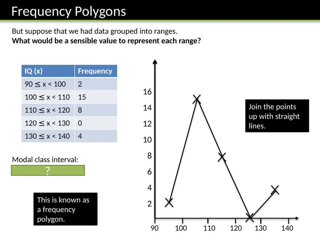
But suppose that we had data grouped into ranges.
What would be a sensible value to represent each range? 90 100 110 120 130 140 16
14
12
10
8
6
4
2 Join the points up with straight lines. This is known as a frequency polygon. Modal class interval:
100 ≤ x < 110 ?<br>
08
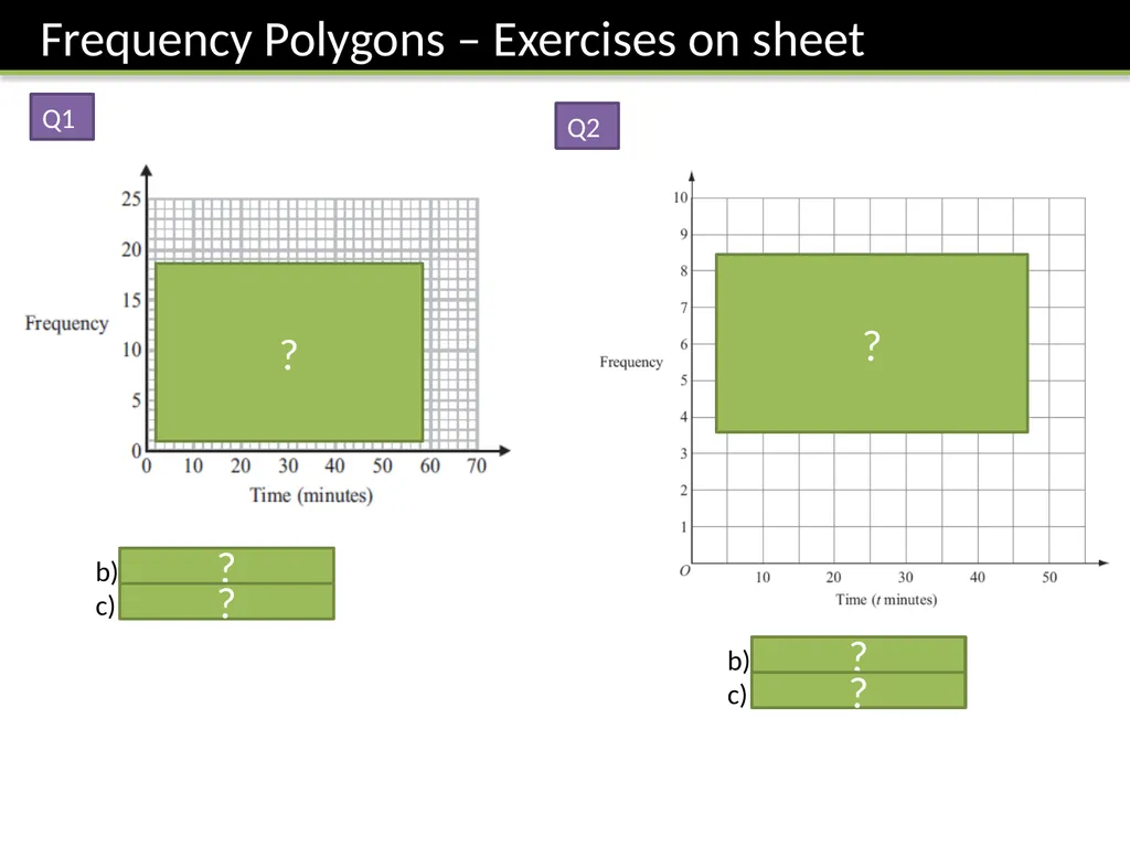
b) 30 < x ≤ 40
c) 16% Q1 Q2 b) 20 < x ≤ 30
c) 16% ? ? ? ? ? ?<br>
09
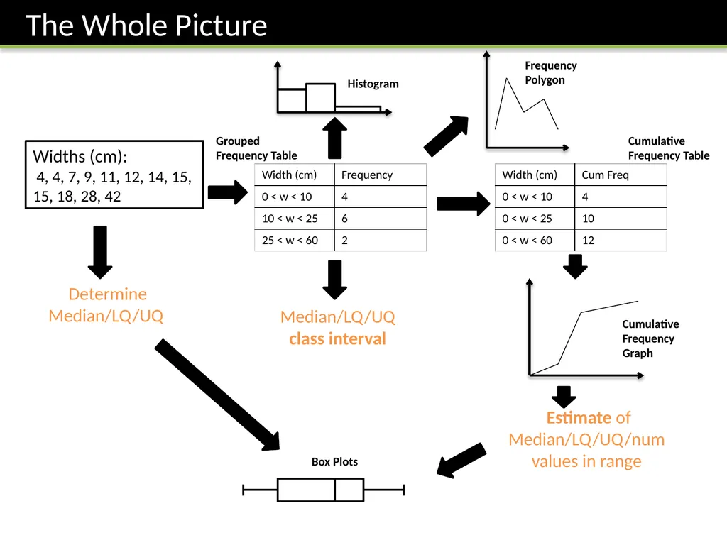
Median/LQ/UQ class interval Estimate of Median/LQ/UQ/num values in range Determine Median/LQ/UQ Widths (cm):
4, 4, 7, 9, 11, 12, 14, 15, 15, 18, 28, 42 Cumulative Frequency Table Cumulative Frequency Graph Box Plots Histogram Grouped Frequency Table Frequency Polygon<br>
10
Suppose that we line up everyone in the school according to height. ?<br>
11
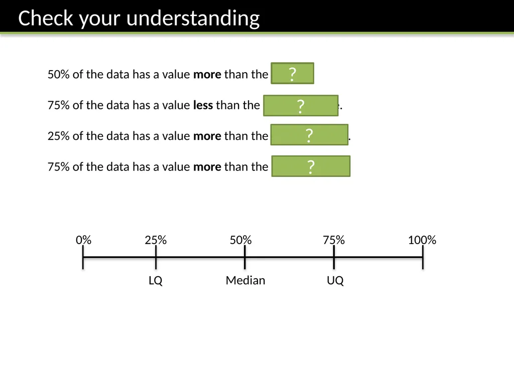
50% of the data has a value more than the median.
75% of the data has a value less than the upper quartile.
25% of the data has a value more than the upper quartile.
75% of the data has a value more than the lower quartile. 0% 25% 50% 75% 100% LQ UQ Median ? ? ? ?<br>
12
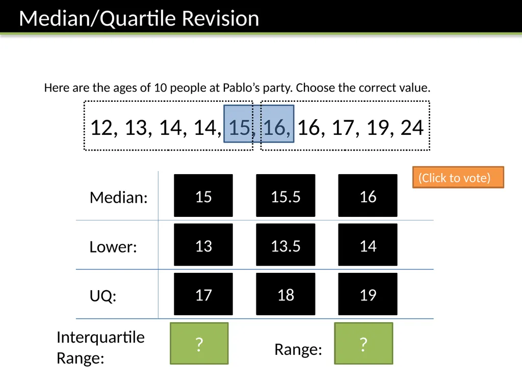
Here are the ages of 10 people at Pablo’s party. Choose the correct value. 12, 13, 14, 14, 15, 16, 16, 17, 19, 24 15 16 Median: 15.5 13 14 Lower: 13.5 17 19 UQ: 18 (Click to vote) Interquartile
Range: 3 Range: 12 ? ?<br>
13
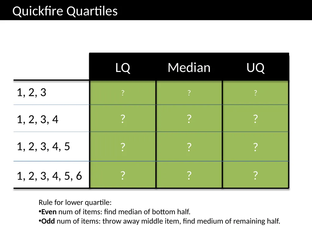
3 2.5 1.5 3.5 1.5 2 4.5 2 3.5 5 2 1 ? ? ? ? ? ? ? ? ? ? ? ? Quickfire Quartiles 1, 2, 3 LQ Median UQ 1, 2, 3, 4 1, 2, 3, 4, 5 1, 2, 3, 4, 5, 6 Rule for lower quartile:
Even num of items: find median of bottom half.
Odd num of items: throw away middle item, find medium of remaining half.<br>
14
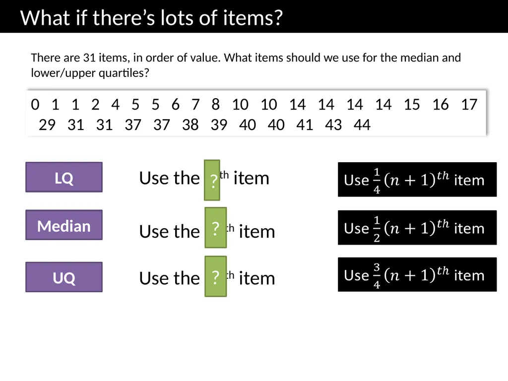
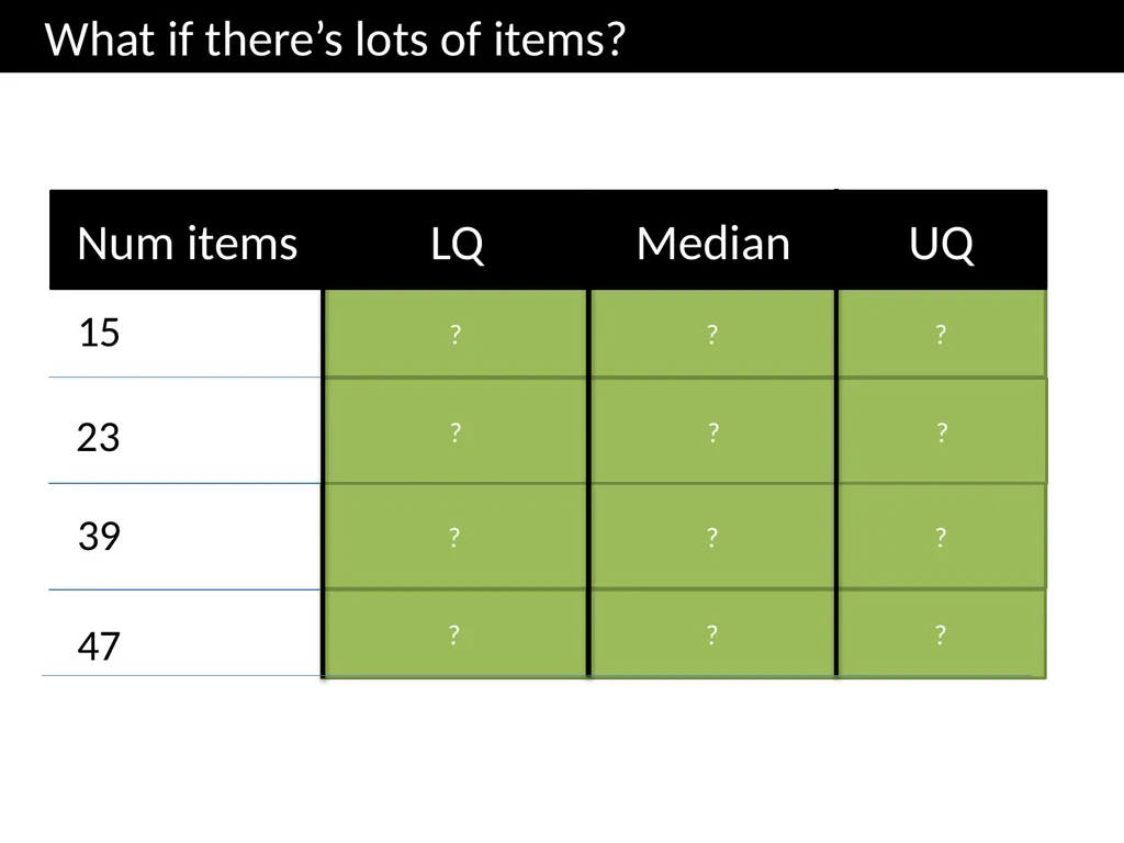
What if there’s lots of items? There are 31 items, in order of value. What items should we use for the median and lower/upper quartiles? 0 1 1 2 4 5 5 6 7 8 10 10 14 14 14 14 15 16 17 29 31 31 37 37 38 39 40 40 41 43 44 Use the 16th item Median LQ UQ Use the 8 th item Use the 24th item ? ? ?<br>
15
Num items 15 23 39 4th 8th 12th 6th 12th 18th 10th 20th 30th 12th 24th 36th 47 ? ? ? ? ? ? ? ? ? ? ? ? What if there’s lots of items? LQ Median UQ<br>
16
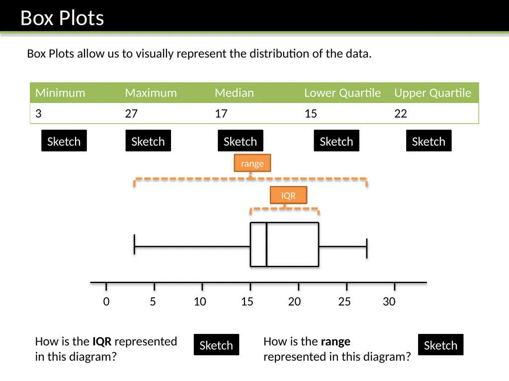
Box Plots Box Plots allow us to visually represent the distribution of the data. 0 5 10 15 20 25 30 Sketch Sketch Sketch Sketch Sketch How is the IQR represented in this diagram? How is the range represented in this diagram? Sketch Sketch<br>
17
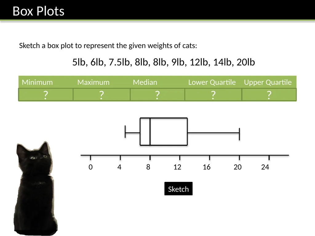
0 4 8 12 16 20 24 Sketch a box plot to represent the given weights of cats: 5lb, 6lb, 7.5lb, 8lb, 8lb, 9lb, 12lb, 14lb, 20lb ? ? ? ? ? Sketch<br>
18
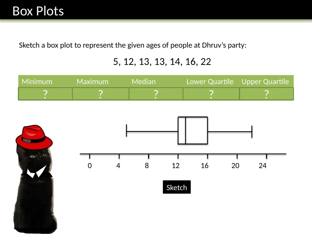
0 4 8 12 16 20 24 Sketch a box plot to represent the given ages of people at Dhruv’s party: 5, 12, 13, 13, 14, 16, 22 ? ? ? ? ? Sketch<br>
19
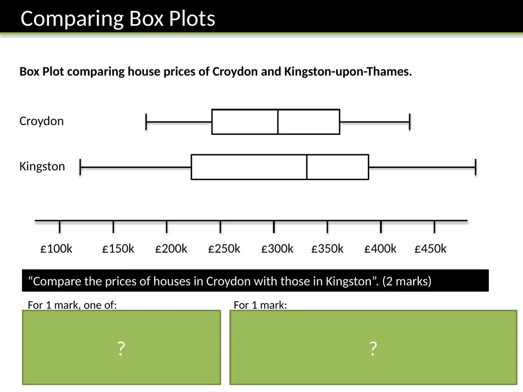
£100k £150k £200k £250k £300k £350k £400k £450k Kingston Croydon Box Plot comparing house prices of Croydon and Kingston-upon-Thames. “Compare the prices of houses in Croydon with those in Kingston”. (2 marks) For 1 mark, one of:
In interquartile range of house prices in Kingston is greater than Croydon.
The range of house prices in Kingston is greater than Croydon. For 1 mark:
The median house price in Kingston was greater than that in Croydon.
(Note that in old mark schemes, comparing the minimum/maximum/quartiles would have been acceptable, but currently, you MUST compare the median) ? ?<br>
20
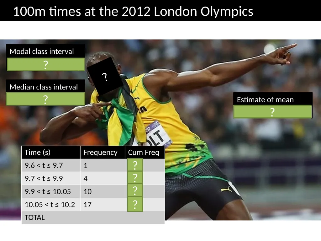
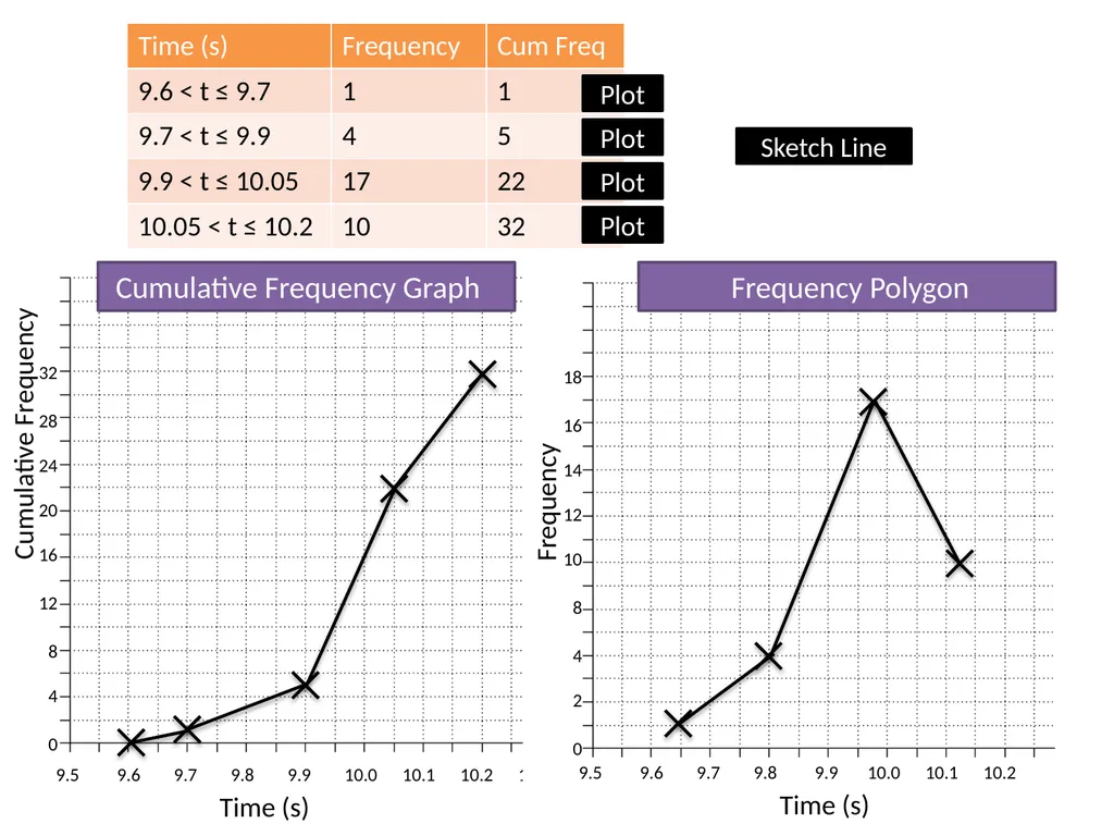
10.05 < t ≤ 10.2 Modal class interval 10.05 < t ≤ 10.2 Median class interval Estimate of mean 10.02 100m times at the 2012 London Olympics ? ? ? ? ? ? ? ?<br>
21
9.5 9.6 9.7 9.8 9.9 10.0 10.1 10.2 10.3 Time (s) Cumulative Frequency 32
28
24
20
16
12
8
4
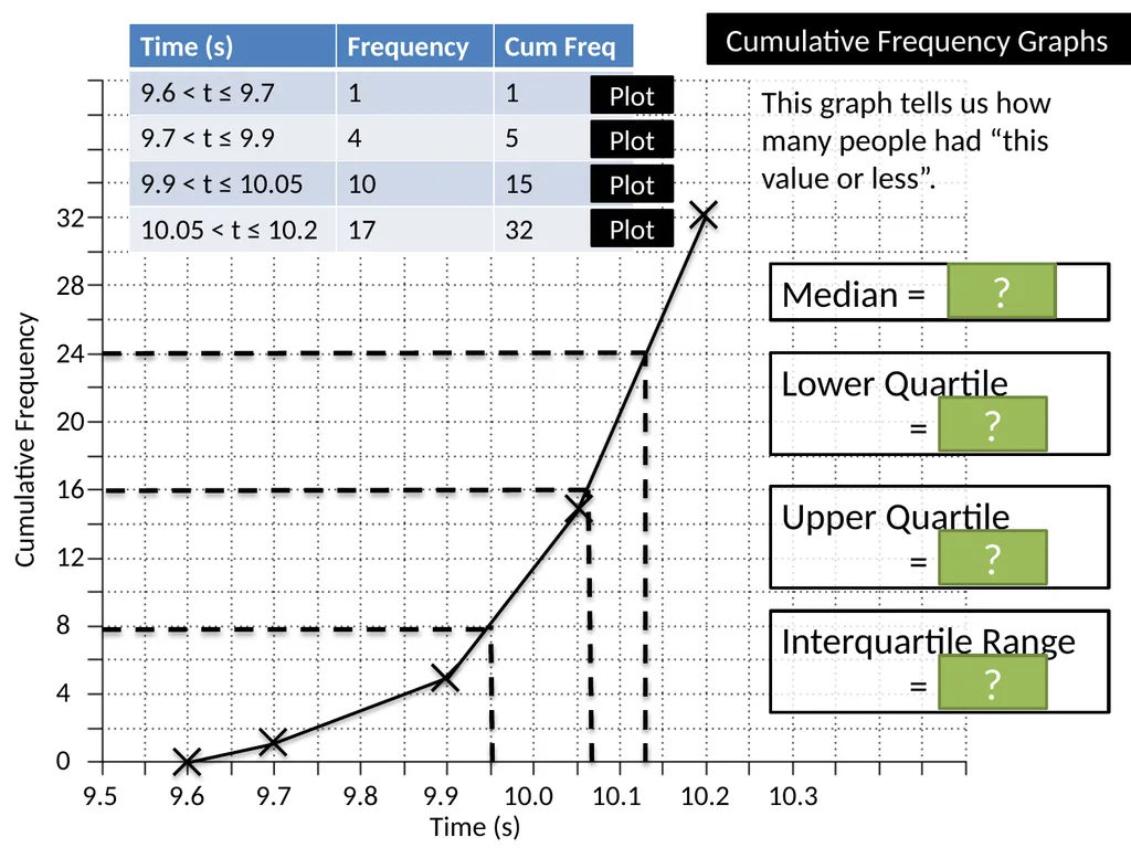
0 Median = 10.07s Lower Quartile
= 9.95s Upper Quartile
= 10.13s ? ? ? Interquartile Range
= 0.18s ? Cumulative Frequency Graphs Plot Plot Plot Plot This graph tells us how many people had “this value or less”.<br>
22
9.5 9.6 9.7 9.8 9.9 10.0 10.1 10.2 10.3 Time (s) Cumulative Frequency 32
28
24
20
16
12
8
4
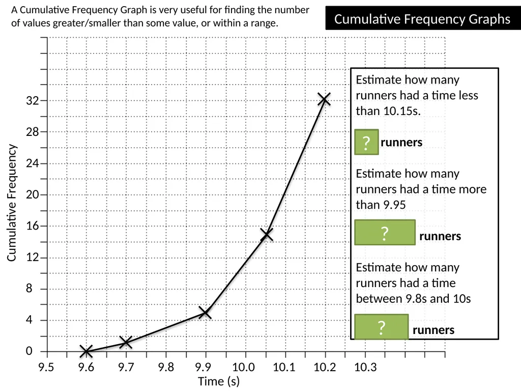
0 Cumulative Frequency Graphs Estimate how many runners had a time less than 10.15s.
26 runners
Estimate how many runners had a time more than 9.95
32 – 8 = 24 runners
Estimate how many runners had a time between 9.8s and 10s
11 – 3 = 8 runners ? ? A Cumulative Frequency Graph is very useful for finding the number of values greater/smaller than some value, or within a range. ?<br>
23
9.5 9.6 9.7 9.8 9.9 10.0 10.1 10.2 10.3 Time (s) Cumulative Frequency 32
28
24
20
16
12
8
4
0 Cumulative Frequency Graph Plot Plot Plot Plot Frequency 18
16
14
12
10
8
4
2
0 9.5 9.6 9.7 9.8 9.9 10.0 10.1 10.2 Time (s) Frequency Polygon Sketch Line<br>
24
Cumulative Frequency Graphs
Printed handout. Q5, 6, 7, 8, 9, 10 Reference: GCSE-GroupedDataCumFreq<br>
25
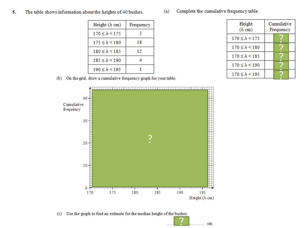
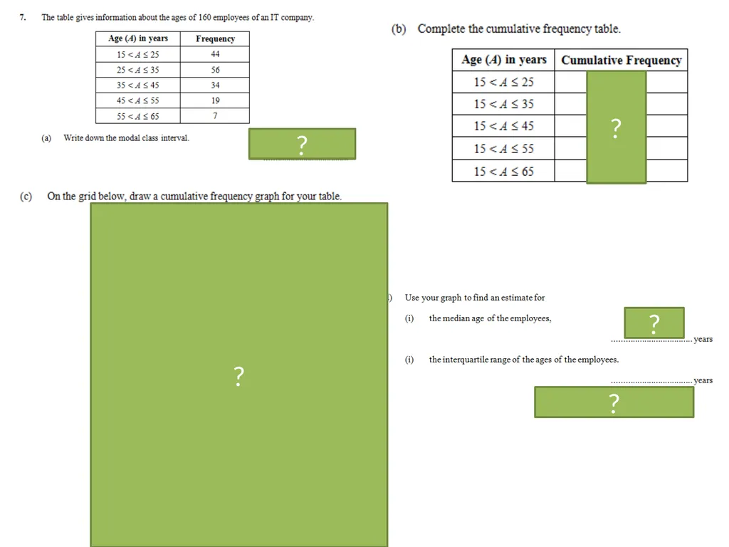
5
23
35
39
40 ? ? ? ? ? 179 ? ?<br>
26
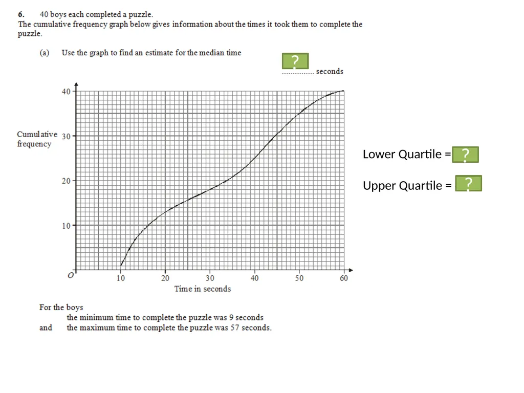
34 Lower Quartile = 16
Upper Quartile = 44.5 ? ? ?<br>
27
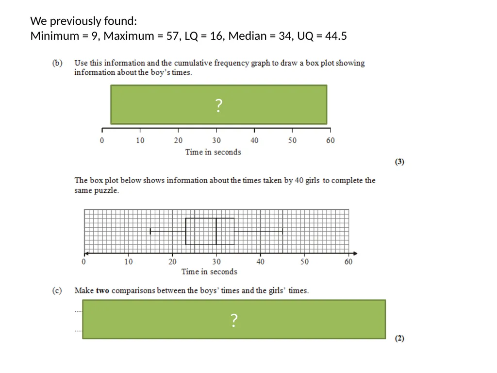
We previously found:
Minimum = 9, Maximum = 57, LQ = 16, Median = 34, UQ = 44.5 1 mark: Range/interquartile range of boys’ times is greater.
1 mark: Median of boys’ times is greater. ? ?<br>
28
44
100
134
153
160 30 ? ? ? ? ?<br>