/
Estimates of Genetic Ancestry Estimates of Genetic Ancestry

Estimates of Genetic Ancestry - PowerPoint Presentation

MrRightNow
MrRightNow . @MrRightNow
Follow
344 views
Uploaded On 2022-08-04

Estimates of Genetic Ancestry - PPT Presentation

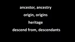
Sequence Analysis Workshop May 2015 University of Michigan TakeHome Points Allele frequencies differ between populations These difference cause confounding Using population as covariate may control such confounding ID: 935874

ancestry population stratification data population ancestry data stratification markers reference structure individuals pca populations coverage sample control genomic 2008

Share:

Link:

Embed:

Download Presentation from below link

Download Presentation The PPT/PDF document "Estimates of Genetic Ancestry" is the property of its rightful owner. Permission is granted to download and print the materials on this web site for personal, non-commercial use only, and to display it on your personal computer provided you do not modify the materials and that you retain all copyright notices contained in the materials. By downloading content from our website, you accept the terms of this agreement.


Presentation Transcript

Slide1

Estimates of Genetic Ancestry

Sequence Analysis Workshop

May 2015

University of Michigan

Slide2

Take-Home Points

Allele frequencies differ between populations.

These difference cause confounding.

Using “population” as covariate may control such confounding.

Population can be estimated from genetic data.

Low coverage data can be used with specialized methods.

Slide3

Sequence of Bottlenecks

National Geographic

Slide4

Isolation by Distance

Slide5

Assortative Mating

Slide6

Rare Varaints in Europe

EU

AA

AS

0.33

0.23

0.19

Median EU-EU: 0.71

Median EU-EU: 0.86

Median EU-EU: 0.98

EU

AA

AS

0.48

0.22

EU

AA

AS

0.90

0.61

0.19

0.63

Slide7

Stratification

Stratification occurs in the following scenario:

The phenotype is more common in one population.

Allele frequencies are different between populations.

Slide8

Stratification causes association

If

prevalences

differ between populations, every marker with differing allele frequencies will be associated to the disease. this creates a lot of false positives.

Not accounting for stratification can reduce the power to detect associated variants.

Cases

A

C

Controls

C

A

Slide9

ABO causes everything

Between 1950-60 a lot of traits were associated with the ABO blood group:

Cancer of the stomach

Gastric Ulcer

Diabetes Mellitus

Salivary tumors

Fracture of the neck and femur

All the results were caused by stratification

Slide10

Detecting stratification

Hardy-Weinberg Equilibrium

Not very powerful; confounded with QC

LD of unlinked markers

For example ancestry-informative markers

q-q plot

Slide11

Good q-q plot

Willer et al,

Nature Genetics, 2008

Slide12

Bad q-q plot

WTCC

Nature (2007) 447:661-78

Slide13

Genomic Control - Concept

Slide14

Genomic Control

Select al pairs of unlinked markers (

pairwise

distance >100kb)

Compute chi-squared for each marker

Inflation factor 

Average observed chi-squared

Median observed chi-squared / 0.456

Should be >= 1

Adjust statistic at candidate markers

Replace

²

biased

with ²

fair

= ²

biased

/

λ

also provides a convenient way to summarize magnitude of stratification.

Slide15

GC as diagnostic

The genomic control value examines markers with little evidence

for association

. If these large p-values were to deviate from expected

, there

is a problem! In this case, λ=1.02.

Slide16

Stratification in Burden Tests

QQ-plot rare variant burden test (CMAT)

Strongly inflated type I error in all cross-population comparisons

(n=900/900, MAF < 1%, Nonsense/

nonsynonymous

variants)

λ

50

is inflation of the median p-value.

(Devlin and Roeder, 1999)

Slide17

General Evaluation of Stratification

Select 2 populations.

Select case contribution.

Sample 30 variants from the 202 genes.

Calculate inflation based on observed frequency differences.

Slide18

Inflation by Mixture Proportion

Zawistowski et al. 2014

Slide19

Inflation across Comparisons

19

Slide20

Controlling for Stratification

Careful sampling (often not sufficient)

Family-based controls

Consider markers from the Null

Ancestry- informative markers

GWAS provides 300,000+

datapoints

from the Null.Genomic controlStructured association

PCA

Slide21

Why Genomic Control

Simple and convenient approach…

Easily adapted to other test statistics, such as those for quantitative trait and haplotype tests

However:

Stratification does not always inflate

p-value under the

alternative.

Results in extra loss of power.Not appropriate for gene –based tests.

Slide22

Estimating Population Structure

Available data is high-dimensional (thousands of makers

).

Populations can be modeled as categories or as a continuum.

Population can be used as

covaraite

.It is not clear that population structure is the same for common and for rare variants.

Slide23

Model-based clustering

STRUCTURE/ADMIXTURE/FRAPPE

Consider a set of markers

Model allele frequencies of (pre--‐specified)

K

discrete clusters

Optimal for AIMsComputationally challenging for large datasetsNot suitable for continuous population structure

Slide24

Human Genome Diversity Panel

Slide25

Results allows for other interpretations

Rosenberg et al,

Science, 2002)

Slide26

Principle Component Analysis

Model each genotype as quantitative variable

Number of copies of the minor allele

Identify small number of principal components (PC)

Linear combinations of observed genotype scores

Selected to explain variation in genotype scores

Typically, one to ten PC are modeled

Allow population structure to be visualized

Can be used as covariates in association analysis

Slide27

Principle Component Analysis

Principal component analysis (PCA) uses an orthogonal transformation to convert a set of observations of possibly correlated variables into a set of values of uncorrelated variables called principal components.

To perform the PCA, the matrix of k genotypes in n individuals is first normalized by

Eigenvectors and

Eigenvalues

are calculated by singular value decomposition.

“Large”

Eigenvalues

indicate that the corresponding Eigenvector reflects nonrandom population

stucture

.

Slide28

World-wide PCA

Li

et al.

(2008)

Science;

Jakobsson

et al. (2008)

Nature

Slide29

J Novembre

et al.

Nature

(

2008)

Population structure within Europe.

PCAs capture geographic structure

Slide30

Application to a GWAS

WTCCC,

Nature, 2007

Slide31

Potential Pitfalls in PCA

Including individuals of known geographic origin can help interpretation.

LD is a major correlation structure in genomic data. Large regions of correlated markers can have their own Eigenvectors. This can be controlled by checking the loading of all Eigenvectors.

Related Individuals will have their own Eigenvector.

Outlier distort smaller Eigenvectors. Analyses should be performed

multiple times, to

detect

and remove outliers

and a

final

time to infer structure in the remaining population.

Slide32

How many markers are needed?

Slide33

What happens if we have too few markers?

2,547 SNPs in POPRES data overlapped with whole

exome

sequencing

Slide34

What about off-target reads?

Slide35

LASER: Locating Ancestry from Sequence Reads

Traditional methods such as PCA cannot be directly applied on off-

­‐

target

s

equencing data

.Genotype uncertainty

Large amount of missing dataThe LASER method:

Use off-

­‐

target sequence reads to place sequenced samples one by one into a reference PCA map of ancestry

Directly analyze sequence reads without calling genotypes

Analyze each sample with a set of reference individuals

Slide36

Data used in LASER

Study samples:

low-coverage sequencing reads sparsely distributed across off-target regions.

Reference samples with known ancestry:

high- quality genome-wide SNP data.

Human Genome Diversity Panel (HGDP)

938 individuals from 53 worldwide populations

632,958 autosomal SNPs after QC Li et al.(

2008

) Science

Population Reference Sample (POPRES)

1,385 individuals from 37 European populations

318,682

autosomal

SNPs after QC

Novembre

et al. (

2008

) Nature

Slide37

Step 1: Generate Reference map with PCA

Slide38

Step 2: Adjust the reference

Consider a sample

i

with coverage

C

ij

at locus j. Let e be the error rate. Simulate sequence data for all reference individuals at site j assuming coverage Cij

.Count the number of non-reference reads at each position

Slide39

Example

1 Individual, 5 sites

Coverage varies from 0x to 5x

2 reference Individuals

Simulated

c

overage identical to sample

i

.

Slide40

Step 3: Perform PC on new data

Slide41

Step 4: Map on Reference Map

Slide42

Repeat

Slide43

All together

Wang

et al.

(2014)

Nat Genet

.

Slide44

Evaluation in World-Wide Sample

Slide45

Evaluation in European Sample

Slide46

What about Local Ancestry?

In admixed individuals, ancestry contributions differ along the genome.

The ancestry at a locus can be an important covariate for analysis.

Example: an African-American is expected to have genome-wide 20% and 80% of European and African ancestry, respectively.

Shriner D. (2013)

1 copy of each parental population

2

copies of parental population 2

Slide47

Methods to Infer Local Ancestry

Window-based

make

ancestry predictions

within

short

(overlapping) windows and then combine the

resultsHidden Markov ModelTrue underlying local ancestry is the hidden stateUse observed genotype to infer the local ancestry

Combing the information from neighboring loci

Slide48

HMM to Infer Local Ancestry

Price et al. (2009)

Slide49

HMM estimate

Slide50

Benefit of off-target coverage

Slide51

Take-Home Points

Allele frequencies differ between populations.

These difference cause confounding.

Using “population” as covariate may control such confounding.

Population can be estimated from genetic data.

Low coverage data can be used with specialized methods.