/
Charts & Graphs Practice Charts & Graphs Practice

Charts & Graphs Practice - PowerPoint Presentation

min-jolicoeur
min-jolicoeur . @min-jolicoeur
Follow
377 views
Uploaded On 2018-03-13

Charts & Graphs Practice - PPT Presentation

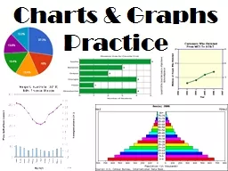
Circle Graph Graph used to the show different parts of a whole In this case the graph shows how zombies spend their time How do zombies spend the majority of their time 1 TrueFalse Zombies spend more time eating your brains than moaning and dancing combined ID: 649709

growth population years country population growth country years japan rate amount chart million amp africa graph countries people literacy pyramid percentage access

Share:

Link:

Embed:

Download Presentation from below link

Download Presentation The PPT/PDF document "Charts & Graphs Practice" is the property of its rightful owner. Permission is granted to download and print the materials on this web site for personal, non-commercial use only, and to display it on your personal computer provided you do not modify the materials and that you retain all copyright notices contained in the materials. By downloading content from our website, you accept the terms of this agreement.


Presentation Transcript

Slide1

Charts & Graphs PracticeSlide2

Circle Graph-Graph used to the show different parts of a whole.

In this case, the graph shows how zombies spend their time.Slide3

How do zombies spend the majority of their time?

1Slide4

True/False: Zombies spend more time eating your brains than moaning and dancing combined.

True: 23% compared to 20%

2Slide5

Japan

Europe

MexicoCanada

According to the pie graph, which individual country receives the most U.S. exports?

3Slide6

Top 5 countries, Dutch exports, 2010

What percentage of Dutch exports goes to Belgium?

24.3%11.1%

42.9%5.%

4Slide7

What category of products does China export the most of?

Textiles & clothing

Machinery & equipment

FoodstuffsOther

5Slide8

What does this circle graph show?

How many workers there are in the U.S.

How many workers take days off in the U.S.

How many paid holidays workers get in the U.S.How far workers travel on their holidays in the U.S.

6Slide9

What is the most popular amount of paid holidays for companies to give in a year?

10 days

11 days

12 daysMore than 13 days

7Slide10

What

percentage of the GDP did Health Care account for in 2000

?

7.0%

24.3%

24.2%

14.6%

8Slide11

Which category accounted for 6.9% of the GDP?

Education

Recreation

Transportation

Other

9Slide12

Bar Graphs

-Most often used for comparingSlide13

Am I better at naming state capitals or foreign countries?

10Slide14

Approximately how many One Direction songs can I name?Slide15

Line Graphs

-Best for showing change over timeSlide16

How many farms did the U.S. have in 1970?

3 million

12Slide17

Did the amount of U.S. farms decrease more between 1955-1960 or 1990-1995?

13Slide18

Approximately how many farms has the U.S. lost between 1950 and 1995?

5.6 million – 2 million = About 3.6 million

14Slide19

In which region of Africa did food production increase the most in the last 40 years?

Southern Africa

East Africa

West AfricaCentral Africa

15Slide20

How much wheat was produced in West Africa in 1981?

2 million tons

2 million pounds

1.5 million tons4 million tons

16Slide21

Which country experienced the largest growth in the amount of unemployed people between the years of 1980 and 1982?

Japan

United States

ItalyAll of the above

17Slide22

What is true about the percentage of unemployment in Japan and in the U.S. according to the graph?

There are more people working in Japan than in the U.S.

There are more people working in the U.S. than in Japan

.

c) Japan has had a much higher percentage of unemployment than the U.S.d) The U.S. has had a much higher percentage of unemployment than Japan

.

18Slide23

Population Pyramid-Shows the distribution of different age/gender groups in a population.Slide24

If a country is developing (like Nigeria) the pyramid will look like a pyramid.

Notice there aren’t very many old people.

Poor medical care, lack of access to technology, etc.

Notice there are lots of babies being born.

Little access to birth control, high infant mortality rate, large families are useful for farming, etc.Slide25

If a country is developed (like the USA), the pyramid will look kind of like a soda bottle.

Notice the decent amount of old people.

Notice we can control our birthrate.Slide26

Which of the following is this population experiencing?

Rapid population growth

A baby boom

Population declineAn aging populationA stable growth rate

A falling growth rate

19Slide27

Is Kenya showing rapid growth, slow growth, or negative population growth?

Based on this chart, is Kenya most likely a developed or developing country?

Developing because they’re having a huge population boom and they don’t have very many old people.

20

21Slide28

Which of the following applies to the United States?

Rapid Growth

Completely stable populationSlow growth over the last 10 years

Negative population growth

22Slide29

Which of the following most likely accounts for Germany’s negative population growth?

Little access to birth control

Increase in immigration from Asia & AfricaLower birth rates

Increased access to medical care

23Slide30

In the United States, do men or women usually live longer?

24Slide31

Which of the following best summarizes current population trends in the U.S.?Many more babies are being born now compared to 30 years ago.

Far fewer babies are being born now compared to 30 years ago.The # of babies is nearly equal to the amount born 30 years ago.Not enough info in this chart.

25Slide32

According to the population pyramid, which of these statements is false?

Elderly females outnumber elderly males in France.

The largest group of males in France is aged 35-39.French citizens most likely do not have access to good healthcare.The birthrate of France has been decreasing in recent decades.

26Slide33

What overall trend can be said about population in the EU and North Africa & West Asia?

The EU experienced more growth than NA & WA

NA & WA are much more developed than the EU

NA’s & WA’s population has far outgrown the EU’s

None of these answers

27Slide34

Which of the following could this population pyramid be used to determine?

The total population of children in Belize

The amount of men compared to the amount of women

The population growth rate

Belize’s literacy rateThe need for new technology in BelizeThe approximate number of women of child-bearing age

28Slide35

Which of the following statements is true?

The UK is a developing country.

The UK will have more 75-year-olds in 30 years than they do now.

The birthrate has only been decreasing for the last 80 years.

The UK has little access to healthcare.

29Slide36

Climate Graph

-Used to measure temperature and precipitation of a locationSlide37

What does the red line measure? How can you tell?

= Temperature

It makes sense that it’s higher in the summer, right?Slide38

What does the blue line measure?

= PrecipitationSlide39

If you wanted to visit Vancouver during the hottest month of the year when would you go?

30Slide40

If you love all forms of precipitation, when would be the best time to visit Vancouver?

31Slide41

What is the average temperature in April?

32Slide42

What is the average temperature in October for the city of Omsk?

1.8°F

4°F

9°F

19°F

33Slide43

Rome, Italy

According to the climate chart, which of these months has the highest average temperature?

October

AugustMay

April

34Slide44

Cartogram-Special type of map that distorts the shapes and sizes of places to convey statistical information.Slide45

What is this cartogram showing?

35Slide46

Which state has the most McDonald’s restaurants in the U.S.?

36Slide47

How many individual restaurants does the state of Oklahoma have?

About 10 squares = A little over 200 Restaurants

37Slide48

Why do you think Florida has more McDonald’s restaurants than Wyoming?

Florida has a much larger population than Wyoming.

38Slide49

What statistic is the cartogram measuring?

Gross Domestic Product

Total land area

Population

Per Capita Income

39Slide50

Which of these countries appears to have a high population density?

Kazakhstan

Saudi Arabia

Oman

Israel

41Slide51

World Map According to Land Area

Cartogram According to PopulationSlide52

What are some countries that have a large population density?

India

China

Japan

42Slide53

Wealth

What are some of the worlds wealthiest countries?

United States, United Kingdom, Japan, China, France, etc.

43Slide54

Which country in the chart is exporting the most oil?

Democratic Republic of the Congo

Sudan

ChadNigeria

44Slide55

Which country in the chart is exporting the least amount of diamonds?

Angola

Central African Republic

BotswanaSouth Africa

45Slide56

In which country do diamonds make up the highest percentage of the country’s total exports?

Angola

Central African Republic

BotswanaSouth Africa

46Slide57

Nothing because Angola has plenty of other exports.

Chad will go bankrupt.

Angola’s economy will suffer because it is very dependent on oil sales.

It’s a trick question. Angola doesn’t have any oil.Based on the chart, what is likely to happen if Angola runs out of oil supplies?

47Slide58

Which country has the highest total literacy rate?

Iran

Qatar

Saudi ArabiaIraq

48Slide59

Which country has the smallest difference in the literacy rate among men and the literacy rate among women?

Iran

Qatar

Saudi ArabiaIraq

49Slide60

According to the chart, which country probably values education the least?

Iran

Qatar

Saudi ArabiaIraq

50Slide61

Which measurement increased in both countries between 1990 and 2009?

Population

Adult Literacy Rate

Life ExpectancyAll of these answers

51Slide62

Which of these statements is supported by the chart?

Both countries have been becoming less developed in recent years.

Hungary has more people than India.

C. As India’s population increases, their literacy rate decreases.D. Both

countries’ life expectancies have increased by at least 5 years.

52