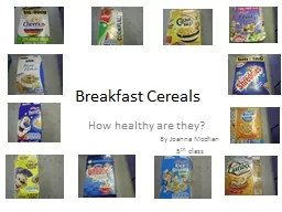
/
Which Cereals are the Healthiest? Which Cereals are the Healthiest?

Which Cereals are the Healthiest? - PowerPoint Presentation

mitsue-stanley
mitsue-stanley . @mitsue-stanley
Follow
438 views
Uploaded On 2017-05-01

Which Cereals are the Healthiest? - PPT Presentation

Michaela Todd Halley White Kalli Rasmussen Ellie Hagen Fiber more than 3 grams Sodium less than 240 grams Sugar less than 7 grams If a cereal meets two of these factors it is considered moderately healthy ID: 543631

plot data lsrl grams data plot grams lsrl residual healthy cereals sugar correlation sodium axis serving calories content moderate size outliers center

Share:

Link:

Embed:

Download Presentation from below link

Download Presentation The PPT/PDF document "Which Cereals are the Healthiest?" is the property of its rightful owner. Permission is granted to download and print the materials on this web site for personal, non-commercial use only, and to display it on your personal computer provided you do not modify the materials and that you retain all copyright notices contained in the materials. By downloading content from our website, you accept the terms of this agreement.


Presentation Transcript

Slide1

Which Cereals are the Healthiest?

Michaela Todd, Halley White, Kalli Rasmussen, Ellie HagenSlide2

Fiber (more than 3 grams)

Sodium (less than 240 grams)

Sugar (less than 7 grams)*If a cereal meets two of these factors, it is considered moderately healthy.*-For this study, moderately healthy will be considered healthy.http://www.eatingwell.com/nutrition_health

What makes a Cereal HealthySlide3

We used

www.ranker.com

to pick 30 of the most popular cereals. This is a good representation of the cereal population because any brand or type of cereal can be voted for on this website.We got our nutrition facts from caloriecount.about.com Our dataSlide4

Quantitative:

Serving Size

CaloriesFat (grams)Sodium (grams)Sugar Content (grams)FiberQualitative:Is the cereal healthy?Kid friendly

Variables of InterestSlide5

Brightly colored box- attracts kids’ attention.

Animals or characters (ex. Froot Loop’s toucan)- Most kids like animated characters so they like to eat cereals with their favorite characters on them.

Games on the back of the box- gives kids something to do while they eat their cereal in the morning.*At least two of the criteria has to be met for the cereal to be considered “kid friendly”.Criteria of Kid Friendly CerealSlide6

Out of our 30 cereal sample, we determined that 21 were targeted towards kids.

Out of the 21 kid targeted cereals, only 6 were considered moderately healthy or healthy.

All 9 cereals that we determined were not marketed towards kids were considered moderately healthy or healthy. According to our data, 6/21 or 29% of kid marketed cereals are healthy while 9/9 or 100% of non-kid marketed cereals are healthy.Based on the results of our study, we can conclude that cereals that are targeted towards children are generally less healthy than cereals that are not targeted towards children. *In this study moderately healthy and healthy are considered healthy.

Are Cereals targeted for young kids more or less healthy than ones not marketed as heavy for young kids?Slide7

Raw Data

Cereal

SS(cups)

Calories

Fat (g)

Sodium(g)

Sugar(g)

Fiber(g)

Healthy?

Kid Ad?

Raisin Bran

1

190

1

210

18

7

Moderate

No

Froot Loops

1

110

1

135

12

3

Moderate

Yes

LuckyCharms

0.75

110

1

170

10

2

No

Yes

Frosted Mini Wheats

1

190

1

0

11

6

Moderate

Yes

Special K

1

120

0.5

220

4

0

Moderate

No

Cinnamon Toast Crunch

0.75

130

2.8

210

9.9

2

No

Yes

Cheerios

1

110

1.8

200

1.2

3

Yes

No

Honey Bunches of Oats

1.75

120

1.5

140

6

2

Moderate

No

Frosted Flakes

0.75

110

0

150

10

1

No

YesSlide8

Honey Nut Cheerios

0.75

110

1.5

160

9

No

Yes

Apple Jacks

1

110

1

130

12

Moderate

Yes

Cap’n Crunch

0.75

109

1.6

202

11.8

No

Yes

Rice Krispies

1.25

130

0

190

4

Moderate

Yes

Cocoa Puffs

0.75

110

1.5

150

12

No

Yes

Corn Pops

1

120

0

105

9

Moderate

Yes

Golden Grahams

0.75

120

1

270

10

No

Yes

Honey Comb

1.5

130

1

180

10

No

Yes

Cookie Crisp

0.75

100

1

120

9

No

Yes

Trix

1

120

1.5

180

10

No

Yes

Reeses Puffs

075

120

3

160

10

No

YesSlide9

Life

1

150

1.9

200

7.5

2

Moderate

No

Cocoa Krispies

0.75

120

1

130

12

0.5

No

Yes

Corn Flakes

1

100

0

200

3

1

Moderate

No

Honey Smacks

0.75

100

0.5

40

15

1

No

Yes

Count Chocula

0.75

110

1

160

12

1

No

Yes

Fruity Pebbles

0.75

110

1

190

9

0

Moderate

Yes

Wheaties

0.75

100

0.5

190

4

3

Yes

No

Chex

1

120

0.5

220

3

2

Moderate

No

Kix

1.25

110

1

180

3

3

Yes

No

Waffle Crisp

1

120

2.5

115

12

1

No

YesSlide10

Serving Size (cup)

Calories

Fat (grams)

Sodium (grams)

Sugar Content (grams)

Fiber (grams)

Mean

0.94

120.3

1.12

163.57

8.98

1.92

Median

1

115

1175102Mode0.751101190101Max.1.751903270187Min.0.75100001.20Range190327016.87IQR0.251016562Q10.751100.513561Q311201.5200123Standard Deviation0.2421.750.7653.873.921.57Outliers0.375 &1.3751.75(Honey Bunches of oats)95 &135190(Raisin Bran, Frosted mini Wheats)150(Life)-1 & 33 grams (Reese’s Puffs)37.5 & 297.50 grams (Frosted Mini Wheats)3 & 213 grams (Corn Flakes, Chex, Kix)-2 & 67(Raisin Bran)

N D

U A

M T

E A

R

I

CSlide11

Serving Size

Shape- We can see from the histogram and the scatterplot that our data is skewed right.

Outliers- 1.75 cups (Honey Bunches of oats)

Center- Slide 10 shows the measures of center for Serving Size. We can see from the data that our values are concentrated in the .75 -1 cup range but measures of center, like the mean, are skewed right.

Spread- By looking at the Graphs we can see that the data is heavily concentrated between 0 and 1 cups.

From this data we can see that most cereals lie between the 0-1 cup range for Serving Size.Slide12

Calories

Shape- This data is skewed right.

Outliers- 190 Calories (Raisin Bran, Frosted mini Wheats)

150 Calories (Life)

Center- The measures of center on slide 10 also show that the data is skewed right.

Spread- The data is concentrated on the left side of the graph.

We can see from this data that most cereals lie in the 0-122.5 calorie range.Slide13

Fat Grams

Shape- The data is skewed to the right.

Outliers- 3 grams (Reese’s Puffs)

Center- The mean is skewed right as well.

Spread- The data is concentrated on the left side of the graph.

By looking at these graphs, we can determine that most cereals lie between 0-1.5 grams of fat.Slide14

Sodium

Shape- This data is skewed left.

Outliers- 0 grams (Frosted Mini Wheats)

Center- The measures of center show that the data is skewed left.

Spread- The data is concentrated on the right side of this graph.

By looking at these graphs we can determine that most cereals have between 75-225 grams of sodium. Most of our cereals meet the healthy criterion for Sodium more than 75% (Q3= 200).Slide15

Sugar Content

Shape- This data is bimodal.

Outliers- 3 grams (Corn Flakes, Chex, Kix)

Center- The measures of center seem to be accurate. They may be skewed a little bit to the left because of the outlier.

Spread- There is a higher concentration of data on the right side of the graph.

By looking at these graphs we can determine that most cereals fit within the middle values for Sugar Content (6-15 grams). A little more than 25% of our cereals meet the healthy criterion for Sugar Content (Q1= 6g).Slide16

Fiber

Shape- The data is skewed right.

Outliers- 7 grams (Raisin Bran)Center- The measures of center are skewed right as well because of the outlier.

Spread- The data is concentrated on the right side.

From this data we can see that most cereals lie in the 0-3.5 gram range for fiber. This shows us that the majority of our sample does not meet the 3 gram or higher criterion that needs to be met for a cereal to be considered healthy. More than 50% of our cereals do not meet this requirement. (Median= 2g).Slide17

Serving Size v. Calories

x-axis: Calories

y-axis: Serving Size (cups).Correlation: 0.227Coefficient of determination: 0.052 5.2% of data variation can be explained by the LSRL.

LSRL: y=0.003x+0.64 The LSRL does not make sense for this set of data because the relationship is not linear and has an extremely weak correlation.

The residual graph also shows that the LSRL is not reliable because all of the data falls in one section which is a pattern.

Scatter Plot

Residual PlotSlide18

x-axis: Fat (grams)

y-axis: Serving Size (cups)

Correlation: -0.089Coefficient of Determination: 0.011% of the variation of the data can be explained by the LSRL.LSRL: y=-0.03x+0.989 The LSRL is not reliable for this data set because the data has an extremely weak correlation. There are also a lot of outliers on the residual plot.

Serving Size v. Fat

Scatter Plot

Residual PlotSlide19

x-axis: Serving Size (cups)

y-axis: Sodium (g)

correlation: -0.018coefficient of determination: .00030.03% of the variation of the data can be explained by the LSRL.LSRL: y=-3.956+166.05

The LSRL is not reliable for this data set because the correlation is extremely weak and the residual plot shows a pattern.

Sodium v. Serving Size

Scatter Plot

Residual PlotSlide20

x-axis: Sugar Content (g)

y-axis: Serving Size (cups)

correlation: -0.215coefficient of determination: 0.0464.6% of the variation of the data can be explained by the LSRL.LSRL: y=-0.014x+1.08The LSRL is not reliable because the data has a very weak correlation and the residual plot has a lot of outliers.

Serving Size v. Sugar Content

Scatter Plot

Residual PlotSlide21

Calories vs. Fat grams

x= Calories y= Fat grams

r=0.618Coefficient of Determination:0.3891-This means that 38.91% can be predicted by the LSRLEquations for LSRL: y= 3.659x +114.414-The line does make sense for this data but the relationship is not very linear but the correlation is moderately strong -The Residual plot is a good fit for all the points but it does have some pattern to its form.

Scatter Plot

Residual PlotSlide22

Calories vs. Sodium

x= Sodium (grams) y= Calories

r= -0.131Coefficient of determination: 0.017-1.7% of the data can be predicted by the LSRL Equation for LSRL: y=-0.053x +128.937-The LSRL does not make sense for this data set because the relationship is nonlinear and a very weak correlation.

-The Residual plot is not good because it is too high for most of the points on the graph.

Scatter Plot

Residual PlotSlide23

Calories vs. Sugar content

x= sugar content (grams) y=calories

r=0.308Coefficient of determination:0.09499.49% of the data can be predicted by the LSRLEquation for LSRL: y=1.712x+104.926-The LSRL does not make sense because of the nonlinear relationship and the weak correlation-The residual plot looks like a good fit for all the points but there are outliers

Scatter Plot

Residual PlotSlide24

Calories vs. Fiber

x= Fiber (grams) y=Calories

r= 0.659 Coefficient of determination:0.43443.4% of the data can be predicted by the LSRLEquation for LSRL: y= 9.156x+ 102.72-The LSRL does make sense for this data. The relationship is nonlinear but the correlation is moderately strong.-Residual plot is good but it does have a few outliers.

Scatter Plot

Residual PlotSlide25

Fat Grams VS Sodium

jhjh

r=-0.087

y=-5.05x+167.492

The line of regression doesn’t make sense for this plot because it has a correlation of -0.087 and the graph isn’t linear.

X Axis: Fat grams

Y Axis: Sodium

Coefficient of determination: 0.00757

0.757% of the data can be predicted by this graph

The residual plot seems to be a good fit but there are a few outliers.

Scatter Plot

Residual PlotSlide26

Fat Grams VS Sugar Content

r=0.163

y=0.851x+7.839

The line of regression doesn’t make sense for this plot because it has a correlation of 0.163 and the graph isn’t linear.

X axis=Fat Grams

Y axis= Sugar Content

Coefficient of determination: 0.0266

2.66% of the data can be predicted by the LSRL

The residual plot shows no patterns or outliers.

Residual Plot

Scatter PlotSlide27

Sodium VS Sugar Content

r=-0.288

y=-0.021x+12.208

The line of regression doesn’t make sense for this plot because it has a correlation of -0.288 and the graph isn’t linear.

X axis=Sodium

Y axis= sugar content

Coefficient of determination:

0.0829

8.29% of the data can be predicted by the LSRL

The residual plot shows a slight pattern in the area above the line

Scatter Plot

Residual PlotSlide28

www.shodor.com

www.ranker.com

caloriecount.about.com http://www.eatingwell.com/nutrition_healthSources