/
 Bell Ringer Daily Agenda  Bell Ringer Daily Agenda

Bell Ringer Daily Agenda - PowerPoint Presentation

trish-goza
trish-goza . @trish-goza
Follow
342 views
Uploaded On 2020-04-04

Bell Ringer Daily Agenda - PPT Presentation

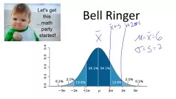
Review Bell Ringer Section 31 Section 32 Figure 31 is a histogram of the scores of all 947 seventhgrade students in Gary Indiana on the vocabulary part of the Iowa Tests of Basic Skills1 Scores of many students on this national test have a quite regular distribution The histogram is symm ID: 775311

curve density figure area curve density figure area median observations normal point deviation standard distribution arm histogram bars areas

Share:

Link:

Embed:

Download Presentation from below link

Download Presentation The PPT/PDF document " Bell Ringer Daily Agenda" is the property of its rightful owner. Permission is granted to download and print the materials on this web site for personal, non-commercial use only, and to display it on your personal computer provided you do not modify the materials and that you retain all copyright notices contained in the materials. By downloading content from our website, you accept the terms of this agreement.


Presentation Transcript

Slide1

Bell Ringer

Slide2

Daily Agenda

Review Bell Ringer

Section 3.1

Section 3.2

Slide3

Slide4

Slide5

Slide6

Figure 3.1 is a histogram of the scores of all 947 seventh-grade students in Gary, Indiana, on the vocabulary part of the Iowa Tests of Basic Skills.1 Scores of many students on this national test have a quite regular distribution. The histogram is symmetric, and both tails fall off smoothly from a single center peak. There are no large gaps or obvious outliers. The smooth curve drawn through the tops of the histogram bars in Figure 3.1 is a good description of the overall pattern of the data.

Slide7

Our eyes respond to the areas of the bars in a histogram. The bar areas represent proportions of the observations. Figure 3.2(a) is a copy of Figure 3.1 with the leftmost bars shaded. The area of the shaded bars in Figure 3.2(a) represents the students with vocabulary scores of 6.0 or lower. There are 287 such students, who make up the proportion 287/947 = 0.303 of all Gary seventh-graders.

Now look at the curve drawn through the bars. In Figure 3.2(b), the area under the curve to the left of 6.0 is shaded. We can draw histogram bars taller or shorter by adjusting the vertical scale. In moving from histogram bars to a smooth curve, we make a specific choice: adjust the scale of the graph so that the total area under the curve is exactly 1. The total area represents the proportion 1, that is, all the observations. We can then interpret areas under the curve as proportions of the observations. The curve is now a density curve. The shaded area under the density curve in Figure 3.2(b) represents the proportion of students with score 6.0 or lower. This area is 0.293, only 0.010 away from the actual proportion 0.303. The method for finding this area will be presented shortly. For now, note that the areas under the density curve give quite good approximations to the actual distribution of the 947 test scores.

Slide8

Slide9

Slide10

The histogram and density curve were both created from the data by software. Both show the overall shape and the “bumps” in the long right tail. The density curve shows a single high peak as a main feature of the distribution. The histogram divides the observations near the peak between two bars, thus reducing the height of the peak. A density curve is often a good description of the overall pattern of a distribution. Outliers, which are deviations from the overall pattern, are not described by the

curve.

Of course, no set of real data is exactly described by a density curve. The curve is an idealized description that is easy to use and accurate enough for practical use.

Slide11

Slide12

Slide13

Our measures of center and variability apply to density curves as well as to actual sets of observations. The median and quartiles are easy. Areas under a density curve represent proportions of the total number of observations. The median is the point with half the observations on either side. So the median of a density curve is the equal-areas point, the point with half the area under the curve to its left and the remaining half of the area to its right. The quartiles divide the area under the curve into quarters. One-fourth of the area under the curve is to the left of the first quartile, and three-fourths of the area is to the left of the third quartile. You can roughly locate the median and quartiles of any density curve by eye by dividing the area under the curve into four equal parts.

Slide14

Because density curves are idealized patterns, a symmetric density curve is exactly symmetric. The median of a symmetric density curve is therefore at its center. Figure 3.5(a) shows a symmetric density curve with the median marked. It isn’t so easy to spot the equal-areas point on a skewed curve. There are mathematical ways of finding the median for any density curve. That’s how we marked the median on the skewed curve in Figure 3.5(b).

Slide15

What about the mean? The mean of a set of observations is their arithmetic average. If we think of the observations as weights strung out along a thin rod, the mean is the point at which the rod would balance. This fact is also true of density curves. The mean is the point at which the curve would balance if made of solid material. Figure 3.6 illustrates this fact about the mean. A symmetric curve balances at its center because the two sides are identical. The mean and median of a symmetric density curve are equal, as in Figure 3.5(a). We know that the mean of a skewed distribution is pulled toward the long tail. Figure 3.5(b) shows how the mean of a skewed density curve is pulled toward the long tail more than is the median. It’s hard to locate the balance point by eye on a skewed curve. There are mathematical ways of calculating the mean for any density curve, so we are able to mark the mean as well as the median in Figure 3.5(b).

Slide16

Slide17

Because a density curve is an idealized description of a distribution of data, we need to distinguish between the mean and standard deviation of the density curve and the mean and standard deviation s computed from the actual observations. The usual notation for the mean of a density curve is μ (the Greek letter mu). We write the standard deviation of a density curve as σ (the Greek letter sigma). We can roughly locate the mean μ of any density curve by eye, as the balance point. There is no easy way to locate the standard deviation σ by eye for density curves in general.

mean of a density curve μ

standard deviation of a density curve σ

Slide18

Slide19

Slide20

One particularly important class of density curves has already appeared in Figures 3.1 and 3.2. They are

called Normal curves. The distributions they describe are called Normal distributions. Normal distributions play a large role in statistics, but they are rather special and not at all “normal” in the sense of being usual or average. We capitalize Normal to remind you that these curves are special. Look at the two Normal curves in Figure 3.8. They illustrate several important facts:

Slide21

Slide22

Slide23

Slide24

Slide25

Slide26

3.5 Upper

Arm Lengths. Anthropomorphic data are measurements on the human body that can track growth and weight of infants and children and evaluate changes in the body that occur over the adult life span. The resulting data can be used in areas as diverse as ergonomics and clothing design. The upper arm length of females over 20 years old in the United States is approximately Normal with mean 35.8 centimeters (cm) and standard deviation 2.1 cm. Draw a Normal curve on which this mean and standard deviation are correctly located. (Hint: Draw an unlabeled Normal curve, locate the points where the curvature changes, then add number labels on the horizontal axis.)As seen in Figure 3.11, the upper arm length is measured from the acromion process, the highest point of the shoulder, down the posterior surface of the arm to the tip of the olecranon process, the bony part of the mid-elbow

FIGURE 3.11

Correct tape placement when measuring upper arm length, for Exercise 3.5.

Slide27

3.6 Upper

Arm Lengths.

The upper arm length of females over 20 years old in the United States is approximately Normal with mean 35.8 centimeters (cm) and standard deviation 2.1 cm. Use the 68–95–99.7 rule to answer the following questions. (Start by making a sketch like Figure 3.10.)

(a)What range of lengths covers almost all (99.7%) of this distribution?

(b)What percent of women over 20 have upper arm lengths less than 33.7 cm?

Slide28

3.7Monsoon Rains

. The summer monsoon rains bring 80% of India’s rainfall and are essential for the country’s agriculture. Records going back more than a century show that the amount of monsoon rainfall varies from year to year according to a distribution that is approximately Normal with mean 852 millimeters (mm) and standard deviation 82 mm.

3

 Use the 68–95–99.7 rule to answer the following questions

.

(a)Between what values do the monsoon rains fall in 95% of all years

?

(b)How small are the monsoon rains in the driest 2.5% of all years?

Slide29