
Chapter 2 (part I) Bivariate Relationship and
SB
Published · 33 slides · 0 views
1 / 1
Description
Chapter 2 (part I) Bivariate Relationship and Two-way Table 2.1 Relationships 2.2 Scatterplots 2.3 Correlation 2.6 Data Analysis for Two-Way Tables 1 Associations Between Variables 2 Two variables measured on the same cases are associated
Related Topics
Share
Embed code
Download this presentation From Below
"Chapter 2 (part I) Bivariate Relationship and" is the property of its rightful owner. Permission is granted to download and print the materials on this website for personal, non-commercial use only, and to display it on your personal computer provided you do not modify the materials and that you retain all copyright notices contained in the materials. By downloading content from our website, you accept the terms of this agreement.
Presentation Transcript
01
Chapter 2 (part I)
Bivariate Relationship and Two-way Table 2.1 Relationships
2.2 Scatterplots
2.3 Correlation
2.6 Data Analysis for Two-Way Tables 1<br>
2.2 Scatterplots
2.3 Correlation
2.6 Data Analysis for Two-Way Tables 1<br>
02
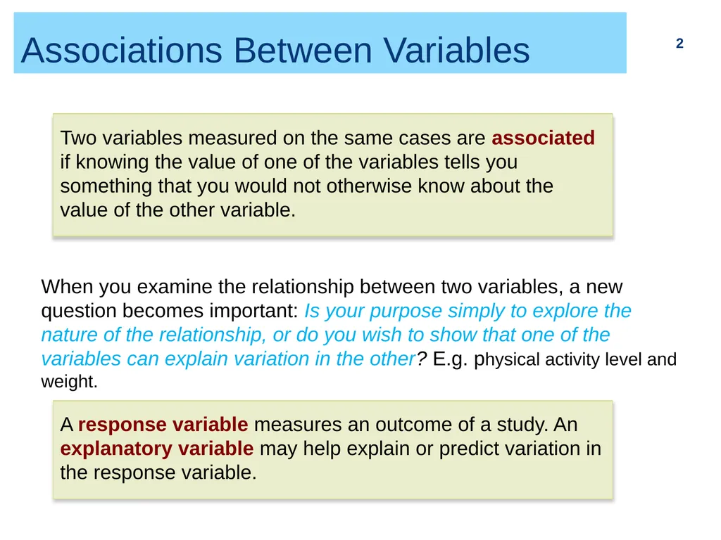
Associations Between Variables 2 Two variables measured on the same cases are associated if knowing the value of one of the variables tells you something that you would not otherwise know about the value of the other variable. When you examine the relationship between two variables, a new question becomes important: Is your purpose simply to explore the nature of the relationship, or do you wish to show that one of the variables can explain variation in the other? E.g. physical activity level and weight. A response variable measures an outcome of a study. An explanatory variable may help explain or predict variation in the response variable.<br>
03
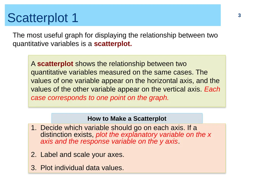
Scatterplot 1 3 The most useful graph for displaying the relationship between two quantitative variables is a scatterplot. A scatterplot shows the relationship between two quantitative variables measured on the same cases. The values of one variable appear on the horizontal axis, and the values of the other variable appear on the vertical axis. Each case corresponds to one point on the graph. How to Make a Scatterplot Decide which variable should go on each axis. If a distinction exists, plot the explanatory variable on the x axis and the response variable on the y axis.
Label and scale your axes.
Plot individual data values.<br>
Label and scale your axes.
Plot individual data values.<br>
04
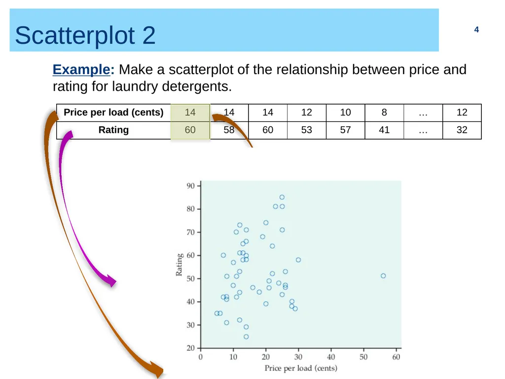
Scatterplot 2 4 Example: Make a scatterplot of the relationship between price and rating for laundry detergents.<br>
05
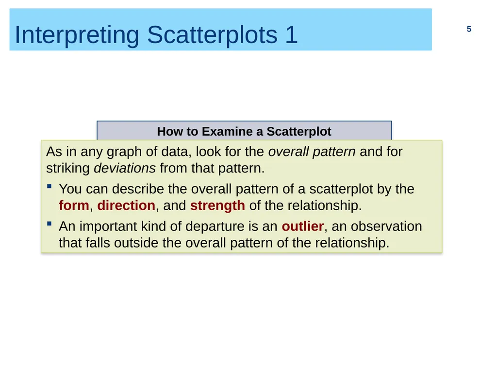
Interpreting Scatterplots 1 5 How to Examine a Scatterplot As in any graph of data, look for the overall pattern and for striking deviations from that pattern.
You can describe the overall pattern of a scatterplot by the form, direction, and strength of the relationship.
An important kind of departure is an outlier, an observation that falls outside the overall pattern of the relationship.<br>
You can describe the overall pattern of a scatterplot by the form, direction, and strength of the relationship.
An important kind of departure is an outlier, an observation that falls outside the overall pattern of the relationship.<br>
06
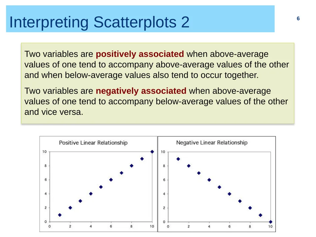
Interpreting Scatterplots 2 6 Two variables are positively associated when above-average values of one tend to accompany above-average values of the other and when below-average values also tend to occur together.
Two variables are negatively associated when above-average values of one tend to accompany below-average values of the other and vice versa.<br>
Two variables are negatively associated when above-average values of one tend to accompany below-average values of the other and vice versa.<br>
07
Interpreting Scatterplots 3 7<br>
08
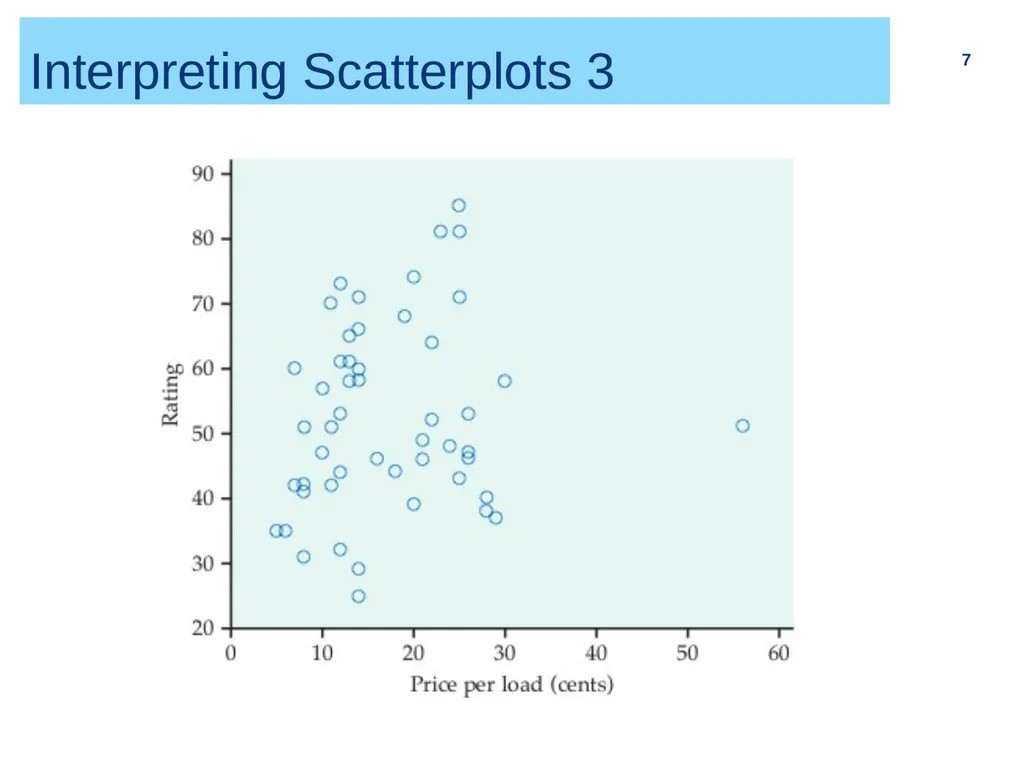
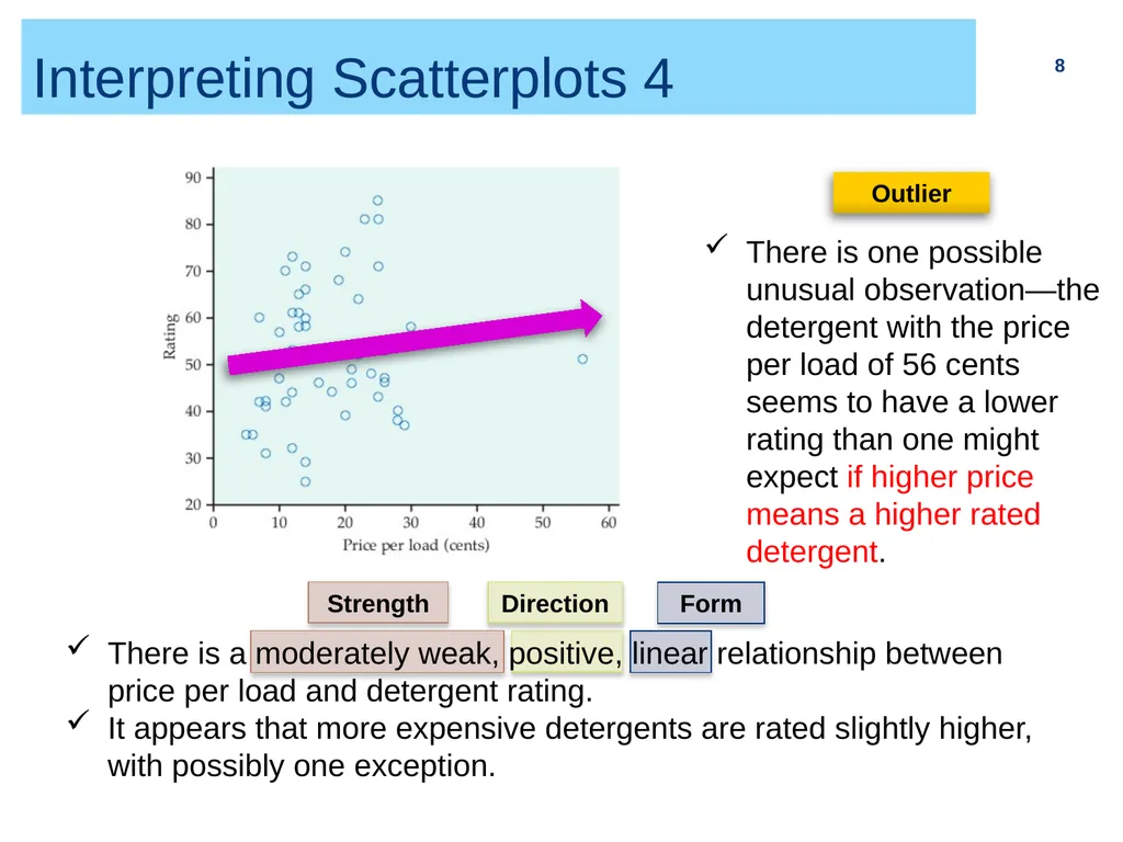
Interpreting Scatterplots 4 8 There is a moderately weak, positive, linear relationship between price per load and detergent rating.
It appears that more expensive detergents are rated slightly higher, with possibly one exception.<br>
It appears that more expensive detergents are rated slightly higher, with possibly one exception.<br>
09
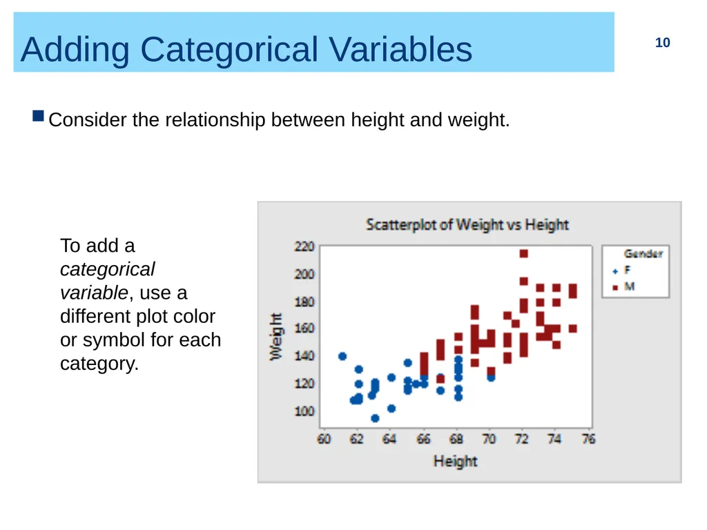
Adding Categorical Variables 10 Consider the relationship between height and weight. To add a categorical variable, use a different plot color or symbol for each category.<br>
10
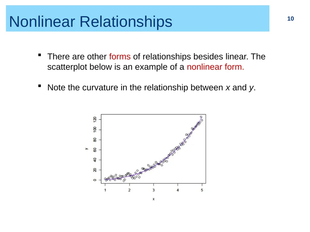
Nonlinear Relationships 10 There are other forms of relationships besides linear. The scatterplot below is an example of a nonlinear form.
Note the curvature in the relationship between x and y.<br>
Note the curvature in the relationship between x and y.<br>
11
Log Transformation 11 The log transformation:
can be used only for variables whose values are positive.
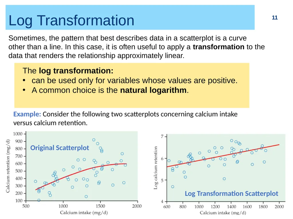
A common choice is the natural logarithm. Sometimes, the pattern that best describes data in a scatterplot is a curve other than a line. In this case, it is often useful to apply a transformation to the data that renders the relationship approximately linear. Example: Consider the following two scatterplots concerning calcium intake versus calcium retention. Original Scatterplot Log Transformation Scatterplot<br>
can be used only for variables whose values are positive.
A common choice is the natural logarithm. Sometimes, the pattern that best describes data in a scatterplot is a curve other than a line. In this case, it is often useful to apply a transformation to the data that renders the relationship approximately linear. Example: Consider the following two scatterplots concerning calcium intake versus calcium retention. Original Scatterplot Log Transformation Scatterplot<br>
12
2.3 Correlation Correlation coefficient r
Properties of r 12<br>
Properties of r 12<br>
13
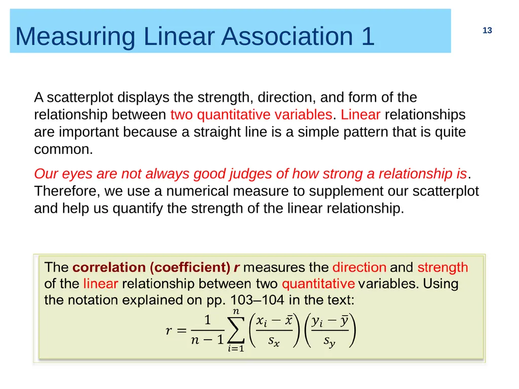
Measuring Linear Association 1 13 A scatterplot displays the strength, direction, and form of the relationship between two quantitative variables. Linear relationships are important because a straight line is a simple pattern that is quite common.
Our eyes are not always good judges of how strong a relationship is. Therefore, we use a numerical measure to supplement our scatterplot and help us quantify the strength of the linear relationship.<br>
Our eyes are not always good judges of how strong a relationship is. Therefore, we use a numerical measure to supplement our scatterplot and help us quantify the strength of the linear relationship.<br>
14
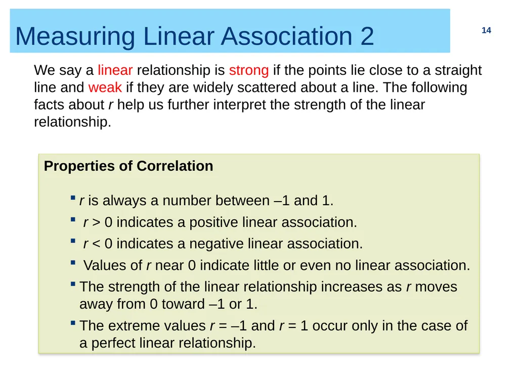
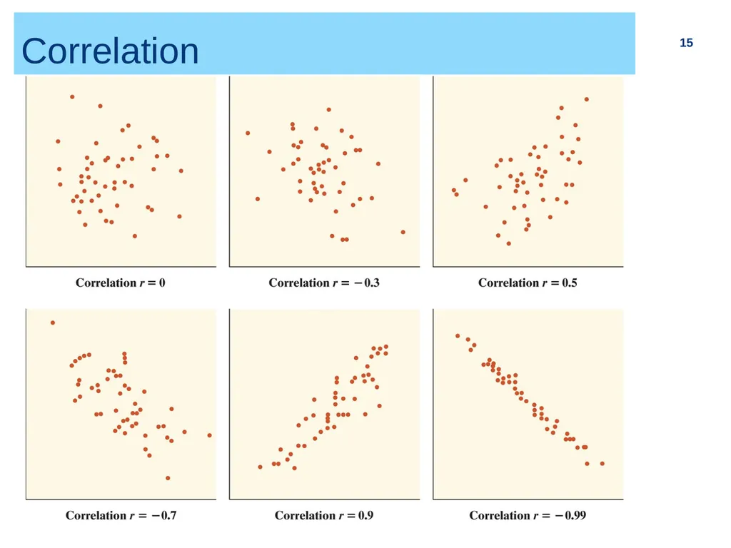
Measuring Linear Association 2 14 We say a linear relationship is strong if the points lie close to a straight line and weak if they are widely scattered about a line. The following facts about r help us further interpret the strength of the linear relationship. Properties of Correlation
r is always a number between –1 and 1.
r > 0 indicates a positive linear association.
r < 0 indicates a negative linear association.
Values of r near 0 indicate little or even no linear association.
The strength of the linear relationship increases as r moves away from 0 toward –1 or 1.
The extreme values r = –1 and r = 1 occur only in the case of a perfect linear relationship.<br>
r is always a number between –1 and 1.
r > 0 indicates a positive linear association.
r < 0 indicates a negative linear association.
Values of r near 0 indicate little or even no linear association.
The strength of the linear relationship increases as r moves away from 0 toward –1 or 1.
The extreme values r = –1 and r = 1 occur only in the case of a perfect linear relationship.<br>
15
Correlation 15<br>
16
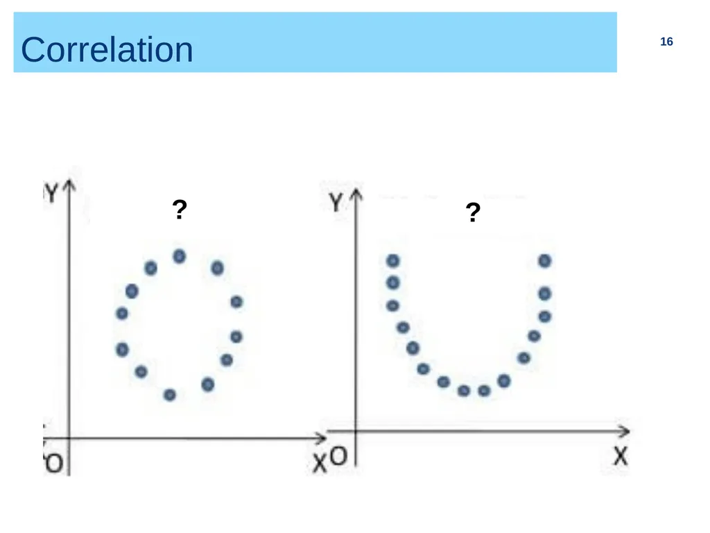
Correlation 16 ? ?<br>
17
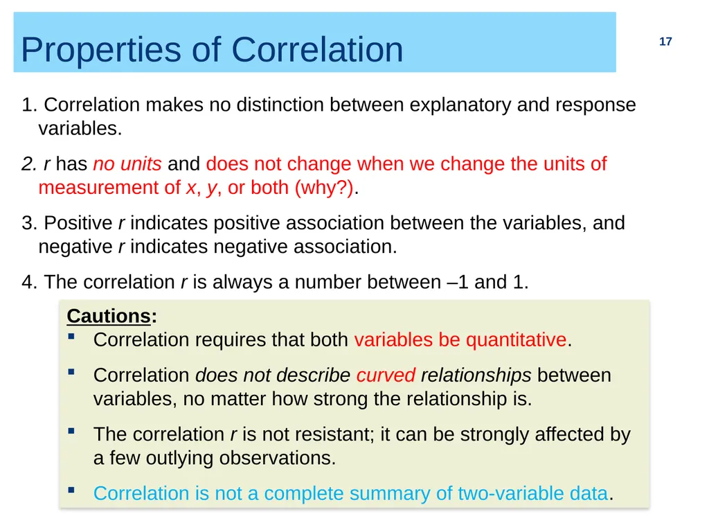
Properties of Correlation 17 Correlation makes no distinction between explanatory and response variables.
r has no units and does not change when we change the units of measurement of x, y, or both (why?).
Positive r indicates positive association between the variables, and negative r indicates negative association.
The correlation r is always a number between –1 and 1. Cautions:
Correlation requires that both variables be quantitative.
Correlation does not describe curved relationships between variables, no matter how strong the relationship is.
The correlation r is not resistant; it can be strongly affected by a few outlying observations.
Correlation is not a complete summary of two-variable data.<br>
r has no units and does not change when we change the units of measurement of x, y, or both (why?).
Positive r indicates positive association between the variables, and negative r indicates negative association.
The correlation r is always a number between –1 and 1. Cautions:
Correlation requires that both variables be quantitative.
Correlation does not describe curved relationships between variables, no matter how strong the relationship is.
The correlation r is not resistant; it can be strongly affected by a few outlying observations.
Correlation is not a complete summary of two-variable data.<br>
18
2.6 Data Analysis for
Two-Way Tables The two-way table
Marginal distributions
Conditional distributions
Simpson’s paradox 18<br>
Marginal distributions
Conditional distributions
Simpson’s paradox 18<br>
19
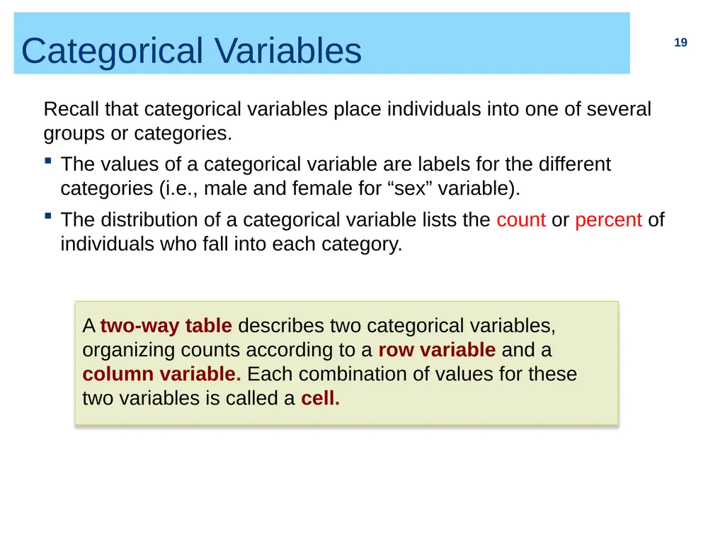
Categorical Variables 19 Recall that categorical variables place individuals into one of several groups or categories.
The values of a categorical variable are labels for the different categories (i.e., male and female for “sex” variable).
The distribution of a categorical variable lists the count or percent of individuals who fall into each category. A two-way table describes two categorical variables, organizing counts according to a row variable and a column variable. Each combination of values for these two variables is called a cell.<br>
The values of a categorical variable are labels for the different categories (i.e., male and female for “sex” variable).
The distribution of a categorical variable lists the count or percent of individuals who fall into each category. A two-way table describes two categorical variables, organizing counts according to a row variable and a column variable. Each combination of values for these two variables is called a cell.<br>
20
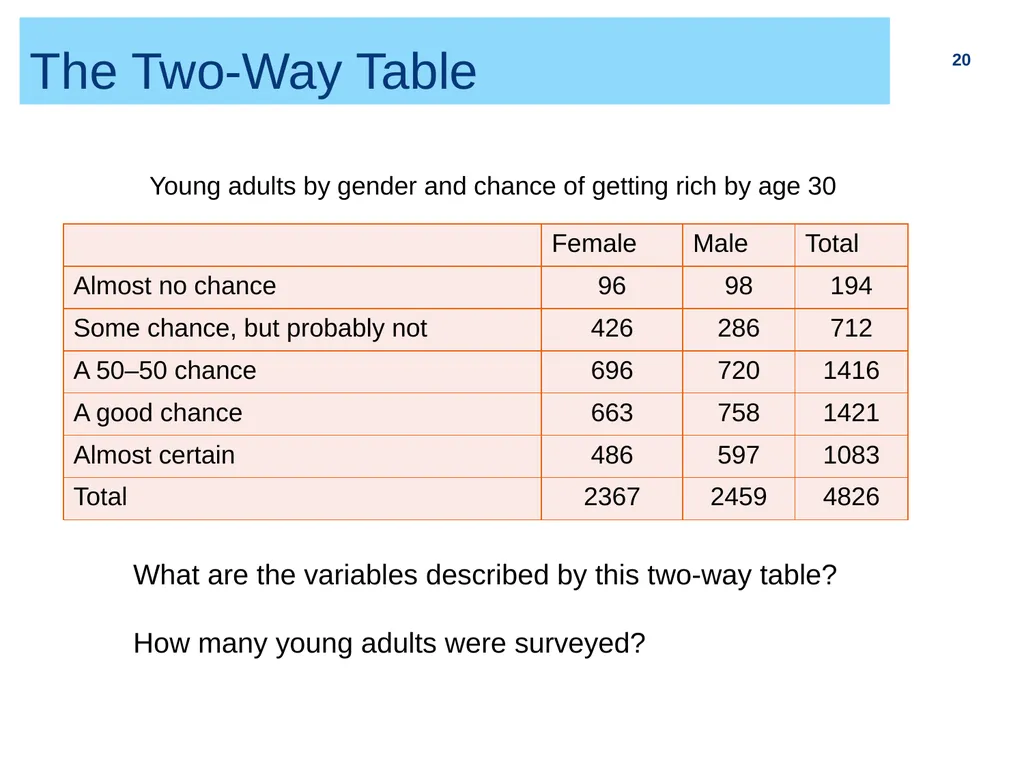
The Two-Way Table 20 Young adults by gender and chance of getting rich by age 30 What are the variables described by this two-way table?
How many young adults were surveyed?<br>
How many young adults were surveyed?<br>
21
Marginal Distribution 1 21 The marginal distribution of one variable in a two-way is the distribution of that variable ignoring the other variable. Note: Percentages are often more informative than counts, especially when comparing groups of different sizes.
To examine a marginal distribution:
Divide each row (or column) total by the grand total to obtain the marginal distribution in percentages.
Make a graph to display the marginal distribution.<br>
To examine a marginal distribution:
Divide each row (or column) total by the grand total to obtain the marginal distribution in percentages.
Make a graph to display the marginal distribution.<br>
22
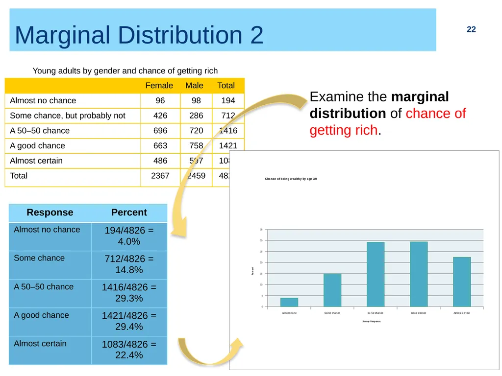
Marginal Distribution 2 22 Examine the marginal distribution of chance of getting rich. Young adults by gender and chance of getting rich<br>
23
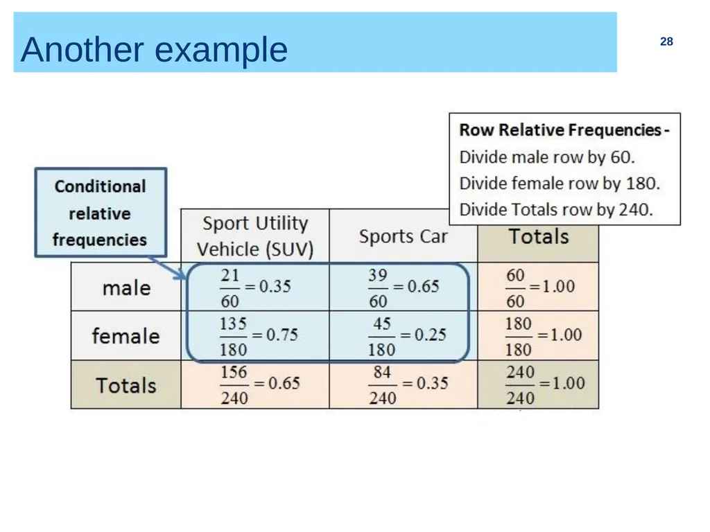
Conditional Distribution 1 23 Marginal distributions tell us nothing about the relationship between two variables. For that, we need to explore the conditional distributions of the variables. A conditional distribution of a variable describes the distribution of that variable among individuals who have a specific value of another variable. To examine or compare conditional distributions:
Select the row(s) or column(s) of interest.
Use the data in the table to calculate the conditional distribution (in percent) of the row(s) or column(s). Note that the denominator is the total for the group being conditioned on, not the grand total.
Make a graph to display the conditional distribution.
Use a side-by-side bar graph or segmented bar graph to compare distributions.<br>
Select the row(s) or column(s) of interest.
Use the data in the table to calculate the conditional distribution (in percent) of the row(s) or column(s). Note that the denominator is the total for the group being conditioned on, not the grand total.
Make a graph to display the conditional distribution.
Use a side-by-side bar graph or segmented bar graph to compare distributions.<br>
24
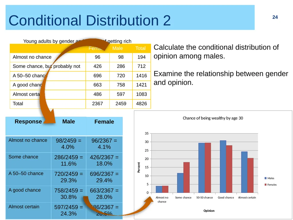
Conditional Distribution 2 24 Calculate the conditional distribution of opinion among males.
Examine the relationship between gender and opinion. Young adults by gender and chance of getting rich<br>
Examine the relationship between gender and opinion. Young adults by gender and chance of getting rich<br>
25
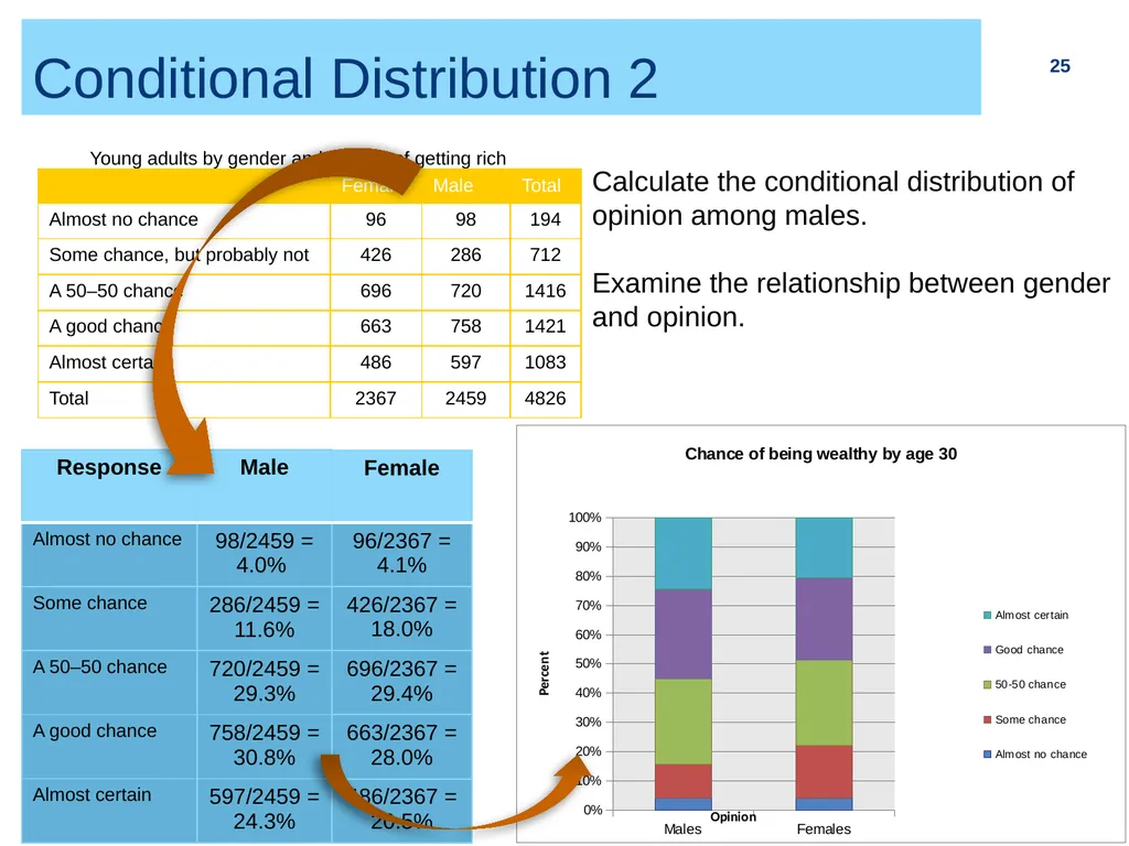
Conditional Distribution 2 25 Calculate the conditional distribution of opinion among males.
Examine the relationship between gender and opinion. Young adults by gender and chance of getting rich<br>
Examine the relationship between gender and opinion. Young adults by gender and chance of getting rich<br>
26
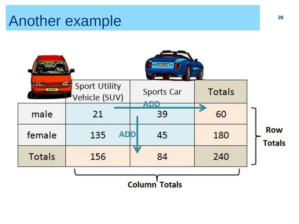
Another example 26<br>
27
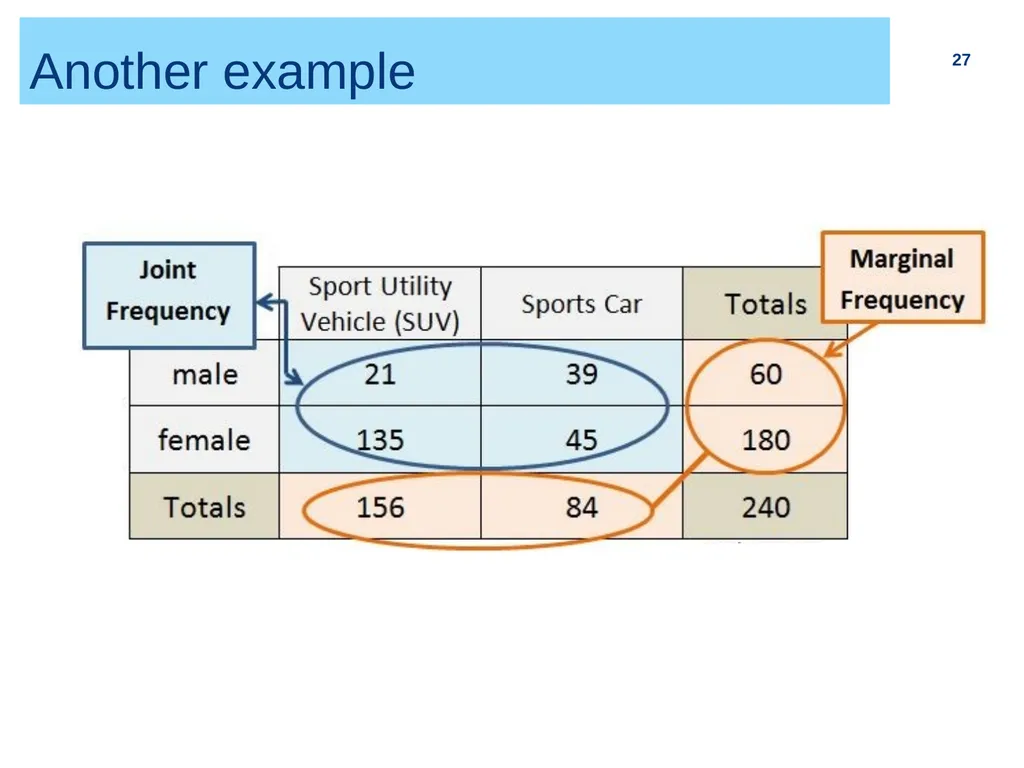
Another example 27<br>
28
Another example 28<br>
29
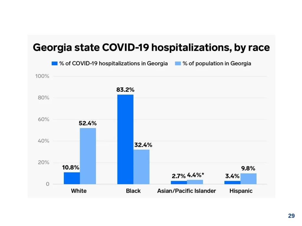
29<br>
30
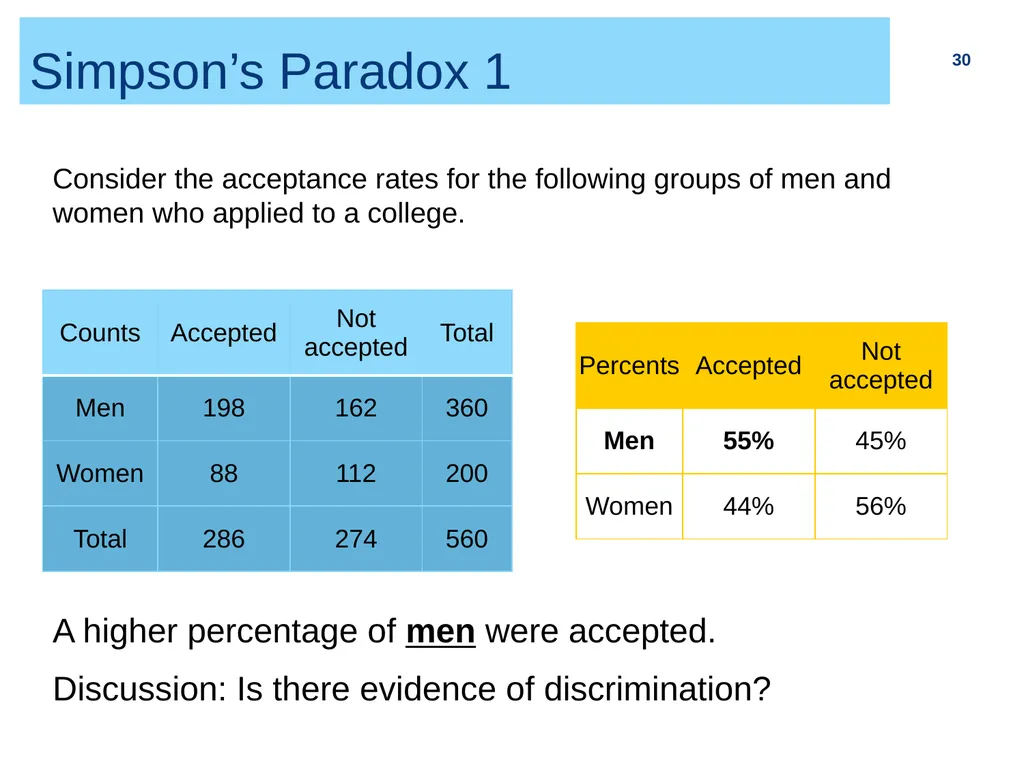
Simpson’s Paradox 1 30 Consider the acceptance rates for the following groups of men and women who applied to a college. A higher percentage of men were accepted.
Discussion: Is there evidence of discrimination?<br>
Discussion: Is there evidence of discrimination?<br>
31
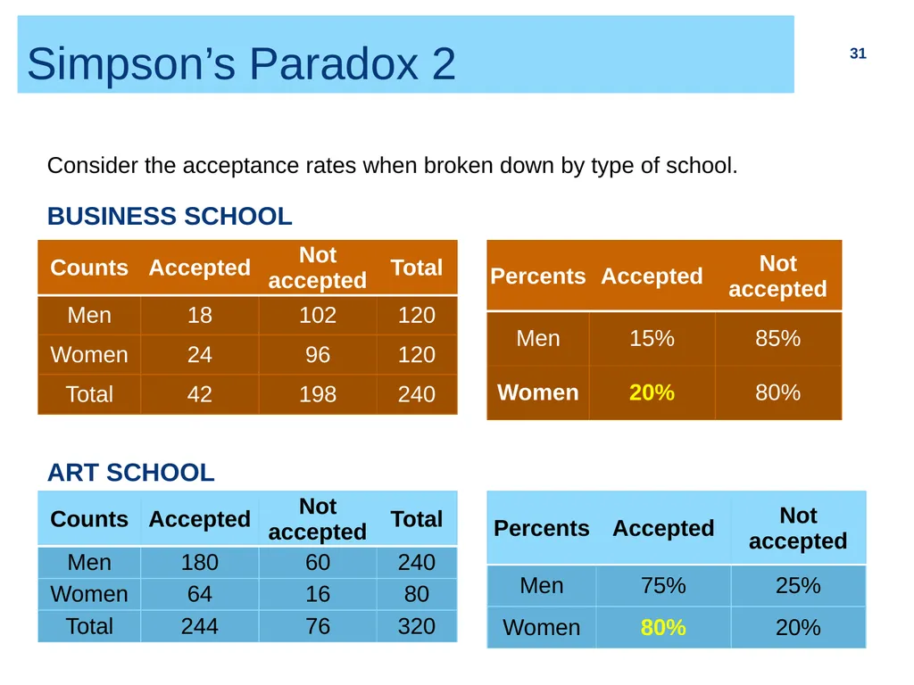
Simpson’s Paradox 2 31 Consider the acceptance rates when broken down by type of school. BUSINESS SCHOOL ART SCHOOL<br>
32
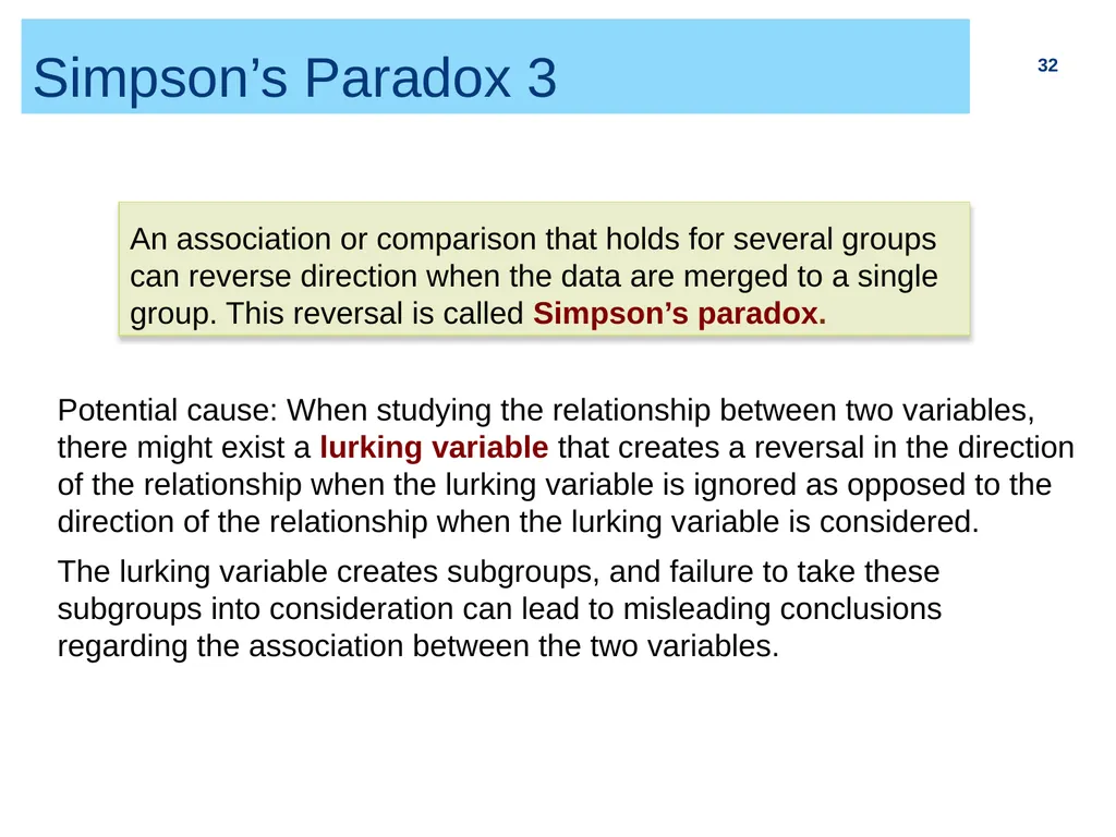
Simpson’s Paradox 3 32 Potential cause: When studying the relationship between two variables, there might exist a lurking variable that creates a reversal in the direction of the relationship when the lurking variable is ignored as opposed to the direction of the relationship when the lurking variable is considered.
The lurking variable creates subgroups, and failure to take these subgroups into consideration can lead to misleading conclusions regarding the association between the two variables. An association or comparison that holds for several groups can reverse direction when the data are merged to a single group. This reversal is called Simpson’s paradox.<br>
The lurking variable creates subgroups, and failure to take these subgroups into consideration can lead to misleading conclusions regarding the association between the two variables. An association or comparison that holds for several groups can reverse direction when the data are merged to a single group. This reversal is called Simpson’s paradox.<br>
33
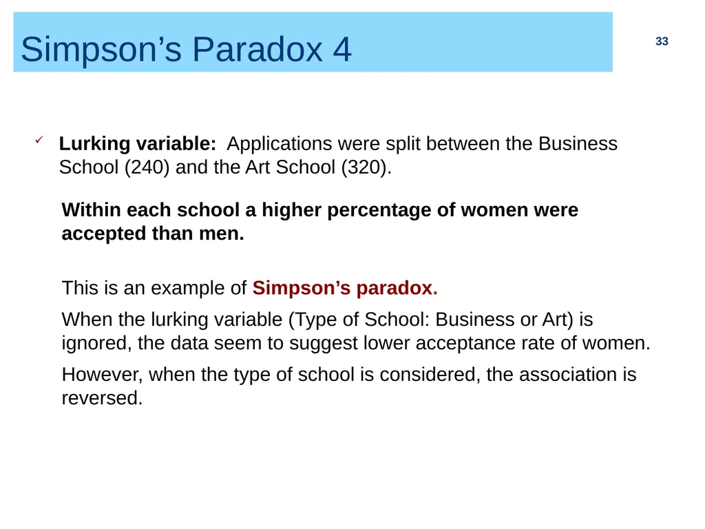
Simpson’s Paradox 4 33 Lurking variable: Applications were split between the Business School (240) and the Art School (320). Within each school a higher percentage of women were accepted than men.
This is an example of Simpson’s paradox.
When the lurking variable (Type of School: Business or Art) is ignored, the data seem to suggest lower acceptance rate of women.
However, when the type of school is considered, the association is reversed.<br>
This is an example of Simpson’s paradox.
When the lurking variable (Type of School: Business or Art) is ignored, the data seem to suggest lower acceptance rate of women.
However, when the type of school is considered, the association is reversed.<br>