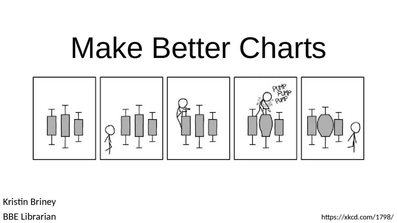
BBE Librarian httpsxkcdcom1798 Its not enough to collect data You also need to effectively convey it Learning Outcomes Participants will be able to choose the right chart for their message and type of data ID: 912263
Download Presentation The PPT/PDF document "Make Better Charts Kristin Briney" is the property of its rightful owner. Permission is granted to download and print the materials on this web site for personal, non-commercial use only, and to display it on your personal computer provided you do not modify the materials and that you retain all copyright notices contained in the materials. By downloading content from our website, you accept the terms of this agreement.
Slide1
Make Better Charts
Kristin BrineyBBE Librarian
https://xkcd.com/1798/
Slide2It’s not enough to collect data.You also need to effectively convey it.
Slide3Learning OutcomesParticipants will be able to choose the right chart for their message and type of data
Participants will be able to make good design decisions to highlighting what’s important and eliminating excess information
Slide4Learning OutcomesParticipants will be able to choose the right chart for their message and type of data
Participants will be able to make good design decisions to highlighting what’s important and eliminating excess information
Focusing on the very basics for a good foundation
Slide5Choose the Right Chart
Slide6What is your message?
Slide7Same DataDifferent Charts
http://flowingdata.com/2017/01/24/one-dataset-visualized-25-ways/
Slide8Same DataDifferent Charts
http://flowingdata.com/2017/01/24/one-dataset-visualized-25-ways/
Slide9Same DataDifferent Charts
http://flowingdata.com/2017/01/24/one-dataset-visualized-25-ways/
Slide10Same DataDifferent Charts
http://flowingdata.com/2017/01/24/one-dataset-visualized-25-ways/
Slide11Same DataDifferent Charts
http://flowingdata.com/2017/01/24/one-dataset-visualized-25-ways/
Slide12What is your message?
Slide13What is your message?
Hint: make it the title of your chart
Slide14Let’s Break it Down by Your Type of DataA single number
ComparisonBeating a benchmarkSurvey resultsParts of a whole
CorrelationsChange over timeQualitative data [not covered]
Adapted from
Evergreen, S. D. H. (2017).
Effective data visualization: The right chart for the right data
.
Slide15Research Says The Best Charts Are…
Adapted from
Evergreen, S. D. H. (2017).
Effective data visualization: The right chart for the right data
.
Position on common scale
Position on non-aligned scales
Length
Direction
Angle
Area
Volume
Curvature
Slide16Choose Your Chart
Adapted from Evergreen, S. D. H. (2017).
Effective data visualization: The right chart for the right data
.
Big number
1
Icon array
2
Pie chart
Bar/column chart
Side-by-side column chart
Slope graph
3
Back-to-back bar chart
4
Dot plot
5
Small multiples
6
Column chart with benchmark
7
Combo chart
8
Stacked bar/column chart
Number and icon
Histogram
9
Map
Scatterplot
Diagram
Line chart
Deviating bar chart
Do not visualize
Single number
X
X
X
X
Comparison
X
X
X
X
X
Beating a benchmark
X
X
Survey results
X
X
X
X
X
X
Parts of a whole
X
X
X
X
Correlations
X
X
X
Change over time
X
X
X
X
X
Non-Standard Charts
Slide18Introducing…Big numberIcon array
Slope graphBack-to-back bar chartDot plot
Small multiplesColumn chart with benchmark lineCombo chart
Histogram
Slide19Big Number1
https://web.archive.org/save/_embed/http://www.vizhealth.org/gallery/assets/48/
Slide20Icon Array2
By Nick.mon - Own work, CC BY-SA 4.0, https://commons.wikimedia.org/w/index.php?curid=37688014
Slide21Slope Graph3
http://www.vizwiz.com/2016/07/the-data-school-gym-slope-graphs-with.html
Slide22Back-to-Back Bar Chart4
http://www.exceluser.com/training/charts/excel-chart-058.htm
Slide23Dot Plot5
http://betterevaluation.org/en/evaluation-options/dot_plot
Slide24Small Multipleshttp://flowingdata.com/2017/01/24/one-dataset-visualized-25-ways/
6
Slide25Bar Chart withBenchmark Linehttp://www.pewforum.org/2016/12/13/religion-and-education-around-the-world/#religions-vary-in-educational-attainment
7
Slide26Combo Chart8
Johnston
, L. R., Carlson, J., Hudson-Vitale, C., Imker
, H., Kozlowski, W.,
Olendorf
, R., & Stewart, C. (2018). How Important is Data Curation? Gaps and Opportunities for Academic Libraries. Journal of Librarianship and Scholarly Communication, 6(1), eP2198. DOI:
http://
doi.org/10.7710/2162-3309.2198
. Used under a CC BY license.
Slide27Histogram9
http://minimaxir.com/2015/02/ggplot-tutorial/
Slide28Activity 1
Pew Research
Center’s “Americans and Privacy: Concerned, Confused and Feeling Lack of Control Over Their Personal Information” [
https://www.pewresearch.org/internet/2019/11/15/americans-and-privacy-concerned-confused-and-feeling-lack-of-control-over-their-personal-information
/
]
Americans and Privacy: Concerned, Confused and Feeling Lack of Control Over Their Personal Information
%
who say they feel __ control over who can access the following types of their information
A lot
A little
No
Private conversations online, text
messaging
13
49
37
Purchases made online, in
person
12
43
45
Search terms they use
online
9
39
48
Their physical
location
18
54
28
Their posts, activities on social
media
16
50
35
Websites they
visit
10
44
41
Slide29A lot
A little
No
Private conversations online, text
messaging
13
49
37
Purchases made online, in
person
12
43
45
Search terms they use
online
9
39
48
Their physical
location
18
54
28
Their posts, activities on social
media
16
50
35
Websites they
visit
10
44
41
Big number
1
Icon array
2
Pie chart
Bar/column chart
Side-by-side column chart
Slope graph
3
Back-to-back bar chart
4
Dot plot
5
Small multiples
6
Column chart with benchmark
7
Combo chart
8
Stacked bar/column chart
Number and icon
Histogram
9
Map
Scatterplot
Diagram
Line chart
Deviating bar chart
Do not visualize
Single number
X
X
X
X
Comparison
X
X
X
X
X
Beating a benchmark
X
X
Survey results XX X X XX Parts of a whole X X XX Correlations XX XChange over time X X X XX
What is your message?What type of data do you have?What type of chart will you use?Draw a preliminary sketch
Activity 1
DATA
CHART TYPE
Slide30Activity 19 out of 10 American say they have little to no control over who can access the search terms they use online
Slide31Activity 1Pew Research
Center’s “Americans and Privacy: Concerned, Confused and Feeling Lack of Control Over Their Personal Information”
[https://www.pewresearch.org/internet/2019/11/15/americans-and-privacy-concerned-confused-and-feeling-lack-of-control-over-their-personal-information/
]
Slide32Chart Design
Slide33Reduce Cognitive LoadPeople can only hold about 3 things in our working memory at one time
Slide34Reduce Cognitive LoadPeople can only hold about 3 things in our working memory at one timeReadable charts highlight key information, suppress (or delete) other information, and are visually easy to scan
Easy to scan doesn’t necessarily mean simplePeople read charts in a Z pattern starting at the top left
Slide35Strategies to Reduce Cognitive Load Identify what is importantRemove chart junk
Draw the viewer’s eyeBe consistent
Slide36Example Figure
Gowen, E. and Meier, J.J., 2020. Research Data Management Services and Strategic Planning in Libraries Today: A Longitudinal Study. Journal of Librarianship and Scholarly Communication, 8(1), p.eP2336. DOI:
http://doi.org/10.7710/2162-3309.2336. Used under a CC BY 4.0 license.
Slide37What is My Message?University library data support increased from 2014 to 2019
Slide38Change Chart Type
Slide39Identify What is ImportantDecide which data to highlightGive
your figure a helpful title
Slide40Remove Chart JunkRemove extraneous lines and numbers
Label the data directly
Slide41Draw the Viewer's EyeUse color sparingly to highlightUse grey for less important content
Avoid:Pairing red and green (colorblind)Pink for women and blue for menCheck: print in black and whiteReorder your data, where possible
Slide42Combo Chart8
Johnston
, L. R., Carlson, J., Hudson-Vitale, C., Imker
, H., Kozlowski, W.,
Olendorf
, R., & Stewart, C. (2018). How Important is Data Curation? Gaps and Opportunities for Academic Libraries. Journal of Librarianship and Scholarly Communication, 6(1), eP2198. DOI:
http://
doi.org/10.7710/2162-3309.2198
. Used under a CC BY license.
Slide43Draw the Viewer's EyeUse color sparingly to highlightUse grey for less important content
Avoid:Pairing red and green (colorblind)Pink for women and blue for menCheck: print in black and white
Reorder your data, where possible
Slide44Be ConsistentAlign content left or right
Limit font types and sizesLimit color paletteMake color assignment consistent across figures
Slide45One More ThingIt’s okay to annotate the data on the graph
Slide46Final Image
Slide47Test Your FiguresTake a break; see how you process the chart when you come backShow your figure to a friend and ask them to talk through what they see and understand
Slide48http://iro.caltech.edu/gradrates
Activity 2
Slide49http://iro.caltech.edu/gradrates
Activity 2
What is your message
?
What chart type?
What information is important?
What content
should
be suppressed?
How
will you draw the viewer’s eye?
What
details do
you
need to make consistent?
Slide50Activity 2What is your message?
What chart type?What information is important?
What content should be suppressed?
How
will you draw the viewer’s eye?
What
details do
you
need to make consistent?
Slide51Further ReadingEvergreen, S. (2016). Effective data visualization: The right chart for the right data. SAGE.Nussbaumer, K. C.
(2015). Storytelling with data: A data visualization guide for business professionals. Wiley & Sons.Few, S. (2012).
Show me the numbers: Designing tables and graphs to enlighten. Analytics Press.
Slide52AttributionContent is available under a CC BY attribution licensePlease attribute to Kristin Briney, Caltech Library
Questions? Let me know at briney@caltech.edu