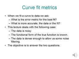
/
Line of Best Fit Sometimes points on a scatter plot are represented by Line of Best Fit Sometimes points on a scatter plot are represented by

Line of Best Fit Sometimes points on a scatter plot are represented by - PowerPoint Presentation

tatiana-dople
tatiana-dople . @tatiana-dople
Follow
378 views
Uploaded On 2018-02-06

Line of Best Fit Sometimes points on a scatter plot are represented by - PPT Presentation

a trend line or a You can study the line to see how the data behaves You may have a basis predict what the data might be for values not given line of best fit Line of Best Fit ID: 628780

fit line points data line fit data points scatter trend strong step find slope predict chicken draw 2015 interpolating

Share:

Link:

Embed:

Download Presentation from below link

Download Presentation The PPT/PDF document "Line of Best Fit Sometimes points on a s..." is the property of its rightful owner. Permission is granted to download and print the materials on this web site for personal, non-commercial use only, and to display it on your personal computer provided you do not modify the materials and that you retain all copyright notices contained in the materials. By downloading content from our website, you accept the terms of this agreement.


Presentation Transcript

Slide1

Line of Best FitSlide2

Sometimes points on a scatter plot are represented by

a

trend line or a ___________________. You can study the line to see how the data behaves. You may have a basis predict what the data might be for values not given.

line of best fitSlide3

Line of Best Fit

Line of Best Fit is a

line that approximates a trend for the data in a scatter plot. It shows pattern and directionSlide4

Line of Best Fit

a line that approximates a trend for the data in a scatter plot

shows pattern and directionSlide5

How to Find the Line of Best Fit

The line of best fit should:

pass through as many points as possibleallow remaining points to be grouped equally above and below the lineSlide6

Draw the line of best fit for the following scatter plots:Slide7

Draw the line of best fit for the following scatter plots:Slide8
Slide9
Slide10

Why make a Line of Best Fit?

Helps us to make predictions by

INTERPOLATING EXTRAPOLATINGSlide11

Interpolating:

Estimating a value

BETWEEN two measurements in a set of dataExtrapolating: Estimating a value BEYOND the range of a set of dataHelps us determine if it is a weak or strong correlation. Slide12

Interpolating

– what would the wife’s age be of a husband who is 57?

Extrapolating

- what would the wife’s age be of a husband who is 84?Slide13

If the data points are close to the line of best fit, it is said to have a ___________correlation.

strong

weak positive

weak negative

strong negative

strong positiveSlide14

Use the line of best fit to predict how many tornadoes may be reported in the United States in

2015

if the trend continues.

1950

1955

1960

1965

1970

1975

1980

1990

1985

1995

200

400

600

800

1000

1200

2000

2005

2010

2015

If the trend continues we predict that there will be 1200 tornadoes reported in 2015.Slide15

Finding the Line of

BEST

FitUsually there is no single line that passes through all the data point, so you try to find the line that best fits the data. Step 1: using a ruler, place it on the graph to find where the edge of the ruler touches the most points. Step 2: Draw in the line. Make sure it touches at least 2 points.Slide16

Finding the Line of

BEST

Fit (continued)Step 3: Find the slope between two pointsStep 4: Substitute that into slope-intercept form of an equation and solve for “b.”Step 5: Write the equation of the line in slope-intercept form.Slide17

Let’s try one:

SANDWICH

Total Fat (g)Total CaloriesGrilled Chicken 5300Hamburger9260Cheeseburger13

320

Quarter Pounder

21

420

Quarter Pounder with Cheese

30

530

Big Mac

31

560

Arch Sandwich Special

31

550

Arch Special with Bacon

34

590

Crispy Chicken

25

500

Fish Fillet

28

560

Grilled

Chicken with Cheese

20

440