PPT-RESPONSIVE DESIGN
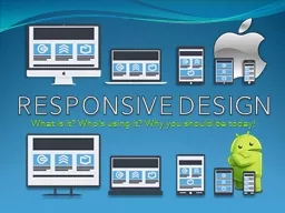
What is it Whos using it Why you should be today What is Responsive Design An Industry Buzz Word Demystified Responsive websites respond to their environment R esponsive
Download Presentation
"RESPONSIVE DESIGN" is the property of its rightful owner. Permission is granted to download and print materials on this website for personal, non-commercial use only, provided you retain all copyright notices. By downloading content from our website, you accept the terms of this agreement.
Presentation Transcript
Transcript not available.