
Instructions for use This resource is not a




Description: Instructions for use This resource is not a teaching and learning program. It should be used in conjunction with the program and teacher resource Data visualisation Enterprise Computing 1112 in Week 4. Classroom teachers are encouraged
Related Topics
Download Presentation
"Instructions for use This resource is not a" is the property of its rightful owner. Permission is granted to download and print the materials on this website for personal, non-commercial use only, and to display it on your personal computer provided you do not modify the materials and that you retain all copyright notices contained in the materials. By downloading content from our website, you accept the terms of this agreement.
Presentation Transcript
slide1. Instructions for use This resource is not a teaching and learning program. It should be used in conjunction with the program and teacher resource Data visualisation – Enterprise Computing 11–12 in Week 4.
Classroom teachers are encouraged to add and adapt slides as required to meet the needs of their students.
Save a copy of the file to make changes to the slide deck. Go to File > Download a Copy (this downloads a copy to the computer to edit in the PowerPoint app).
To convert the PowerPoint to Google Slides:
Upload the file into Google Drive and open it.
Go to File > Save as Google Slides.
(Note: conversion may cause formatting changes in the slides.) 1<br>
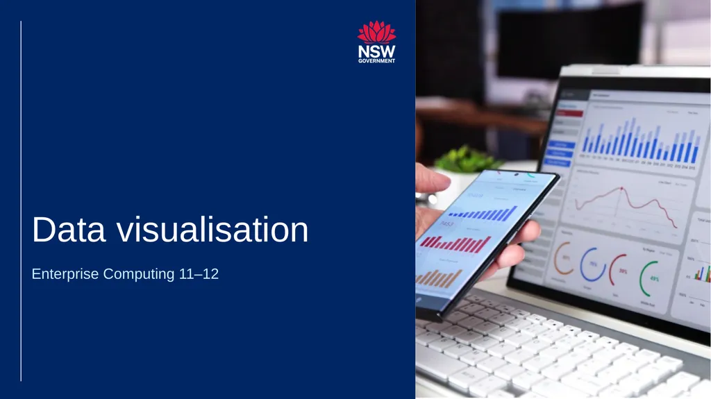
slide2. Data visualisation Enterprise Computing 11–12<br>
slide3. Learning intentions and success criteria We are learning to
understand the purpose and benefits of data visualisation
create clear and accurate data visualisations
choose the correct chart type for various data relationships.
We can
explain why data visualisation is essential for uncovering trends and communicating insights
design visualisations to ensure clarity that focus on key data
implement appropriate chart types to communicate data relationships
critically assess visualisations for clarity, accuracy and potential bias. 3<br>
slide4. Why visualise data?<br>
slide5. Why visualise data? Data is only as good as our ability to understand and communicate it Data visualisation helps:
uncover trends and patterns – visualisations help spot trends and patterns in data that might be missed in spreadsheets or raw numbers.
make data accessible – charts and graphs translate complex data sets into a format that's easier to understand for a wider audience.
communicate insights clearly – visuals can present findings in a compelling way, making it easier to share data stories and recommendations.
spark action and decision making – by highlighting key trends, visualisations can guide better decision-making based on clear data insights.
make data memorable – information presented visually is more likely to be remembered and recalled. 5<br>
slide6. General design tips<br>
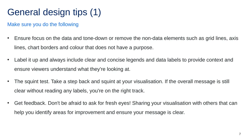
slide7. General design tips (1) Make sure you do the following Ensure focus on the data and tone-down or remove the non-data elements such as grid lines, axis lines, chart borders and colour that does not have a purpose.
Label it up and always include clear and concise legends and data labels to provide context and ensure viewers understand what they're looking at.
The squint test. Take a step back and squint at your visualisation. If the overall message is still clear without reading any labels, you're on the right track.
Get feedback. Don't be afraid to ask for fresh eyes! Sharing your visualisation with others that can help you identify areas for improvement and ensure your message is clear. 7<br>
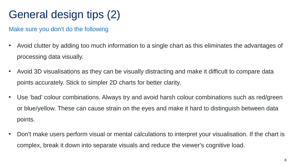
slide8. General design tips (2) Make sure you don’t do the following Avoid clutter by adding too much information to a single chart as this eliminates the advantages of processing data visually.
Avoid 3D visualisations as they can be visually distracting and make it difficult to compare data points accurately. Stick to simpler 2D charts for better clarity.
Use ‘bad’ colour combinations. Always try and avoid harsh colour combinations such as red/green or blue/yellow. These can cause strain on the eyes and make it hard to distinguish between data points.
Don't make users perform visual or mental calculations to interpret your visualisation. If the chart is complex, break it down into separate visuals and reduce the viewer's cognitive load. 8<br>
slide9. Core considerations<br>
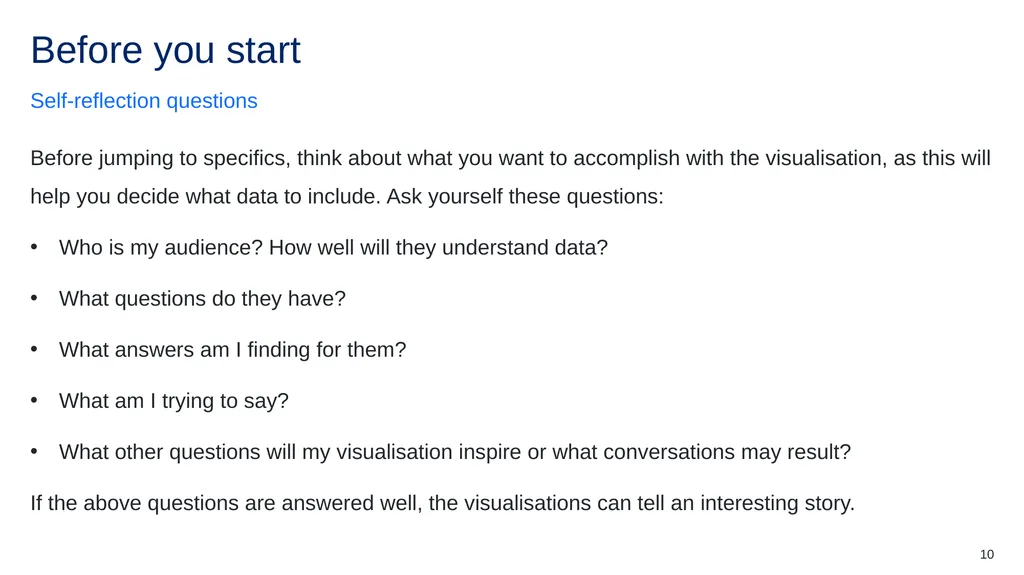
slide10. Before you start Self-reflection questions Before jumping to specifics, think about what you want to accomplish with the visualisation, as this will help you decide what data to include. Ask yourself these questions:
Who is my audience? How well will they understand data?
What questions do they have?
What answers am I finding for them?
What am I trying to say?
What other questions will my visualisation inspire or what conversations may result?
If the above questions are answered well, the visualisations can tell an interesting story. 10<br>
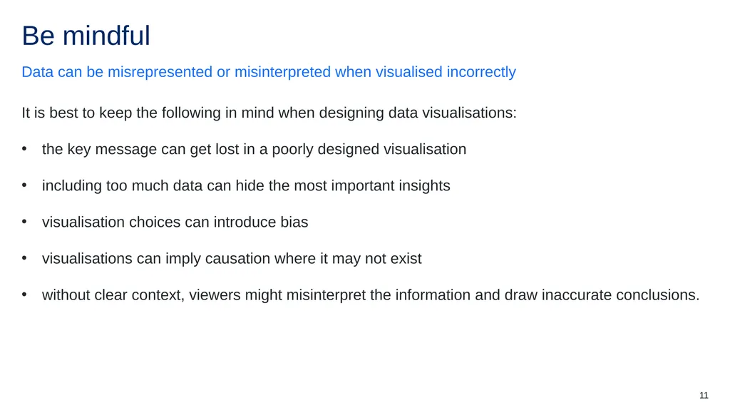
slide11. Be mindful Data can be misrepresented or misinterpreted when visualised incorrectly It is best to keep the following in mind when designing data visualisations:
the key message can get lost in a poorly designed visualisation
including too much data can hide the most important insights
visualisation choices can introduce bias
visualisations can imply causation where it may not exist
without clear context, viewers might misinterpret the information and draw inaccurate conclusions. 11<br>
slide12. Data charts (1)<br>
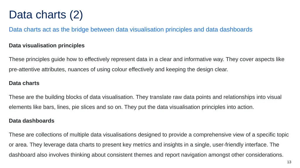
slide13. Data charts (2) Data charts act as the bridge between data visualisation principles and data dashboards Data visualisation principles
These principles guide how to effectively represent data in a clear and informative way. They cover aspects like pre-attentive attributes, nuances of using colour effectively and keeping the design clear.
Data charts
These are the building blocks of data visualisation. They translate raw data points and relationships into visual elements like bars, lines, pie slices and so on. They put the data visualisation principles into action.
Data dashboards
These are collections of multiple data visualisations designed to provide a comprehensive view of a specific topic or area. They leverage data charts to present key metrics and insights in a single, user-friendly interface. The dashboard also involves thinking about consistent themes and report navigation amongst other considerations.
Think of data graphs as the individual bricks, data visualization principles as the blueprint, and the data dashboard as the final built structure. 13<br>
slide14. Chart types<br>
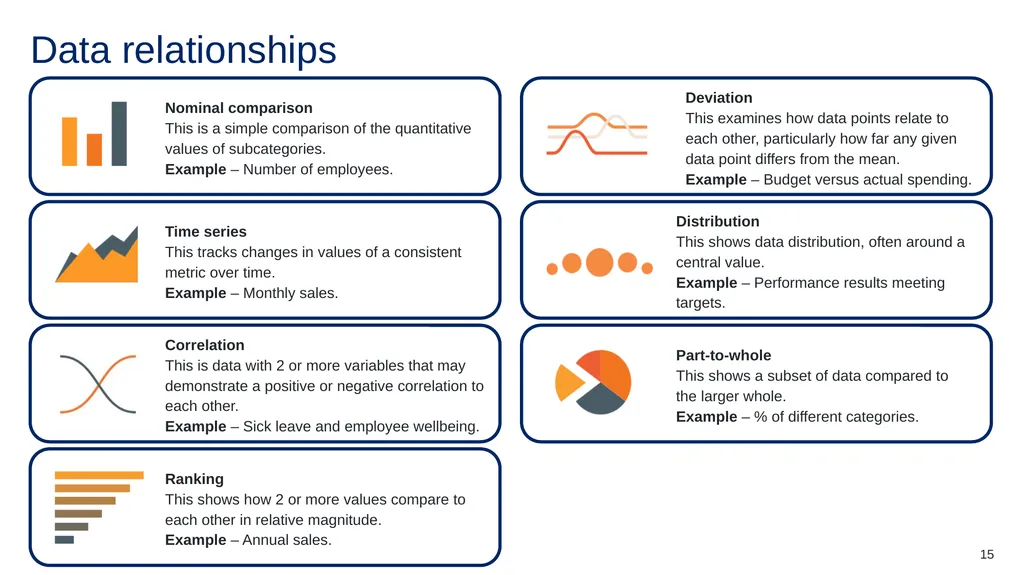
slide15. Data relationships 15<br>
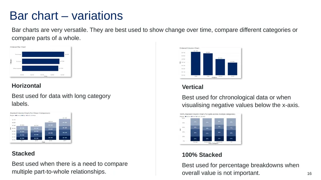
slide16. Bar chart – variations Bar charts are very versatile. They are best used to show change over time, compare different categories or compare parts of a whole. 16<br>
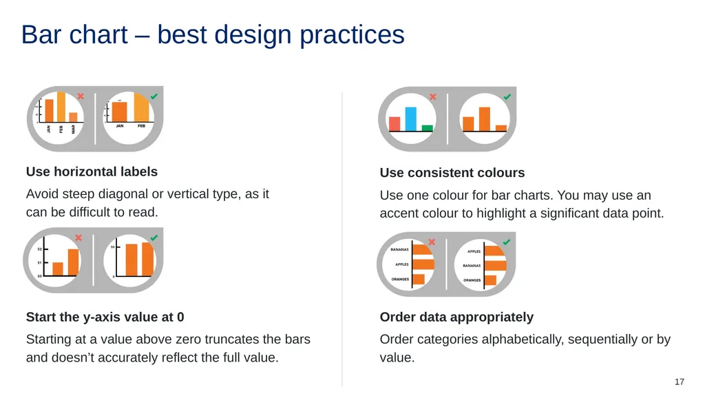
slide17. Bar chart – best design practices 17<br>
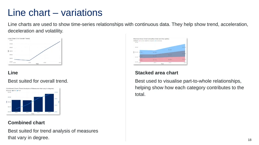
slide18. Line chart – variations Line charts are used to show time-series relationships with continuous data. They help show trend, acceleration, deceleration and volatility. 18<br>
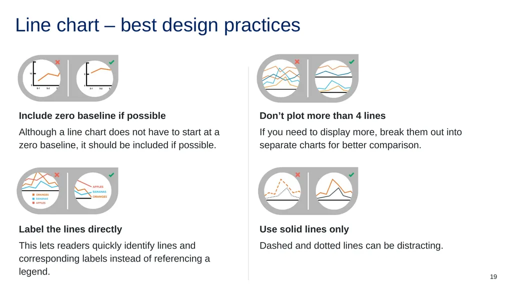
slide19. Line chart – best design practices 19<br>
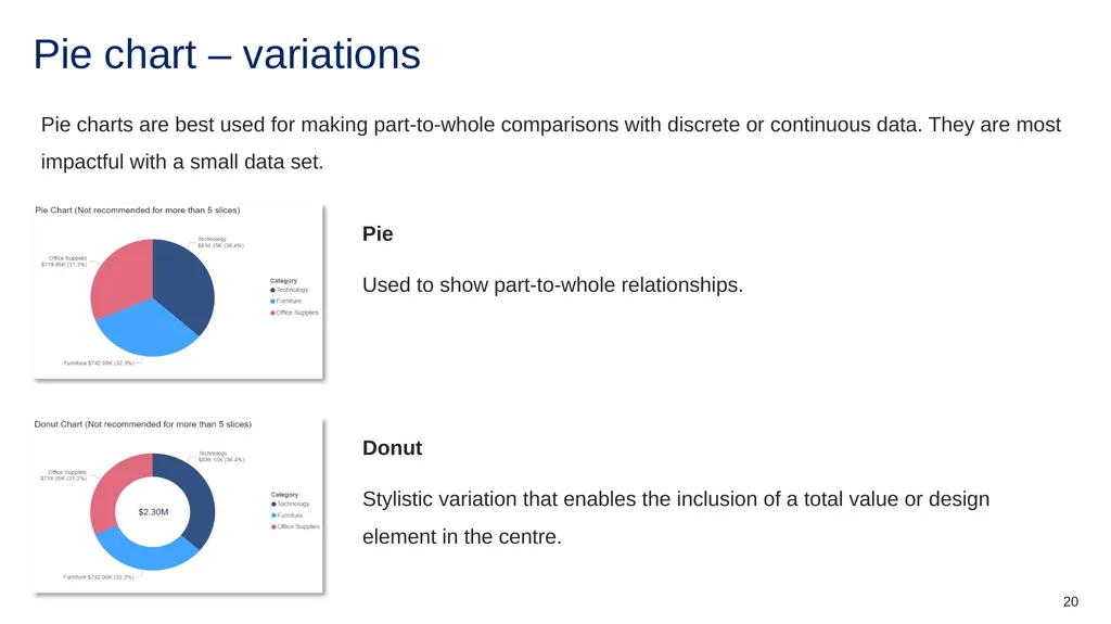
slide20. Pie chart – variations Pie charts are best used for making part-to-whole comparisons with discrete or continuous data. They are most impactful with a small data set. 20<br>
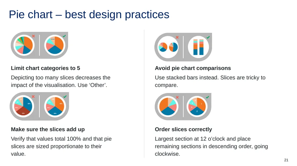
slide21. Pie chart – best design practices 21<br>
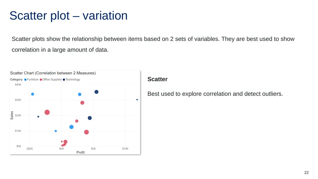
slide22. Scatter plot – variation Scatter plots show the relationship between items based on 2 sets of variables. They are best used to show correlation in a large amount of data. 22<br>
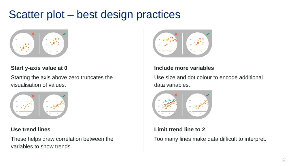
slide23. Scatter plot – best design practices 23<br>
slide24. Links Useful reading for data visualisation Visual Vocabulary
Data Visualization Cheat Sheet
Data Visualization Reference Guides
12 Great Books About Data Visualization
The 10 Best Data Visualization Blogs To Follow 24<br>
slide25. References This presentation contains NSW Curriculum and syllabus content. The NSW Curriculum is developed by the NSW Education Standards Authority. This content is prepared by NESA for and on behalf of the Crown in the right of the State of New South Wales. The material is protected by Crown copyright.
Please refer to the NESA Copyright Disclaimer for more information https://educationstandards.nsw.edu.au/wps/portal/nesa/mini-footer/copyright.
NESA holds the only official and up-to-date versions of the NSW Curriculum and syllabus documents. Please visit the NSW Education Standards Authority (NESA) website https://educationstandards.nsw.edu.au and the NSW Curriculum website https://curriculum.nsw.edu.au. Enterprise Computing 11–12 Syllabus © NSW Education Standards Authority (NESA) for and on behalf of the Crown in right of the State of New South Wales, 2022.
Enterprise Computing 11–12 course specifications © NSW Education Standards Authority (NESA) for and on behalf of the Crown in right of the State of New South Wales, 2022.
Cotton R (2022) ‘Data Visualization Cheat Sheet’, Cheat Sheets, DataCamp website, accessed 29 October 2024.
Krum R, InfoNewt LLC (2023) Data Visualization Reference Guides, Cool Infographics website, accessed 29 October 2024.
Salesforce, Inc (2024) ‘The 10 Best Data Visualization Blogs To Follow’, Tableau, accessed 29 October 2024.
Salesforce, Inc (2024) ‘12 Great Books About Data Visualization’, Tableau, accessed 29 October 2024.
Thomas J (n.d.) Visual Vocabulary [Microsoft PowerBI], Microsoft Fabric website, accessed 29 October 2024. 25<br>
slide26. Copyright © State of New South Wales (Department of Education), 2024 The copyright material published in this resource is subject to the Copyright Act 1968 (Cth) and is owned by the NSW Department of Education or, where indicated, by a party other than the NSW Department of Education (third-party material).
Copyright material available in this resource and owned by the NSW Department of Education is licensed under a Creative Commons Attribution 4.0 International (CC BY 4.0) license.
This license allows you to share and adapt the material for any purpose, even commercially.
Attribution should be given to © State of New South Wales (Department of Education), 2024.
Material in this resource not available under a Creative Commons license:
the NSW Department of Education logo, other logos and trademark-protected material
Material owned by a third party that has been reproduced with permission. You will need to obtain permission from the third party to reuse its material.
Links to third-party material and websites
Please note that the provided (reading/viewing material/list/links/texts) are a suggestion only and implies no endorsement, by the New South Wales Department of Education, of any author, publisher, or book title. School principals and teachers are best placed to assess the suitability of resources that would complement the curriculum and reflect the needs and interests of their students.
If you use the links provided in this document to access a third-party’s website, you acknowledge that the terms of use, including licence terms set out on the third-party’s website apply to the use which may be made of the materials on that third-party website or where permitted by the Copyright Act 1968 (Cth). The department accepts no responsibility for content on third-party websites.<br>
Classroom teachers are encouraged to add and adapt slides as required to meet the needs of their students.
Save a copy of the file to make changes to the slide deck. Go to File > Download a Copy (this downloads a copy to the computer to edit in the PowerPoint app).
To convert the PowerPoint to Google Slides:
Upload the file into Google Drive and open it.
Go to File > Save as Google Slides.
(Note: conversion may cause formatting changes in the slides.) 1<br>
slide2. Data visualisation Enterprise Computing 11–12<br>
slide3. Learning intentions and success criteria We are learning to
understand the purpose and benefits of data visualisation
create clear and accurate data visualisations
choose the correct chart type for various data relationships.
We can
explain why data visualisation is essential for uncovering trends and communicating insights
design visualisations to ensure clarity that focus on key data
implement appropriate chart types to communicate data relationships
critically assess visualisations for clarity, accuracy and potential bias. 3<br>
slide4. Why visualise data?<br>
slide5. Why visualise data? Data is only as good as our ability to understand and communicate it Data visualisation helps:
uncover trends and patterns – visualisations help spot trends and patterns in data that might be missed in spreadsheets or raw numbers.
make data accessible – charts and graphs translate complex data sets into a format that's easier to understand for a wider audience.
communicate insights clearly – visuals can present findings in a compelling way, making it easier to share data stories and recommendations.
spark action and decision making – by highlighting key trends, visualisations can guide better decision-making based on clear data insights.
make data memorable – information presented visually is more likely to be remembered and recalled. 5<br>
slide6. General design tips<br>
slide7. General design tips (1) Make sure you do the following Ensure focus on the data and tone-down or remove the non-data elements such as grid lines, axis lines, chart borders and colour that does not have a purpose.
Label it up and always include clear and concise legends and data labels to provide context and ensure viewers understand what they're looking at.
The squint test. Take a step back and squint at your visualisation. If the overall message is still clear without reading any labels, you're on the right track.
Get feedback. Don't be afraid to ask for fresh eyes! Sharing your visualisation with others that can help you identify areas for improvement and ensure your message is clear. 7<br>
slide8. General design tips (2) Make sure you don’t do the following Avoid clutter by adding too much information to a single chart as this eliminates the advantages of processing data visually.
Avoid 3D visualisations as they can be visually distracting and make it difficult to compare data points accurately. Stick to simpler 2D charts for better clarity.
Use ‘bad’ colour combinations. Always try and avoid harsh colour combinations such as red/green or blue/yellow. These can cause strain on the eyes and make it hard to distinguish between data points.
Don't make users perform visual or mental calculations to interpret your visualisation. If the chart is complex, break it down into separate visuals and reduce the viewer's cognitive load. 8<br>
slide9. Core considerations<br>
slide10. Before you start Self-reflection questions Before jumping to specifics, think about what you want to accomplish with the visualisation, as this will help you decide what data to include. Ask yourself these questions:
Who is my audience? How well will they understand data?
What questions do they have?
What answers am I finding for them?
What am I trying to say?
What other questions will my visualisation inspire or what conversations may result?
If the above questions are answered well, the visualisations can tell an interesting story. 10<br>
slide11. Be mindful Data can be misrepresented or misinterpreted when visualised incorrectly It is best to keep the following in mind when designing data visualisations:
the key message can get lost in a poorly designed visualisation
including too much data can hide the most important insights
visualisation choices can introduce bias
visualisations can imply causation where it may not exist
without clear context, viewers might misinterpret the information and draw inaccurate conclusions. 11<br>
slide12. Data charts (1)<br>
slide13. Data charts (2) Data charts act as the bridge between data visualisation principles and data dashboards Data visualisation principles
These principles guide how to effectively represent data in a clear and informative way. They cover aspects like pre-attentive attributes, nuances of using colour effectively and keeping the design clear.
Data charts
These are the building blocks of data visualisation. They translate raw data points and relationships into visual elements like bars, lines, pie slices and so on. They put the data visualisation principles into action.
Data dashboards
These are collections of multiple data visualisations designed to provide a comprehensive view of a specific topic or area. They leverage data charts to present key metrics and insights in a single, user-friendly interface. The dashboard also involves thinking about consistent themes and report navigation amongst other considerations.
Think of data graphs as the individual bricks, data visualization principles as the blueprint, and the data dashboard as the final built structure. 13<br>
slide14. Chart types<br>
slide15. Data relationships 15<br>
slide16. Bar chart – variations Bar charts are very versatile. They are best used to show change over time, compare different categories or compare parts of a whole. 16<br>
slide17. Bar chart – best design practices 17<br>
slide18. Line chart – variations Line charts are used to show time-series relationships with continuous data. They help show trend, acceleration, deceleration and volatility. 18<br>
slide19. Line chart – best design practices 19<br>
slide20. Pie chart – variations Pie charts are best used for making part-to-whole comparisons with discrete or continuous data. They are most impactful with a small data set. 20<br>
slide21. Pie chart – best design practices 21<br>
slide22. Scatter plot – variation Scatter plots show the relationship between items based on 2 sets of variables. They are best used to show correlation in a large amount of data. 22<br>
slide23. Scatter plot – best design practices 23<br>
slide24. Links Useful reading for data visualisation Visual Vocabulary
Data Visualization Cheat Sheet
Data Visualization Reference Guides
12 Great Books About Data Visualization
The 10 Best Data Visualization Blogs To Follow 24<br>
slide25. References This presentation contains NSW Curriculum and syllabus content. The NSW Curriculum is developed by the NSW Education Standards Authority. This content is prepared by NESA for and on behalf of the Crown in the right of the State of New South Wales. The material is protected by Crown copyright.
Please refer to the NESA Copyright Disclaimer for more information https://educationstandards.nsw.edu.au/wps/portal/nesa/mini-footer/copyright.
NESA holds the only official and up-to-date versions of the NSW Curriculum and syllabus documents. Please visit the NSW Education Standards Authority (NESA) website https://educationstandards.nsw.edu.au and the NSW Curriculum website https://curriculum.nsw.edu.au. Enterprise Computing 11–12 Syllabus © NSW Education Standards Authority (NESA) for and on behalf of the Crown in right of the State of New South Wales, 2022.
Enterprise Computing 11–12 course specifications © NSW Education Standards Authority (NESA) for and on behalf of the Crown in right of the State of New South Wales, 2022.
Cotton R (2022) ‘Data Visualization Cheat Sheet’, Cheat Sheets, DataCamp website, accessed 29 October 2024.
Krum R, InfoNewt LLC (2023) Data Visualization Reference Guides, Cool Infographics website, accessed 29 October 2024.
Salesforce, Inc (2024) ‘The 10 Best Data Visualization Blogs To Follow’, Tableau, accessed 29 October 2024.
Salesforce, Inc (2024) ‘12 Great Books About Data Visualization’, Tableau, accessed 29 October 2024.
Thomas J (n.d.) Visual Vocabulary [Microsoft PowerBI], Microsoft Fabric website, accessed 29 October 2024. 25<br>
slide26. Copyright © State of New South Wales (Department of Education), 2024 The copyright material published in this resource is subject to the Copyright Act 1968 (Cth) and is owned by the NSW Department of Education or, where indicated, by a party other than the NSW Department of Education (third-party material).
Copyright material available in this resource and owned by the NSW Department of Education is licensed under a Creative Commons Attribution 4.0 International (CC BY 4.0) license.
This license allows you to share and adapt the material for any purpose, even commercially.
Attribution should be given to © State of New South Wales (Department of Education), 2024.
Material in this resource not available under a Creative Commons license:
the NSW Department of Education logo, other logos and trademark-protected material
Material owned by a third party that has been reproduced with permission. You will need to obtain permission from the third party to reuse its material.
Links to third-party material and websites
Please note that the provided (reading/viewing material/list/links/texts) are a suggestion only and implies no endorsement, by the New South Wales Department of Education, of any author, publisher, or book title. School principals and teachers are best placed to assess the suitability of resources that would complement the curriculum and reflect the needs and interests of their students.
If you use the links provided in this document to access a third-party’s website, you acknowledge that the terms of use, including licence terms set out on the third-party’s website apply to the use which may be made of the materials on that third-party website or where permitted by the Copyright Act 1968 (Cth). The department accepts no responsibility for content on third-party websites.<br>