MODULE 5: RHIS Data Analysis SESSION 1: Key
Description: MODULE 5: RHIS Data Analysis SESSION 1: Key Concepts of Data Analysis ROUTINE HEALTH INFORMATION SYSTEMS A Curriculum on Basic Concepts and Practice The complete RHIS curriculum is available here: https:www.measureevaluation.orgour-work
Related Topics
Download Presentation
"MODULE 5: RHIS Data Analysis SESSION 1: Key" is the property of its rightful owner. Permission is granted to download and print the materials on this website for personal, non-commercial use only, and to display it on your personal computer provided you do not modify the materials and that you retain all copyright notices contained in the materials. By downloading content from our website, you accept the terms of this agreement.
Presentation Transcript
slide1. MODULE 5:
RHIS Data Analysis SESSION 1:
Key Concepts of Data Analysis ROUTINE HEALTH INFORMATION SYSTEMS
A Curriculum on Basic Concepts and Practice The complete RHIS curriculum is available here: https://www.measureevaluation.org/our-work/ routine-health-information-systems/rhis-curriculum<br>
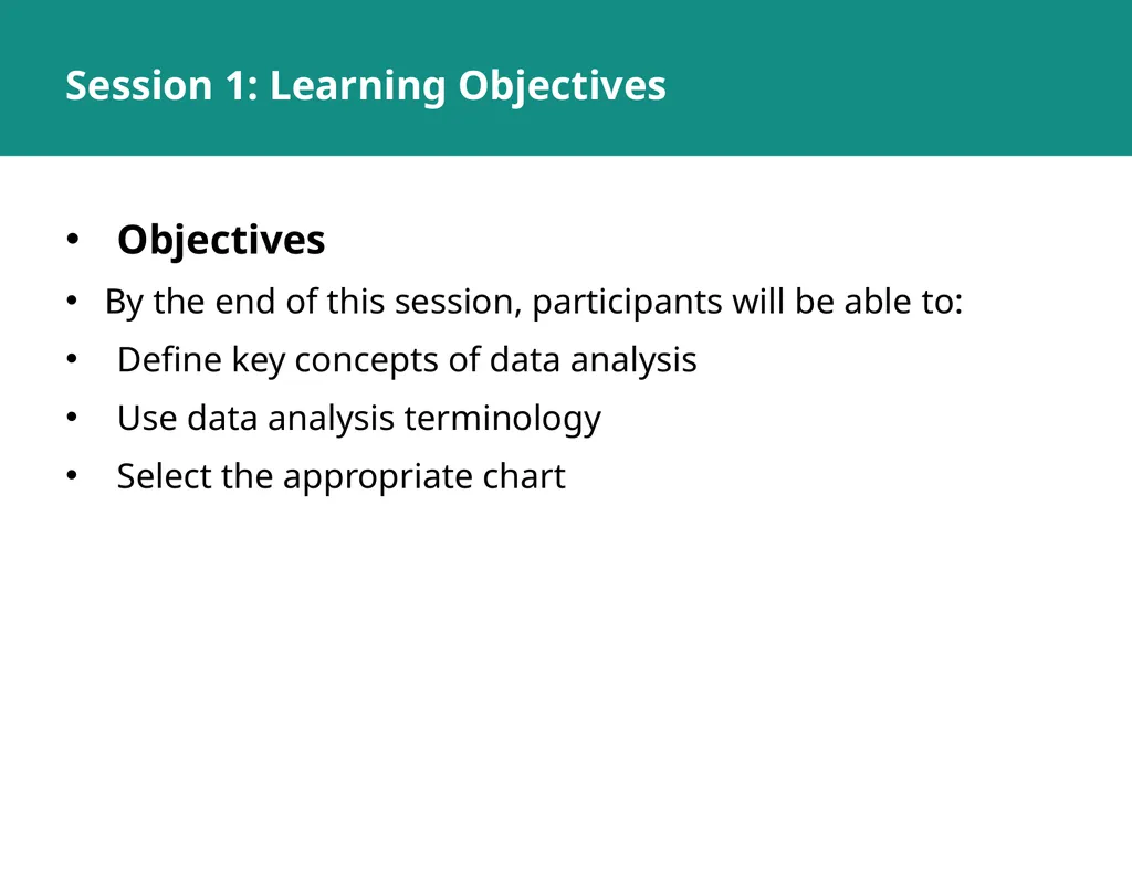
slide2. Session 1: Learning Objectives Objectives
By the end of this session, participants will be able to:
Define key concepts of data analysis
Use data analysis terminology
Select the appropriate chart<br>
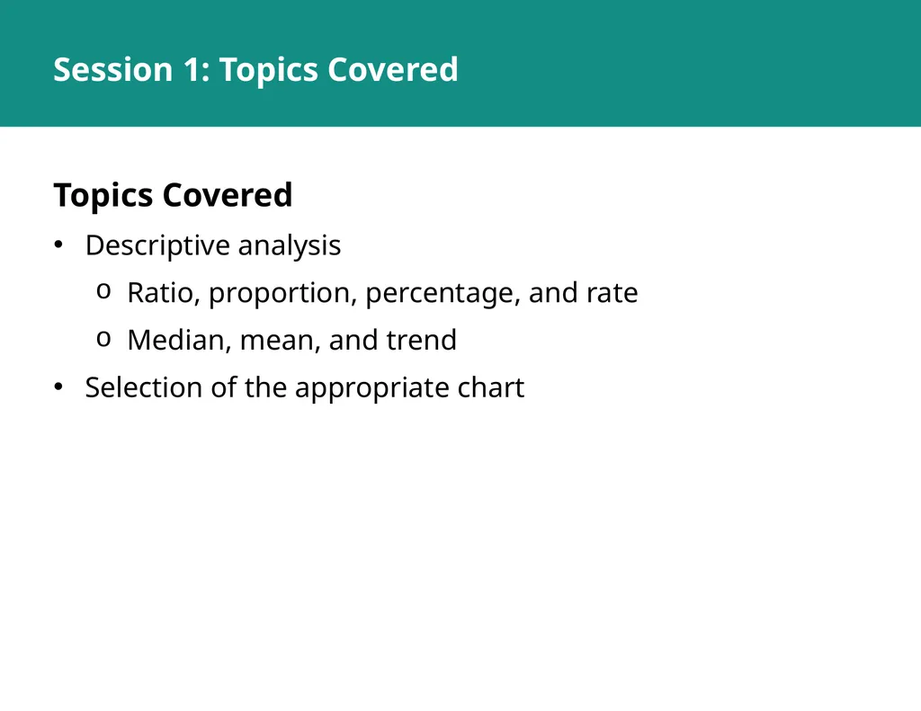
slide3. Session 1: Topics Covered Topics Covered
Descriptive analysis
Ratio, proportion, percentage, and rate
Median, mean, and trend
Selection of the appropriate chart<br>
slide4. Data Analysis: Key Concepts<br>
slide5. Data Analysis Analysis: Turning raw data
into useful information
Purpose: To provide answers to questions being asked by a health program
Even the greatest amount and best quality of data mean nothing if data are not properly analyzed—or analyzed at all.<br>
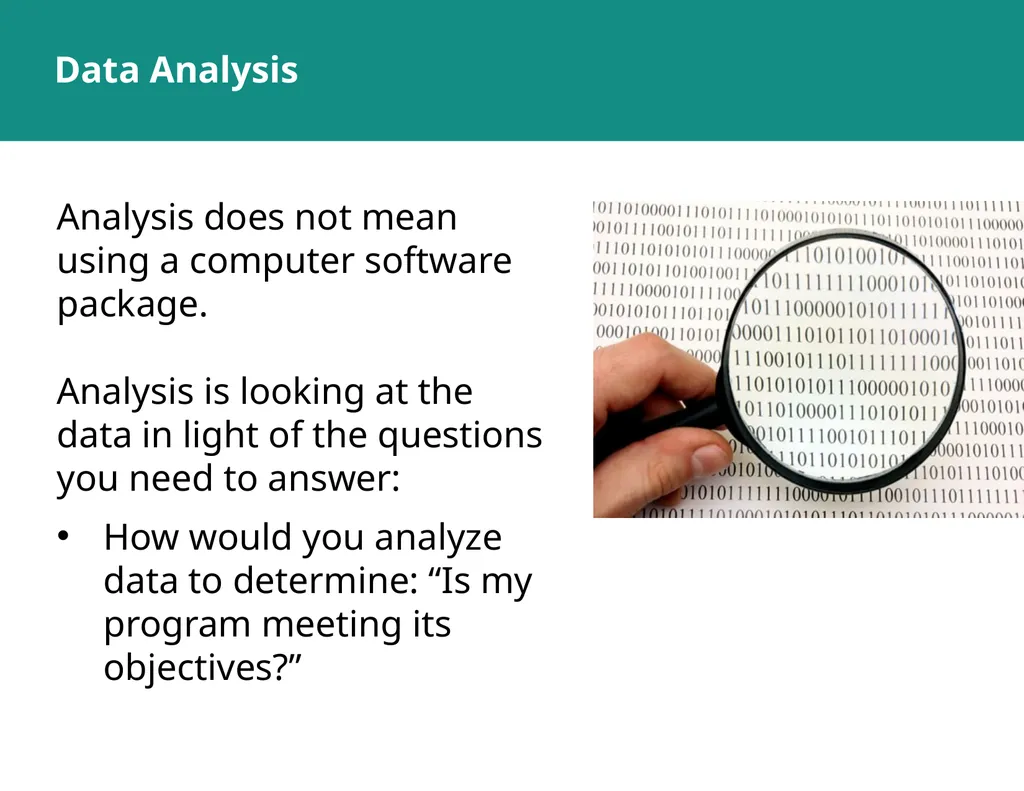
slide6. Data Analysis Analysis does not mean using a computer software package.
Analysis is looking at the data in light of the questions you need to answer:
How would you analyze data to determine: “Is my program meeting its objectives?”<br>
slide7. Answering Program Questions Question: Is my program meeting its objectives?
Analysis: Compare program targets and actual program performance to learn how far you are from the targets
Interpretation: Why have you achieved or not achieved a target, and what does this mean for your program?
Answering may require more information.<br>
slide8. Descriptive Analysis Describes the sample/target population (demographic and clinical characteristics)
Does not define causality; tells you what, not why
Example: Average number of clients seen per month<br>
slide9. Basic Terminology and Concepts Statistical terms
Ratio
Proportion
Percentage
Rate
Mean
Median
Trend<br>
slide10. Central Tendency Measures of the location of the middle or the center of a distribution of data
Mean
Median<br>
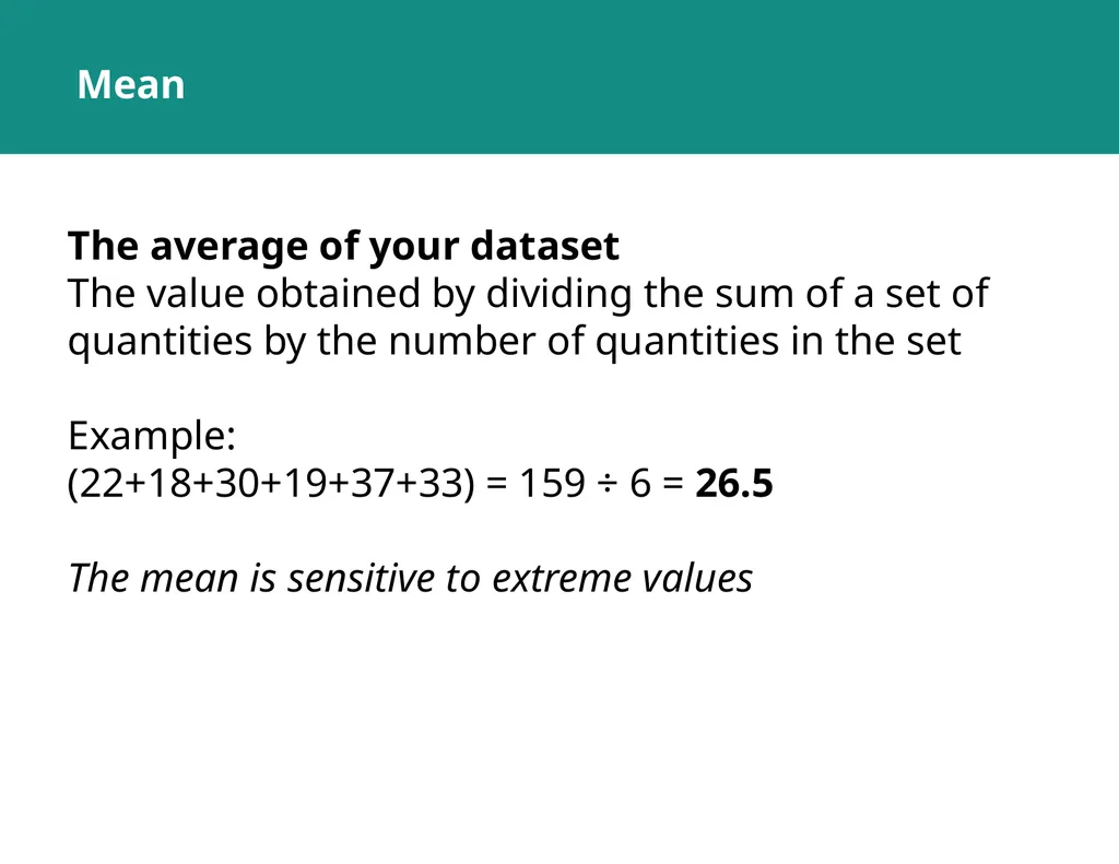
slide11. Mean The average of your dataset
The value obtained by dividing the sum of a set of quantities by the number of quantities in the set
Example:
(22+18+30+19+37+33) = 159 ÷ 6 = 26.5
The mean is sensitive to extreme values<br>
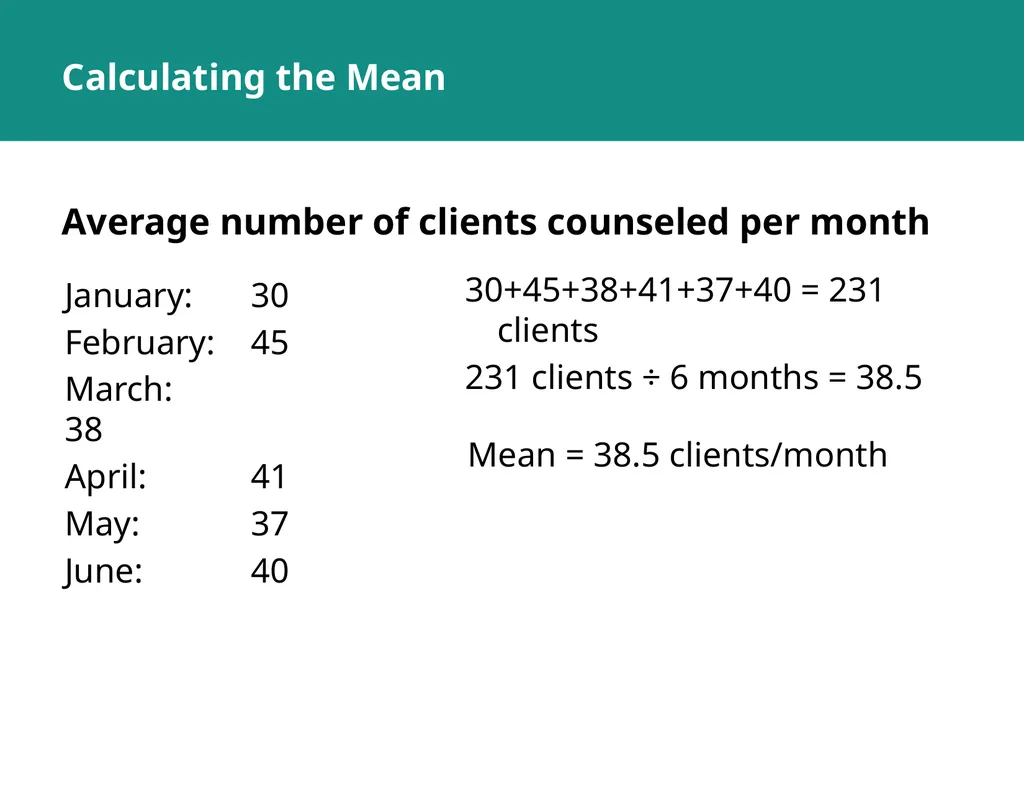
slide12. Calculating the Mean Average number of clients counseled per month January: 30
February: 45
March: 38
April: 41
May: 37
June: 40 30+45+38+41+37+40 = 231 clients
231 clients ÷ 6 months = 38.5 Mean = 38.5 clients/month<br>
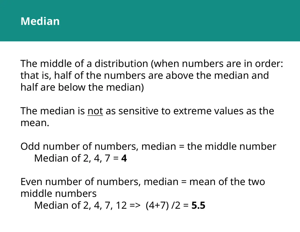
slide13. Median The middle of a distribution (when numbers are in order: that is, half of the numbers are above the median and half are below the median)
The median is not as sensitive to extreme values as the mean.
Odd number of numbers, median = the middle number
Median of 2, 4, 7 = 4
Even number of numbers, median = mean of the two middle numbers
Median of 2, 4, 7, 12 => (4+7) /2 = 5.5<br>
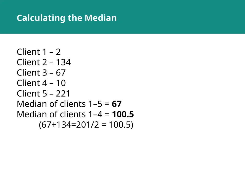
slide14. Calculating the Median Client 1 – 2
Client 2 – 134
Client 3 – 67
Client 4 – 10
Client 5 – 221
Median of clients 1–5 = 67
Median of clients 1–4 = 100.5
(67+134=201/2 = 100.5)<br>
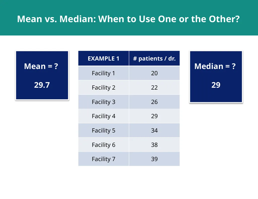
slide15. Mean vs. Median: When to Use One or the Other? Mean = ?
29.7 Median = ?
29<br>
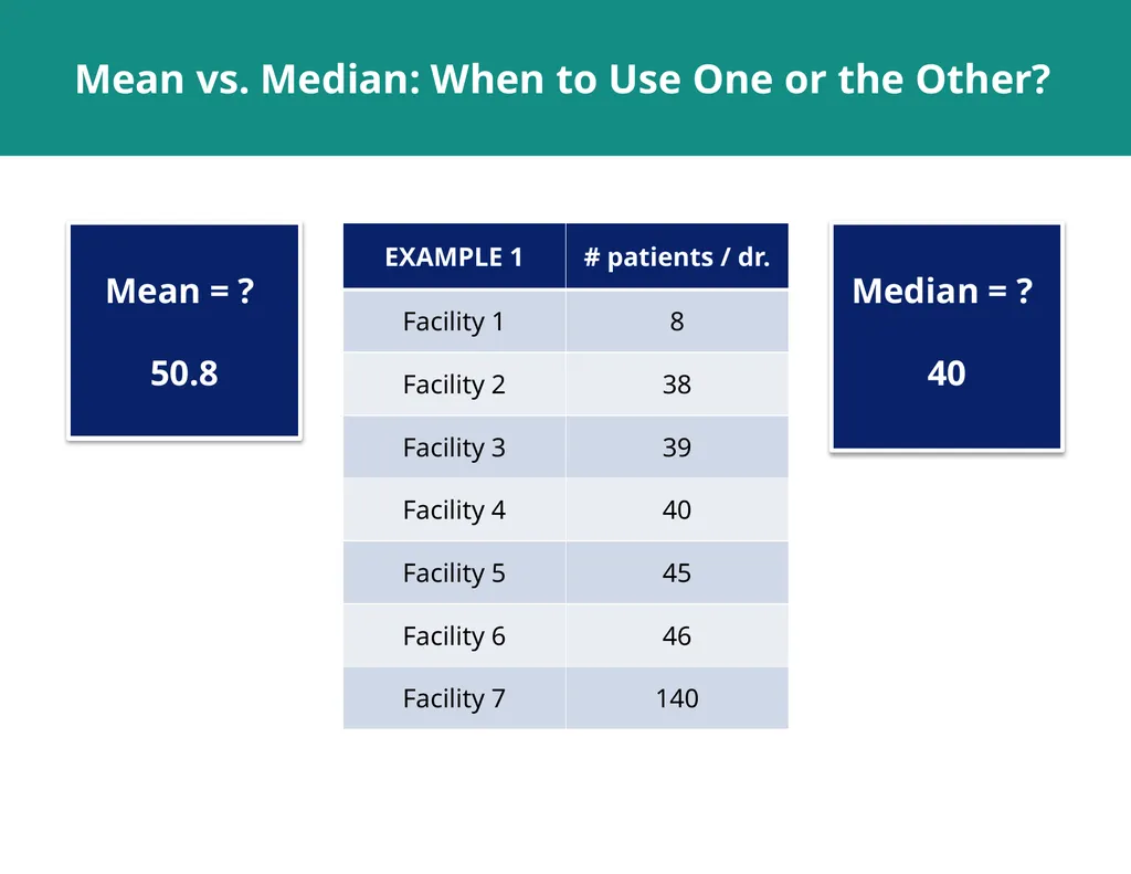
slide16. Mean vs. Median: When to Use One or the Other? Mean = ?
50.8 Median = ?
40<br>
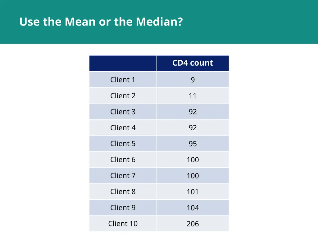
slide17. Use the Mean or the Median?<br>
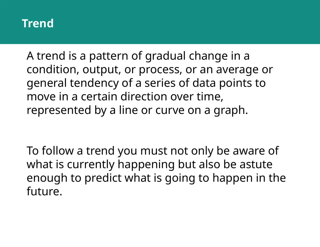
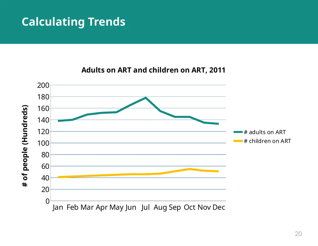
slide18. Trend A trend is a pattern of gradual change in a condition, output, or process, or an average or general tendency of a series of data points to move in a certain direction over time, represented by a line or curve on a graph.
To follow a trend you must not only be aware of what is currently happening but also be astute enough to predict what is going to happen in the future.<br>
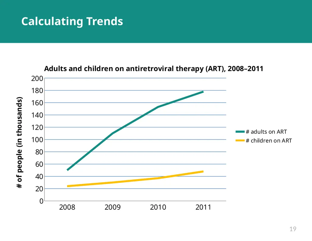
slide19. Calculating Trends 19<br>
slide20. Calculating Trends 20<br>
slide21. Key Messages Purpose of analysis: Provide answers to programmatic questions
Descriptive analyses describe the sample or target population.
Descriptive analyses do not define causality. That is, they tell you what, not why. 21<br>
slide22. SELECT THE RIGHT CHART<br>
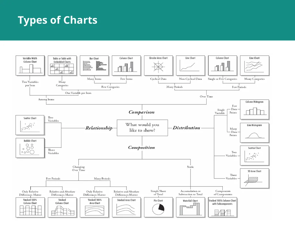
slide23. Types of Charts<br>
slide24. 5 QUESTIONS TO ASK YOURSELF WHEN CHOOSING A CHART<br>
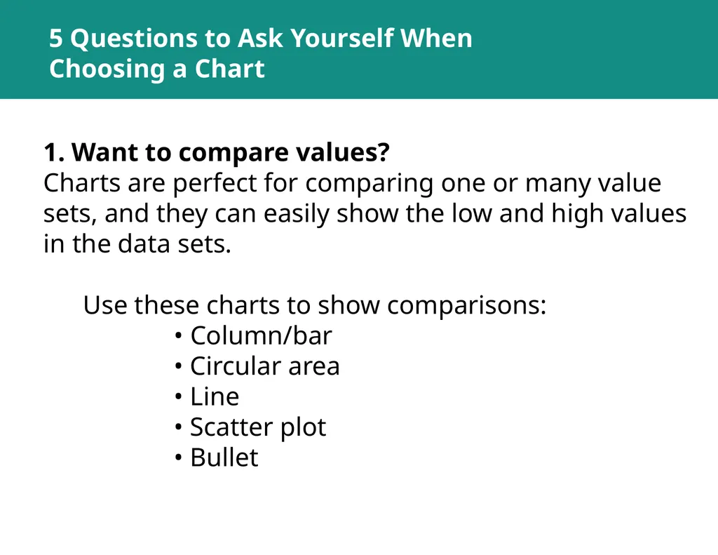
slide25. 5 Questions to Ask Yourself When Choosing a Chart 1. Want to compare values?Charts are perfect for comparing one or many value sets, and they can easily show the low and high values in the data sets.
Use these charts to show comparisons:
• Column/bar • Circular area • Line • Scatter plot • Bullet<br>
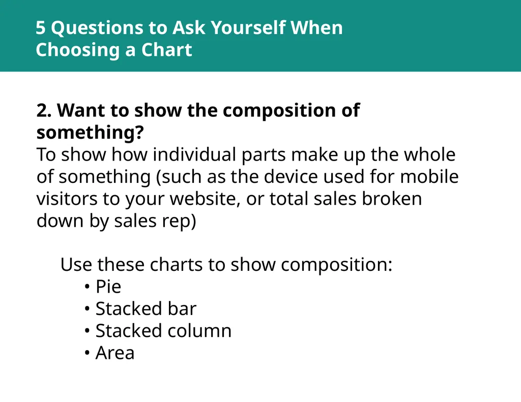
slide26. 5 Questions to Ask Yourself When Choosing a Chart 2. Want to show the composition of something?
To show how individual parts make up the whole of something (such as the device used for mobile visitors to your website, or total sales broken down by sales rep)
Use these charts to show composition:
• Pie
• Stacked bar
• Stacked column
• Area<br>
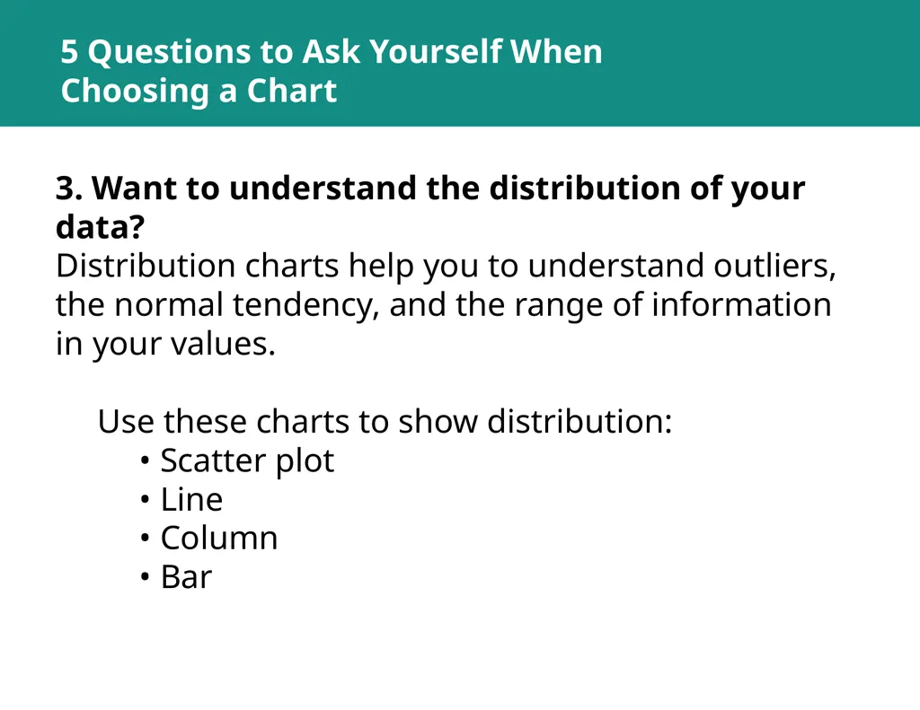
slide27. 5 Questions to Ask Yourself When Choosing a Chart 3. Want to understand the distribution of your data?
Distribution charts help you to understand outliers, the normal tendency, and the range of information in your values.
Use these charts to show distribution:
• Scatter plot
• Line
• Column
• Bar<br>
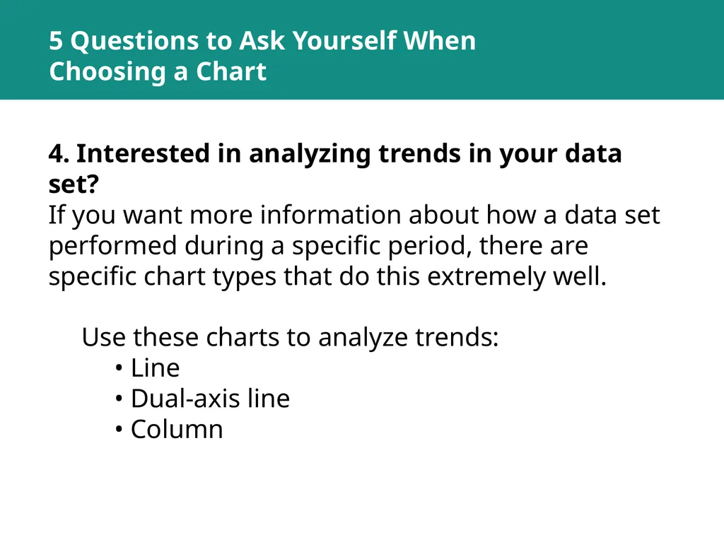
slide28. 5 Questions to Ask Yourself When Choosing a Chart 4. Interested in analyzing trends in your data set?
If you want more information about how a data set performed during a specific period, there are specific chart types that do this extremely well.
Use these charts to analyze trends:
• Line
• Dual-axis line
• Column<br>
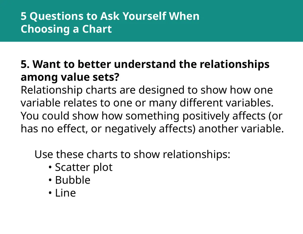
slide29. 5 Questions to Ask Yourself When Choosing a Chart 5. Want to better understand the relationships among value sets?
Relationship charts are designed to show how one variable relates to one or many different variables. You could show how something positively affects (or has no effect, or negatively affects) another variable.
Use these charts to show relationships:
• Scatter plot
• Bubble
• Line<br>
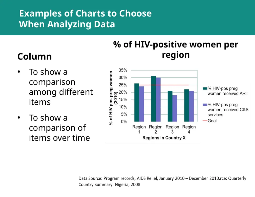
slide30. Examples of Charts to Choose When Analyzing Data Column To show a comparison among different items
To show a comparison of items over time % of HIV-positive women per region<br>
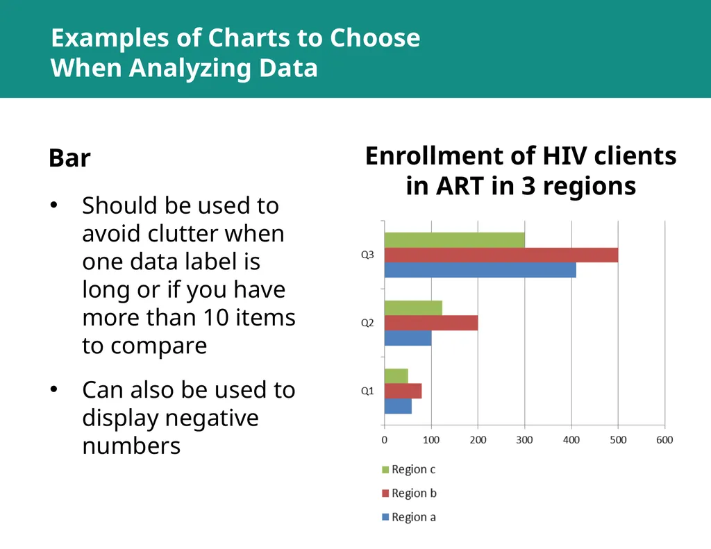
slide31. Examples of Charts to Choose When Analyzing Data Bar Should be used to avoid clutter when one data label is long or if you have more than 10 items to compare
Can also be used to display negative numbers Enrollment of HIV clients in ART in 3 regions<br>
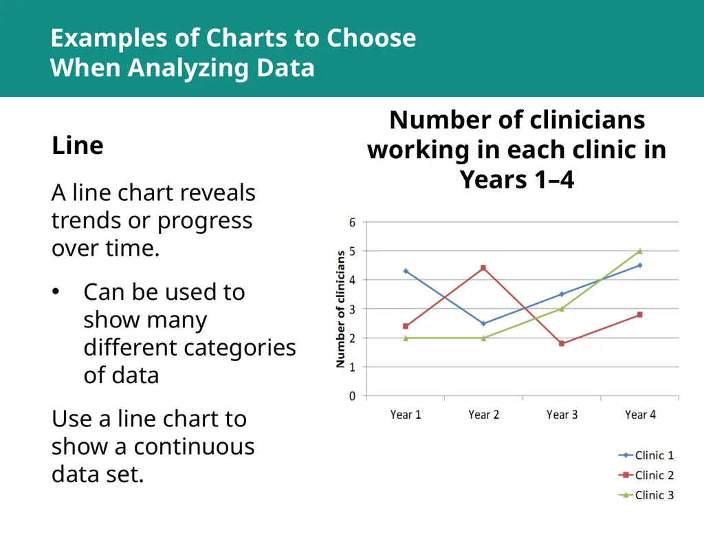
slide32. Line A line chart reveals trends or progress over time.
Can be used to show many different categories of data
Use a line chart to show a continuous data set. Number of clinicians working in each clinic in Years 1–4 Examples of Charts to Choose When Analyzing Data<br>
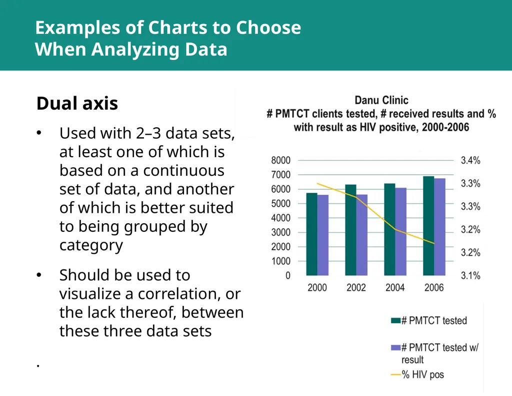
slide33. Examples of Charts to Choose When Analyzing Data Dual axis Used with 2–3 data sets, at least one of which is based on a continuous set of data, and another of which is better suited to being grouped by category
Should be used to visualize a correlation, or the lack thereof, between these three data sets
.<br>
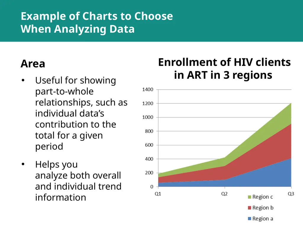
slide34. Example of Charts to Choose When Analyzing Data Area Useful for showing part-to-whole relationships, such as individual data’s contribution to the total for a given period
Helps you analyze both overall and individual trend information Enrollment of HIV clients in ART in 3 regions<br>
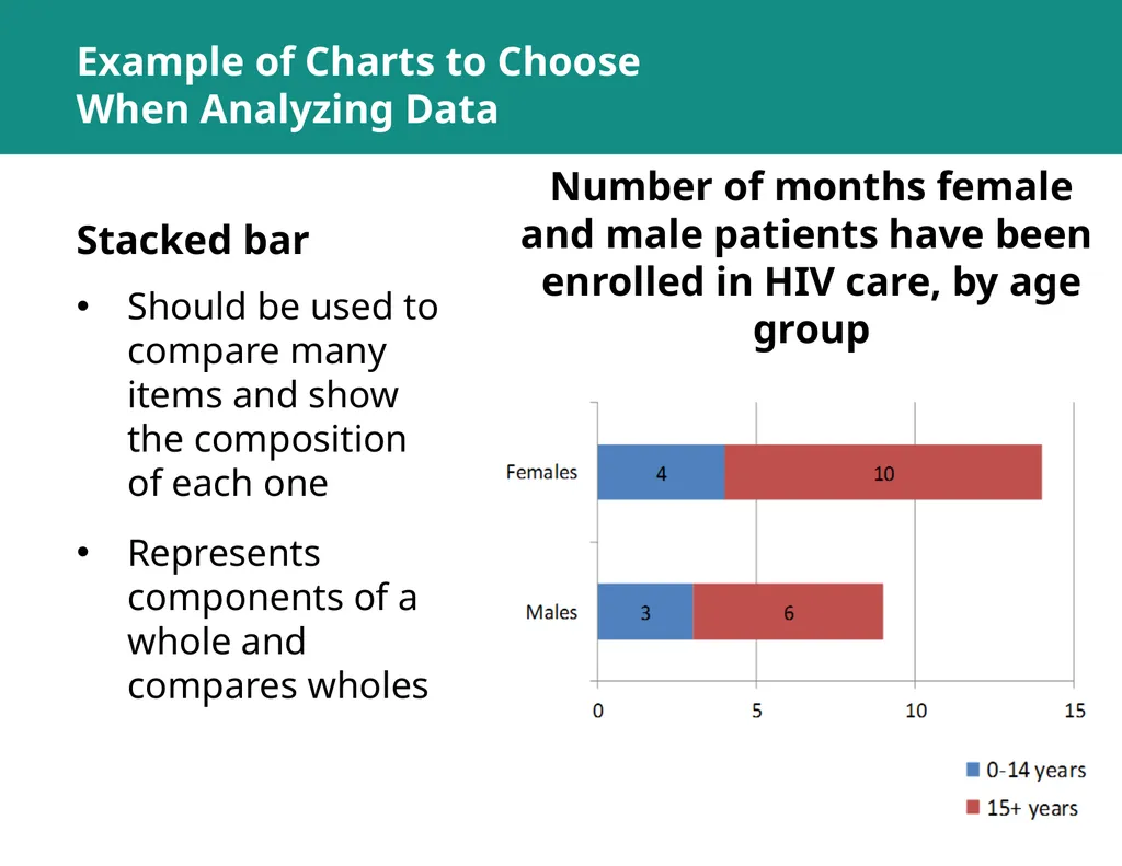
slide35. Example of Charts to Choose When Analyzing Data Stacked bar Should be used to compare many items and show the composition of each one
Represents components of a whole and compares wholes Number of months female and male patients have been
enrolled in HIV care, by age group<br>
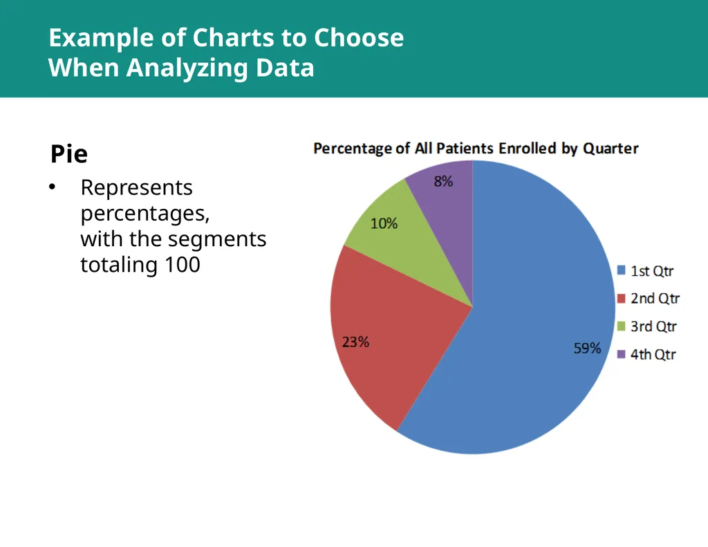
slide36. Example of Charts to Choose When Analyzing Data Pie Represents percentages,
with the segments totaling 100<br>
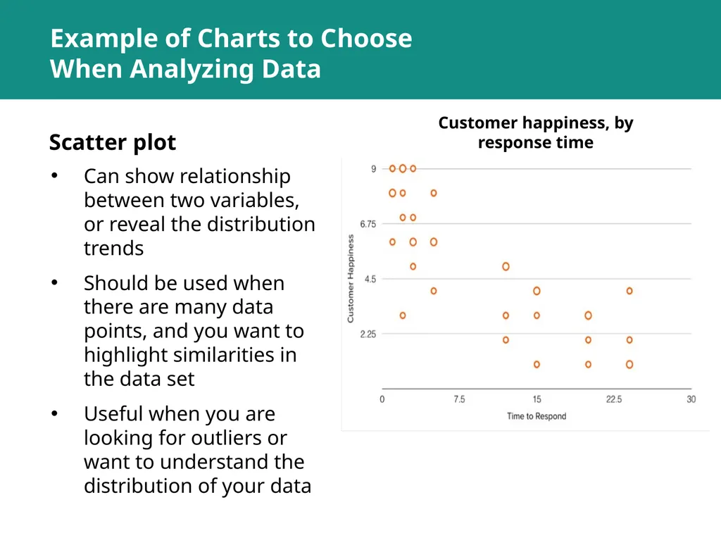
slide37. Example of Charts to Choose When Analyzing Data Scatter plot Can show relationship between two variables, or reveal the distribution trends
Should be used when there are many data points, and you want to highlight similarities in the data set
Useful when you are looking for outliers or want to understand the distribution of your data Customer happiness, by response time<br>
slide38. ROUTINE HEALTH INFORMATION SYSTEMS
A Curriculum on Basic Concepts and Practice This presentation was produced with the support of the United States Agency for International Development (USAID) under the terms of MEASURE Evaluation cooperative agreement AID-OAA-L-14-00004. MEASURE Evaluation is implemented by the Carolina Population Center, University of North Carolina at Chapel Hill in partnership with ICF International; John Snow, Inc.; Management Sciences for Health; Palladium; and Tulane University. The views expressed in this presentation do not necessarily reflect the views of USAID or the United States government.<br>

RHIS Data Analysis SESSION 1:
Key Concepts of Data Analysis ROUTINE HEALTH INFORMATION SYSTEMS
A Curriculum on Basic Concepts and Practice The complete RHIS curriculum is available here: https://www.measureevaluation.org/our-work/ routine-health-information-systems/rhis-curriculum<br>
slide2. Session 1: Learning Objectives Objectives
By the end of this session, participants will be able to:
Define key concepts of data analysis
Use data analysis terminology
Select the appropriate chart<br>
slide3. Session 1: Topics Covered Topics Covered
Descriptive analysis
Ratio, proportion, percentage, and rate
Median, mean, and trend
Selection of the appropriate chart<br>
slide4. Data Analysis: Key Concepts<br>
slide5. Data Analysis Analysis: Turning raw data
into useful information
Purpose: To provide answers to questions being asked by a health program
Even the greatest amount and best quality of data mean nothing if data are not properly analyzed—or analyzed at all.<br>
slide6. Data Analysis Analysis does not mean using a computer software package.
Analysis is looking at the data in light of the questions you need to answer:
How would you analyze data to determine: “Is my program meeting its objectives?”<br>
slide7. Answering Program Questions Question: Is my program meeting its objectives?
Analysis: Compare program targets and actual program performance to learn how far you are from the targets
Interpretation: Why have you achieved or not achieved a target, and what does this mean for your program?
Answering may require more information.<br>
slide8. Descriptive Analysis Describes the sample/target population (demographic and clinical characteristics)
Does not define causality; tells you what, not why
Example: Average number of clients seen per month<br>
slide9. Basic Terminology and Concepts Statistical terms
Ratio
Proportion
Percentage
Rate
Mean
Median
Trend<br>
slide10. Central Tendency Measures of the location of the middle or the center of a distribution of data
Mean
Median<br>
slide11. Mean The average of your dataset
The value obtained by dividing the sum of a set of quantities by the number of quantities in the set
Example:
(22+18+30+19+37+33) = 159 ÷ 6 = 26.5
The mean is sensitive to extreme values<br>
slide12. Calculating the Mean Average number of clients counseled per month January: 30
February: 45
March: 38
April: 41
May: 37
June: 40 30+45+38+41+37+40 = 231 clients
231 clients ÷ 6 months = 38.5 Mean = 38.5 clients/month<br>
slide13. Median The middle of a distribution (when numbers are in order: that is, half of the numbers are above the median and half are below the median)
The median is not as sensitive to extreme values as the mean.
Odd number of numbers, median = the middle number
Median of 2, 4, 7 = 4
Even number of numbers, median = mean of the two middle numbers
Median of 2, 4, 7, 12 => (4+7) /2 = 5.5<br>
slide14. Calculating the Median Client 1 – 2
Client 2 – 134
Client 3 – 67
Client 4 – 10
Client 5 – 221
Median of clients 1–5 = 67
Median of clients 1–4 = 100.5
(67+134=201/2 = 100.5)<br>
slide15. Mean vs. Median: When to Use One or the Other? Mean = ?
29.7 Median = ?
29<br>
slide16. Mean vs. Median: When to Use One or the Other? Mean = ?
50.8 Median = ?
40<br>
slide17. Use the Mean or the Median?<br>
slide18. Trend A trend is a pattern of gradual change in a condition, output, or process, or an average or general tendency of a series of data points to move in a certain direction over time, represented by a line or curve on a graph.
To follow a trend you must not only be aware of what is currently happening but also be astute enough to predict what is going to happen in the future.<br>
slide19. Calculating Trends 19<br>
slide20. Calculating Trends 20<br>
slide21. Key Messages Purpose of analysis: Provide answers to programmatic questions
Descriptive analyses describe the sample or target population.
Descriptive analyses do not define causality. That is, they tell you what, not why. 21<br>
slide22. SELECT THE RIGHT CHART<br>
slide23. Types of Charts<br>
slide24. 5 QUESTIONS TO ASK YOURSELF WHEN CHOOSING A CHART<br>
slide25. 5 Questions to Ask Yourself When Choosing a Chart 1. Want to compare values?Charts are perfect for comparing one or many value sets, and they can easily show the low and high values in the data sets.
Use these charts to show comparisons:
• Column/bar • Circular area • Line • Scatter plot • Bullet<br>
slide26. 5 Questions to Ask Yourself When Choosing a Chart 2. Want to show the composition of something?
To show how individual parts make up the whole of something (such as the device used for mobile visitors to your website, or total sales broken down by sales rep)
Use these charts to show composition:
• Pie
• Stacked bar
• Stacked column
• Area<br>
slide27. 5 Questions to Ask Yourself When Choosing a Chart 3. Want to understand the distribution of your data?
Distribution charts help you to understand outliers, the normal tendency, and the range of information in your values.
Use these charts to show distribution:
• Scatter plot
• Line
• Column
• Bar<br>
slide28. 5 Questions to Ask Yourself When Choosing a Chart 4. Interested in analyzing trends in your data set?
If you want more information about how a data set performed during a specific period, there are specific chart types that do this extremely well.
Use these charts to analyze trends:
• Line
• Dual-axis line
• Column<br>
slide29. 5 Questions to Ask Yourself When Choosing a Chart 5. Want to better understand the relationships among value sets?
Relationship charts are designed to show how one variable relates to one or many different variables. You could show how something positively affects (or has no effect, or negatively affects) another variable.
Use these charts to show relationships:
• Scatter plot
• Bubble
• Line<br>
slide30. Examples of Charts to Choose When Analyzing Data Column To show a comparison among different items
To show a comparison of items over time % of HIV-positive women per region<br>
slide31. Examples of Charts to Choose When Analyzing Data Bar Should be used to avoid clutter when one data label is long or if you have more than 10 items to compare
Can also be used to display negative numbers Enrollment of HIV clients in ART in 3 regions<br>
slide32. Line A line chart reveals trends or progress over time.
Can be used to show many different categories of data
Use a line chart to show a continuous data set. Number of clinicians working in each clinic in Years 1–4 Examples of Charts to Choose When Analyzing Data<br>
slide33. Examples of Charts to Choose When Analyzing Data Dual axis Used with 2–3 data sets, at least one of which is based on a continuous set of data, and another of which is better suited to being grouped by category
Should be used to visualize a correlation, or the lack thereof, between these three data sets
.<br>
slide34. Example of Charts to Choose When Analyzing Data Area Useful for showing part-to-whole relationships, such as individual data’s contribution to the total for a given period
Helps you analyze both overall and individual trend information Enrollment of HIV clients in ART in 3 regions<br>
slide35. Example of Charts to Choose When Analyzing Data Stacked bar Should be used to compare many items and show the composition of each one
Represents components of a whole and compares wholes Number of months female and male patients have been
enrolled in HIV care, by age group<br>
slide36. Example of Charts to Choose When Analyzing Data Pie Represents percentages,
with the segments totaling 100<br>
slide37. Example of Charts to Choose When Analyzing Data Scatter plot Can show relationship between two variables, or reveal the distribution trends
Should be used when there are many data points, and you want to highlight similarities in the data set
Useful when you are looking for outliers or want to understand the distribution of your data Customer happiness, by response time<br>
slide38. ROUTINE HEALTH INFORMATION SYSTEMS
A Curriculum on Basic Concepts and Practice This presentation was produced with the support of the United States Agency for International Development (USAID) under the terms of MEASURE Evaluation cooperative agreement AID-OAA-L-14-00004. MEASURE Evaluation is implemented by the Carolina Population Center, University of North Carolina at Chapel Hill in partnership with ICF International; John Snow, Inc.; Management Sciences for Health; Palladium; and Tulane University. The views expressed in this presentation do not necessarily reflect the views of USAID or the United States government.<br>