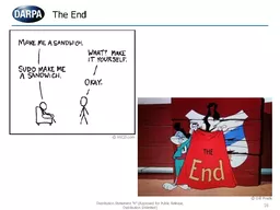
/
Lecture 3 End of lecture 2 Lecture 3 End of lecture 2

Lecture 3 End of lecture 2 - PowerPoint Presentation

yoshiko-marsland
yoshiko-marsland . @yoshiko-marsland
Follow
343 views
Uploaded On 2019-12-21

Lecture 3 End of lecture 2 - PPT Presentation

Lecture 3 End of lecture 2 Displaying quantitative variables First Class Second Class Third Class Crew Total Alive 203 118 178 212 711 Dead 122 167 528 673 1490 Total 325 285 706 885 2201 First Class ID: 771092

median class numbers data class median data numbers lecture chart times middle histogram number earthquakes center

Share:

Link:

Embed:

Download Presentation from below link

Download Presentation The PPT/PDF document "Lecture 3 End of lecture 2" is the property of its rightful owner. Permission is granted to download and print the materials on this web site for personal, non-commercial use only, and to display it on your personal computer provided you do not modify the materials and that you retain all copyright notices contained in the materials. By downloading content from our website, you accept the terms of this agreement.


Presentation Transcript

Lecture 3 End of lecture 2 + Displaying quantitative variables

First Class Second Class Third ClassCrewTotalAlive203118178212711Dead1221675286731490Total3252857068852201 First ClassSecond ClassThird ClassCrewAlive62%41%25%24%Dead38%59%75%76% Instead of “Alive + Total” we now have only one number to compare

Bar chart again We express survivor percentages depending on class

One more bar chart And here is a side-by-side chart of survivors vs nonsurvivors

We (almost) see that the survival chance DEPENDS on the class. If all conditional distributions (conditioned to what?) were the same, we would say that survival chances and class are INDEPENDENT

Now Lecture 3 begins

Earthquakes from 2010 to 2015 Here is the full table: link Unpleasant, isn’t it?Here is the column of magnitudes(double click to open).It is still unpleasant as it has toomany numbers.

A histogram

On the x-axis we see intervals. Height of every rectangle = how many earthquakes had magnitude in this interval. I.e., around 60 of them had magnitude from 4.9 to 5.4

A histogram from our survey 20 191818 19181918 19 20 19 19 18 20 18 18 18 19 19 18 18 20 21 18 18 18

Stem and leaf display 1 8888888888889999999920000120 19181819 18 19 18 19 20 19 19 18 20 18 18 18 19 19 18 18 20 21 18 18 18 This shows that we have “ 1 8 ” 12 times, “ 1 9” 8 times, “ 2 0” 4 times and “ 2 1” 1 time.

Shape When looking at a histogram, we should first notice it shape. Is it somewhat flat? Or does it have pikes? How many? Is it symmetric?Does it have a tail?

Sorry, can’t help it

From representing to summarizing It is essential to find the “center” of our data. What is a “center”? Assume you need to make ONE precise guess: what is the next outcome? In a sense, center is your most safe bet. It somewhat tells you where most of the data is concentrated.

The median Let’s first order numbers in our data. If there is an odd number of numbers, then median = the middle value:1 4 6 7 10 19 26 Median =If there is an even number of numbers, then average two middle values 1 4 6 7 10 19 26 28 Median = 7(7+10)/2

Range: (maximal value) – (minimal value) Quartiles: Divide the data in the middle by median, and repeat with left-hand part and right-hand part. 1 4 6 7 10 19 26  1 4 6 7 // 7 10 19 26Lower quartile = (4+6)/2=5Upper quartile = (10+19)/2 = 14.5IQR = (upper q.) – (lower q.)Spread